


It’s easy to have too much faith that our page-layout programs will do the right thing, especially when it comes to centering type. Although centering lines of type seems like a straightforward mechanical process, what your program says is centered doesn’t necessarily look centered. It’s up to your eyes to spot the problem and yours hands to make the fix.
The effect is vividly illustrated in Figure 1, a brochure that appeared in my mailbox recently. I spend a lot of time creating sample text to illustrate various typographic problems, but this fabulous specimen came to me ready-made and almost too good to be true. Click any of the figures to see larger versions.
Figure 1. The centered lines on this page look off-center. The problem? The graphically weak hyphen and points of ellipsis in some lines cause the more massive text to appear to drift off in the opposite direction.
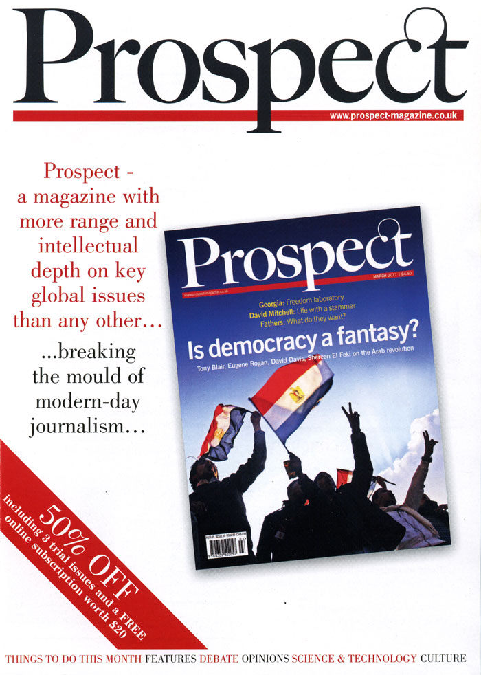
I first thought about using this page for a quiz, asking how many typographic missteps you could find. There are quite a few, and they’re all in these few centered lines. They include using a hyphen in lieu of an em dash, mixing tight character spacing with loose word spacing, and using grossly inconsistent spacing in the points of ellipsis. But the disjointed centering effect is the biggest gaffe of all, and it’s the result of simple inattention.
Your software centers lines mathematically. It counts the sum of the character widths on each line, subtracts the total from the specified measure, and divides the leftover space in two, putting half before the visible type and half after it. It sounds logical, but as you can see, logic doesn’t always work for human eyes.
The first line of the would-be centered sequence in Figure 1 drifts to the left because the hyphen and the word space before it are, compared to the word Prospect, mostly empty space. The last line in red is even worse, the fault of the insubstantial points of ellipsis having received the same consideration in centering the line as the more bulky letters preceding them.
In the four lines in black, only the position of the second and third lines informs the eye that the block is supposed to look centered.
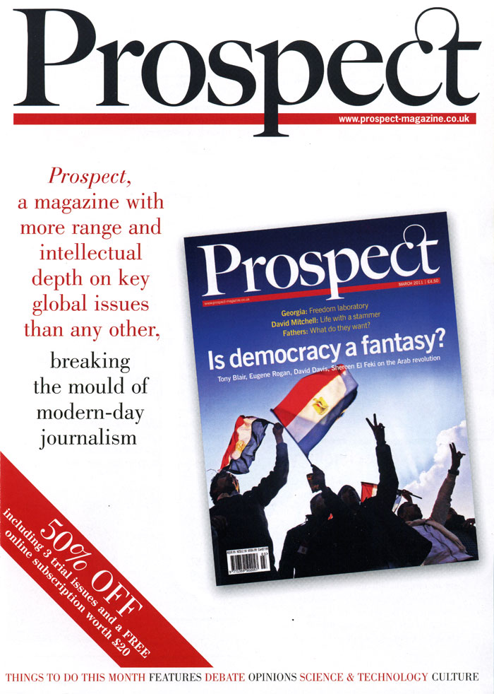
All of these lines need to be repositioned to give them the overall impression of being centered. Figure 2 shows my efforts to accomplish this by pushing selected lines left or right using indents. But first, to give myself a fighting chance, I substituted the more massive (and typographically correct) em dash for the hyphen and respaced the ellipse on the first black line to match the others.
Figure 2. When adjusting the centering of lines in a setting like this, first use returns to manually break each centered line. You can then adjust the horizontal position of each one with paragraph indents.

Because of the problems arising from lines ending with weak characters, this text is never going to appear centered to the close observer. The best you can do is give the general impression of being centered; that is, reduce the glaring imbalance of the lines until it no longer attracts the eye.
The fundamental issue with this type is the text itself. If its creator had followed common conventions of typography and copy-editing, these alignment and spacing gymnastics wouldn’t have been necessary. Were the name of the magazine in the first line, for example, to follow the prescription of most style guides, it would be set in italic. This would eliminate the need for the dash because it would be clear that the word “Prospect” is not a verb, but the name of the magazine. A simple comma following it would then suffice.
Likewise, the points of ellipsis make no sense from a content perspective. They’re being used as graphic devices, but ironically they create graphic problems by throwing the sense of centering out of whack. Besides, the contrast in ink color and the break in the leading already creates the visual dramatic pause the text calls for; the ellipses add nothing, especially the last one. This is a sober layout, and the edgy, hectic intrusion of all that jumpy punctuation looks out of place.
To make this point, I made the brassy gesture of editing the text to eliminate the troublesome punctuation and italicizing the name of the magazine. The result, shown in Figure 3, is far less choppy than the original.
Figure 3. Although lines that end in punctuation marks (such as the commas here) also tend to look slightly off-center, the effect is far less disruptive than ending them with wide but graphically weak characters.
Short texts like this don’t need to be punctuated aggressively or theatrically. In this makeover, eliminating the dashes and the three sets of ellipsis points creates a more harmonious whole while maintaining editorial punch through the contrasting color alone. Balanced centering happens all by itself.
Although the main point of this article was meant to be the supremacy of visual centering over mechanical centering, the question of the punctuation in the examples raises another important point: Typography is not the decoration of text, but an integral part of what makes text work. Where content and form can act collaboratively from the outset, the message will be best served. And the reader, too.
This article was last modified on June 2, 2011
This article was first published on June 2, 2011
Commenting is easier and faster when you're logged in!

Recommended for you

Wood Type Museum Urgently Seeks Donations
The Hamilton Wood Type & Printing Museum, which hosts the largest collection...

Saul Bass, Master of the Movie Title Sequence
Mention movie titles to any designer in the know, and undoubtedly the name Saul...

Three New Type Designs from FontShop
Press Release FontShop is launching several original and useful new designs: FF...