
Building Presentations in InDesign
Mark Heaps shows how to craft presentations in InDesign that are both beautiful and memorable.

This article appears in Issue 114 of InDesign Magazine.
InDesign is a wonderful application that over the years has adapted to its users’ many needs and desires. What was once a simple layout application for magazines and books has turned into a tool that can publish to the web, generate interactive PDFs, and more. However, making presentations (often called “slide decks”) is one design task few people think to use InDesign for. I think it’s time to change that, because InDesign can be a very powerful tool for presentation design, as I’ll explain.
InDesign Is Not PowerPoint… and That’s OK
One thing we have to acknowledge right away is that InDesign is not PowerPoint or Keynote. These industry standard applications were built from the ground up for the purpose of crafting presentations. They also have a full range of features for the presenter to use while serving slide designs to an audience—things like Presenter View, Timers, Speaker Notes, and so on. InDesign has a Presentation Mode, but that’s about it. However, I still think you should consider InDesign as a viable option for presentation design jobs, for several reasons.
Use what you know. Regardless of what kind of project you’re working on, you’ll be more efficient using the tools you know best. So why wrestle with unfamiliar programs if you don’t need to? You’ve probably also developed skills in other Creative Cloud apps that are seamlessly integrated with InDesign—which leads me to my second point.
Photoshop and Illustrator. In my opinion, the single biggest advantage InDesign has over PowerPoint and Keynote is its connection to Illustrator and Photoshop. Simply put, there isn’t a built-in connection with those traditional presentation tools. With them, you’ll feel like you stepped into a time machine and are working with a page-layout program from 20 years ago. You
can’t place Photoshop and Illustrator native files into PowerPoint or Keynote and maintain a live link to the art files. Even worse, PowerPoint and Keynote don’t understand editable vectors from Illustrator the way InDesign does. There are some workarounds on Windows, but on the Mac side, you’re out of luck. Fortunately, Recosoft recently addressed this problem by releasing IR2Office. It allows you to export from Illustrator (oddly, the “IR” in the product name) directly to a PowerPoint or Keynote slide. But of course, when you’re using InDesign you have all kinds of options for integrating vector and raster artwork into your designs, without having to invest in extra software.
Leverage Creative Cloud Libraries. CC Libraries are great for storing and sharing brand assets like logos, graphics, colors, and text styles—all of which you may need to construct your presentation (Figure 1). As long as you have an internet connection, you know you’ll be able to access the right assets. Even better, searching for stock assets and collaborating with others on those graphics through CC Libraries is great, and we can’t do that with traditional presentation apps.
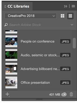
Figure 1. CC Libraries are a great place to store presentation assets.
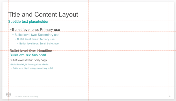
Harness the power of styles. If the depth of formatting options in InDesign is like an Olympic-sized pool, then PowerPoint is more like a backyard kiddie pool. Yes, there are some techniques in both PowerPoint and Keynote that let you take advantage of styles for formatting, but it’s nothing compared to the power and flexibility of character styles, object styles, and paragraph styles that you probably take for granted as an InDesign user (Figure 2).

Figure 2. Character styles offer much more formatting power and flexibility than you get in the dedicated presentation applications.
For example, once I worked on a presentation for a large commercial real estate developer. They had a presentation for their investors to show all the floor plans for the various room types in a large multistory building. After painstakingly drawing all the floor plans for the presentation in Illustrator, then transferring them to PowerPoint, I was informed by the Creative Director that my line weights were “too bulky and dark.” They wanted something lighter in weight and in tone. So, I had no choice but to go slide by slide, selecting each drawing (or parts of it), and making those adjustments. In InDesign, I could have used an object style for the floor plans and updated that style to fix them all.
You’re going to need a PDF anyway. If you’re designing a presentation for someone else, you may be asked to deliver a PDF instead of a PowerPoint or Keynote file. This is an increasingly common request, especially with users “out in the field” like salespeople and distributors. A PDF of a presentation gives them the information they need in a way that is very stable and reliable on almost any platform or operating system, including mobile devices. And, as you know, InDesign is really good at making PDFs.
Output to the Web with Publish Online. The ability to easily output a presentation to the web with Publish Online can also be a great benefit (Figure 3).
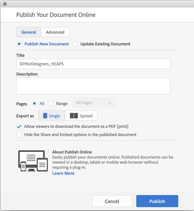
Figure 3. Publish Online can make your presentations easily available to your audience.
Not only does Publish Online support all the interactive features available in InDesign (including animation), it also makes the presentation easy to distribute, since it’s accessible to anyone with the URL. Furthermore, if you have to make changes to the presentation, the same URL can still be used, so version control is automatic. There’s no need to send out email updates with file attachments, and no worries that someone might be viewing an old version of the presentation. In theory, Google Slides would offer the same benefits. But in reality, the story is different. Google Slides is extremely limited in what it can do with media and some basic design tasks. I have spent hours tweaking graphics in Google Slides to get the same results that would take just a few minutes in InDesign.
Key Considerations
At this point, you might be starting to envision using InDesign for your next presentation. If so, awesome! But first, here are a few questions you need to answer.
Will you have full control over the creation of the presentation? If the answer is Yes, and you are already a confident InDesign user, then you should design in InDesign. If not—that is, if you’re creating a document that others need to tweak and update—then you might have to use an application that everyone else on the team has and knows, and that’s probably going to be PowerPoint.
Will the slides be shared after the presentation? If the slides will be shared, a PDF makes a great digital “leave behind” that is also perfect for printing. PDFs can also be uploaded to LinkedIn’s Slideshare service (so can PowerPoint files).
Will someone else need to access the content on your slides? This can be a significant problem, and may even be a deal breaker. Presentations are often cannibalized for particular slides that are then edited into another presentation or document. Unfortunately, most folks in the business world don’t have an Adobe Creative Cloud license or the applications that come with it.
But all is not lost, because there are ways of sharing your InDesign documents with business users in a format they can use. For example, Acrobat can export to a PowerPoint format. And, if you want a more direct approach, third-party developer Recosoft also has a plug-in called ID2Office, which can export InDesign documents to PowerPoint, Keynote, or even Word.
Presentation Essentials
There are some norms you should follow when building presentations that are essential for effective communication and a positive audience experience. These are relevant no matter what software you’re using to build your deck.
Overall, it’s helpful to think of the design and content in your presentation as a “Signal vs. Noise” experience for the audience. That means that you choose designs, layouts, and colors in a way that the audience can rapidly ingest content without getting distracted because they always know exactly what to look at.
Fixed-position items
You should start with standardized elements that can be the foundation of your design template. These are:
- Title
- Subtitle
- Page number
- Footer
- Grid for aligning content in the main body area
The goal here is to quickly teach your audience where things will be throughout the presentation experience. That way, they can more quickly engage with the content without having to review the whole screen each time a new slide appears.
In short, consistency can be a powerful tool. And for true consistency, anchoring those fixed-position items needs to be done with surgical precision. The title and subtitle should not shift position at all when the presenter clicks to the next slide. This means making sure the placeholder text frame has the same size and position and that the text formatting is entirely consistent. Lucky for you, this is easily achievable with the use of styles and master pages in InDesign. So unify your alignments, spacing, and distribution of content types so they all fall on a grid like you learned in Design Theory 101.
Of course, you need to be careful with overusing these elements (see “No-nos,” below).
Slide types
Here’s a list of the slide types that you should have readily available for any presentation. You aren’t required to use them all, but they are certainly handy to have.
Title Slide. At a minimum, this should include the topic of the presentation and presenter (or host) name. Some title slide templates will also have a subtitle line. This can be used for a department name, date, time, and so on.
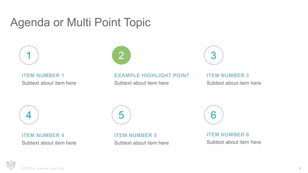
Agenda Slide. This should contain at least 5 points. Try to make it interesting and not resemble a typical bullet content slide. Using two columns helps, in case there are long descriptions between each agenda item. Consider using numbers or flags for each item to differentiate the agenda items from a typical bullet slide.
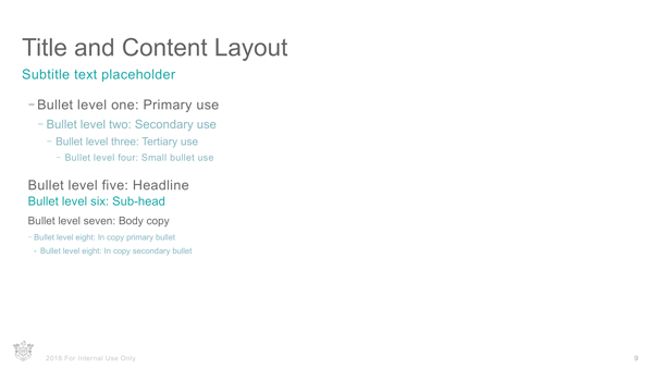
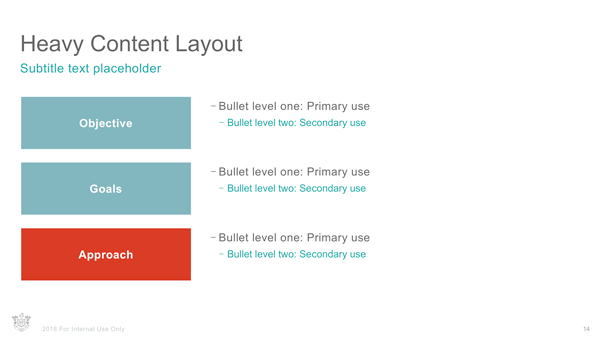
Main Body Slide. This is the one that you’ve seen thousands of times in PowerPoint or similar applications. It includes a title, possibly a subtitle, and then a large body area with text. In traditional presentation apps it can also be used to show a chart, table, image, movie, or some other element. This reference frame should also act as the outer frame for the design grid you use for all other slides, so there is a sense of cohesion and logic to your layouts.
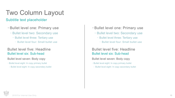
Two-Frame Slide. This is very much like the Main Body Slide except that is has content in two columns (usually preceded by a header) with a small gutter between them. The width of the gutter is usually less than the margin of the slide. Content does not flow from one column into the other. It can be used to tell a compare/contrast story, or present two ideas as a pair.
Three-Row Slide. Essentially the same thing as the Two-Frame Slide, but the frames used to house the content are spaced out in three even rows. This gives you more width for longer phrases while also providing some hierarchy. If you are animating a slide like this, it helps the audience to see Row 1 first; then the following rows can be loaded in “on click.” This allows the audience to focus in that moment without reading past the speaker’s current talking point.
Title Only. Many slides are abstract and custom in nature. They might present a mixed collage of company logos, smaller text frames, or a chart and a photo. In this situation it’s important to try and still represent some alignment with the main content slides. So even though this slide master might only have a title/subtitle on it, you should still use guides to align to the boundary frame of the Main Body Slide content frame. You can also chop that frame up into a grid (perhaps 5 columns and 4 rows) for aligning various assets so there is some order to all that abstract content. Consistency from slide to slide will help the viewer ingest the content quickly.

Segue. The segue slide can be used as a chapter divider or to introduce a new topic or speaker. Additionally, it will often be used to show a quotation, a key takeaway, or “big message.” This is a good opportunity to play with some custom formatting. Use really large type, a solid color slide, or something else that breaks up the monotony of the system they’ve seen so far. Whatever approach you choose for segues, again, be consistent. It’s through repetition that you create a rhythm for your audience to follow.

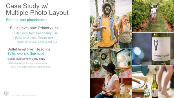
Photo Slides. There are a range of photo slides you can include in a presentation template, but three are essential. The first is a full-screen image slide, where the picture takes over the entire space, and the speaker just tells the story of that single image. It’s big, it adds color to the whole space, and the scale is large and impactful.

The second type is a mosaic photo slide. This can be a grid of your choosing, but take advantage of the grid system you have used in your other slides to decide where images get cropped in the mosaic. This might have one big image on the left, and three images on the right. The number doesn’t really matter as long as there are more than three images. Use this slide to flesh out a deeper story, or represent a case study more in depth.
The third essential photo slide is a “split layout” where a third of the slide contains an image and the other two-thirds is used for text content. The message you want to convey with the text is supported and enhanced by the image. If you want to limit the presenter to a smaller space (so they don’t add too much unnecessary copy), then split the space 50/50 between image and text.
Blank Slide. Yes, a blank slide. Sometimes you just have to place content on a slide that doesn’t require titles, subtitles, footers, or anything. It’s similar to a Title Only slide, but no title is necessary. It seems silly, but you’ll use it more than you think.
Thank You Slide. You should have some form of closing slide readily available. Some designers use the segue slide format for this, or they’ll replicate the Title Slide and replace the title with “Thank You” or “Q&A.” In my experience, it’s best to give the audience something slightly different that lets them know this is the end. You can use a photograph, or a unique layout, or possibly a different colored background. It’s like the credits rolling in the movie theater. That sense of completion is a reward for the audience and shifts their focus.

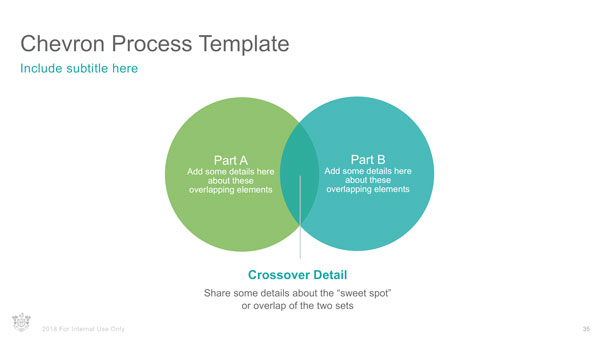
And the rest. There are many other slides that might be found in a good presentation template, including a table slide, a diagram/chart slide (or various types of charts each as a different slide), a timeline slide, a calendar slide, a case study slide, and so on.
Charts, tables, and infographics
Let’s talk for a moment about charts, tables, and infographics. These elements are incredibly important because the core story of most business presentations is based on data. The sales report, the financial report, the operations roadmap, audits of customers… the list is endless. And as a designer, it’s your job to turn piles of data into something visual and impactful. Your charts and tables should be crafted in a way that’s eye-catching and attractive, while at the same time fitting the overall style of the presentation.
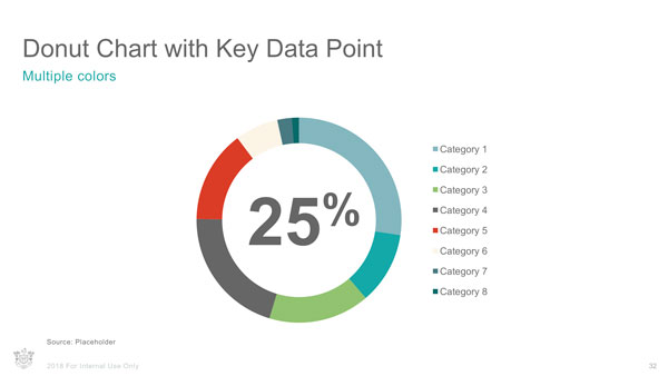
And it’s more of a challenge than you might think. It’s not enough to just look good. Your charts should be able to incorporate last-minute data changes just before the speaker walks on stage.
Sadly (and surprisingly), Adobe has never given us great chart-making tools. Remember CC Charts? That didn’t last long. And this is an ongoing problem, because so many documents nowadays, whether they’re presentations, reports, or books, need to include powerful data-driven visualizations. Today, you’re pretty much limited to drawing charts in Illustrator the same way folks have done for years.
But perhaps help is on the way. At the 2017 Adobe MAX conference, a prototype data-visualization tool nicknamed Project Lincoln was shown along with the other “sneaks” of work in progress. With this technology, the designer sketches the look of an infographic first and then binds the design to a data set. The result would be an instant, dynamic visualization that you can reshape on the fly. You can read more about Project Lincoln and watch the demo here.
Animations and transitions
Since the days of CS5, InDesign has offered basic animation tools and page transitions (Figure 4).

Figure 4. Page transitions are readily available to add in between slides.
You can’t do anything too exotic, but that’s fine; an animation doesn’t need to be exotic to be impactful. I would argue that you need only a few key object animations for most slides of a presentation:
- Fade in/out
- Float in/out
- Ease in/out
- Wipe in/out (horizontally or vertically)
- Zoom/Pop in/out
- Flip in/out
There are similar animations to these available in InDesign. And with timing controls, path directions, and more, you can mimic the most common and popular object animations audiences are used to experiencing with traditional tools. Check out issue #38 and #98 to learn about creating animations in InDesign.
When it comes to page/slide transitions, a few types are seen in most presentations. These are things like:
- Fade
- Push
- Wipe
- Iris
And, again, InDesign has transition effects similar to these.
The problem with animation and transitions built in InDesign has to do with the lack of support in most output formats. Animations work only in Fixed-layout EPUB and Publish Online. Transitions work only in PDF (and then, only when Acrobat is in Full Screen mode). These limitations, along with the fact that your client probably has PowerPoint or Keynote installed on their machine—and has some familiarity with how to use it—can be the end of the discussion about using InDesign for a particular presentation project.
But if you aren’t using any animations, and you’re certain that the client will not be asking to tinker in the presentation file at some point, then PDF can be a winning choice. It’s a stable and ubiquitous platform across all operating systems, and reader-versions are easy to get (and free). Plus, as I said earlier, PDF gives you the perfect leave-behind/takeaway piece of collateral.
No-nos, or at least things to reconsider
Here are a few things you should avoid when designing your presentation.
Dividers. You don’t need to draw a line dividing the title area from the main body area. The same goes for separating the footer area from the main body area. This was really popular in the early 2000s and we still see it pop up from time to time. It can be an interesting visual treatment, but inevitably it makes your presentation look very dated. Double negative points if you use a gradient line!
Logos on every slide. This is always a topic that causes major debate. Remember: anything an audience member doesn’t need to read on the slide is just visual noise. Branding is important, but in this era of communication, the experience someone has while engaging a company is equally as important to how the logo is represented for that brand. Also, during the presentation experience, an audience member isn’t likely to forget where they are, why they are there, or what company is giving the presentation. Logos on opening slides, or closing thank-you type slides are fine. But let’s finally kill the trend of needing them on every slide.
Footers and notes. In truth, you may have to include footers or notes because a legal compliance department may require copyright notices, citations, or privacy terms. But from a design perspective, these items are a hindrance to effective communication. In the signal vs. noise debate, they are definitely noise. Limiting them to the opener and/or closer of the presentation can be a compromise solution.
Stacking the Deck in Your Favor
When you design a presentation with InDesign, you get to take advantage of its connections with Illustrator, Photoshop, Adobe Stock, and CC libraries. On top of that, add the power of styles and master pages, and the ability to deliver slides in the form of a PDF, HTML5, or Publish Online, and you have one powerhouse presentation maker. Just remember that you always need to deliver something the presenter can work with. If they might have to make last-minute changes before walking on stage (which happens quite often), then you may need to design with (or at least export to) more traditional applications like PowerPoint or Keynote. But the same tools and features you use every day to make books, magazines, and other publications can also help you craft beautiful and effective presentations.
Commenting is easier and faster when you're logged in!

Recommended for you

Can You Read Me Now? Testing the Limits of Readability in Design
I’ve long been obsessed with how things work. Sometimes I think maybe desi...

3 Reasons Print Design Isn’t Dead
Every year, more marketers and designers perpetuate the idea that the print indu...

InFocus: April 2017
A bewitching bouquet of InDesign-related goodies, just in time for spring.