Branislav’s Great Ghost Technique
How do you make text or an object a little blurry in InDesign? Most people would answer, "Feathering," but unfortunately feathering anything with details usually leaves you with a mess...

How do you make text or an object a little blurry? Most people would answer, “Feathering,” but unfortunately feathering anything with details usually leaves you with a mess of icky broken lines.
Feathering text (top) vs. Blurring with this tip (bottom)

A couple of years ago, Tim Cole showed me a great technique for making text or objects blurry, but it had a little problem: It didn’t actually print correctly. That’s why I was a little skeptical when Branislav Milic showed me a new method for creating this sort of effect. But I’m here to tell you that not only does it look great, but it also appears to print great!
Branislav demoed this technique at the final “tips session” at the recent InDesign Conference in New York and told me I could post it here.
The trick relies on four steps:
- First, give your object a drop shadow. It is the shadow that you will see in the end (not the object itself).
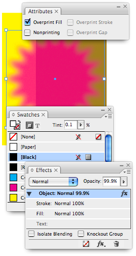
- Change the color of the object or text to a “fake white” of something almost imperceptible: .1% black. You can make your own .1% black color swatch, or just apply [Black] and then change the tint to .1%.
- While the text is selected, sse the Attributes panel to turn on Overprint Fill.
That’s as far as Tim and I ever got… it’s clever, but in only appears properly in Acrobat (or InDesign) when Overprint Preview is turned on, and — as I noted above — it typically won’t print separations properly (at least not on the printers I’ve tried it on). So you need one more step:
- Use the Transparency palette (CS2) or the Effects panel (CS3) to set the transparency of the object (the frame itself) to 99.9%.

This last step kicks in the transparency flattener which performs the magic we need. As long as you export an Acrobat 4 PDF (such as a PDF/X1-a) or an EPS or print directly from InDesign, the object itself disappears, leaving the drop shadow behind. In the image above, the starburst object is colored .1% black, but it’s drop shadow is set to a Magenta color!
It seems like a lot of work, but once you do one or two of these, it’s actually pretty easy to repeat. Plus, you can set it up as an object style, making it easy to move from one document to another.
This article was last modified on December 18, 2021
This article was first published on June 11, 2007
Commenting is easier and faster when you're logged in!
Recommended for you

Turn a QuarkXPress Document into a Web Page with BeyondPress
Version: 4.1 Operating systems: Macintosh, Windows If you’re pulling doubl...

Adjust Photoshop FX quickly and easily with tomaxxiFXcolor
If you like working with Photoshop FX, check out a free extension available on A...

10 Photoshop Efficiency Tips from CreativePro Week
Use these quick tips to increase your efficiency and enjoyment in Photoshop.


