
Book Excerpt: Typography Essentials
Ina Saltz shows how to make use of case, leading, images, and more to create beautiful and effective layouts with type.

This article appears in Issue 128 of InDesign Magazine.
 In the following excerpt from her book Typography Essentials: 100 Design Principles for Working with Type, Ina Saltz shows how to make use of case, leading, images, and more to create beautiful and effective layouts with type.
Using Cases
Majuscules are majestic. Minuscules are modest. Uppercase and lowercase letters (so called because they were kept in separate drawers of the typographer’s “case,” or cabinet) have distinct purposes. Capital letters, as they are also known, speak loudly, while small letters are quieter.
Again, everything is relative; very lightweight uppercase letters in a simple sans serif might speak more quietly than a chunky slab serif lowercase. Everything depends on proportion and the mix.

Project Cover
Creative Director, Designer Vanessa Holden
Photographer Ellen Silverman
Client Real Simple
Though the magazine’s logo is in caps, the cover employs simple, modestly sized lowercase cover lines; unlike many magazines, it does not wish to “shout” visually. The core of its mission is to calm and reassure the reader.

Project Tablet edition
Creative Direction Joe Zeff Design
Client Kids Discover
Cases are flipped here, as the enormous bold sans serif headline clearly dominates all other text in caps in the left panel.
Initial Caps and Drop Caps
Initial caps mark the beginning of a chapter or an article; drop caps may be used throughout the text to mark logical breaks in the text and to provide entry points for the reader. Drop caps may continue the
style of the initial cap or be a variation of it. Drop caps and initial caps continue a long tradition that dates back to the earliest illuminated manuscripts (which often had entire scenes depicted within the counter spaces of the letterforms). There are many options for drop caps and initial caps: partial or full indents, partial or full outdents, tops flush with the body copy, baseline alignment with the first line of body copy, baseline alignment with any body copy, and baseline within the depth of the initial cap (these last two are called raised drop or initial caps). Some text does not lend itself well to an initial cap; most common are opening paragraphs beginning with a quote mark or punctuation, or when opening paragraphs are too short to accommodate the height of the cap.

Project Feature spread
Design Director Louis Fishauf
Designer Louis Fishauf
PhotographerPierre Manning
Client Toronto Life
The initial cap is partially contained within the opening paragraph, and the wrap hugs its diagonal leg. Its vertical position matches the capital A in the headline, a nice touch of alignment.
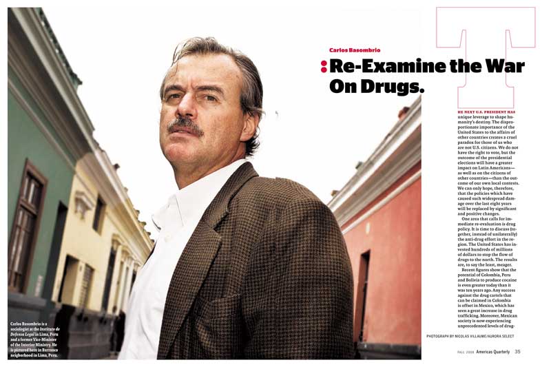
Project Feature spread
Creative Director Donald Partyka
Photo Editor Ramiro Fernandez
Photographers Nicolas Villaume and Aurora Seleet
Client Americas Quarterly
This unusual version of an initial cap sitting on top of and aligning with the text column allows it to be scaled up; as an outline, it is lightweight and does not interfere with the overlapping headline.
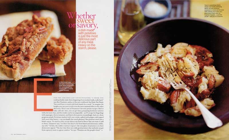
Project Feature spread
Design Director Carla Frank
Designer Erika Oliviera
Client O, The Oprah Magazine
The initial cap sits partially within the text block and links into the photo; the top of its middle crossbar “kisses” the image. It intrudes upon the image, as does the pull quote at the top of the page.
Increasing Leading
Space between lines (leading) should be increased if the measure (line length) increases beyond the optimum range, or if the letterforms vary even slightly from a highly legible text face (designed to be read in quantity at small sizes). Even Bodoni, with its strong vertical strokes (in comparison to its horizontal strokes), may require a bit more leading to compensate. Increasing leading, even slightly, aids the eye in finding its place when it cycles back from the end of one line to the beginning of the next.

Project Cutthroat: Native Trout of the West
Art Director Charlie Nix
Designers Charlie Nix and Gary Robbins
Client University of California Press
The longish introductory quote is more legible (and more elegantly presented) with extra leading.
 Project Single page
Creative Director Donald Partyka
Client Americas Quarterly
This airy text block has extra leading in keeping with the spacious graphic treatment and the other elements on the page.
Legibility Taking a Back Seat
There are reasons why legibility might not be a designer’s primary concern. When type is treated as an image, it can communicate on a different level. Type can be manipulated or used in such a way that it is difficult or impossible to read and still play a pivotal role in the reader’s understanding of the text.
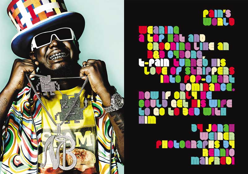
Project Feature spread
Creative Director, Designer Dirk Barnett
Photographer Rennio Maifredi
Client Blender
This artist’s appearance was clearly the inspiration for the opposite text treatment; a youthful audience of music lovers will undoubtedly be more interested in appearances than content (as it takes a great deal of effort to decipher this text).
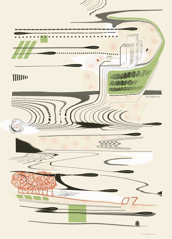
Project Lateral + Vertical
Design Director Jeremy Mende
Designers Amadeo DeSouza, Steven Knodel, and Jeremy Mende
Client American Institute of Architects, California Council (AIACC)
This poster for a design conference does provide some basic information, but it must be searched out amid the woozy graphics; since the readers are likely an audience of designers, they are probably willing to make the effort.

Project Poster
Company Henderson Bromstead Art Co.
Client Triad Health Project
The text is so embedded in the gridded imagery that we can scarcely make it out, but it is repeated at the bottom left. The poster is coveted as memorabilia from the event, but it “pushed the decorative envelope,” says the designer.
Organized Entry Points
Readers are beset by distraction, and unless they are highly motivated, they will take the path of least resistance (which might mean ignoring the text completely). Much has been written about the decline in attention spans and the competition for attention from all sides. So the successful typographic designer will offer up an appetizing smorgasbord of options for the reader, offering many places where the text may be entered and consumed in bits and pieces that can be easily digested. This layering and compartmentalization may also signal that there is something for everyone: more perceived value because there is a lot of content constrained in a confined space.
The delicate interplay of hierarchy has an important role: relationships of bold and light, roman and italic, small and large, and caps and lowercase should faithfully represent the relative importance of the content. Typographic hierarchy cues the reader to evaluate the content in relation to the whole. Variety in typographic presentation is the key to directing the reader to pierce the typographic veil. Even modest adjustments in size, weight, width, color, and slope can signal shifts in the content to provide entry points. Overall balance must be maintained simultaneously, making these pages among the most complex to design well.

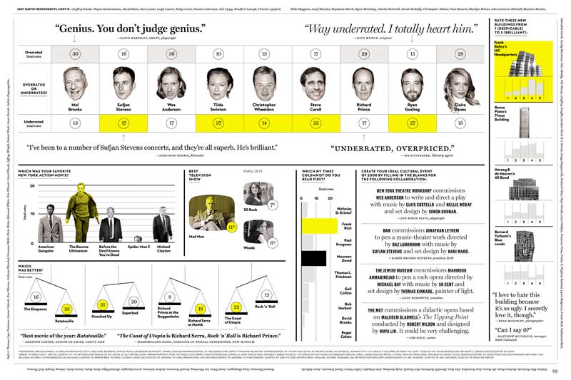
Project Single page
Creative Designer Donald Partyka
Designer Cathy Yun
Client Americas Quarterly
Eighteen different sizes, styles, weights, and colors of type populate this deceptively simple single page. The overall effect is clean, compartmentalized, and organized, so readers may easily enter the text at many points and choose bite-size info bits. Infographic options include a map, a poll with percentages, sound-bite quotations, and a pie chart.

Project The Culturati Caucus
Design Director Chris Dixon
Art Directors Randy Minor and Kate Elazegui
Designer Robert Vargas
Client New York
Spectacular in its complexity, this four-page cultural survey section pulls off a tour de force of organized entry points by using a mixture of strong grids, the restraint of two colors, and the simplicity of two type families. Segments include an intro, seventeen infographics, and eight sets of survey quotations, plus all of the attendant credits and other “utility” text. Subtle changes in width, weight, and slope, as well as the use of small but essential chunks of white space, demonstrate a masterful handling of detail and an awareness of how readers enter and absorb the content.
Text Overlapping Images
Legibility issues come into play when type overlaps images: the image demands our attention. To make the type stand out, type size and style, contrast with the background, and stroke weight all contribute to the important separation between the background and the foreground. Laying a few words of display type over an image can be complex enough, but where some designers go wrong is laying a quantity of text type over an image—this is sure to make reading a difficult task.

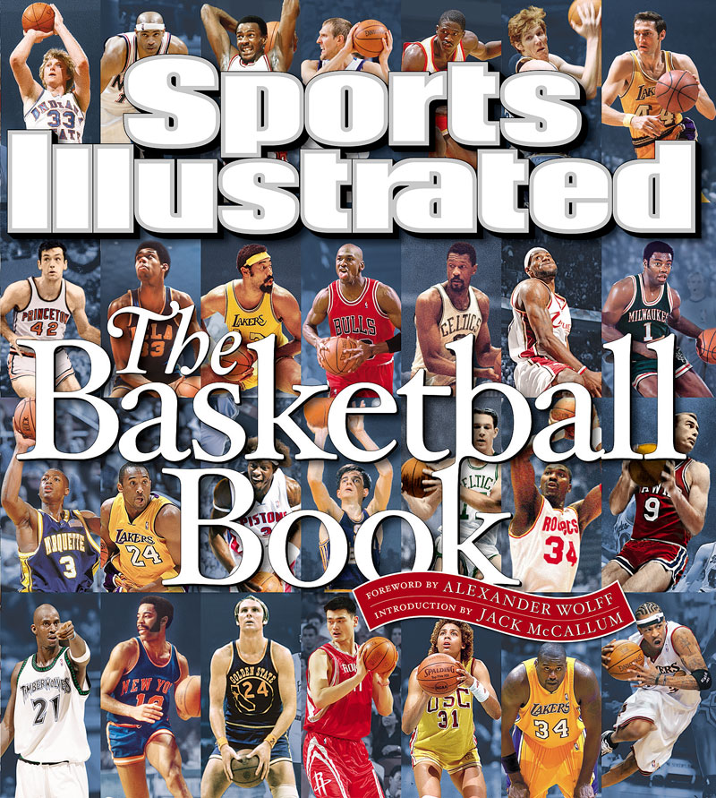
Project Covers
Creative Director, Designer Steven Hoffman
Client Sports Illustrated
These covers demonstrate some good techniques for making sure that type is legible when overlapping complex details and many levels of contrast. The type must have enough weight and be large enough to stand apart from the images, but that is not always sufficient. A combination of outlines and hard and soft drop shadows provide separation and “lift” the text visually forward from the images.
Commenting is easier and faster when you're logged in!

Recommended for you

TypeCon2011 Dates & Venue Set
The Society of Typographic Aficionados is thrilled to bring TypeCon2011: Surge t...
Scanning Around With Gene: Old News is Good News
There are a lot of perks to being a highly paid blogger here at CreativePro. The...

Adobe Mobile Apps for Designers
Is your mobile device part of your creative workflow? If not, it should be. Here...