

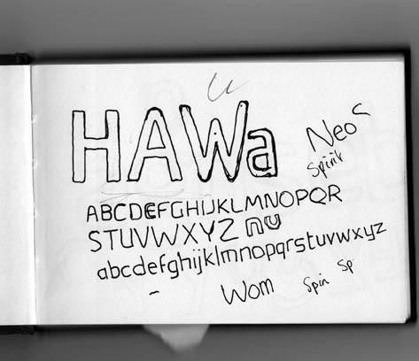
When Sebastian Lester designed the Neo Sans family for Monotype in 2004, he aimed for something that had a “slightly futuristic feel to it, but was still useful for general design purposes.” He succeeded.
Neo Sans is the official font of the Vancouver 2010 Olympic Games. The Neo Sans type family includes 13 weights (12 of which you can buy for your own projects; only Neo Sans Unicase is reserved for Olympic use). Yet before this fame and family, Neo Sans was just a sketch in Lester’s notebook:
What Makes a Brand Identity Typeface?
Allan Haley, director of words and letters at Monotype Imaging, says that Neo Sans rose to such heights from these humble beginnings because it has qualities you should look for whenever you’re seeking a brand identity typeface:
• It’s distinctive
• It’s versatile
• It has a large family behind it
• It has staying power
“When you’re putting together a brand identity,” Haley advises, “choose the typefaces first thing so you can build everything else around them. However, never use a system font. You’d be surprised how many people do. One reason even large firms choose system fonts is because they want to use ‘Web-safe’ fonts that most people have installed on their systems.” But happily, the @font-face rule makes that a moot point.
More Olympicy Goodness
Once I started researching the Olympic brand identity, I came across all sorts of interesting links. Here are a few of the best. If I’ve missed your favorite, please share the link by clicking the Comments button.
Official Explanation of the Vancouver 2010 Graphic Identity
Core77’s article on the Olympic medals (made from recycled computer waste!)
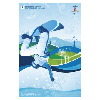
Official posters of the Vancouver 2010 Winter Olympic Games:

This article was last modified on December 14, 2022
This article was first published on February 23, 2010
Commenting is easier and faster when you're logged in!

Recommended for you
Good Things in Small Packages
Small capital letters—small caps, as we say in the trade—are a typesetting mains...
Cyril Burt: Putting Readability to the Test
How’s this for a typographer’s mission statement: to provide the swiftest access...

New Font Family from P22
Late November is a new font family from Norwegian type designer Torliev Sverdrup...