

I recently came across these online advertisements for the SoCo Music Experience, a music festival sponsored by Southern Comfort:

Click on either ad to see larger versions.
According to the team behind the ads, the palette for all of the SoCo communications is “distilled” (get it?!) to red, black, white, and the golden amber of the drink itself. “We worked with the key elements of the label to express the authentic feel of Southern Comfort in a contemporary way. The logo and parts of the label border are set against an appropriately distressed parchment-like white background. High-energy photographs of SoConsumers form the outer layer; the inner layer is created from images of the kinds of places they might go to enjoy SoCo.”
To achieve this layered look for your own projects, follow the steps below.
Step 1
Launch Photoshop and open an image you can use as the white part of the design. To follow along with the photo I used, download kelly.JPG.
Step 2
Go to Image > Adjustments > Threshold. Set the threshold to a setting that keeps the image recognizable. I selected 94 for this example.

Step 3
The photo should now look something like this.

Step 4
Open the Layers palette and double-click the Background layer. Its name should change to Layer 0.

Step 5
Go to Select > Color Range and set the Fuzziness to 200. Click the Eyedropper cursor over the black area. This will select the black pixels. Press OK.

Step 6
Press Delete (PC: Backspace) to delete the black pixels. With the Marquee Selection tool, click somewhere on the image to deselect the pixels. Alternately, you could mask out the pixels, but you don’t need the black pixels for this example.

Step 7
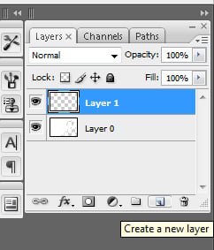
Click the New Layer icon on the bottom of the Layers palette to create a new layer, called Layer 1.
Step 8
You now need to create the design that will show through the original layer. In the Layers palette, click and drag Layer 1 below Layer 0. Click the Eye icon next to Layer 0 so it’s not visible for now.

Step 9
Click the Foreground color on the bottom of Photoshop’s Toolbar and choose a color to fill the area with.

Step 10
Press Option-Delete (PC: Alt-Backspace) to fill Layer 1 with this color. Now it’s time to choose another color to brush some variation into it. Click the Foreground color in the Toolbar and change the hue to something a little bit different.

Step 11
Click the Brush tool on the Toolbar and change the brush on the Control Palette to a softer-edged large brush, like 300.

Step 12
To make the brush blend in better, change the Flow on the Control Palette to 20%.

Step 13
Click the Eye icon next to Layer 0 on the Layers palette to make it visible again, but don’t select it by clicking on the name or thumbnail preview, since you need to edit that layer. Click on the New Layer icon on the bottom of the Layers palette to create a new layer, Layer 2.

Step 14
While Layer 2 is highlighted blue in the Layers palette, use the Brush tool and paint on some of the orange color into various areas. You can adjust the opacity of the layer if it needs to be softer.

Step 15
Now it’s time for the texture. Click on the New Layer icon on the Layers palette and drag that new layer to the bottom of the layers.
Open a photo in Photoshop to use for the texture. I used a photo from Ruslan Gilmanshin that continues my bubble theme.
Click and drag the texture photo onto the photo you’ve been working on. Make sure that the texture photo is the bottom layer. Click and drag a corner to resize it and use the Move tool to move it. Note: If the corners aren’t bounding boxes, see whether Show Transform Controls is checked on the Control Palette.
Once it’s where you want it, click to select Layer 1 (the red layer) and change the Layer Blending Mode at the top of the Layers palette to Multiply. You can also try the Soft Light or Overlay blending modes. What looks best depends on the photos you’re using.

Try a few different photos for texture, but remember to match the theme of the photo in the other layer.
This article was last modified on January 5, 2023
This article was first published on September 10, 2008
Commenting is easier and faster when you're logged in!

Recommended for you

Remove.bg: A Worthy Alternative to Photoshop’s Select and Mask
Get to know this web-based app that performs instant photo cutouts with a remark...

Better Tools for Tones: Why I Don’t Look at the Histogram
The histogram—the graph of tonal levels you see in photo-editing software—helps...
Learn About Photoshop CC While You Use It With the New Features Panel
We are all creatures of habit and develop our favorite ways of getting work done...