

Once upon a time — that is, before the industrial and electronic revolutions permitted a host of shortcuts — typefaces were designed one point size at a time. From the small to the large, each iteration of a typeface was designed for optimal legibility and beauty at a particular size. Fine details that would be lost in small sizes could be elaborated in larger ones. Consequently, it took many size-specific fonts to set a job in a single typeface. Titling faces, designed for use in large sizes, are a vestige of that tradition, and they’re one that you should take advantage of.
By the dawn of the 20th century, in the heyday of metal type, mechanical tracing machines called pantographs allowed a single master character design to serve as a template for creating type at any desired size. You still needed many size-specific fonts to set a single job, but if you photographically enlarged a range of those types to the same scale, you’d likely see that all the characters were identical in proportion and form. Sometimes different masters were used to create types for use in specific size ranges, but not always.
When digital type was introduced, a computer could scale a single character outline, defined in software, to any size. A single font — consisting of a single set of character outlines — could now produce type at any size. Today, most of the type we see and use in any given typeface is scaled from a single set of master outlines, which means that most of the time the type we see hasn’t been specifically designed to be seen at that size.
It doesn’t have to be this way.
Both the TrueType and OpenType font specifications allow type designers to create fonts that can generate size-sensitive type. That is, when you set small, footnote-sized type, the characters your program puts on the page can be somewhat wider, somewhat bolder, and sport a somewhat larger x-height than type set at larger sizes. These stylistic variations — the importance of which designers of metal types understood centuries ago — make small type much easier to read.
Likewise, as type size increases, characters can assume more normal proportions at common text sizes and take on finer features at larger, display sizes. Unfortunately, fonts this flexible remain rare because they’re so much work to create. And expensive to buy. So far, the community of font consumers hasn’t shown a willingness to pay the price that would make creating such fonts profitable.
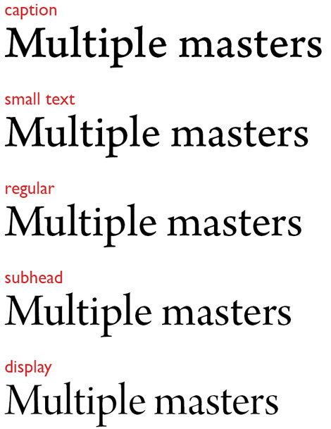
Nevertheless, digital foundries have created a modest number of fonts containing what Adobe Systems (champion of the technology) calls “opticals.” These are multiple point size–specific sets of master character outlines included in a single font. Adobe’s Arno Pro, for example, contains distinct sets of outlines for use in roles from “caption,” “small text,” “regular,” and “subhead” to “display.” The differences among their designs become obvious when they’re all scaled to the same size, as shown here:
This built-in design variability gives you a scaled down, electronic version of an old-fashioned type cabinet, in which each size-specific version of a typeface was held in its own drawer. You may have fewer “drawers,” but the type in each can be scaled to cover a range of sizes.
But structuring digital fonts in this way pressures the type designer to limit the design variations between opticals so there is a smooth transition in styles right through large, display sizes. Historically, this is not how things have always worked, and typefaces designed specifically for display use have often had substantially different designs than those used for text and smaller intermediate display uses (such as subheadings). These large, so-called titling faces aren’t common, but they’re worth seeking out. Typeface families with a titling member or an allied titling face give you an extra dimension of design flexibility.
Some titling faces were (and are) different enough from their associated family to get a unique name. The titling face for the ITC Galliard typeface family, for example, is called Mantinia. In other families, the titling face shares the family name, as with Perpetua Titling.
Let’s say you want to design a book using ITC Galliard. If you stick to the Galliard family proper, you might end up with a cover that looks something like this:
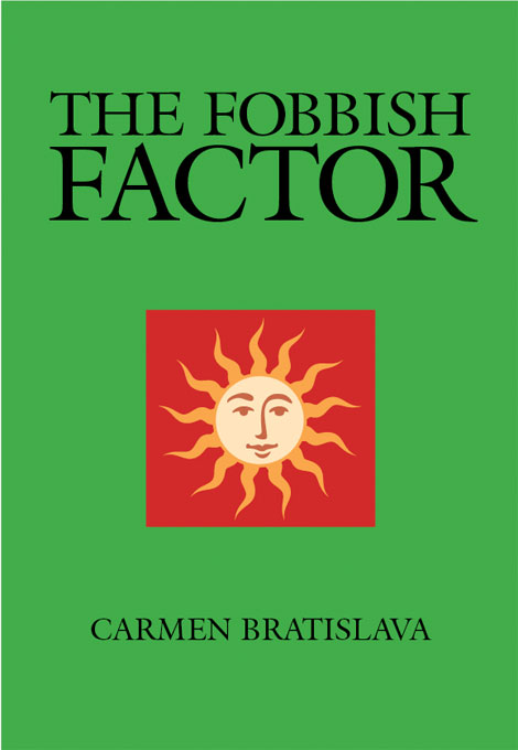
Nice enough, but if you use Mantinia for the title type, you end up with this:

The type set in Mantinia still tastes of Galliard, but it’s striking for the more complex shapes of its characters, its unique proportions, and a fineness of detail (the serifs, for example) that would make it unsuitable for text because it would appear too busy. The very features that make Galliard so effective as a text face work against it in display roles, where compared to Mantinia it may look too austere. This may be the effect you’re after, but it’s valuable to have a more animated option.
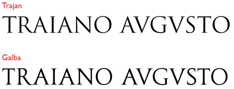
A problem with titling faces is that, following tradition, they often contain no lowercase letters, only capitals. This is the case with Mantinia and Perpetua Titling as well as a host of other common titling faces, including Adobe Trajan and Mecanorma Galba (pictured below), which are modeled after the famous and influential lettering engraved in 113 A.D. on the base of Trajan’s Column in Rome.
In the latter case, the exclusive use of the upper case is understandable, because the Romans had no lowercase letters, minuscules not making their appearance in European texts for at least several hundred years after Trajan’s exploits.
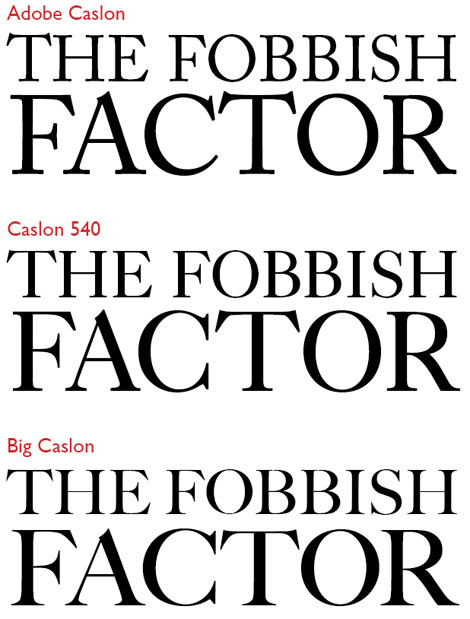
Big Caslon is probably the most popular titling face, as it’s part of the standard font set built into Apple’s Mac OS X. Since Caslon is not a trademarked or copyrighted name, there are scads of Caslon faces out there that are more or less derived from the works of William Caslon. The situation is complicated by there being scads of William Caslons as well, with four generations of type founders by the same name producing “Caslons” for about 150 years. (An old typographic saw regarding typeface selection runs, “When in doubt, use Caslon.”) But as the following illustration shows, Big Caslon matches up better with Caslon 540 than with many others.
The titling face Big Caslon is a better match with Caslon 540 than, for example, Adobe Caslon, because it shares 540’s finer strokes, as well as structural features such as the double-barbed capital C.
Like most titling faces, Big Caslon has more expressive and detailed features than its family cousins, which were designed for use in smaller sizes. But unlike many titling faces, it includes a set of full lower case characters. This may not be traditional, but the modern trend to include minuscules in titling faces is a welcome development. Titling, like most things, just isn’t what it used to be.
Locating titling faces can be tricky. If you search popular type outlets on the Internet, you’ll find that searching for fonts using the key words titling face (or the like) casts a very wide net. That’s because many vendors use the term titling to describe any and all display faces in their catalogues. Finding the titling font you’re after, then, probably won’t be a push-button affair.
It will, however, be worth the effort.
This article was last modified on August 13, 2021
This article was first published on April 28, 2010
Commenting is easier and faster when you're logged in!

Recommended for you

Free Book Sample: Design Fundamentals Notes on Type
Even if you’re a true typophile with a bookshelf full of titles on typogra...

The Right Font Could Save Your Life
Good design can be important for many reasons. It can be critical to the success...

TypeTalk: Kerning in Action
Q. Kerning is a black art I have yet to get my head around. How much is too much...