

As job descriptions and responsibilities have been telescoped over the past couple of decades, the person setting type has had to make more and more interventions that used to be handled by copy editors and proofreaders. Since these last two are sadly becoming rarer, the compositor or typesetter has had to fill their shoes. In this installment, we’ll be looking at line endings, where typographic norms exist, but a lack of policing has resulted in declining quality in the text we read.
The division of text into lines is the job of the hyphenation and justification engine of your page layout software. When it comes to how lines break, your principal leverage is in managing hyphenation. (See my column “Hy-phen-a-tion”) But line breaks determined by software don’t have the advantage of human intelligence, so even “legal” line breaks may trip up a reader or interfere with the clarity of the text. Some line breaks don’t make the grade on aesthetic grounds—they’re just not pretty.
Here are some of the more common line-break problems you’re likely to come across and how to cope with them.
• “False” periods Lines that end with periods that are not sentence-ending periods are apt to confuse the reader. For example, a line containing the phrase et al. shouldn’t be allowed to break after the abbreviation even though it’s followed by a word space. Similarly, in a manuscript about T. Rex or E. coli, the initial should not be separated at a line break from word that follows it.
Likewise, because the typographic norm is to put a word space between someone’s initials (as in P. G. Wodehouse, or A. J. P. Taylor), you need to take care that these don’t break badly at line endings. Whereas a proper name written with a single initial, such as O. Henry, should never be divided at line’s end, names with multiple initials may be divided before the surname if needs be, as shown in Figure 1.
Figure 1: In the upper sample here, the author probably wouldn’t be happy with the inadvertent allusion to The Story of O. In the lower sample, uniting Wodehouse’s initials on the same line smoothes the reader’s path by restoring their familiar configuration.

If your work group uses a manuscript style manual, it should specify that such initials be separated by a nonbreaking space, and not a regular word space. Every font contains a nonbreaking space, which is the same width as a regular word space, and every word processor can insert it. In MS Word, for example, the keyboard shortcut is Option-Spacebar (Mac) or Shift-Ctrl-Spacebar (Windows). In other Windows applications you can use the generic keystroke code for the non-breaking space: Alt-0160.
The HTML code for a non-breaking space is as in O Henry.
• Name Breaks at Inopportune Spaces Names followed by numerals should also be kept together, so in expressions such as Louis XIV and Nicholas Rothschild 3rd, the numeric values should be kept on he same lines as the names that precede them.
• Points of ellipsis The three consecutive periods used to indicate an omission within a text (called ellipsis points) can begin or end a line, but they should never be divided across two lines. (For the full nine yards about them, see my earlier column “Dot Dot Dot ”) If the ellipsis points are properly constructed, this should happen automatically. This means binding the periods to each other with non-breaking spaces but using regular word spaces between the ellipsis points and the words before and after them.
• Non-English usage Some languages use spaces to separate text from certain punctuation marks and symbols that in English are set closed up. Unless you make sure that non-breaking spaces are used in these situations, you may get unfortunate line breaks. The most common of these situations are:
Guillemets Commonly used as quotation marks in French, Spanish, and Italian, guillemets (« ») are separated from the text they contain by word spaces, and these should always be set using non-breaking spaces.
Degree symbol In both French and British English, the degree symbol (°) is separated by a space from the number before it. This too should be a non-breaking space.
Particularly French exceptions Non-breaking spaces should also be used in other situations in which French usage calls for word spaces, including before exclamation points and question marks; after em dashes used to punctuate dialogues; between numeric values and percentage signs; and before colons and semicolons. The same is true where spaces are used in lieu of commas or periods in large numbers (e.g., 1 000 000). When this style is employed, spaces may also be used after every third numeral in long decimal expressions (? = 3.141 592 65)
Spanish double consonants In Spanish, the doubled consonants ll and rr (while rare) are considered single characters and cannot be divided at line endings. So, for example, the correct hyphenation for the Barcelona metro stop Parallel is Para-llel.
• Double hyphenations Double-hyphenated words are also bad news for readers, and although software should be able to help with this, I don’t know of any that can. It happens when a word containing a hard-hyphen is divided at some other point and hyphenated again. Two classic examples of this appear in Figure 2.
Figure 2: These two examples of double hyphenation come from the same magazine article. The first is a rare specimen of quadruple hyphenation, whose unfortunate machine-inserted hyphen trips up the reader by clouding the meaning of the numeric value cited. (Most style guides would recommend using the numerals 217 in this situation.)
If you were thinking that narrow measures such as this (13p2) make double hyphenations inevitable, the lower samples dispel the notion. The first shows the text as it was published, with spacing that varies grossly from tight to loose over the course of the paragraph morsel (it appeared at the bottom of a column). The bottom sample is my reconstitution of the text that both eliminates the double hyphenation and also smoothes the spacing.

Double hyphenation doesn’t occur all that often (although you might not guess it from Figure 2), so it’s probably easier to fix it when it happens than try to prevent it during manuscript preparation. To undo the damage, select the word that’s been machine-hyphenated (but not the hard hyphen) and format it not to hyphenate. In Adobe InDesign, do this by selecting No Break in the Character palette menu; in QuarkXPress (and here’s one you won’t find in the documentation) select None in the Character Specifications palette’s Language pop-up menu.
The nerve-wracking thing about bad line endings is how fast they can appear. Even without changing typeface, tracking, or point size, a small change on page one can ripple through an entire manuscript, altering untold line endings along the way. This can happen as unrelated paragraphs recompose to obey “keeps” obligations to avoid widows and orphans, and text wraps change along the way. Your only insurance is a good proofreader.
This article was last modified on July 31, 2021
This article was first published on July 10, 2012
Commenting is easier and faster when you're logged in!

Recommended for you
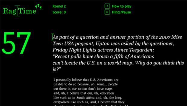
Rag Time Is Perfect Game for Picky Typographers
Fathom, an information design company, has created a game called Rag Time. With...
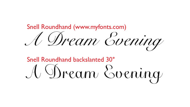
The Taming of the Skew
Regular readers of this column know that I generally take a dim view of electron...

New Font Has Its Own Movie Trailer
Heroine is a new typeface designed by Göran Söderström. Söderström was inspired...