Drop Cap Tips, Part 2
Tips and tricks for refining the look of drop caps

Be sure not to miss Part 1 of Drop Cap tips, with info on kerning drop caps and determining their exact point size (which is not as easy as you might expect).
Refining an Outline Drop Cap
Turning your drop caps into outlines opens a wide range of graphic possibilities. It’s important to note, though, that once you’ve converted to outlines, the kerning trick mentioned in Part 1 won’t work anymore in either InDesign or Quark XPress. If you need to reposition your drop cap to the left, do it before converting to outlines.
To create an outline drop cap in XPress, select the drop cap and choose Item/Convert to Boxes/Anchored, which binds the drop cap to the text. If you find that your paragraph text has sunk to base-align with the drop cap, select the drop cap and open the Box tab in the Item/Modify dialog box. Click on the Ascent button under Align with Text to restore the original depth of your drop cap’s indent.
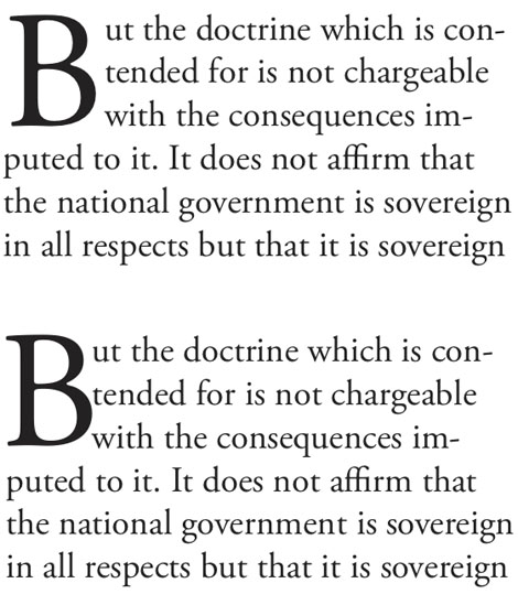
Turning drop caps into outlines also changes their spacing relative to the text next to them. The text type now snuggles right up against the drop cap (actually its bounding box, as shown in Figure 1), so if you do convert a drop cap to outlines for whatever reason, you have to make some spacing adjustments.

Figure 1: The version on top shows a drop cap’s alignment before its conversion into an object. Once it’s been converted, as in the lower version, the paragraph text to its right aligns smack up against its bounding box—too close for comfort.
Fortunately, InDesign continues to recognize some type characteristics of a drop cap even after it’s been converted to outlines. If you place the text cursor between the drop cap and the first character of regular text in the paragraph, you can use manual kerning commands to push the text to the right and re-establish proper spacing between it and the drop cap. Kerning this one space will cause all of the lines indented by the drop cap to move in unison.
To achieve the same thing in XPress, you have to act in advance. When creating a drop cap that you want to convert permanently to outlines, add a hair space (Utilities/Insert Character/Special) after the first character in the paragraph and make your drop cap two characters wide. After converting both of these to boxes, the hair space will create a buffer between the visible drop cap and text the follows it.
In InDesign, there’s another less obvious advantage that comes from converting drop caps to outlines. Having made the conversion, you can change the setting controlling how many lines deep your drop cap is without affecting its size. This allows you to create partially dropped caps, as seen in Figure 2. You’ll probably have to add space after the preceding paragraph to keep the drop cap from crashing into it.

Figure 2: Once you’ve converted your InDesign drop cap to outlines, reducing the depth of the drop cap causes the drop cap to jump upward to align on a higher baseline. Here, a previously four-line deep drop cap has been made three lines deep.
The Curse of the Descending Drop Cap
Checking Scale for Descenders in InDesign’s Drop Caps and Nested Styles dialog box will cause InDesign to reduce the size of descending characters to fit them into the indent created when you specify how many lines deep the drop cap should be. But what if you want all your drop caps to be the same point size?
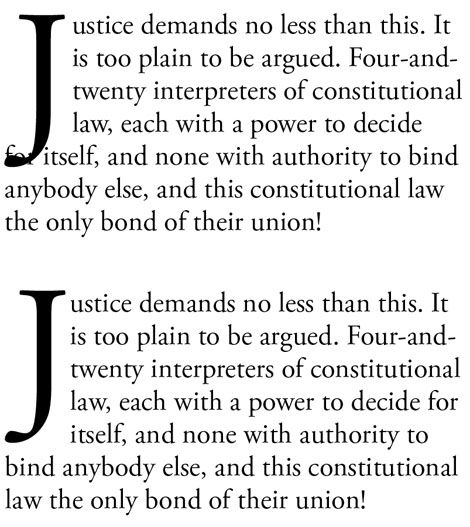
With Scale for Descenders unselected, you may get a drop cap like the one in Figure 3, which is distinctly a problem. The solution is to first select the drop cap, change its leading to Auto, and convert it to outlines. Then look at how many lines deeper your drop cap indent will need to be in order to accommodate the descender, and change your drop cap specs accordingly. This will cause your drop cap to sink lower and out of position, so select it and use the up arrow key to move it into proper top-alignment. Lastly, kern the space between the cap and the first-line text to restore correct spacing between cap and text.

Figure 3: The cure for a descending character, such as the one in the upper sample here, is to convert it to outlines, freezing its size, add another line of depth to the drop cap indent, and then adjust the drop caps vertical position. The lower sample shows the “after” version.
This is all seriously geeky stuff, and in a better world, there would be better ways to accomplish these things. But in the meantime, I guess we should be pleased that we can do them at all.
This article was last modified on June 5, 2024
This article was first published on June 14, 2013


Am I missing sth? To achieve Fig 2 effect in QuarkXPress, simply choose 133% of size for the drop cap.
This is a wonderful article James – definitely saving for future reference! Thanks :-)