

Each installment “Around the World in ePublishing” looks at a different digital publication—sometimes an ebook, sometimes an e-textbook, sometimes a digital magazine or catalog. With each publication we’ll examine the techniques and technologies used, the good and bad choices the designer and publisher made, and sometimes even how to incorporate the same features and effects into your own publications.
This time we’re looking at the Ampersands app.
What Is It
One-off self-promotional iPad app built using Adobe DPS and InDesign.
Cost: Free.
Get it: Here.
Note: Not to be confused with Ampersand, the poetry book or Ampersánd, a real estate app selling condos in the Ampersánd community in Malaysia.
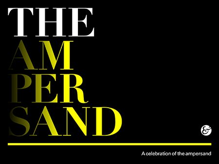
Figure 1: The Ampersand…or Amperands…or Ampersand… Whichever, it’s “A celebration of the ampersand.”
Ampersands is a one-off digital magazine publication intended to promote the UK training firm inddtraining, headed by Chris Gregory, and Nick Booth’s Studiobooth design firm. inddtraining (properly lowercase) provides classroom training in InDesign and Adobe Digital Publishing Suite. The Ampersands app is intended to demonstrate the company’s proficiency with both. Unfortunately, the fact that the publication is riddled with both design and DPS production flaws doesn’t reflect well on inddtraining or Studiobooth and may very well be costing the companies business. I’ll identify those flaws below and then go step-by-step through how to fix them in InDesign and DPS.
Full disclosure: I own Workflow Creative and offer training and consulting in many of the same areas as inddtraining. Although there is naturally a small amount of competitive overlap, Chris’s UK-based company and my US-based company serve different geographic areas. Moreover, I decided to review Ampersands for this feature before I researched its creators. In fact, I decided to review it the moment I found it in the App Store.
The Good
Ampersands first drew my attention because the publication is, as the cover title reveals, “a celebration of the ampersand.” The ampersand is my favorite glyph in Latin-based languages—and I’m not alone in my appreciation of this “and” glyph (see Figure 1). I fail to see how any fan of typography can help but love it. The ampersand is entirely curves—loose curves, tight curves, curves with tails, compound curves—unless you want to put straight strokes in it. There are few other glyphs in the Latin glyph set that can boast the optional use of straight or curved strokes; think you can arbitrarily swap those in a B or M? Designs of the ampersand vary wildly from typeface to typeface. The ampersand is where type designers express their creativity—particularly in the italic versions. If you want to know what a type designer really felt while creating a typeface, look to the ampersand; it’s all there, the mood and attitude of the designer summed up in one glyph.

Figure 1: Historical evolution of the ampersand. [Image courtesy of Wikipedia]
The rich variety of expression is what makes me a fan of the ampersand. That and my desire to contribute to a worthwhile charity, is why I was among the first to purchase Font Aid’s all-ampersand charity font benefiting Doctors Without Borders a couple of years ago. Thus, when I discovered the Ampersands app, I had to have it.
Ampersands is a fun celebration of the glyph that, despite its flaws, still belongs on the iPad of every type aficionado.
This publication is all about appreciating ampersand designs. Counting the fact that it’s about ampersands as the greatest feature of the publication, the second greatest feature must be that care was taken not to detract from its main purpose. Other than a cover, introduction, legal notices, and colophon, the rest of the 53-page publication is a showcase of ampersands from different typefaces.
Within the meat of the publication, which is a single article with screen-by-screen vertical scrolling, are 25 ampersand glyphs from a variety of serif, san-serif, and script typefaces (see Figure 2). Holding the tablet in portrait orientation lets you explore and examine the ampersands in the roman or regular typeface families. Another set of 25 glyphs—the italic or oblique versions from the same families—is accessed in the landscape orientation (see Figure 3).
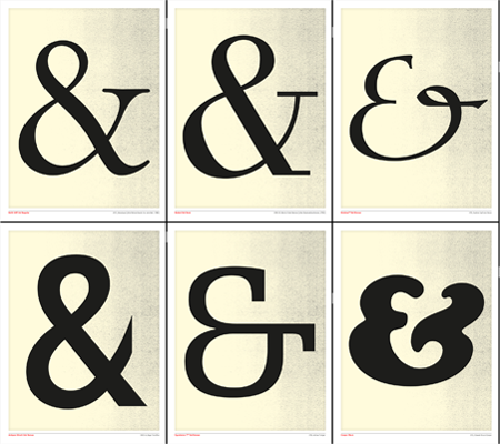
Figure 2: Ampersand samples in roman or regular in portrait orientation.
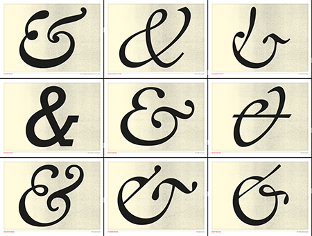
Figure 3: Landscape orientation reveals italic or oblique versions.
Each sample fills the screen but for discreet little slugs identifying the typeface, the designer, and the year the typeface was published (see Figure 4). The designers’ intent was that nothing should get in the way of the viewer’s appreciation of the glyph. Unfortunately, several things do.
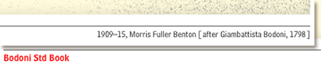
Figure 4: Discreet elements enhance the sample page.
[Quick tip: You can use any of the samples as your iPad wallpaper. Just navigate the one you want and press the Home button and the power button simultaneously to take a screenshot. The screenshot will be saved in your Camera Roll and can easily be chosen from there as your wallpaper in Settings > Brightness & Wallpaper.]
The Bad (and How to Fix the Bad)
Despite inddtraining’s good idea and the many good design decisions Studiobooth made, the app sports many little flaws. A few things were left out, too. Things like the ability to zoom in on the ampersand samples for closer scrutiny. Below I’ll walk you through fixing—or preventing—some of the flaws that mar Ampersands.
What is the Title?
The very first mistake one notices is the inconsistent title. Is this publication actually called “Ampersand App,” “Ampersands,” or “The Ampersand?” All three are in use in different places—even on the same page, as in the screenshot from designer Studiobooth’s own Web page promoting the publication (see Figure 5).
Branding 101: Present your brand name consistently.
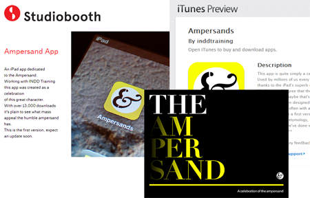
Figure 5: Just what is the title of the publication?
I’m curious how creator Chris Gregory titles it, but we can’t know since Chris’s inddtraining site doesn’t even list it.
Marketing 101: Promote your product.
User Interface Design Matters
While we’re on a roll with the 101 references, let’s mentions some relevant lessons from User Interface Design 101.
User Interface Design 101: Don’t assume your audience knows how to use your UI, especially if your UI doesn’t adhere to established conventions.
Tablets are new to most people, ergo tablet publications are new to most people. It follows then that how to navigate tablet publications is also a new concept to most people.
As you’ve no doubt heard me lecture emphatically on numerous other occasions, tablets and digital publications are like the World Wide Web and Websites in the mid-1990s: The average person doesn’t know how they work or how to navigate them. Back then, Web designers had to write “click here to go to [somewhere]” because merely hyperlinking a word wouldn’t adequately communicate to the average viewer that he or she was expected to click on it. You had to hold your audience’s collective hand as they moved through your site; every step of the way you—and every other “Webmaster”—had to educate them about the user interface experience. The things we take for granted now—text colored differently than surrounding text is a hyperlink, underlines are used to indicate hyperlinks, hyperlinks change to a different color when you’ve already visited their destinations, mousing over a navigation bar button often makes a menu appear—the things we know our Website visitors know now, they didn’t back in ’96, ’97, ’98. We, the designers, had to reach a consensus, to establish universal conventions in user experience design (“UX”), and then educate our visitors about those conventions through descriptive language, icons, and even step-by-step instructions in cases like how to download a file.
Today, audiences of our tablet-based digital publications going through the same education process and it’s up to us, the designers, to establish UX conventions and standards, and then communicate those to our audiences. That’s something Ampersands doesn’t do well.
The publication breaks with convention by placing the majority of the content into a single article with vertical scrolling (see Figure 6). To move between samples you don’t swipe sideways, you swipe upward. While that’s a clever design decision, one I applaud, it’s unconventional. Do you see any icons, text, or other indicators to inform the viewer that he or she must navigate vertically (see Figure 7)? Sure, there’s an 8-pixel-wide scrollbar visible on the right, and an argument could be made that the intended audience, visual artists and designers, would notice it. However I disagree. I don’t think 8-pixels is enough to count on.
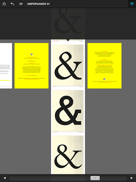
Figure 6: Viewing the scrubber reveals the clever design.
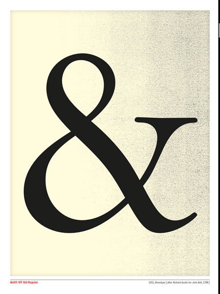
Figure 7: Looking at this would you know to swipe vertically?
On the Introduction page is a tiny blurb about how to navigate the publication (see Figure 8). This is also too subtle. The vast majority of people who download apps like this will, the first time, blow right past the introduction to look inside the publication. At that point most people are evaluating whether the app is worth their time; if they don’t see content worthy of their attention—in this case, multiple ampersand sample pages—they won’t bother investing the time in reading the introduction either. So, when such people arrive at the first—and only—page with a type sample on it, Ampersands is relying on a scrollbar only 8-pixels wide (on Retina devices, 4-pixels wide on non-Retina) to inform the reader that there are 24 other ampersand samples waiting just below.

Figure 8: Here is how to use this app.
Nowhere within the sample article does it suggest that another 25 samples can be accessed by rotating the tablet. Many people lock the iPad’s rotation to prevent accidental and annoying automatic screen rotations if the hand-held or table-resting device’s angle changes by just a few degrees. Moreover, many digital publications don’t use dual-orientation layouts, while those that do tell readers that different content is available by rotating the device. Those publications are therefore setting a precedent—defining the audience’s education, expectation, and behavior—to not rotate the device unless symbols or text tell them they should.
In short, Ampersands makes assumptions about the audience it has no right to make. The publication could easily have incorporated discreet directions into the design. The below is just one way, something I whipped up in only a few minutes and then added to the document’s master pages (see Figure 9).
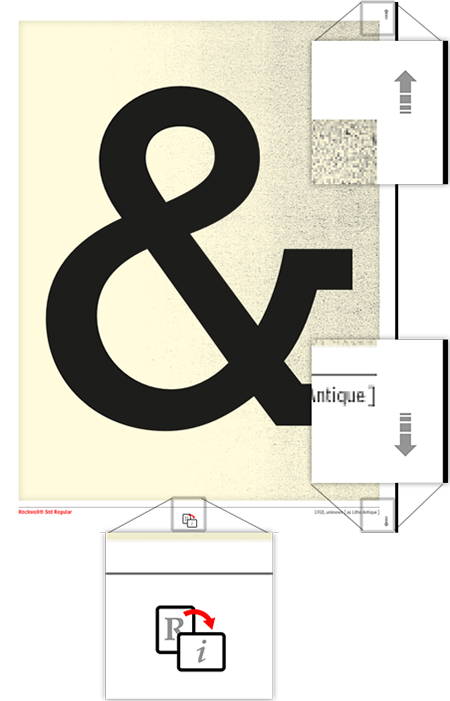
Figure 9: Here’s one solution (of many) to communicate vertical navigation and the fact that rotating the device shows the italic version of the ampersand.
No Zoom, No Retina
Right up front I need to note that Ampersands was published in May 2011, using Adobe InDesign CS5. That was a year before the iPad (3rd Generation) arrived with its high-resolution Retina display. Unless the creators had a magic ball or a better inside source than did WikiLeaks.com, there was no way that the PNG and JPEG images comprising the glyph samples in Ampersands should have been created Retina-ready. The publication would have been Retina-ready if it had also allowed readers to zoom in on the samples.
This may just be my opinion—and it won’t be last, see “Other Gripes” below—but shouldn’t a digital publication devoted to appreciation of typography allow readers to zoom in and scrutinize the shapes closely? More than once I found myself wishing I could more closely examine the convergence of curves in an ampersand sample. Ampersands, however, doesn’t allow pinch to zoom. If it did, then the shapes that looked spectacular on iPad 1 and 2 also wouldn’t now be pixelated on iPad 3 and 4 and iPad Mini.
The trick to both is choosing the best article format.
All the non-interactive elements of an article in a DPS folio are considered background elements. When you tell InDesign and the DPS tools to render those non-interactive elements as JPEG or PNG, all static images and text get rasterized into a single image at the resolution chosen when the folio was created. If you opt for a PDF-based page, then vector objects stay vector, meaning they render to the highest resolution of the output device—whether that’s a 1024×768 iPad 1 & 2 and iPad Mini or 2048×1536 iPad 3 & 4. PDF-format articles also allow users to pinch to zoom on images. In the case of Ampersands, the ampersand glyphs themselves would have rendered sharply on all screens, allowing typography fans to get a closer look.
Choosing PDF format for articles can be done either when you create the folio, which causes the default format of all articles in the folio to be PDF (see Figure 10, left), or during individual article creation, overriding the default format chosen for the folio (see Figure 10, right).
Figure 10: Choosing PDF format while creating the folio (left) and while creating the article (right).
Other Gripes
I don’t want to say the following are minor gripes, but I dinged the designers pretty heavily for some of their other decisions. I hate to compound that, so let’s say these are not-as-serious design flaws.
On the acknowledgements and colophon pages both agencies involved in the creation of Ampersands include their companies’ Website URLs. They also list a couple of email addresses (see Figure 11). That’s all good, of course, as is the fact that those URLs are live hyperlinks. What’s not so good is that you can’t tell they’re live hyperlinks. There is no differentiation between hyperlinked text and non-hyperlinked. Most of the links are set in the same style as body copy. One—the last line of the page—looks like a hyperlink, but so does the non-hyperlinked part of the line. “Please contact us at” is static text while only “Am***********@**.com” is the actual hyperlink. Without differentiation between static and hyperlink text, readers aren’t informed that they can tap on an email address or Website URL to start an email to the creators or visit their Websites. That is unequivocally detrimental to both inddtraining and Studiobooth. The average reader will not even try to tap on what looks like static body copy, but he or she is also rather unlikely to switch over to a Web browser and manually type in one of those addresses, too. Therefore the creators are definitely losing connections they would have otherwise made, and in can be inferred within a reasonable probability that at least some of the lost connections could have resulted in business earned.
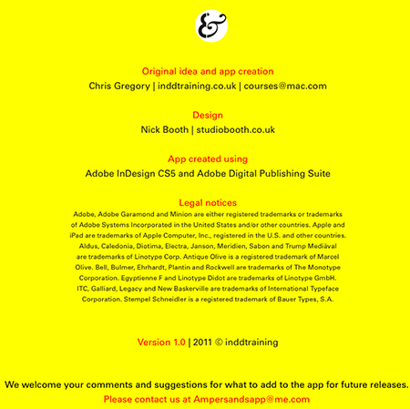
Figure 11: URLs and email addresses on the colophon page are hyperlinked but you’d never know it.
I don’t mean to bludgeon the app but two first-year rules speak directly to this significant design flaw: User Interface Design 101: Don’t assume your audience knows how to use your UI, especially if your UI doesn’t adhere to established conventions; and: Marketing 101: Make it easy for customers to buy from you.
Speaking of the email addresses, I don’t care for the creators’ use of @mac.com and @me.com addresses—in the publication and on their sites. It might just be me, but I consider it unprofessional to use as your professional address an email address from a free provider—especially when you own a domain name as do both inddtraining (inddtraining.co.uk) and Studiobooth (studiobooth.co.uk). @mac.com and @me.com addresses are barely a step above @hotmail.com and @aol.com email addresses. If you don’t own a domain and are a freelancer, I can see the need to use a free email address—they’re all better than @comcast.net or @verizon.net—but in this case, both entities have domain names and thus full use of any and all email addresses at those domains.
Finally, my last gripe with the technical (not subjective) aspects of the design of Ampersands is evident on the Introduction page (see Figure 12). One would think that a professional design studio (Studiobooth) and an InDesign training company (inddtraining) would know how to use paragraph vertical spacing in InDesign instead of double-returns. Moreover, you would think both would recognize when they missed separating the paragraphs.
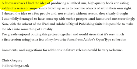
Figure 12: Using double-carriage returns as paragraph spacing and forgetting even that between the first two paragraphs.
Ampersands was first published in May of 2011. By the time you read this, all of these mistakes have been sitting in the App Store and on approximately 13,000 iPads, for nearly two years. I’m sure what they did right is bringing both creators business, but it’s impossible that what they did wrong isn’t costing them business, too. Neither inddtraining nor Studiobooth has fixed the mistakes in nearly two years.
Do get a copy of Ampersands if you appreciate typography—just don’t use it as an example of good digital publication design.
Let Me Feature Your ePublication
Do you produce electronic publications? If so, I’d really like to see them for possible profiling in “Around the World in ePublishing with Pariah Burke.” I’m interested in any type of modern electronic publication built as EPUB, KF8, MOBI, PDF, digital replica, or interactive tablet publication. Please send one or more examples of your publication—or URLs thereto—to *******@*******ah.com?subject=ePublishing%20World%20Example%20Submission”>ep*******@*******ah.com.
This article was last modified on December 13, 2022
This article was first published on December 26, 2012
Commenting is easier and faster when you're logged in!

Recommended for you

Holiday Text FX, part 1: Candy Cane Text
Make your documents more festive this holiday season with some fun text effects...

Jupitermedia's JupiterImages Division Announces Acquisition of BananaStock
Jupitermedia Corporation (Nasdaq: JUPM) today announced that its wholly-owned su...
CreativePro Magazine Issue 21 Now Available
CreativePro Magazine Issue 21 has articles on Generative AI, Adobe Firefly, hard...