
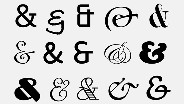
One of the most beautiful symbols in our Latin-based written language is the ampersand. It can be sexy and curvy with sensuous thicks and thins or a solid and strong, single-thickness glyph. The ampersand allows for more creativity and interpretation in its design than most other glyphs, which have more rigid guidelines. For this reason, it is frequently a highlighted element in a logo or word mark.
The ampersand glyph is a representation of the word and. It is actually a ligature that combines the e and the t from the Latin word et, which means “and.” The word ampersand is an alteration of the phrase “et per se and” (that is: “et by itself [means] and”). This then became “and per-se and,” which eventually evolved into ampersand. Once the ampersand glyph was accepted as a single character, it evolved into a more flowing design.
The invention of the ampersand is usually credited to Marcus Tullius Tiro, who was the faithful slave and secretary to the Roman lawyer and politician Cicero. Tiro invented a shorthand writing system in 63 B.C. called Tironian Notes, which included the ampersand.

The evolution of the ampersand
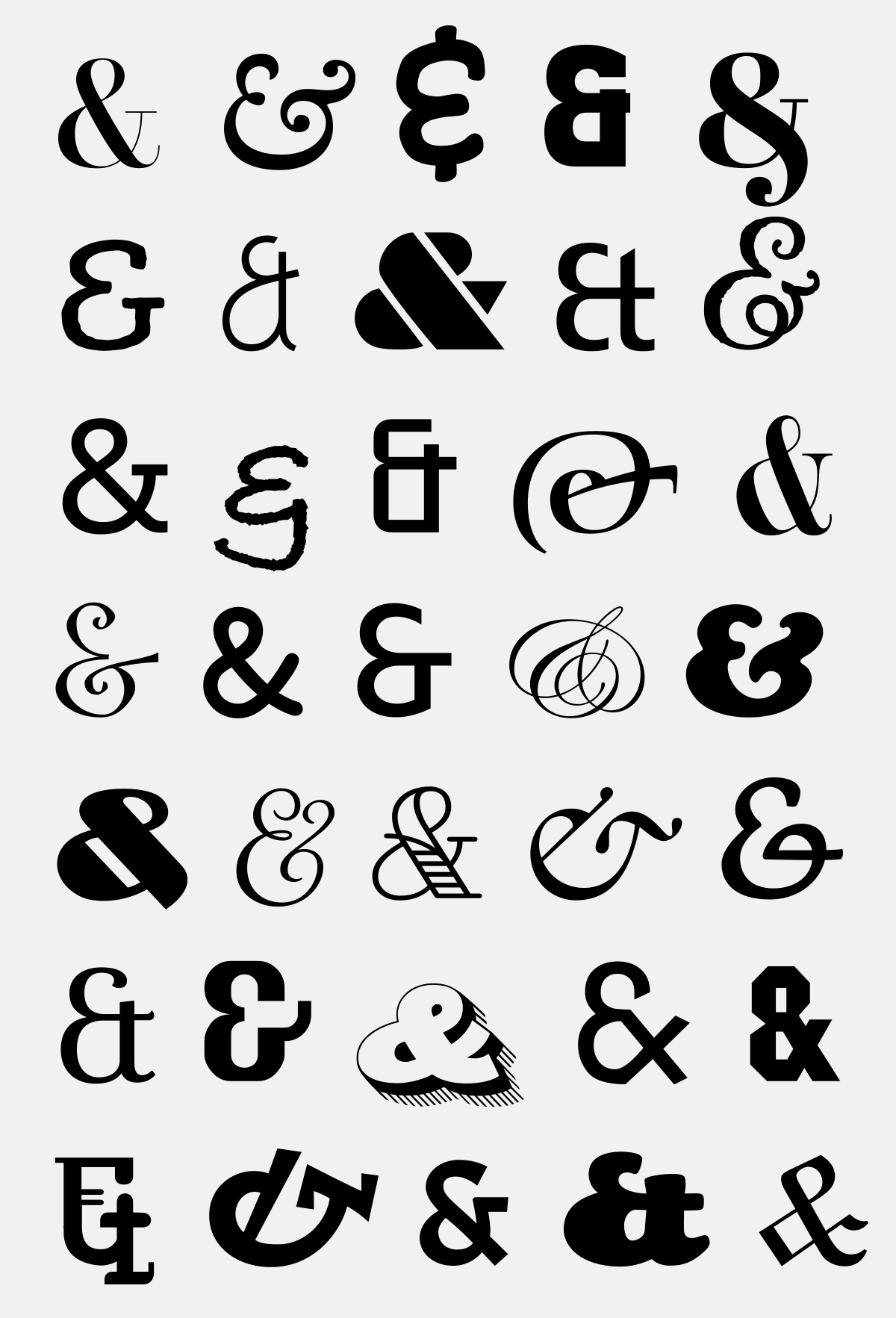
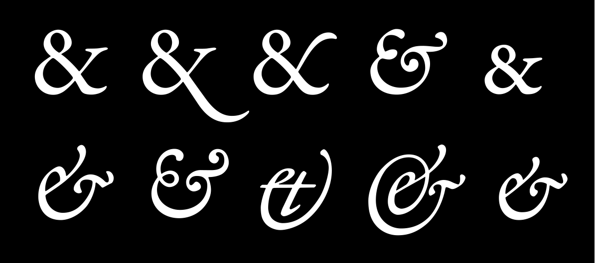
There are two basic forms of the ampersand, with many variations of both: the traditional, classic, double counter version (&) and the style that looks more like an E or an et, sometimes with the addition of curves and flourishes. It is common for an upright, roman typeface version to have the first style, with its companion italics switching to the second, more calligraphic version. Most fonts have just one ampersand, but with the expanded character set of the OpenType font format, some contain two or more versions. Occasionally they include a small cap ampersand that is designed to match the lower case’s shorter height.
Adobe Garamond Premier Pro has five different ampersand glyphs for both the roman (upper) and the italic version (lower).
Ampersand Usage
Although the ampersand is a representation of the word and, it should not be used willy-nilly to replace the spelled out form when setting type, especially in running text. Save it for more prominent instances, such as: headlines, subheads, and other display settings; titles; company, business and retail names (John Wiley & Sons, Inc.); branding and logos; and connecting two related words in a list (blues, jazz, and rock & roll).

Never substitute the ampersand for the word and in running text.

When using an ampersand with small caps, check to see if the font has a small cap version, which will match the height of the small caps instead of the caps.

Don’t change the ampersand glyph in a company name or logo to the written out version.
As mentioned earlier, many company names and logos contain an ampersand. When they appear, they can be designed to be unobtrusive and match the rest of a work mark or logo, or they can be highlighted in some way to stand out for a more customized appearance. Ampersands can also be used oversized or separated from the text as a decorative or illustrative graphic element. Herb Lubalin, the iconic designer who was known for this technique, often played with ampersands in headlines and logos.
![]()

The owner of this ice cream shop must be a typophile!

The new logo for this magazine now includes an ampersand.

Herb Lubalin created this excerpt from U&lc magazine around the ampersand. Illustration by Marvin Matterson

This logo for a never published magazine is purported to have been one of Lubalin’s favorite designs.
When you want to add a bit of creativity to a design or setting with an ampersand, be sure to check out the available versions in any font you are considering. Time spent on this important font exploration might well lead to an eye-catching, recognizable, and even iconic design.
Can you find the ampersands in these logos?


![]()
This article was last modified on February 2, 2022
This article was first published on March 28, 2018
Commenting is easier and faster when you're logged in!

Recommended for you

Get to Know InDesign's Glyphs Panel
Many people who use InDesign can’t precisely define the word “glyph.” Whil...

Review: Monotype Library Subscription
Love them or hate them, subscriptions and cloud-based services are here to stay....

Identifying Fonts
New artificial intelligence software (and some good old-fashioned human knowledg...