
Advanced PowerPoint Infographics
Go beyond SmartArt and pretty pictures in your presentation designs


This article appears in Issue 22 of CreativePro Magazine.
“I need this graphic created in PowerPoint so we can edit it later.” I used to cringe when my clients would request that I use PowerPoint to create graphics, because—as I would assert—it is not a graphics package. PowerPoint is presentation software. Graphic designers like me use software like Illustrator and Photoshop to create professional infographics. However, I’ve found that many clients don’t want to invest in graphics software for their team. They don’t want to learn these tools when they need to make only small changes to graphics. And it doesn’t make sense for my clients to keep me available 24/7 for small (but inevitable) graphics updates. Because PowerPoint comes packaged with Word, Excel, and other Microsoft apps on corporate computers, my clients had immediate access to and a basic understanding of the software. So, even if I didn’t like it, I had to admit their request made a lot of sense. Consequently, it made sense for me to learn how to design graphics in PowerPoint, because my clients were paying me to design their graphics for their needs. Digging my heels in the Adobe dirt and refusing to budge my designer beliefs wouldn’t help anyone, especially them. Plus, I could lose their business. So I took on the challenge to meet my clients where they were by delivering their graphics in PowerPoint. This shift more than tested my design skills. Using PowerPoint to create graphics evolved my entire design process. When I began, I would open PowerPoint and start designing—without a concrete plan. That technique resulted in many iterations and a lot of frustration for my clients and me. I often found myself in an I’ll-know-it-when-I-see-it situation. This was not ideal; redesigning graphics multiple times costs money and time for my clients, pushing their
budgets and deadlines. At first, I blamed PowerPoint. It wasn’t an actual graphics package, so that’s why I was always running through so many iterations. But I soon realized that PowerPoint wasn’t the main problem. My design process was the problem! That aha moment led me to overhaul my entire approach to creating graphics to get graphics right the first time. I divided the process into three phases:
- Discover
- Conceptualize
- Render
In the first two phases, I don’t use any graphic software. I start my design process by researching the message and then sketching graphic ideas—either on paper or on a tablet. Rendering the graphic doesn’t happen until Phase 3. I was surprised to find that PowerPoint contains many tools that are similar to those found in programs like Illustrator. My final infographics, rendered directly in PowerPoint, were professional, compelling, and comparable to those I’d created using Adobe’s tools. When you follow my step-by-step design process, you will learn to easily turn words, ideas, and data into professional PowerPoint infographics that improve understanding, recollection, and adoption. Note: All infographics in this article were created within PowerPoint using built-in features and two add-ins, my own Build-a-Graphic and BrightSlide, by BrightCarbon.)
Phase 1: Discover
In the Discover phase, I delineate five things before I create the graphic: requirements, objective, audience, message, and the answers to the learner’s (target audience’s) questions.
Requirements
The first step is to determine what the client will need in the final graphics and why. Some key aspects of a project include:
- Preferred font and font size
- Dimensions
- If it will be animated
- Style (modern, flat, skeuomorphic, retro, etc.)
- Colors
- Client brand standards
- Whether it will be printed, projected, screen shared, or all three
I make better graphic choices and provide better guidance to my clients when I know these requirements up front. On one project, a client asked me to make an infographic that explains the features of a new microchip facility. Due to the complexity and volume of content, I recommended that we animate the infographic to reveal each level while we explained it in the presentation. Knowing that this graphic would be presented in front of an audience let me suggest this animated alternative. The resulting infographic did not overwhelm the audience and was a success.
Objective
I next discover the objective: what is supposed to happen after the target audience has reviewed the content in the infographic. For example, you may want your boss to quickly see that your department is on budget by showing them a line graphic of your current spending. Or you may want your client to buy into your solution by showing them a process diagram that demonstrates how it meets their needs. Who decides the objective varies from project to project. Sometimes it’s my client, sometimes it’s me, and other times it is a collaborative effort. Here’s an example from my own book, A Trainer’s Guide to PowerPoint: Best Practices for Master Presenters. My objective: I wanted readers to have an overview of what they would learn so they could manage their expectations. I designed a simple yet effective infographic to meet this objective (Figure 1). Agreeing to an established objective before you design the graphic helps avoid the inefficient I’ll-know-it-when-I-see-it approach to design. It also helps you measure a graphic’s success against this agreed upon goal.
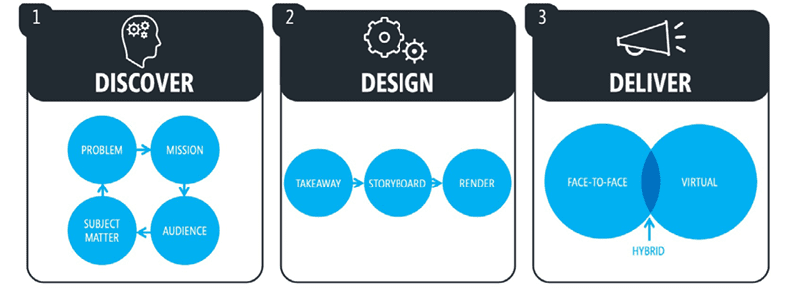
Figure 1. The overview infographic for my book A Trainer’s Guide to PowerPoint: Best Practices for Master Presenters
Audience
Who is my target audience? What is their proficiency level with my content? The more I know, the better my choices. We are not making the graphic for us; we are making it for them. You might find these very different types of people in your audience—and they respond very differently to information: Strategic thinkers want the big picture first. They are focused on holistic, overarching goals and objectives. They need to know why your content matters to them as soon as possible, or else they will tune out. Tactical thinkers are geeks. They want the details. They do the work and need to know if this information will help them in real-world situations. The unengaged, or ambivalent learners, do the bare minimum to absorb your content. They don’t want to do more than they must. Your presentation might be a work requirement for them, or they otherwise don’t feel as if they need to learn it. I’ve found almost every learner fits into one (or more) of these three archetypes. The degree to which you know the composition of your audience will make or break the effectiveness of your presentation.
Message
Your message can be your infographic’s title, headline, takeaway, action caption, or bumper sticker. At its core, a message concisely summarizes your graphic and should include two parts: You need a motivator to give your learner a reason to care. If your audience isn’t engaged, then your infographic will fail in its objective. The means explains how your learner will get what the motivator promises. Either can be implied based on context, but I recommend being explicit. Figure 2 shows an effective message with a motivator and a means.
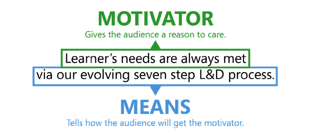
Figure 2. All messages should have a motivator and means.
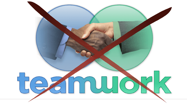
Figure 3. This graphic fails to communicate the intended message: “Increase market saturation by combining iSystem’s software and eMark’s marketing tools.”
Answers
An infographic is a conversation between the author(s) and the learner(s) in your audience. When you create a message with a motivator and means, a learner will naturally want two questions answered: The what: What is the means? The how: How will it get me the motivator(s)? Our job is to answer those questions quickly and efficiently. Let’s return to Figure 2, where our message states, “Learner’s needs are always met via our evolving seven-step L&D process.” Our graphic will need to communicate to learners what our seven-step process is and how it ensures their needs are always met. We can further use these details on the path to determining the best type of graphic to communicate our points.
Phase 2: Conceptualize
Once you’ve completed the Discovery phase, you’re ready to conceptualize. The goal here is to make your content easier to understand at a glance. In this phase, you will visualize how to illustrate your infographic and determine the graphic type that best communicates your message: organization chart, process diagram, pyramid graphic, bar chart, road graphic, or something completely different. Infographics streamline communication. They showcase our core messaging by visually answering the what and the how for our audience. Infographics contain a limited amount of text and instead rely on graphic elements to help convey the key ideas. Therefore, the first step in this phase is to chunk your text and remove unnecessary content that could be spoken, shared in the narrative, or delivered in another form. Figure 4 shows a first draft of an L&D Process slide that answers the what and the how of the motivator in the previous figure. This text-only numbered list would likely overwhelm a graphic (and the audience), so I chunked and distilled the text into the important keywords or key phrases of the L&D process until it looked like Figure 5. Now, the text reads from left to right, telling a linear story in sequence.
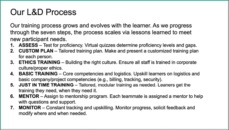
Figure 4. Answer the what and how questions at a high level as you develop your presentation.
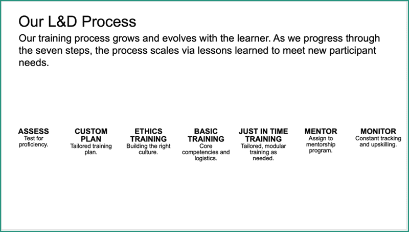
Figure 5. This slide chunks and edits the text from Figure 4.

Figure 6. This slide chunks and assembles the text from Figure 4 to better tell the story.
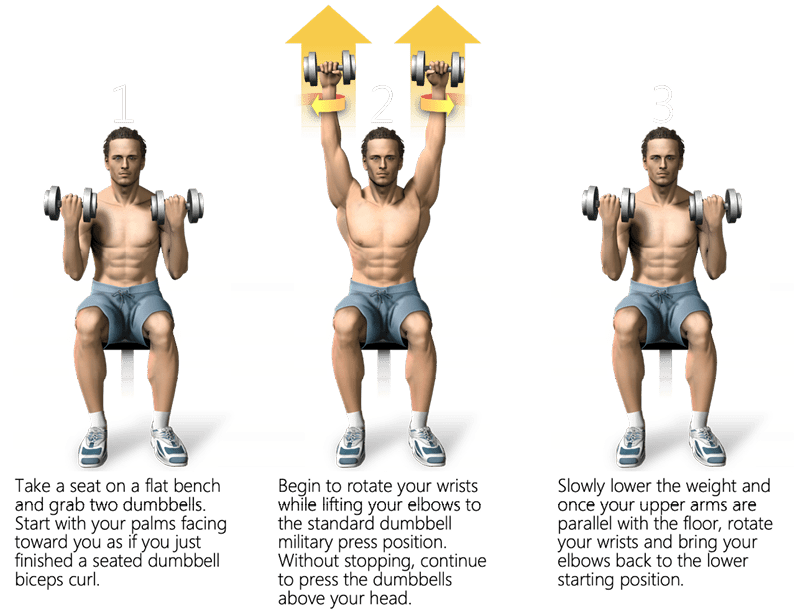
Figure 7. Using the Literal Method, this infographic (literally) shows the reader how to do an exercise.
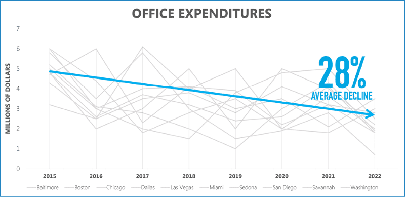
Figure 8. Using the Quantitative Method, this infographic shares amount, value, and time.
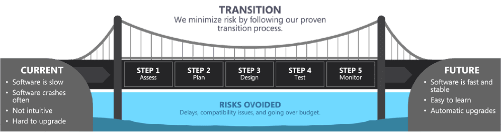
Figure 9. Using the Substitution Method, this infographic uses a metaphor to communicate a concept. It uses a bridge to help the learner understand the process of transitioning from a company’s current software to the new software.
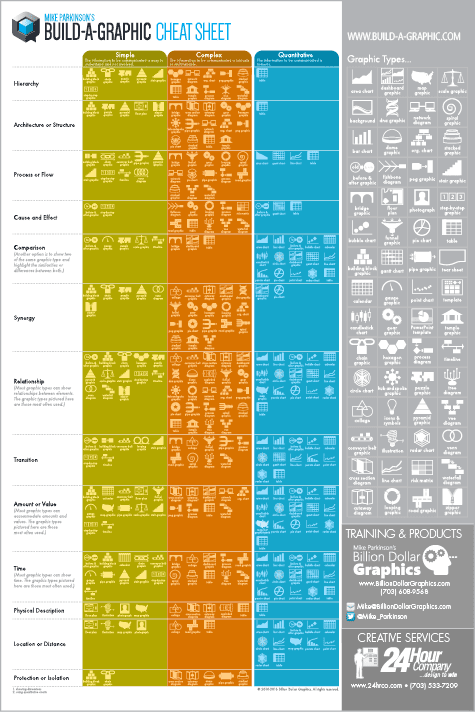
Figure 10. Use my Build-a-Graphic Cheat Sheet to discover the best graphic type for your infographic.
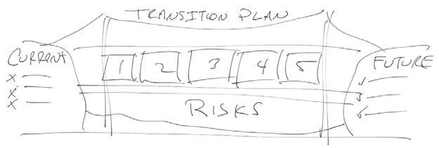
Figure 11. I first developed a rough concept sketch of the bridge metaphor graphic shown in Figure 9.
Phase 3: Render
Once your message and concept are approved, it’s time to render your graphic. For this article, I am using PowerPoint. Note: The principles I am sharing work for all graphics software. First, you and your client will want to agree to a style—colors, fonts, and the other qualities that create a look and feel. Most likely, you will use your organization’s brand standards. If you don’t have or are not constrained by brand standards, Figure 12 offers a quick reference guide to choosing a style for your target audience.
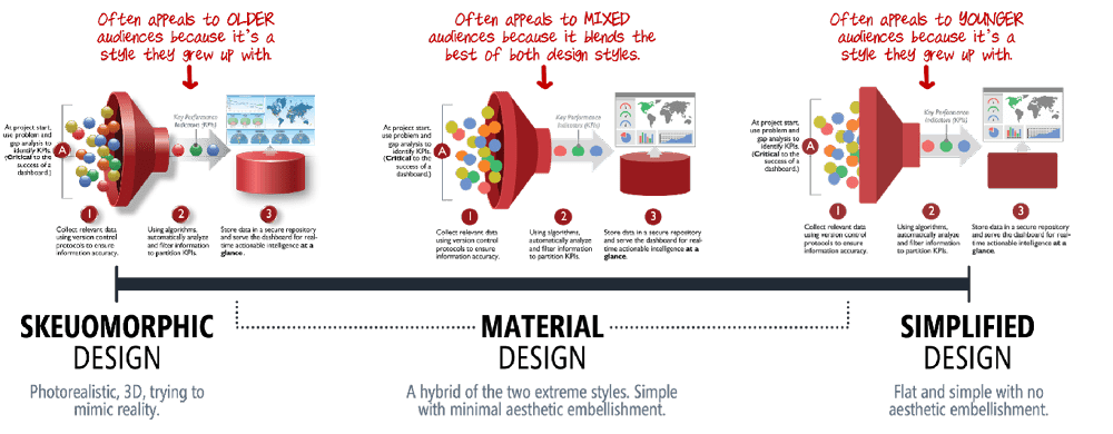
Figure 12. This scale shows different design styles and their associated demographics for infographic design.
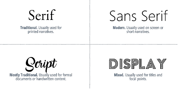
Figure 13. Here are four font categories to choose from based on use cases.
Build it
Even though PowerPoint is optimized to make and deliver presentations, you can use it to render most designs. Its built-in features include a library of photos and other raster images, icons, cutout people, stickers (embellishments), videos, illustrations, and cartoon people (Figure 14).

Figure 14. PowerPoint offers built-in graphic elements to help you make professional infographics.

Figure 15. Step-by-step instructions to build a funnel graphic in PowerPoint
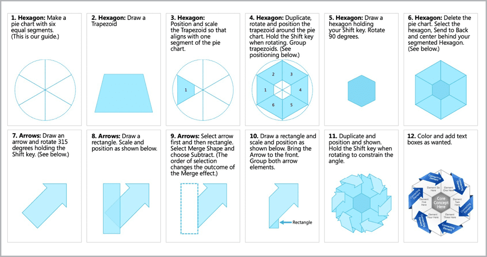
Figure 16. Step-by-step instructions to build a hexagonal infographic in PowerPoint
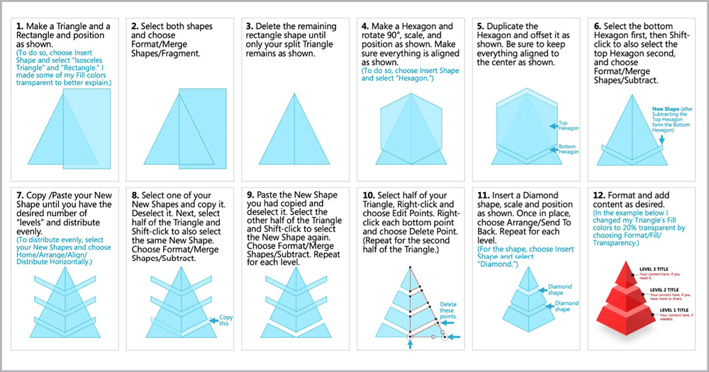
Figure 17. Step-by-step instructions to build a pyramid infographic in PowerPoint
Buy it
If you don’t have the time, desire, or proficiency to build your infographics, there are tools that do the heavy lifting for you. The Noun Project and my Build-a-Graphic are both add-ins that work within PowerPoint. The Noun Project (Figure 18; $2.99 per icon or $40/year per user for unlimited access) is a massive library of icons and symbols, and now photos, too. If your workflow is icon-heavy and you want a greater selection than PowerPoint offers, there is no better resource. Because The Noun Project is a collection of different artists’ work, the styles vary. Be sure to keep your icon styles consistent. Choose icons that are filled or unfilled, or ones with similar line weights to keep quality high.
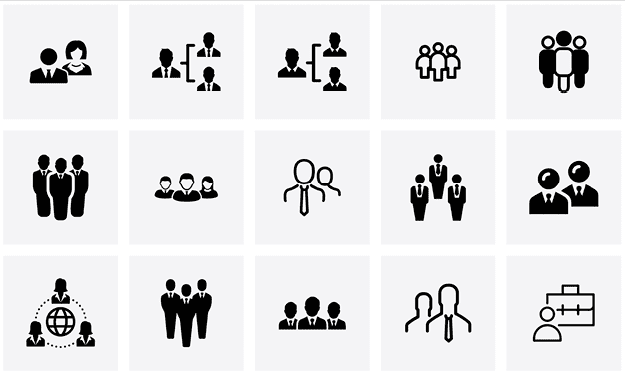
Figure 18. The Noun Project evolved from a Kickstarter idea into a global repository of royalty-free icons, symbols, and photography.
Figure 19. Build-a-Graphic, a PowerPoint add-in, helps turn words and ideas into professional infographics.

Figure 20. BrightSlide increases your productivity by adding new functionality to PowerPoint.
Putting It All Together
Aesthetics matter a lot, but pretty pictures without substance won’t get the job done. Attractive infographics with no objective, message, or story will fail. That is why my phased approach to designing advanced infographics gives you the foundation—through discovery and conceptualization—to create graphics tailored to your audience. By using visuals that present clear, compelling content in a professional, engaging way—and do so at a glance— you will achieve not only your goals but the goals of your learners and your organization. It’s a win/win for everyone.
Commenting is easier and faster when you're logged in!

Recommended for you
How to Create Focus with Animation in PowerPoint
Learn how to create focus on a topic or bullet point by creating simple fade-in...

LinkrUI Now Offers DAM Syncing for Microsoft Word, Microsoft Powerpoint and Microsoft Excel
LinkrUI with Microsoft Office Compatibility Now Available via Resellers and Reta...

Create an Animated Zoom Effect in PowerPoint
Learn a simple technique to zoom in and highlight the most important content on...