
![]()
A few years back, Apple Computer touted its hardware and software with the marketing slogan "Think Different." After using the company’s latest, greatest and largest Apple Cinema Display (ACD) for the past few weeks, I’ve come to wonder if maybe that ad campaign has morphed into "Think Big."
That’s really all you can think when you see the 30-in. monitor in person. It’s big. Huge. Overwhelmingly so. Think sitting in the front row at the local cinema, and you have an idea what it feels like to plop down for the first time in front of this LCD display, which offers a whopping 2,560-by-1,600-pixel resolution.
And then, after you use it for a while, it doesn’t seem quite so gargantuan.
First, a little background: Apple officially unveiled the TV-size display (I’ll call it the ACD 30) last June, with delivery promised later in the summer at a price of $3,299. But as is often the case with new Apple products, shipping times stretched into the fall. That’s in part due to the fact that this display requires a special 256MB video card to operate. Those $599 GeForce 6800 Ultra DDL cards offered by Nvidia Corp. were delayed into the fall as well — and a quick check at the Apple Store online still shows a three- to five-week shipping time. A second, scaled-down version of the card, the Nvidia GeForce 6800 GT DDL, has been offered since last fall, and it’s available now for $499.
So it has only been in the past month or two that the 30-in. display has become somewhat available.
Since its debut at last year’s Worldwide Developers Conference, two important things have happened regarding the ACD 30: Apple dropped the price by $300, making it $2,999 (with the 23- and 20-in. displays now going for $1,799 and $999, respectively). And ATI Technologies Inc. announced that later this year it will release the ATI X800 XT, a video card that drives the ACD 30 — and costs the same as the lesser Nvidia card.
Like all of Apple’s LCDs, the ACD 30 uses a standard Digital Video Interface (DVI) connector to hook up to a Power Mac G5 (which is required). It also uses up a FireWire port and a Universal Serial Bus port on the G5, although it offers two of each on the back of the display for peripherals. But first, you’ll need to get one of those Nvidia cards and install it inside the G5. This is a five-minute do-it-yourself job, since all you have to do is loosen two screws and slide out whatever card is already there. Slide in the Nvidia card, which is so big it actually takes up two Peripheral Component Interconnect slots, close up the computer, plug in the ACD 30, and behold.
How much bigger is it than Apple’s onetime LCD king, the 23-in. model? According to Apple, the new king of the display hill offers 77 percent more screen real estate, with 4 million pixels. It also offers a 170-degree viewing angle from side to side and top to bottom, meaning the image can be viewed from the side just as easily as head-on.
So just who is this larger-than-life LCD display designed for? I had a chance to ask Scott Brodrick, product line manager for displays at Apple, just that question. His response: It’s aimed at professional users who need massive screen space for desktop publishing, video and audio work, and of course, graphics.
If you use programs such as Adobe Photoshop, InDesign, Final Cut Pro or Logic Pro (for audio mixing) — basically anything that has a lot of palettes — this one’s for you. In fact, when I viewed Computerworld’s content management application on the screen, I was able to see virtually every text field and drop-down menu I needed without having to scroll up and down.
"This 30-in. screen is like having the entire Adobe Creative Suite on-screen at one time," Brodrick said. "It’s just more productive to have more real estate to do your work. The more real estate you have, the better."
Equally important is brightness, sharpness and color accuracy. "Our goal is to provide a display which delivers a bright [image] and is very sharp and very crisp and has a color gamut that has the best color viewing that you can provide in a computer," Brodrick said.
That it does. Color saturation to my untrained eye was uniform across the screen, from side to side and top to bottom. Text was razor-sharp, and the brightness was more than abundant. I had to turn it down a notch or two — even more in the evening when the lights were low.
Brodrick noted that the display has been certified by SWOP Inc. (SWOP stands for Specifications Offset Web Publications.) "We’re the first monitor to receive a SWOP certification, which says that the image you’re seeing on-screen is a soft proof of what you’ll print out with a Web offset printer," he said. "This has been a goal of the display industry for a long time."
The display, like its smaller brethren, offers a pixel response time of 16 milliseconds, which Brodrick said eliminates the ghosting and smearing appearance that can show up in video playback and on-screen motion. "Each of our displays supports that, and [pixel response time] has improved steadily. Our video customers are happy with this technology."
In fact, the display makes for an incredibly good, albeit rather expensive, DVD playback monitor. And given the 30-in. size, you can watch it from across the room.
Brodrick also pointed to the narrow aluminum bezel surrounding the screen, making it easy for high-end users to put two of the monitors side by side. You will, of course, need a workspace with a lot of elbow room. Although the aluminum stand on which the display sits takes up very little space, you’d be looking at a screen combo that’s about five feet wide.
"In the video field, we have Final Cut Pro HD, the ultimate video-editing system that allows you to use not one, but two of these displays [with] the idea of using your second display as your preview monitor," Brodrick said. "Rather than having to use a broadcast HD monitor as your preview device, the color space of these monitors and pure digital perfection of the screen allows you to view all of your HD content on [one] screen and use the second monitor as your preview."
All of Apple’s displays were designed so they can be mounted on a wall or on an extendable arm. And they can be adjusted up and down from 5 degrees below the horizon to 25 degrees above with just a light touch, Brodrick said.
"The design of the stand allows it to [appear as if it’s] suspended in air," he said. "That was something we paid extreme attention to."
Apple also made the base easy to move from left to right. "You would expect you’d want a sticky base, but we made it slide a little bit," Brodrick said. "It gives a little."
In fact, the 30-in. display I’ve used is remarkably easy to adjust. And while you’d think it would be top-heavy, Brodrick said the aluminum arm and base are integrated into the back of the display in a way that keeps it balanced.
Asked whether Apple has any plans to boost the resolution of its various displays, either the Cinema Displays or those incorporated in its PowerBooks and iBooks, Brodrick said no — the company is happy where it is right now. The ideal resolution for text, video and graphics, he said, is about 100 pixels per inch.
"I think we’ve put that issue to rest," he said. "It’s a resolution we feel is the optimal resolution for today’s systems. Our customers aren’t just viewing highly detailed images. They’re balancing their books. They’re editing movies. They’re iChatting. We’re trying to strike the right balance. And to go lower than [100 pixels per inch] is not making the best use of the technology."
Brodrick also said Apple has no plans to add TV tuner capabilities. "When you try to design a display that is being used in multiple ways, such as a desktop monitor as well as a television monitor, you’re compromising both designs for each of those customers. It doesn’t fit in our strategy."
Asked about Apple’s decision to return to DVI connectors rather than its proprietary Apple Display Connector (ADC), which incorporated the video signal and power into one cable, Brodrick called it a practical move. DVI allows the displays to be connected easily to Windows-based PCs, as well as to Apple’s own PowerBooks — although they’re limited to using the smaller 20- and 23-in. displays. In fact, it was PowerBook users that helped push the company to make the change.
"We wanted a display connector that was simple, direct and provided ease of use, and over the … years, the popularity of our PowerBook line has grown," he said. "A lot of those customers are interested in attaching the portable to the displays. It’s very difficult to put an ADC connector on a portable system. To better support the use of our flat-panel products, we went back to the DVI."
He also welcomed the upcoming ATI X800 XT video card. "We partner very close with Nvidia and ATI throughout our line, so we’re of course very happy to have more options for our customers to use to drive our 30-in. monitor."
Indeed, options are a good thing. So if the 20-in. LCD is too small, and the 23-in. model isn’t just right, you’d be well advised to take a look at the 30-in. display. It’s pricey, but if you really need the real estate or want to have the best and the brightest, the ACD 30 is the best option available.
As for me, I’ll soon be returning to my almost-new 20-in. display and sending this ACD 30 back to Apple. Twenty inches never looked so small.
Copyright © 2005 Mac Publishing LLC. All rights reserved. Reproduction in whole or in part in any form or medium without express written permission is prohibited.
A new proof-of-concept from Microsoft that came out of the recent Siggraph Asia conference is being hailed as “autocomplete for drawing.” In fact the slightly cumbersome name for the tech preview is Autocomplete for Hand-Drawn Animations. The tech giant’s research arm—along with the University of Hong Kong and the University of Tokyo—demoed software that actually predicts an animator’s next moves.

The tool works without complicated interface elements to smoothly fill in the next logical step in creating an animation. After creating the initial drawing, it not only predicts what needs to be drawn next, it even makes suggestions for improvement! With a second drawing in place, the “motion” is then filled in by the software in real time. The process still involves the artist drawing the incremental steps, while the software assembles the missing bits.

Autocomplete is also capable of detecting—and repeating—patterns, and will continuously re-color each new drawing along the way. The software’s lack of handles, points, and other engineering-like elements makes it a natural for touch surfaces, as the process takes a very organic approach. These types of apps are exactly what tablets were geared towards and I hope this product sees the light of day soon. Now, could somebody please invent the tech that will get the drawings that live in my brain automatically onto the page?
See it in action here.
Adobe’s creative apps have a long history of including little Easter Eggs to put a nerdy smile on users’ faces. InDesign had its friendly alien, silly stroke styles, and butterfly game; Illustrator had a pair of eyes the followed your cursor, moon phases, shopping days ’til Christmas, and other goodies.
And over the years, Photoshop has included many alternative versions of the About box, including the Big Electric Cat, Strange Cargo, and the legendary Adobe Space Monkey, which you could access by holding various modifier keys while choosing the About Photoshop menu command. In CC 2018, if you hold Command/Ctrl while choosing About Photoshop, you get the White Lion. Very purrrrty.

There are also a couple of fun food-related Easter eggs built into Photoshop CC.
To add a banana to your toolbar: choose Edit > Toolbar (or click the three dots on the toolbar). In the Customize Toolbar dialog box, hold the Shift key and click Done.
![]()
To hide the banana, go back to the Customize Toolbar dialog box, hold the Command (Mac) or Ctrl (Win) key and click Done.
To change the Color Theme icons in Interface preferences to coffee cups or toast, hold Command+Shift+Option (Mac) or Ctrl+Shift+Alt (Win) and click any of the icons. Use the same shortcut to restore the default Color Theme icons.


My only question is, with all these food-related pranks in Photoshop, how come no actual eggs? Too obvious?
Welcome to our Speaker Spotlight series, designed to highlight some of our CreativePro Week 2017 Conference speakers, which will be in Atlanta, Georgia, May 22–26. We’ve assembled a dream team roster of Photoshop, InDesign, and Illustrator gurus, and thought you’d like to get to know what makes them tick, why they’re passionate about what they do, and what you can expect to learn from them at the conference.
The Diane Burns File
Geek Cred: Diane Burns is the animations super star. Want to make your publications stand out, include animations! Don’t know how? Don’t fret—Diane can help!
Hails from: Live Oak, Florida, which is in Suwannee County (as in “Way Down Upon.”) North Florida, the deep, deep South. Over 30 years ago, she traveled west, discovered San Francisco and never looked back.
Hangouts: A chef extraordinaire, you can almost always find Diane somewhere near a kitchen, at cooking class abroad (the pic below is from Bodrum, Turkey) or shopping the great local farmer’s markets for fresh vegetables to use in her cooking. You may also find her hiking, and depending on the week, maybe even in the Eastern Sierra, hiking well above 10,000 feet.
Short bio: Adobe InDesign Trainer and Consultant, Lynda.com Author, Chef Extraordinaire.
 First job: At 14 she had a part-time job selling movie tickets, working the ticket booth in a local movie theatre.
First computer: Apple IIc running CP/M operating system
Pen and paper or keyboard? She likes pen and paper, very much, but uses a keyboard.
Favorite foods: Loves food and trends vegetarian, though there’s nothing wrong with bacon in her book. ;-)
At 6AM I am usually: reading the print version of the New York Times.
Current Projects: Diane runs a localization company called TransPacific Digital and has her hands full with private training and consulting gigs.
Her CreativePro Week 2017 Session: This will Diane’s 8th year speaking at PePcon (part of CreativePro Week) and this year her session is titled: Publish Online: Web Distribution with a Click of a Button. Attendees can expect to see examples of how Publish Online is being used, they will also learn the best ways to use Publish Online and take advantage of InDesign’s powerful interactive features.
An InDesign Tip from Diane:
Add One Color Swatch from Another File
You can add colors from another file to the Swatches panel by choosing Load Swatches on the panel’s flyout menu. But what if you want to add just one color? Choose New Color Swatch. Under the Color Mode menu, choose Other Library, then select the file containing the colors you want to add. The colors from the file will show up as individual swatches that you can add one by one to your current file.
What attendees have to say about Diane’s conference sessions:
“Diane’s object styles class was amazing. I can’t wait to use the knowledge I gained in this session some time soon.” ~PePcon 2015 attendee
Website: dianeburns.com
Social Media: Twitter: @dianeburns_sf Linkedin: Diane Burns
 Register today for the CreativePro Week 2017 Conference! Four conferences back-to-back: The PS/AI: The Conference for Photoshop and Illustrator Users, The InDesign Conference, PePcon: The Print and ePublishing Conference, and the Creative Developers Summit.
Don’t miss out on these great conferences and a great early bird deal: Get $100 off any multi-day registration now through March 31st.
We’ll see you in beautiful Atlanta, May 22–26, 2017.
In the PePcon Speaker Dossier series we’re getting up close and personal with some of the coolest people on the planet: the print, PDF, and digital publishing gurus who’ll be the speakers at the conference! You’ve read their books, seen their videos, and liked their Facebook posts, now you can get to know them a little more personally, and have something to talk about when you meet them in person at PePcon.
“What’s a PePcon?” you ask. PePcon: The Print + ePublishing Conference is a massive 4-day multi-track extravaganza of all things print, PDF, and digital publishing, produced by the same folks that bring you this web site, InDesignSecrets.com. The seventh annual PePcon will be coming to San Diego, June 5–8.
The Diane Burns Dossier
Geek Cred: Diane Burns is the animations super star. Want to make your publications stand out, include animations! Don’t know how? Don’t fret—Diane can help!
Hails from: Live Oak, Florida, which is in Suwannee County (as in “Way Down Upon.”) North Florida, the deep, deep South. Over 30 years ago, she traveled west, discovered San Francisco and never looked back.
Hangouts: A chef extraordinaire, you can almost always find Diane somewhere near a kitchen, at cooking class abroad (the pic below is from Bodrum, Turkey) or shopping the great local farmer’s markets for fresh vegetables to use in her cooking. You may also find her hiking, and depending on the week, maybe even in the Eastern Sierra, hiking well above 10,000 feet.
Short bio: Adobe InDesign Trainer and Consultant, Lynda.com Author, Chef Extraordinaire.
First job: At 14 she had a part-time job selling movie tickets, working the ticket booth in a local movie theatre.
First computer: Apple IIc running CP/M operating system
Pen and paper or keyboard? She likes pen and paper, very much, but uses a keyboard.
Favorite foods: Loves food and trends vegetarian, though there’s nothing wrong with bacon in her book. ;-)
At 6AM I am usually: reading the print version of the New York Times.
Current Projects: Diane runs a localization company called TransPacific Digital and has her hands full with private training and consulting gigs. She is happy to report that she just completed another Lynda course, that is not yet released, but let’s just say it is relevant to her session at PePcon 2016.
Her PePcon 2016 Session: This will Diane’s 7th year speaking at PePcon and this year her session is titled: Publish Online: Web Distribution with a Click of a Button. Attendees can expect to see examples of how Publish Online is being used; learn the pros and cons of the platform; learn how InDesign’s interactive features can be used; and how to publish, share and embed documents.
An InDesign Tip from Diane:
Add One Color Swatch from Another File
You can add colors from another file to the Swatches panel by choosing Load Swatches on the panel’s flyout menu. But what if you want to add just one color? Choose New Color Swatch. Under the Color Mode menu, choose Other Library, then select the file containing the colors you want to add. The colors from the file will show up as individual swatches that you can add one by one to your current file.
What attendees have to say about Diane’s conference sessions:
“Diane’s object styles class was amazing. I can’t wait to use the knowledge I gained in this session some time soon.” ~PePcon 2015 attendee
Website: dianeburns.com
Social Media: Twitter: @dianeburns_sf Linkedin: Diane Burns
 Want more Diane? Register for PePcon: the Print + ePublishing Conference 2016 and join us San Diego. Not only is this the #1 conference for creatives within the publishing industry, it’s also the best place to mingle with the masters and build a community of colleagues from around the world.
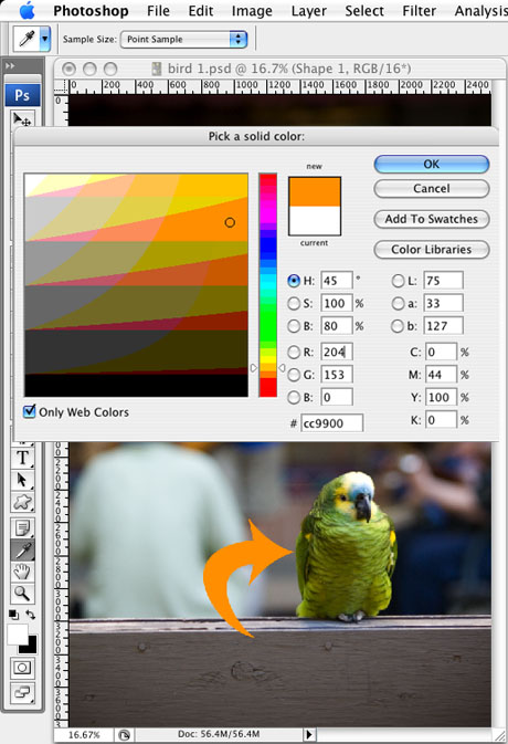
Ever needed to create an arrow to point at something in a photograph? (Like, “Dead body found here,” or “Note the crack in the fuselage”?) You don’t have to jump to a different program to do that. With the image open in Adobe Photoshop, there are at least two ways to create an editable, vector arrow pointing at exactly what you want.
Method 1: Use One of the Built-in Custom Shapes
To begin, choose the Custom Shape tool from the toolbar. Can’t find it? Click on the Rectangle tool at the bottom of the toolbar’s group of vector tools (Pen tool, Type tool, Selection tool). Now the Options bar shows all the vector shape tool variations. The Custom Shape tool is the blobby-looking one at the right. Select it there, or choose it from the Rectangle tool’s fly-out menu down in the toolbar.
Make sure the tool is in Vector Shape mode, one of the three modes available when you’re working with vector tools in Photoshop. That way, dragging the tool across the image creates a vector shape layer (instead of a path or a selection), which is what we want. Vector Shape mode is the first icon at the far left of the Options bar and looks like a square with points on the corners (Figure 1). Click it if it’s not selected already.
Figure 1.

Now that you’ve selected the correct mode and the right tool, you can open the custom shapes library. In the Options bar, look for the label “Shapes:” and click the shape thumbnail to the right to open the library. The arrows aren’t part of the default shape set, so you’ll probably have to use the library’s fly-out menu to choose it. (Hint: the library you want is called “Arrows.” Very obscure.) Add or append the shapes to the ones already in the library; either works.
You’ll see twenty different arrow shapes to choose from. Click on the one that calls you to and then press Return/Enter to close the library. Now just start dragging diagonally on the image and you’ll see the arrow appear, changing its width/height ratio as you drag the mouse. Release the mouse button when it’s roughly how you want it (Figure 2).
Figure 2.

Initially, the arrow is filled with the foreground color, but that’s easily changed by double-clicking the color swatch thumbnail in the shape layer that you just created and choosing another color (Figure 3).
Figure 3.
You can modify the path with the Direct Selection tool, add/remove/modify points with the Pen tool variants, and curve the shape with Edit > Transform > Warp (Figure 4).
Figure 4.

To get the bounding box back (so you can change the width, height and rotation of the entire arrow shape), press Command/Ctrl-T, which is the keyboard shortcut for Edit > Free Transform Path.
Method 2: Use the Line Tool
Here’s another way to skin the cat. You may have noticed that one of the vector shape tool variants is the Line tool. It’s the only tool in Photoshop that allows you to add arrowheads at the start or end of it (or both).
The trick to the Line tool is that you have to set up its weight and arrowhead styles before you drag a line with it. After you create the line, its shape can only be modified with the Direct Selection and path editing tools, or by transforming it, as above. So, it may take some experimenting with different lines and settings to get what you want. (You can save the perfect settings, though, as a Line tool preset. That way you can have the same type of arrows in other Photoshop files.)
You’ll find the Line tool in the shape tool’s fly-out menu (press and hold on whichever shape tool is currently active — the default is the Rectangle — to reveal the fly-out) or as one of the shapes in the Options bar when any Pen or Shape tool is active.
Select the Line tool and change its weight (thickness) in the Weight field in the Options bar from the default value of 1 pixel. Then, click on the downward-pointing triangle to the right of the array of shape tools in the Options bar. Doing so reveals the options for the particular shape tool that’s selected. When the Line tool is selected, the options are all about arrowheads (Figure 5).
Figure 5.

Here’s your cheat sheet for the Arrowhead Options:
Start: Do you want an arrowhead to appear at the start point of the line you’re about to drag out? If so, turn on this checkbox.
End: Do you also or alternatively want an arrowhead at the end of the line, when you release your mouse button? If so, turn it on.
Width: What percentage of the line weight should the width of the arrowhead be? The default is 500% (five times the line weight), your typical arrowhead. As you transform the finished arrow, the arrowhead will grow/shrink proportionally.
Length: The default measure of 1000% means that the length of the arrowhead (from its pointy business end to its base) should be ten times the line weight. In other words, accepting the default 500% width and 1000% length means you’ll get a somewhat narrow, pointy arrowhead — its length will be twice its width. If you want an equilateral triangle for an arrowhead, enter the same percentage for Length as you did for Width.
Concavity: Because this is set to 0% by default, the base of an arrowhead — the side that touches the line’s end — is perfectly straight. To make the bottom end curve inwards, towards the tip of the arrow, enter a larger percentage. You can go up to 50%, which I think stands for 50% of the arrowhead’s length. Interestingly, you can also go down as far as negative 50% (enter -50), which makes the bottom end curve outward, into the line.
Now that you’ve entered your settings, press Return/Enter to close the Arrowhead Options window and get-to-draggin’ (Figure 6).
Figure 6.

All your arrows will be straight when you first create them because that’s what the Line tool does, but you can curve them with Edit > Transform > Warp. For more control you can add curve points to the shape with the Add Anchor Point tool (one of the Pen tool variants). It’s kind of tricky, though, since the “Line” tool actually creates very thin rectangles, not lines (!) so you’ll have to add matching curve points on either side.
To change the overall width, height, and rotation of the arrow itself, use the same Free Transform method as above.
Fancy It Up
With both of these methods, you’re working with shape layers, and you can apply Layer Effects to shape layers (Figure 7). I’ve seen some striking Photoshop arrows designers have created with clever applications of Stroke, Drop Shadow, Gradient Overlay and Bevel & Emboss. These too can saved in a Custom Shape or Line tool’s preset.
Figure 7.


Cipe Pineles
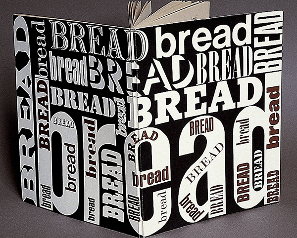
Cipe Pineles (1908–1991) was a very influential, albeit unsung, graphic designer of the 1930s. She is credited with blending fine art, lively, colorful illustrations (especially of food, her passion) and hand lettering within her designs— especially in her work on magazines. Pineles totally changed the world of editorial design during her reign. She was a powerful role model and a major creative inspiration for many. She could make an editorial spread come alive with eye-popping, colorful illustrations, often accompanied by hand-written lettering, in a manner that was way before its time. Not only was she a female creative in a very powerful role, but she was also one of the first women to hold the position of art director for a major magazine, opening the door for many who followed.
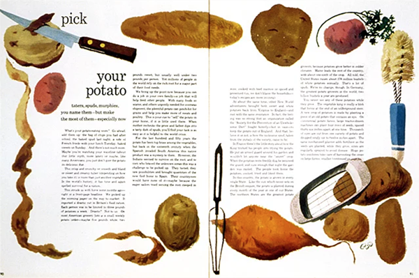
The famous potato spread for Seventeen, 1948, which won an Art Directors Club award.
Born in Austria in 1908, Cipe Pineles immigrated with her mother and sisters to New York in 1915. Already, she knew she had an affinity for creative pursuits, as her talent and intelligence were evident from an early age. In 1926, she enrolled at Pratt Institute in Brooklyn, where she studied fine art. Even in her early paintings, her love of food appears—images of bread and chocolate rendered in watercolor. But her career began in the commercial realm and remained in print media and client work, even as she privately kept books full of ingredients and recipes. She managed to bring both her own food-related work and that of others into her art direction for magazines such as Seventeen, Charm, Glamour, Vogue, and Vanity Fair.
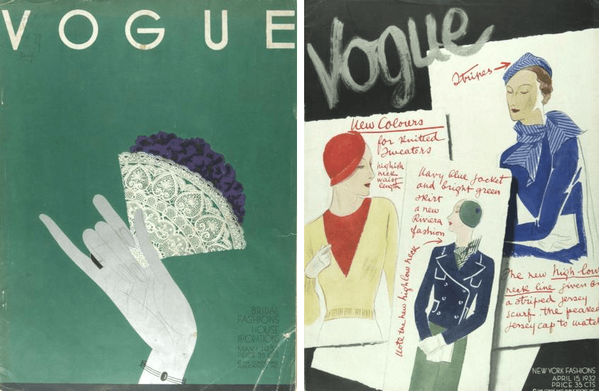
Covers for Vogue, 1932. Back in the day, Vogue did not have a consistent cover design.

Two more covers for Vogue, late 1930s
Pineles was a pioneer, not only because she was a woman in a male-dominated profession, but because she had a vision for innovation and wasn’t afraid to make it real. She was the first art director at a magazine to commit to assigning fine artists for editorial illustration—a previously unusual practice—and it was under her direction that such celebrated names as Andy Warhol and Ben Shahn began creating spot illustrations to accompany stories.
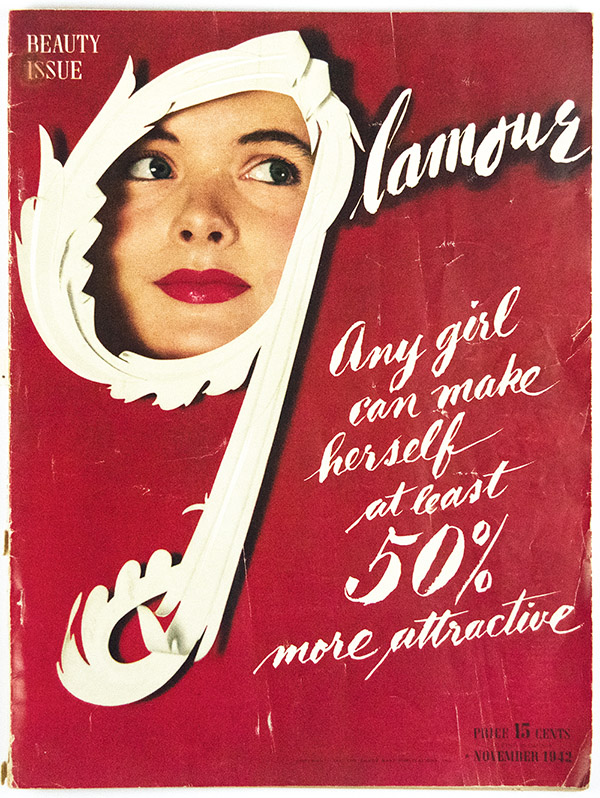
Cover and lettering for Glamour, 1942
Pineles worked at Condé Nast for many years and simultaneously taught at the Parsons School of Design. She continued to teach well into her later years and was celebrated many times over for the projects she spearheaded with her class. These included creating books of recipes and narratives about food, from the Parsons Bread Book, a collection of tales about New York bakeries, to Cheap Eats, which featured both art and recipes from famous creatives of that era.
Pineles was married to two notable designers: William Golden, from 1939 until his death in 1959; and Will Burtin, from 1961 until his death in 1972.

Charm cover, 1953. Note the early use of hand lettering, which has since made a major reappearance in the digital age.
Editorial spread from Charm, 1953
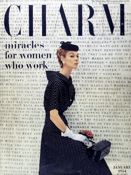
Another Charm cover, 1954, with extensive use of type as background image
A typographic cover for Bread Book, based on a sketch by Pineles

Cover and spreads from the 1974 trade paperback edition of the Parsons Bread Book
Leave Me Alone with the Recipes
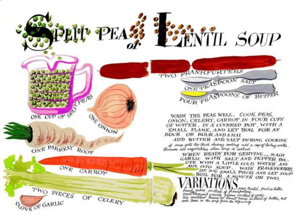
Pineles wrote and illustrated a sketchbook of Eastern European Jewish recipes as a personal project in 1945. This sketchbook, with its painted manuscript, was recently (re)discovered at an antiquarian book fair by Sarah Rich and Wendy MacNaughton, and it drew them in like magnets. It displayed a vibrant paintings, such as one of hot pink beets and a hand-lettered recipe for borscht written in script so full of life, it was hard to believe it was more than sixty-five years old.
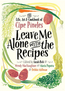
The newly designed cover of the ‘found’ collection of recipes using Pineles’ art.
This sketchbook, which Pineles entitled Leave Me Alone with the Recipes, was a keepsake of her connection to her childhood’s Eastern European food. For Wendy and Sarah, it was a talisman of a woman they had not known was their idol: a strong, independent spirit whose rich archive of drawings, recipes, diaries, and letters to family and friends led them into a dazzling history of mid-century design, art, food, New York City society, and culture.
They teamed up with Maria Popova of Brain Pickings and Debbie Millman of Design Matters, along with contributors Mimi Sheraton, Steven Heller, Paula Scher, and Maira Kalman, to present Cipe Pineles’ life and work as it should be presented—in glorious color. With Pineles’ illustrated cookbook and a section of updated recipes as its centerpiece, this gorgeous volume entitled Leave Me Alone with the Recipes: The Life, Art, and Cookbook of Cipe Pineles (2017) delighted foodies and design devotees alike. These newly discovered, illustrated recipes helped to introducing Cipe Pineles and her exciting work in food and art to a new generation.


Several spreads included in the book.
I have loved minimalist design since way before I knew the style had a name (or that it was even a style). I was the kid with a poster featuring silhouettes of Han Solo and pals in her bedroom. Luckily for me and other lovers of spartan style, designer Nick Barclay has created a set of prints that satisfies my love of minimalism and movies with his series of movie posters that contain only circles. Yep. He doesn’t even mix it up with an oval or a swirl!

By using only circles, Barclay has distilled down a theme, character, or plot device to its barest form. Obviously Lord of the Rings is pretty straightforward with its “one ring to rule them all.” The two blood-red bitemarks depicting Bram Stoker’s Dracula is genius in its simplicity and I incorrectly guessed Chocolat instead of Forrest Gump when presented with the various shades of brown circles and clearly seeing a box of chocolates. And while I thought the red and blue pills from The Matrix was clever, I laughed quite loudly (sorry, fellow Starbucks patrons) when I saw the depiction of one of Total Recall‘s most memorable characters. You know the one.
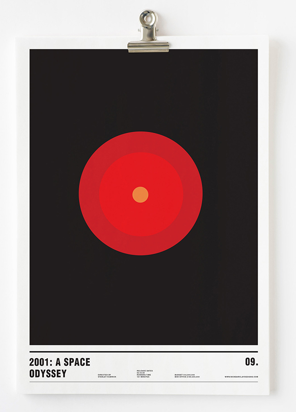
The prints are available for sale on Barclay’s website, along with his series of world cities, planets, and adult beverages to name a few. Most of the prints run about $23USD before shipping. Now if you’ll excuse me, I have some film buffs* to buy presents for.
*me
With remote work now a staple of modern business, real-time collaboration tools have become essential. They help distributed teams communicate clearly, manage projects efficiently, and deliver high-quality creative work on time.
According to a Gallagher survey, nearly half of workers feel their organizations underinvest in communication tools. This highlights the urgent need for platforms that drive transparency, accountability, and productivity.
Why collaboration matters
Collaboration software empowers teams to work smarter. It streamlines workflows, enables faster feedback, and fosters a transparent work culture. These tools support global collaboration, helping creative teams work seamlessly across locations and time zones.
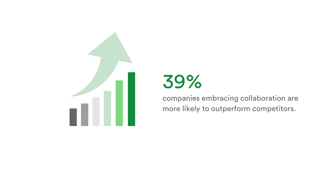
In fact, McKinsey’s Diversity Matters report found that companies embracing collaboration are 39% more likely to outperform competitors.
Let’s explore the top 10 collaboration tools preferred in 2025.
1. Asana
Asana powers project management for marketing and design teams by making task delegation and progress tracking crystal clear. With Kanban boards, due dates, subtasks, and priority tags, teams can reduce unnecessary meetings and streamline daily workflows. It’s especially useful for teams juggling multiple campaigns or creative projects at once.
Tip: Best for managing cross-functional marketing and creative projects.
2. PageProof
PageProof eliminates the chaos of creative feedback with its online proofing platform. It supports Adobe Creative Cloud files, Microsoft Office documents, images, videos, audio, banner ads, emails, websites (both live and staging), and even 3D content, with feedback added directly on the work. With version control and customizable automated approval workflows, marketers and designers can keep feedback loops efficient and audit trails clear.
Tip: Best for online proofing of all creative assets.
3. monday.com
monday.com offers customizable workflows that fit marketing calendars, product launches, and creative production pipelines. Its intuitive dashboards and team templates help everyone stay on track. Integrations with Slack, Adobe, PageProof, and other key apps, mean fewer silos and more fluid collaboration.
Tip: Best for customizing workflows across campaigns, content, and product launches.
4. Adobe Creative Cloud
For creative teams, Adobe Creative Cloud offers stand-out design tools along with some collaborative features. Options like Share for Review in InDesign and Illustrator let team members and stakeholders leave comments directly on designs.
Tip: Best for creating and managing high-quality visual and video content.
5. Figma
Figma redefines collaborative design by allowing marketers and designers to co-create and review UI/UX prototypes in real time. Cloud-based access, version history, and live commenting make feedback frictionless – ideal for creative teams designing websites, apps, or digital experiences together.
Tip: Best for real-time collaborative design and UI/UX prototyping.
6. Miro
Miro brings visual thinking to remote creative collaboration. Its whiteboarding features are perfect for marketing ideation sessions, journey mapping, or creative planning. Design and marketing teams can co-draw wireframes or map out customer flows – no physical whiteboard needed.
Tip: Best for visual brainstorming and creative planning workshops.
7. Slack
Slack keeps marketing and design teams in sync with organized channels for projects, clients, and creative assets. Whether you’re sharing quick feedback, dropping file links, or integrating updates from tools like Asana and PageProof, Slack makes conversations trackable and searchable.
Tip: Best for centralizing team communication and quick creative feedback.
8. Microsoft Teams
Ideal for organizations already using Microsoft 365, Teams blends video meetings, chat, and file sharing into one hub. Creative teams can co-author PowerPoint presentations or review campaigns with clients over video, all while staying within the same platform as their email and calendars.
Tip: Best for collaborating on creative work within the Microsoft 365 ecosystem.
9. Google Workspace
Google Workspace is a go-to for real-time content collaboration. Marketers and designers can co-edit briefs in Docs, build reports in Sheets, Slides, and gather campaign feedback via comments. It’s particularly useful when multiple stakeholders need to chime in on creative content.
Tip: Best for real-time co-editing and feedback across marketing documents.
10. Microsoft 365
For marketing teams that need robust document editing and collaboration, Microsoft 365 offers seamless teamwork in Word, Excel, and PowerPoint. With OneDrive integration, version tracking, and secure sharing, it’s a practical foundation for content creation and asset management.
Tip: Best for secure, scalable document creation and version-controlled collaboration.
Choosing the right tools for your team
Before investing in collaboration tools, consider:
- Ease of use: Tools should be intuitive and easy to adopt.
- Scalability: Choose platforms that grow with your team.
- Security: Ensure strong data protection and access controls.
- Integrations: Look for tools that work along with your existing workflows.
Top tip: Free trials are a great way to evaluate tools.
Final thoughts
Collaboration tools are no longer optional – they’re foundational. From managing creative projects to communicating effectively, these tools drive efficiency and enable better results.
Whether you’re creating designs in Figma, getting approvals in PageProof, or organizing tasks in monday.com, the right stack of tools can supercharge your design team’s productivity.