
Showing results for 71229 29888 229 8881 71229 29888 229 8881 71229 29888 229 8881
In this episode:
- Latest news:
- CreativePro Conference!
- PePcon, InDesign Conference, Creative Developer Summit
- Template Essentials, our new premium member benefit
- January 2016 InDesign Magazine: Publish Online
- David’s new Color Management title at Lynda.com
- Our 2016 InDesign Resolution: Pay Attention to the Little Things!
- Obscure InDesign Feature of the Week: Select and Fit Item
News and special offers from our sponsors:
>> Rorohiko, owned by InDesign developer extraordinaire Kris Coppieters, is not just about plug-ins or scripts. They also provide expertise as scripters, software developers and consultants when it comes to automating part of a graphics workflow. Rorohiko’s motto is ‘Slash the time it takes’ and that also applies to their ‘Expertise on call’ service. They have been instrumental in finding a simple, efficient solution to many of their customer’s problems. Call on Kris and Rorohiko (or email dev@rorohiko.com) for help with publishing systems design, implementation, tech support, and debugging. They know their stuff!
- Time for PePcon 2016! Sign up now and we’ll see you in San Diego in June
- CreativePro 2016: The Conference for Photoshop and Illustrator Users, July 11-13, web site to come
- InDesign Conference 2016: Washington DC, November 7–9, (also home of the Creative Developers Summit)
- Our first Template Essentials: Sidebars and Pull Quotes
- InDesign Template of the Month
- Check out the January 2016 InDesign Magazine
- The book: Real World InDesign
- David’s new course, InDesign Insider Training: Color Management
- Important Checkboxes: Smart Text Reflow, Ignore Text Wrap, Use Document Bleed
- More about Select and Fit Item
Mixing type and graphics to choose the right font for the job every time
According to the ’50s Sinatra hit, love and marriage go together like a horse and carriage. The same is true for type. The right type adds harmony to a layout—like drinking a chilled Sancerre alongside a meal of Dover sole. Yet despite this relationship, designers often struggle finding fonts that play nice with the graphics on a page. And who can blame them? Go to any type resource and you’ll be blinded by the number and variety of available choices. It’s dizzying.
To borrow another musical oldie from Lloyd Price: type’s got personality. Let’s take Helvetica as an example. True to its Swiss pedigree, Helvetica is cool, calm, and collected (Figure 1).
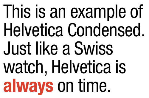
Figure 1: Helvetica Neue LT Std Condensed and Condensed Bold. I’ve tracked this type at –15 points and reduced the leading between lines to help pull it all together.
Trajan is another font that practically tells you how to use it—in grammatically correct Latin, no doubt. Unfortunately, some fonts become victims of their own success (Figure 2).
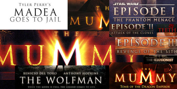
Figure 2: Trajan is a font that’s been so popular that it’s now overused as the go-to movie title font.
Of course, choosing the right font is only half the battle. Once you’ve chosen the font, how do you properly set it? How big is too big? How loose or tight do you kern it? And what about color? Should body text always be black? Is Comic Sans always a no-no? What about Times Roman? Head starting to spin? If so, you’re not alone, my friend.
Fortunately, finding the right font for a graphic is often easy, if you first consider how both “feel.” Often, common sense is all it takes to make a good match of text and imagery. Here, for example (Figure 3), is a recent cover of Real Simple magazine.

Figure 3: Cover of Real Simple magazine. Clean type combined with the apple image on a pure white background adds up to a layout that’s true to the magazine’s name: real and simple.
In this case, the name says it all. Except for the flourish used for the word The, all the type is set using Interstate Black, a clean san serif from designer Tobias Frere-Jones. Frere-Jones fans might also recognize the similarity of Interstate to Gotham, another popular san serif from the same designer. It doesn’t take an artistic genius to find any number of fonts that might work well with this magazine or the apple cover photo.
Now let’s take a look at two variations of the fictitious magazine Really Really Simple to further explore this design conundrum.
In Figure 4, I’ve used Minion Pro, from Adobe’s in-house type designer Robert Slimbach. Chosen by Adobe as InDesign’s default font, Minion Pro is available in more than 60 different weights and styles and is an excellent and reliable choice for body text and serious typesetting. Its x-height (the height of lowercase letters like x, u, or v from the baseline to the median) is considered medium, which gives Minion Pro a sturdy feel, particularly at smaller sizes. This serif face isn’t a terrible choice, but it doesn’t feel right when matched with the roundness of the content (and the emphasis on simplicity suggested by the title).

Figure 4: Real and simple can also add up to boring, like in this fictitious example. Apples are symmetric, type placement is symmetric, type weights and styles are too similar. Yawn.
On the flip side, Figure 5 is a design nightmare that breaks many of the rules of good typesetting and good taste. Among its litany of sins are the use of script and italics for all caps, the use of too many fonts (five) on one page, and the use of “silly” type in a serious publication. Ouch.

Figure 5: This mockup is bad for other reasons. Many other reasons. Never, ever, ever set a script font in All Caps. Never.
My next example is a jacket I designed for a book about country music (Figure 6).

Figure 6: Perhaps there’s unintented irony in using fonts named Rockwell and Antique for a book about classic country music.
Here I relied on the content (country music) to steer me in the right direction. The title font (and author’s name) is in Rockwell Extra Bold. The book’s subtitle is set using Antique 3 from Wooden Type Fonts. To add a bit of texture to the title type, I converted the type to outlines and filled it with an image of aged wood. The guitar was created in Adobe Illustrator from a pixel-based stock image.
Rockwell Extra Bold’s thick, chunky, slab serifs give the typeface a wood-type feeling that lends itself to a book about country music. Antique 3 is also a good match because of a slight uneven quality to the letterforms. And, perhaps even more importantly, note how well the curves in the type mirror the outline of the guitar image. Try squinting at the image to see its “essential” shapes—sometimes that can provide some insight into the typographic shapes you’re looking for.
By the way, when in doubt about a font’s “authenticity,” spend some time Googling images from the period you’re trying to re-create. After researching a handful of Civil War-era posters and broadsides, I was confident that Rockwell Extra Bold and Antique 3 would be a good fit. When historical references aren’t available, just use common sense. Comic Sans in the Old West? Hmm, maybe not!
Mixing Type Successfully
If figuring out which typeface to pair with a particular image weren’t hard enough, designers must often decide how to make multiple fonts work together on a given page or screen. Here are a few rules which I’ve found helpful through the years:
Limit the number of fonts to two: If you find yourself reaching for more than two (or three) different typefaces per page, chances are you’re headed for typographic trouble. Although there are always exceptions to this rule, generally and when in doubt, less is more (Figure 7).

Figure 7: In this poster I used only two fonts: Archive Antique Extended (headline, subheads) and Helvetica Neue Lt Std Bold Condensed (bullet points).
Keep it in the family: You can never go wrong by staying within the same typographic family. I’ve seen (and designed) beautiful layouts with only one font family. Fonts like Helvetica Neue Lt Std or Minion Pro have so many variations of style and weight that there’s no reason to look anywhere else (Figure 8).
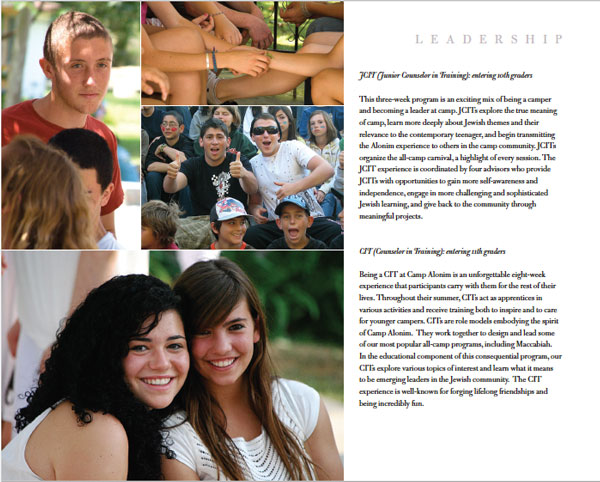
Figure 8: In this page from a sales booklet I designed for a Los Angeles day camp, I used only one typeface, Bulmer MT. By varying its size, style, and tracking, I was able to create variety and design cohesion all at the same time.
Combine a serif with a sans serif: When one font alone won’t do, try combining serif and sans serif fonts (Figure 9).
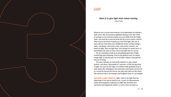
Figure 9: In this spread from David Blatner’s book Spectrums, I chose Swift for the body text and various styles of Franklin Gothic for everything else.
For more tips about artfully mixing fonts, I highly recommend this excellent article by Douglas Bonneville.
Hopefully your typographic antennae are warmed up by now. But as we’ve seen, sometimes choosing which font not to use is easier than choosing which to use. Figure 10 is a good example.

Figure 10: The opening spread I designed for a feature article about Syrian refugees fleeing to the Greek island of Lesbos, with the headline set in the font Hermes.
In this magazine feature opening spread, I struggled for more than a day trying to find the right typeface to kick off this timely article about Syrians seeking refuge on the island of Lesbos. Eventually I settled on a font called Hermes, a typeface I’d never seen or used previously. Originally designed by Heinz Hoffmann in 1908, the font reflects the German grotesks that, according to Font Bureau, “were workhorses of factory printing 100 years ago. Blunt corners suggest the wear and tear of rough presswork.”
A Layout in Need of a Typeface
So how does a designer go about finding a font appropriate for the layout? The answer lies in a combination of a little bit of knowledge and a little bit of luck.
For the Rewriting A Greek Tragedy article, I began my search at MyFonts.com. If you’ve never been to MyFonts.com, prepare yourself. This website is among the best places to see and try out a dizzying number of typefaces. Fortunately, the people behind MyFonts.com have done an amazing job of creating a user-friendly site that caters to all typographic whims. In my particular MyFonts.com search I used the word Greek as a starting place. I also typed in the phrase Rewriting A Greek Tragedy, so I could see how it would look when MyFonts.com finished its search. Among the many suggestions the site offered were lots and lots of typefaces that contained Greek characters, as one would expect. What I didn’t expect was stumbling onto the Hermes font, whose name is based on the Greek god of commerce (Figure 11).

Figure 11: The right font for the job is revealed with a little help from the search function at MyFonts.com.
Bingo! Whether Hermes was or wasn’t an authentic Greek typeface really didn’t matter. What did matter was a tough, muscle-like quality that seemed simpatico with the gravity of the article. Even better was the realization that I already owned Hermes, as it was among the thousands of fonts I’d collected over the years.
Nearly all typographic websites now allow users to type in a word or phrase to see how it would look in a chosen font. If you’re a Creative Cloud subscriber you’ll find this same feature integrated into Typekit, for example (Figure 12).

Figure 12: You can enter your own custom text to see how it looks in a variety of Typekit fonts.
If you’re salivating at the thought of owning thousands of fonts as I do (or just having access to tons of fonts through services like Typekit), realize that with such a huge selection comes a price. What good is it if, despite such a large collection, you have no idea (beyond a few obvious choices) what you really have? Every time I need a typeface I can’t cull through 35,000 fonts. Or even 3,500 fonts. It’s not practical. What’s a designer to do?
One approach is to use a powerful font management tool like FontAgent Pro. Among its features, there are four I particularly like (Figure 13), Font Player, Font Compare, Font Data, and Glyph View.
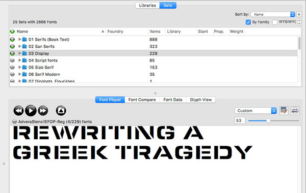
Figure 13: FontAgent Pro’s Font Player is a handy feature for quickly previewing a large number of fonts. Click the button on the right to add a font to a Font Player set that can be saved and reviewed later.
Font Player allows me to add a bunch of fonts I’m considering for a project and view them consecutively. Here I’ve selected a font set called Display that contains 229 fonts. Clicking the Play button of the Font Player allows me to step through all 229 fonts one at a time, or play them quickly in rapid succession.
When evaluating fonts, my first pass is usually based on pure gut: does the font “feel” right or not? I believe you should trust your instincts. Often I don’t know exactly why a font works, but simply that it does. Achieving this level of font intuition takes time. But over time you begin to discover how each font has its own personality and voice. Again, use historical references when possible. If you’re creating a ’60s poster, go online and study the Sixties. Most of the time the right font will reveal itself without too much work.
If, after locating an image with the right font, you have no idea of the name of the typeface, there are resources on the web to help identify fonts. A couple of places to try are identifont.com and whatfontis.com.
Another great (and diverting) website is namethatfont.net. Here you can see examples of common brands like Mercedes Benz or McDonald’s and learn the name of the font used in its logo.
’Cause You’ve Got to Have Pers-o-nality
As you can see, choosing the right font for the job can often be approached in a systematic way. First and foremost is understanding the content and the context in which the type lives. Sometimes the answer is clear. A frilly font for a macabre murder mystery probably won’t work well (although there are exceptions!). But if we think of type as having personality, then the task of pairing the right font for the job becomes suddenly not only logical, but more manageable.
Bringing even more choices to people looking for affordable, high-quality desktop monitors, ViewSonic® Corp. today announced four new options in its VA Series of LCD monitors. Offering increased clarity, vibrant color and brightness, the widescreen 19-inch VA1926w, 20-inch VA2026w and 22-inch (21.6-inch visible) VA2226w displays bring the desktop to life with the ability to view multiple applications simultaneously and enhanced video and gaming views, while the 19-inch VA926 provides a traditional 4:3 size for users with extremely limited desktop space.
"Small and home offices need versatile, yet high-quality options for the multitude of applications they deal with on a day-to-day basis," said Jeff Volpe, vice president of marketing, ViewSonic Americas. "With these affordable LCD options, customers don’t have to give up quality and clarity because of budget constraints."
Starting at an estimated street price (ESP) of $229, the new displays offer a 2000:1 dynamic contrast ratio (typ), meaning sharp detail for text and graphics and better overall image quality. Dynamic Contrast adjusts black levels based on screen content, allowing for darker black levels and a higher contrast. An additional benefit is the significant reduction of light leakage on darker screens, especially when viewed from the side.
Each model has 300 nits of brightness for brilliant image and color quality and a ClearMotiv® 5 ms fast response time for smooth, broadcast-quality video ideal for business and gaming applications.
The displays are Windows Vista™ certified and fit easily into a small or home office with a slim-bezel design that takes up less space on a busy desktop, and feature multi-mode input technology that supports both digital (DVI) and analog (VGA) signals to make the displays compatible with any office setup. Numerous size options meet a variety of needs for the small/home office user:
- Priced at $259, ViewSonic’s VA926 LCD has a 4:3 aspect ratio and a 1280×1024 resolution offering high quality and affordability.
- The VA1926w, VA2026w and VA2226w offer full, viewable widescreens for low ESPs of $229, $249 and $279 respectively. These full-screen displays are designed to enhance productivity by allowing users to view two full-size documents side-by-side, and giving gaming and entertainment application users a panoramic view.
The ViewSonic VA Series displays are available now through authorized ViewSonic resellers, distributors, retailers and e-tailers. The displays are compliant with the strictest safety and environmental standards, including TCO and ENERGY STAR®, and are made with environmentally friendly materials. ViewSonic’s LCD monitors are backed by a three-year limited warranty on parts and labor. For more information and images of ViewSonic LCDs, or to locate an authorized ViewSonic dealer, visit www.ViewSonic.com/lcd or call 800.888.8583.
About ViewSonic
ViewSonic® Corporation is a leading global provider of visual display products. ViewSonic develops, markets and supports a broad range of innovative products including LCD monitors, LCD TVs, projectors, digital signage displays and other display products. For further information, please contact ViewSonic Corp. at 800.888.8583, 909.444.8888 or visit www.ViewSonic.com.
Digital Foci, Inc. (https://www.digitalfoci.com) introduced today Media Buddy portable digital photo storage with hard drive and card reader that lets you instantly and securely save digital photos on a hard drive wherever you go, so you can keep snapping away and not worry about running out of memory card space.
Media Buddy is the traveler’s essential digital camera companion. Its built-in memory card slots let you copy and store photos directly from any digital camera card, without the need of cumbersome cabling. A lower cost alternative to Digital Foci’s Picture Porter, Media Buddy is priced starting at only $229. Both Media Buddy and Picture Porter save photos on their portable hard drives, so you don’t have to bring heavy laptops on the road, but Media Buddy provides a lower price by offering a backlit LCD for text-only use, instead of the Picture Porter’s 2″ color LCD screen for viewing photos (see https://www.thomas-pr.com/pressreleases/digitalocipictureportervmediabuddy.html for Media Buddy/Picture Porter comparison chart).
Portable Digital Photo Storage
With Media Buddy’s 30GB to 80GB hard drive versions, you’ll virtually never run out of memory card space on the road again. Media Buddy frees up expensive memory card space and lets you reuse your memory card to keep snapping photos. Just insert the memory card from your digital camera into Media Buddy and download images into its built-in hard drive. The backlit text-based LCD screen lets users view file information and operation status, including copy progress and confirmation. You can select to save a specific folder or file from your card, or you can copy the entire contents of your memory card with the convenient one-touch Auto Copy button with no computer needed. A unique folder name is automatically created to indicate media card type and copy sequence per card type to keep you organized. When you get home, simply connect Media Buddy to your computer to retrieve your saved pictures.
Works with All Media Formats
Media Buddy works with all media card formats, including CF I/II, MD, SM, xD-Picture Card, MMC, SD Card, miniSD, Memory Stick, MS PRO, MS Duo, and MS PRO Duo, so you can copy and save your precious pictures directly from any digital camera memory card. You can also make copies of photos taken from friend’s and family member’s digital cameras by quickly inserting their cards into Media Buddy for instant archival of special picture moments.
External Hard Drive, Data Bridge & MP3 Player
When connected to your computer, Media Buddy functions as an external hard drive. Use Media Buddy to back up and archive digital images, digital music and important files from you computer through its high-speed USB 2 connection. Since Media buddy is compatible with both Windows and Mac, you can also easily transfer files between computers with the different operating systems. In addition, Media Buddy is perfect as a portable MP3 player for listening to your favorite MP3 songs on the go.
Media Buddy Features:
- One-touch operation for copying pictures directly from your digital camera memory card without the need of a computer
- Backlit text-based LCD screen for viewing file information and operation status
- Reads directly from memory cards
- Memory card format support of CF I/II, MD, SM, MMC, SD Card, Memory Stick, MS PRO, MS Duo, MS PRO Duo, and xD-Picture Card (and miniSD with adapter)
- Shows copy progress and copy confirmation
- On screen menu includes browse, single file copy, and delete feature
- Attractive brushed anodized aluminum casing
- External hard drive for backing up your computer
- High-speed USB 2.0 computer interface
- Compatible with both PC and Mac
- Transfers files between multiple computers running different operating systems
- MP3 music player
- Includes Ulead Photo Explorer to edit, enhance, and organize your photos
- Built-in Lithium Ion rechargeable battery
Media Buddy weighs 11 oz. (with hard drive and battery included) with dimensions of 5.8″ (L) x 3.4″ (W) x 1″ (H). It comes in 3 stylish colors: Powder Blue, Arctic Silver, and Pearl Gray and 4 storage capacities: 30GB, 40GB, 60GB, and 80GB. Media Buddy comes complete with Ulead Photo Explorer image management software (normally a $30 value), USB cable, earphones, AC adapter, Lithium-Ion battery, carrying case, resource disk, and user’s guide. It is available immediately at Digital Foci’s online store at www.digitalfoci.com starting at $229.95. For more information, see the website: www.digitalfoci.com.
About Digital Foci
Digital Foci helps consumers manage and enjoy their digital content collection easily. The company enhances people’s lives by allowing them to seamlessly move digital photos, video, and music from one place to another. With Digital Foci products, consumers are able to enjoy any of their digital content on any device without ever worrying about format compatibility. Digital Foci products include digital picture frames, photo displays, storage devices, and card readers for transfer, storage, and management optimized for any setting where you choose to enjoy your digital content.
Digital Foci (pronounced “foe-sigh”) is the plural form of the word “focus” and symbolizes the many distinct points where light and sound converge and diverge. It is at these digital focus points, or foci, where you view and share your digital pictures, watch your digital video, listen to your digital music, and access your digital files.
I’m always surprised when I meet someone who doesn’t use a pressure-sensitive tablet while editing photographs. If your edits are confined to global adjustments that can be easily applied using a slider, a tablet isn’t so necessary. But if you perform localized edits — dust removal or cloning; masking of tone or color adjustments; or any type of dodge or burn effects — then a tablet can greatly ease your post-production life.
If you’re unsure as to why you might need a tablet for your image editing chores, or if you don’t know what to look for in a tablet, this discussion should put you to rights.
What a Tablet Can Do For You
I’ve been using pressure-sensitive tablets for the past fifteen years. I was originally drawn to them by their superior ergonomics. Due to a medley of repetitive stress issues, using a mouse is a really bad idea for me. Retouching with a mouse is especially troublesome, because painting requires precise brush movements, which usually result in my clenching the mouse very tightly.
With a tablet, though, the grip is very light, and there’s no index finger clicking to aggravate the tennis elbow. Also, there are more ways that you can position your body with a tablet. You can work with it on a desktop, or in a lap, and it’s easy to shift position while you work. Finally, with a tablet I tend to sit a little farther from the screen, which can help reduce eyestrain.
But if you’re one of those people who doesn’t let something as minor as teeth-rattling hand pain get in the way of your image-editing tasks, a tablet can still be an essential accessory. Here are a few reasons why:
1. Precise painting is much easier. When you’re painting a mask or brushing an effect onto an image, fine detail work such as painting around difficult shapes or following an ungainly edge is much easier with a tablet. There are lots of reasons, from the natural pen-and-paper-like motions to the fact that you don’t run out of “mousing space” in the middle of a stroke. Once you’re practiced, painting will be much speedier with a tablet, and you’ll probably get better results.
2. Imprecise painting is much easier. Sometimes you need to cover a large area very quickly, but you don’t want to use a paint bucket because you don’t trust it to stay confined to a particular area. Grab your pen and tablet, dial in a big brush, and you can quickly cover a large area of a mask or image.
3. Airbrush effects are smoother and more gradual. Good mask painting and retouching often centers around the ability to create subtle airbrush effects. With a pressure-sensitive pen, you can configure your airbrush tool to apply more or less ink depending on how hard you push down. This makes smooth, gradual shading much easier. Sure, you can use a gradient tool to create smooth transitions, but if you’re transitioning around an irregular shape, there’s no substitute for painting.
4. Other brush dynamics. Depending on the tablet you have and the software you’re using, you can set up your digital brushes to respond to different pen dynamics. For example, by default, most brushes change shape depending on how hard you push, but you can also program them to change opacity or color. If your tablet supports it, you might be able to program the tilt and bearing of your pen. So, you could have size dependent on pressure, hue dependent on the direction you tilt the pen, and saturation dependent on how far you tilt. To be honest, I don’t use that much functionality for photo work, but if you also paint, these are nice features to have.
Finally, there are some less quantifiable advantages to tablets, the main one being that they’re simply fun. When I work with my tablet, I don’t feel so much that I’m working on a computer. While not as tactile as real analog media, there’s still a strong feeling of relating to your image through your hands.
To demonstrate the above points, I created the following short movie. Click below to open it in another window.

What to Look for in a Tablet
Wacom pretty much owns the tablet market, and with good reason. Their pens don’t require a battery, making them lighter and more convenient over the long haul; and they offer a wide array of sizes, with a varied assortment of utility features. And Wacom’s tablets are well-made, dependable, and come with very good driver software.
Size. When shopping for a tablet, your first consideration should be size. Tablets come in a wide range of sizes, from small and very portable to large and barely luggable.
The table below gives you a quick glimpse; for many, many more details, visit the Wacom tablet comparison pages for the Intuous4 and the Bamboo.
| Model | Drawing Area Dimensions* | Price (US$) |
|---|---|---|
| Intuos4 Small** | 3.9″ x 6.2″ | 229 |
| Intuos4 Medium** | 8.8″ x 5.5″ | 369 |
| Intuos4 Large** | 12.8″ x 8″ | 499 |
| Bamboo Pen | 3.6″ x 5.8″ | 49 |
| Bamboo Fun** | 8.5″ x 5.4″ | 199 |
| Bamboo Craft** | 3.6″ x 5.8″ | 129 |
* Sizes refer to the dimensions of the drawing area. The actual tablet size is larger.
** Tablet includes at least one programmable button.
If you usually edit images on the road, then a small tablet makes more sense. If you’re buying a tablet for exclusive use on your desktop, then you’ll want to consider what size will fit comfortably in your lap or on your desk. If you’re primarily a photographer, you probably don’t need an especially large tablet, as you won’t be trying to trace large documents or perform other “drafting” tasks.
But size can also affect ease of use. If you don’t have much painting or drawing experience, working on a large tablet may be more difficult than working on a small one. (For someone with limited painting/drawing experience, large strokes are harder to control than small ones.) Because your screen is mapped to the dimensions of the tablet’s drawing surface, a larger tablet requires larger strokes to cover a given distance across your document.

The Intuos4 Wireless pen tablet
Programmable Buttons. Once you add a tablet to your workflow, you won’t want to use a keyboard as often because of the hassle of switching back and forth. To replicate important keyboard functions such as navigating a document or reproducing keyboard shortcuts for modifying brush behavior, many tablets include buttons that you can program to generate these same keystrokes.
So, for example, you can create Shift and Control buttons on the tablet, or specific key commands for changing tools. Some tablets also include special controls ideally suited to zooming in and out of a document.
Tablet Surface. Tablet surface is, unfortunately, not something you can probably test beforehand, so you’ll have to depend on reviews. Surface feel is something that’s easy to take for granted until you try using a tablet with a bad surface. Scraping a pen or pencil across a piece of paper generates a fair amount of friction, and that tactile feedback helps you control your stroke. A good tablet will offer a similar type of surface. A slippery tablet surface will make for strokes that are harder to control, and a stylus that “skates”.
Pen Design. Stylus design is also very important, and weight will be your primary concern. Again, unless you can get your hands on a tablet beforehand, you’ll have to base your decision on reviews.
You want at least one programmable button on the side of the pen, and you’ll usually configure this for double-click. Some pens also have a virtual eraser on the other end of the pen. This effectively gives you immediate access to two tools simply by flipping the pen over. Some pens even have interchangeable nibs, to get a different feel for different types of painting.
Wacom’s Intuos tablets all come with pens that have a two-button switch on the side, an eraser on the top, and interchangeable nibs. Wacom sells additional pens for the Intuos4 series, including a pen with true airbrush controls. The Wacom Bamboo series pens feature two buttons on the side, but lack an eraser and interchangeable nibs. Unfortunately, pens are not interchangeable, so you can’t buy a Bamboo and use it with a fancy Intuos4 pen.
Wireless or Wired? Wireless gives you a little more ergonomic freedom, but wired doesn’t require pairing with Bluetooth, which some computers don’t have.
Getting Used to a Tablet
Some people find painting and drawing on a tablet to be confusing at first, because you draw on one surface and look at another. If you have traditional sketching experience, you shouldn’t have any trouble adjusting to the coordination of a tablet.
Even without sketching experience, in a few days of solid tablet use, you should find that you don’t think about the seemingly disjointed coordination. For even greater comfort, check the controls in your driver. You might be able to change the sensitivity of some of the pen’s behaviors to achieve a better feel.
The Latest
Wacom’s Intuos4 Wireless is a great example of a state-of-the-art tablet. Shipping in three sizes, the Intuos offers fantastic performance with up-to-the-minute features. I reviewed the wired version of the Intuos4, and the Intuos4 Wireless is the same design with the addition of a Bluetooth connection.

The tablet also has a normal USB port, giving you the option for wired use. You charge the tablet via the USB port. Because it’s Bluetooth, its battery must be charged before you can use the tablet wirelessly. As with any Bluetooth device, the tablet must be paired with your computer. To pair the tablet, you turn it on and press a small button on the tablet’s side. This makes the Intuos4 discoverable for three minutes. It presents itself to your computer as a mouse, and I had no trouble pairing it with any of my Macs.
As far as actual use goes, the tablet doesn’t feel or perform any differently than when it’s corded. But not having the cord — which sticks out the side — definitely gives you some extra ergonomic options. It’s easier to work with the tablet in your lap, since the cord doesn’t smash into your knees. That said, I’m glad the corded option is available for times when I forget to charge the battery, or move it to a computer without Bluetooth.
In all other ways, the tablet is the same as the normal Intuos4, meaning it’s a great tablet with excellent features and software.
Panasonic announced pricing for its new line of Lumix digital cameras, which include the Lumix FH-, FP- and F- Series — all which will be available in mid-February 2010.
The Lumix FH-Series including the FH1, FH3 and FH20 are all slim, pocket-size models that pack a powerful 28mm wide-angle lens. All of these models also record High Definition video and feature Panasonic’s hallmark, iA (Intelligent Auto) mode, a suite of technologies that engage automatically — with no setting changes needed by the user. The Lumix FH1 will be available for a suggested retail price of $159.95, the Lumix FH3 for $179.95 and the Lumix FH20 for $199.95.
The FP-Series, featuring the Lumix FP1 and the Lumix FP3, have a 4x optical zoom with a folded optics design, making the camera design stylish and sleek. The series highlights a newly adopted lens cover which protects the lens and also serves as the camera’s power switch. The FP3 features an intuitive 3.0″ touch-screen LCD for easy-to-use operation. New to the FP-Series is High Definition (HD) video recording capability allowing for both beautiful still and motion images. The FP1 will be available for $149.95 and the FP3 for $229.95.
In the Lumix F-Series, the Lumix F3 and Lumix F2 have been designed with simplicity, style and performance in mind. Both models record High Definition video and are equipped with 28mm wide angle lenses and an Extra Optical Zoom function to extend zoom power from 4x to 7.8x. Both models also feature Intelligent ISO Control, which prevents the blurring of a moving subject; Face Detection, which helps to clearly capture registered faces; and Intelligent Scene Selector, which automatically selects one of six scene modes that best fits the shooting situation. The Lumix F3 will be available for $129.95 and the Lumix F2 for $109.95.
Press release
Delkin Devices, Inc., has expanded their lineup of CompactFlash card storage by announcing four new blazing fast 420X PRO cards capable of transfer speeds up to 63MB/s. The new UDMA enabled flash memory comes with a remarkable San Diego based customer service team as well as a lifetime warranty, and is available in capacities of 8GB, 16GB, 32GB and 64GB. The 420X PRO cards are available now for $129.99, $179.99, $229.99 and $399.99, respectively.
For a working photographer, the reliability and service support behind a memory card can be just as crucial, if not more so, than the camera itself. “Unless they have blown it up, dissected it, or their dog has chewed on it, we’ll take it back,” said Eric Findley, Delkin’s Customer Service Supervisor. “Since we’re based out of Southern California it’s easy to call us up and talk to a knowledgeable person within minutes. We stand by our hassle free exchange policy; in addition to the lifetime warranty on flash memory, we have industry leading product support policies on our batteries, readers, adapters, and most all of our digital camera accessories. We build superb products and we want photographers to know they can count on us to support them.”
Delkin’s PRO memory card line combines blazing fast speeds and increased capacity with unmatched reliability. Every card is manufactured with high grade NAND flash, advanced controller design, and quality control guidelines based on ISO:9001 standards. Additionally, built-in ECC (Error Correction Code) automatically detects and corrects any errors that might occur during data transfer. Delkin’s 420X CF cards are fully compliant with current CompactFlash specifications with support for Ultra DMA (UDMA) mode 6. These high-speed cards are able to instantaneously store high-resolution images and HD video, making recording faster and easier than ever.
This article is excerpted from the August/September 2009 issue of InDesign Magazine, #31. Subscribe to InDesign Magazine.
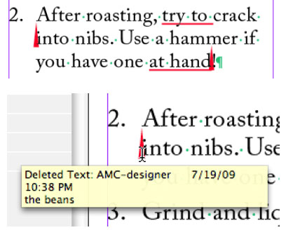
Pros: If you require text changes to be tracked in your InDesign files, CtrlChanges gets the job done and is simple to use.
Cons: Difficult to see the text in tracked deletions. Must buy pricey Pro version to see which user made certain changes.
Score: 3.5 [Editor’s note: InDesign Magazine uses a 5-point rating scale]
Adobe InCopy has a few nifty editorial features that are so useful, I’ve often wondered why Adobe didn’t include them in InDesign. One that I’ve longed for in particular is InCopy’s Track Changes, which shows you all the text edits (additions or deletions) that have been made to a story and allows someone reviewing the file to accept or reject each individual edit. Why doesn’t InDesign have that feature? After all, a lot of text editing is done in InDesign! And knowing exactly which text has been changed can be invaluable in many publishing workflows.
There is a plug-in for InDesign CS3 called Blacklining that can accomplish this. It’s been around for a while, but the problem is that the plug-in costs more than $1,000 per seat. Ouch!
Recently, the Ctrl Publishing company came out with a track changes plug-in that is far more affordable. Called CtrlChanges, it’s a plug-in for InDesign CS3 or CS4 that in some respects goes beyond InCopy’s Track Changes feature, as you’ll soon learn. In fact, the plug-in also works with InCopy CS3 or CS4 as a replacement or supplement to the program’s own track changes features.
In this review, I’ll tell you what CtrlChanges can do, where it falls short, and whether it’s worth its price: $60 for the Light version, $229 for Standard, and $549 for Pro.
Click on the image below to download the PDF excerpt:
Samsung Electronics America Inc. extended its SL-Series of easy-to-use, compact digital cameras with the introduction of the new SL720 and SL502. Offering 12.2 megapixels, 5x optical zooms and eye-catching style, the new SL720 and SL502 are “two of the most full-featured compact digital cameras on the market,” said Reid Sullivan, senior vice president of audio/video and digital imaging marketing, Samsung Electronics America.
With the SL720, users have access to a 28mm wide?angle lens, while the SL502 offers a standard 35mm lens. The SL720 and SL502 offer powerful 5x optical zooms and are each paired with image stabilization to help reduce blur caused by hand movements. The SL720 offers Dual Image Stabilization, which combines both optical and digital stabilization technology. The SL502 features Digital Image Stabilization. Users can also frame their shots and review their images on the cameras’ large LCD screens. The SL720 features a 3.0 inch LCD and the SL502 features a 2.7 inch LCD.
The SL720 and SL502 incorporate a host of intuitive and smart features that simplify how users take and view their photos. Both cameras include Samsung’s Smart Auto shooting mode, an advanced setting which automatically chooses from one of the cameras’ 11 scene modes, to produce the best possible image. When finished taking photos, the SL720 and SL502 feature Smart Album, a useful tool that allows users to easily search for a specific image they have saved on their memory card. Smart Album automatically organizes the user’s digital images and gives them the ability to narrow their search based on specific criteria such as the date or week the image was taken, the overall color tone, portraits or specific file types, including photos, videos, or voice memos.
The SL720

The SL720 and SL502 are also the first cameras in Samsung’s SL-Series to feature Face Recognition technology. Samsung’s Face Recognition technology automatically stores up to 20 preferred faces to the cameras’ internal memory. While taking a portrait, the SL720 and SL502 will automatically recognize if one of the user’s 20 preferred faces is in the frame and identify them as a priority for focus and exposure. Users can also save time sorting through their photos and instead search for photos that contain a specific face. Samsung’s Perfect Portrait System can also be found on the new SL720 and SL502, which includes Face Detection, Smile Shot, Blink Detection and Samsung’s Beauty Shot.
The new SL720 and SL502 offer consumers advanced video recording options. With the SL720, users can record 720p, high-definition video which can be played on an HDTV through an optional HDMI cradle sold separately. The camera also utilizes H.264 compression, an advanced codec that allows users to record video for longer periods of time. The SL502 features high-quality MJPEG video recording at a resolution of 640×480. For added versatility, both the SL720’s and SL502’s 5x optical zooms can be used while recording video.
Pricing and Availability
Both cameras will be available in August 2009. The SL720 will cost $229.99 and the SL502 will be $149.99.