
There has never been a better time to produce print. I love designing for digital, but there are some things print does that digital doesn’t. First among them is that print is tactile. The paper a piece is printed on, the inks used to print it, the coatings applied, and the way it’s folded, bound, or otherwise finished conveys in a visceral way what an organization perceives as the most positive qualities of its brand.
If you believe that marketing’s goal is to distinguish a product, service, or idea from all others, the fact that less print material is making its way into consumers’ hands is good news. It means that the creative presentation of ideas in print are more likely than ever to be noticed.
Sometimes Less Color Is More
Not so long ago, an organization distinguished itself from others by using four-color process. The majority of desktop printers, copiers, and commercial printing presses produced collateral, newspapers, books, and so on, in black and white. In the last decade, though, that notion has been turned on its head—in 2011 seemingly everything is four-color.
To draw readers of today into your story, experiment with using fewer colors more creatively; try unusual combinations of spot colors and paper types; and, the next time you use four-color process, consider adding spot colors and coatings to raise the project’s creative temperature.
Defining the Terms
For the uninitiated, the four-color printing process uses overlapping screens of four colors—cyan, magenta, yellow, and key (black)—to simulate a wide range, or gamut, of colors. The critical distinction is that the unaided human eye can discern a far larger color gamut than four-color process can reproduce. If you want vivid colors or you want to match a specific color precisely, four-color process printing is not ideal.
So what is ideal? Solid or “spot” inks. A spot ink is physically mixed to match a specific color formula—a formula, in most cases, provided by an authority such as PANTONE. The PANTONE Matching System (PMS) is the de-facto ink formulation standard that most of the world’s ink manufacturers and commercial printers have adopted.
To me, spot color and specialty inks are infinitely more interesting than four-color process. In addition to a full palette of colors, metallics, and fluorescents, there are phosphorescent inks that glow in the dark, scratch and sniff inks that release a fragrance, there are glitter inks, security inks, and others.
You need three things to use spot colors and specialty inks in InDesign:
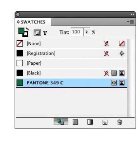
First, get familiar with InDesign’s PMS solid color swatch library. You access it from the Swatches panel menu by choosing New Color Swatch > Color Type: Spot > Color Mode: PANTONE solid… (Figure 1). Select the version—coated,uncoated, or matte—based on the paper stock the color will be printed on (Figure 2). Select a color, click the Add button, and the new spot color appears on the Swatches menu (Figure 3).
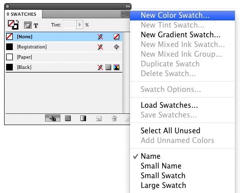
Figure 1: Going to New Color Swatch is the first step in adding a spot color to your InDesign document.
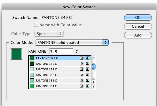
Figure 2: Next comes selecting a Pantone version appropriate for the project’s paper type.
The second thing you’ll need is a PANTONE chip book or fan guide, which is composed of printed samples of each of the 1,300-plus colors PANTONE provides formulas for. Because your computer screen also has a limited color gamut, you need a physical sample of a color printed on paper to see the true value of a color.
The third thing you need, perhaps the most important, is some inspiration. That’s where this article comes in.
Getting Bold with One or Two Spot Colors
The business card in Figure 4 was printed using a single PMS spot color. The combination of the logo, the color choice, and the paper make it out of the ordinary.
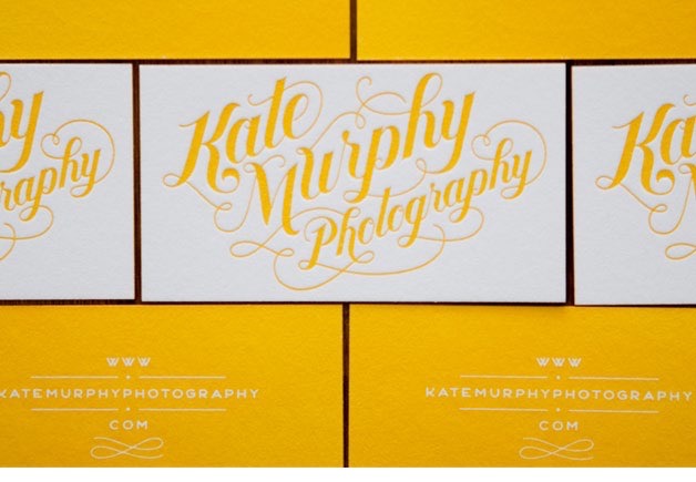
Figure 4: This example demonstrates the power of limited spot colors. Typography and design by Jessica Hische
Although it looks like more, the notebook in Figure 5 was printed using just two solid inks: one metallic and one fluorescent. It’s a good reminder of how much paper color and finish affect ink colors. Uncoated papers typically absorb more ink than coated papers and have a rougher surface that is less friendly to process printing—but uncoated papers lay a distinctive creative foundation.
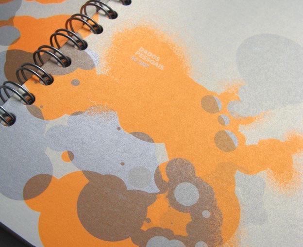
Figure 5: Metallics are spot colors, too. The designer was Filipe
Lizardo of the Flúordesign agency
How do you know what a specific type of ink looks like printed on a specific sheet of paper? A PANTONE chip book shows you what colors look like on white, but if you have a specific sheet in mind, you’re best off going directly to the paper manufacturer. Most have promotional pieces that demonstrate how various inks and coatings look and feel on their papers.
Creating a Simple Duotone in Photoshop and InDesign
A duotone is a halftone printed using two spot colors. I used the technique for the client’s brochure in Figure 6 because, in addition to showing the reader its property, I wanted to pick up on what I perceived as the Inn’s style and mood.
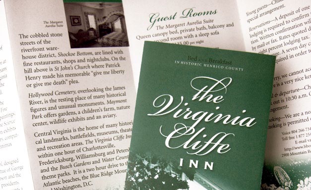
Figure 6: A duotone suits the subject of this brochure, which I designed.
Though there are some workarounds, you maintain more control when you create your duotones in Photoshop and then place them in InDesign.
In Photoshop, size your image to fit the layout and convert it to Grayscale: Image > Mode > Grayscale. Then choose Image > Mode > Duotone and select Preview so you can seen what you’re doing (Figure 7).
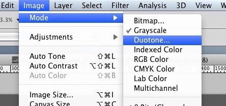
Figure 7: Creating duotones in Photoshop gives you more control than doing so in InDesign.
Next, select Duotone from the Type option and click on the second color box, under the box labeled Black, to open the color picker. Click the Color Libraries button, select a PANTONE solid color swatch library, and choose a color (Figure 8). Leave the color name as it appears in the Duotone Options window so that, when you place the image in InDesign, it will be recognized and added to the your Swatches menu.

Figure 8: Choosing the colors that will make up your duotone.
Now it’s time to adjust how colors are distributed within the highlights and shadows of the image. To do so, click the Curve box to the left of both colors and adjust the points of the duotone curve. Though there are defaults, there are no right or wrong settings. How you set the curves depends on the effect you’re attempting to achieve (Figure 9).
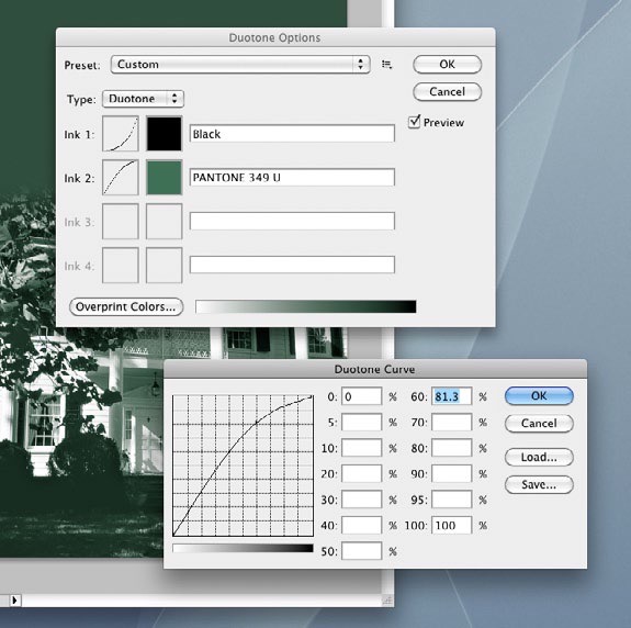
Figure 9: Adjusting how Photoshop distributes the two colors.
Save your finished image in the PDF or EPS format. When you place it in InDesign (Figure 10), the color is automatically added to your Swatches menu. Then you simply complete your layout and Package it for your print shop or output it using the printer’s instructions.
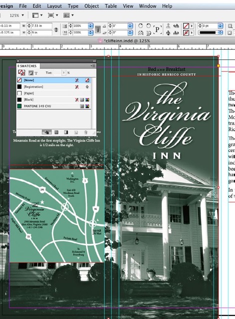
Figure 10: The duotone placed in the InDesign layout.
Using Six Colors to Save Money
I’m showing you the following project to make an important point.
The piece in Figure 11 was printed by passing the sheet through the press twice. The first time through, the printer laid down the areas of black and a spot PMS metallic silver. (The logo, some of the type, and the areas beneath the green and gold are printed in silver.) The second pass was four-color process and produced the green and orange, plus what amounts to a second hit of black. The printer used a process called “dry trap” that allows the first run to dry completely before you print over top of it. Does that sound complicated? It is. The funny part is, they produced it this way not just to achieve the desired effect, but to save money in printing the eight different brochures in the series.

Figure 11: In this brochure, the logo, some of the type, and the areas beneath the green and gold are printed in silver. Designers: Jerome Calleja, Virginia Teager-Haenni; Creative Director: David Jensen; Photography: Tom Hollar; Agency: JDA, Inc.
And therein lies my point: To design a piece that includes spot colors, uncommon stock, or an unconventional printing or finishing process, you have to think from back to front. In other words, you must know what the possibilities are—the materials, the equipment, and the talents available to you—before you can start to design it.
And, although I can generalize about ideas and techniques, I can’t generalize about commercial printers. Not only are there technical constraints to what can be accomplished on a particular printing press, but every print shop has its own way of doing things. To create interesting and innovative work, you should get to know the players. Tell your printer the type of piece you have in mind and most are more than happy to offer insights into the processes involved and specifics on preparing your piece for the press. Occasionally they may even offer a suggestion that ends up improving on your original idea.
Creating Drama with Spot Varnish
A spot varnish can be a bit mysterious-looking (Figure 12). Because it’s clear, it’s there… but it isn’t. It invites you to run their hand across its surface and to tilt it ever so slightly to catch the light and set off each glossy element.

Figure 12: Do you see the shine on the dotted lines,solid paths, and icons? That’s spot varnish. Designer: Cat Townsend, www.notpretty.net; Agency: Open Agency
There are four common materials used to coat a printed piece:
Varnish is clear ink. It can be applied, as you see in Figure 12, as “spot varnish” that is only on the areas and elements you designate, or as “flood varnish” that covers the entire surface of the sheet. Varnish is generally the least expensive coating but is also the least effective at protecting against frequent handling. It’s available in gloss, dull/matte, and satin finishes.
UV Coating is a thicker coating applied like ink and cured with ultraviolet light. It, too, can be applied as a flood or spot but is more expensive than varnish. Your money buys the highest gloss of all the alternatives and better protection than varnish. UV coating is also available in a dull/matte finish.
The other common coatings are not used for spot applications. Aqueous is a water-based coating that’s substantially more expensive than varnish but that offers better protection and durability. It’s become a standard for many printers because it provides good-looking gloss, dull/matte, and satin finishes.
Laminates are applied as a film or liquid and are the most effective at protecting against frequent handling—they can even be washed. They’re available in both gloss and dull/matte finishes and are generally the most expensive alternative.
If you’re using a spot varnish, ask your printer if they want it designated in a particular way. If they don’t, I suggest that you add a layer to your InDesign document that contains all of the elements you want varnished—type, shapes, and so on—and color them with a spot color you aren’t using for any other purpose.
I recommend naming both the layer and the spot color “varnish” and choosing a color so obnoxious that it reminds you to tell the printer that it represents varnish and not that actual spot color. Then—this is the important part—alert the printer to what you intended.
Printing with a Palette of Spot Colors
Wow. The brochure in Figure 13 was printed using three PMS colors (one fluorescent pink) and a satin aqueous coating that, as the art director put it, keeps the piece from looking “garish.” Imagine the same brochure printed in four-color process. It would be well designed but not nearly as striking. Spot colors and the coatings make it stand out in a way CMYK simply would not.

Figure 13: This brochure gets its pop from fluorescent pink and its polish from a satin aqueous coating. Art Director: Woody Holliman; Designer: Nicole Kraieski; Agency: Flywheel Design. Printer: Classic Graphics, Morrisville, NC
It’s impressive, especially when you consider that it and the other images in this article are pale imitations of the printed pieces. You can’t touch them or see the true colors. With a little exploration and experimentation, your next print piece could be equally as compelling.

GREP is what I call a “write-only” language: it’s easy enough to create a GREP expression, but sometimes very difficult to look at an expression and work out exactly what it does, especially if it’s been more than a few days since you created it. So whenever I find a useful bit of GREPness here at InDesignSecrets, in InDesign Magazine, or elsewhere, I save it. Here’s how.
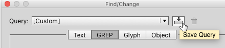
I start by typing the expression in the fields of the Find/Change dialog, and then clicking the “Save Query” button at the top right of the dialog box (just to the left of the trashcan icon). I give it a memorable name (i.e. not something like “Chuck’s GREP #42”).
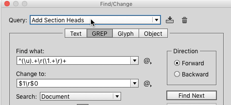
For example, I enjoyed Peter Kahrel’s “GREP of the Month” in InDesign Magazine issue #79 (November 2015), where he explained how to add section heads to an existing index. I copied his find and change strings from the article, and saved them to a query I called “Add Section Heads.” Now, whenever I need to do that, I can just pick that particular GREP query from the popup at the top of the Find/Change dialog box. Simple, efficient, and environmentally friendly.
Saving GREP Queries to Use on Multiple Computers
I have a couple of different computers that I use for InDesign, and I also work with a number of colleagues with whom I’d like to share the GREPs that I’ve collected. Unfortunately, there’s no obvious way do that. There are no Load GREP and Save GREP features like there are for swatches, styles, and other InDesign settings. But with a little bit of sleuthing, it turns to be easy: InDesign saves each GREP query that you create as a separate XML file.
Finding Saved GREP Queries in Mac OS
For Mac users, these XML files are stored in an Adobe InDesign subfolder of your Preferences folder; for exmple, Peter’s query is saved here inside the Preferences folder:
~/Library/Preferences/Adobe InDesign/Version 10.0/en_US/Find-Change Queries/GREP/Add Section Heads.xml
Your version of OS X may hide your Library folder, in which case you can get to it by holding down the Option key and choosing Go > Library in the Finder.

The Version 10.0 part of the file path will vary depending on what version of InDesign you’re using. Check the About InDesign dialog box to see for sure. In this case, 10.0 is InDesign CC2014.

The en_US part of the file path will vary depending upon the language you’re using – the magic phrase for different languages can be found in a number of places, but in particular here: https://creativepro.com/change-ui-language-indesign-cs6-cc.php.
Finding Saved GREP Queries in Windows
For Windows users, it’s a bit harder. Microsoft makes it difficult to directly navigate to the folder where these types of settings are stored, but you can do it easily by pasting a path into a Windows Explorer window:
C:Documents and SettingscwegerApplication DataAdobeInDesignVersion 8.0en_USFind-Change QueriesGREP
The cweger part of the file path should be replaced with whatever your Windows login is, and (as on the Mac) the Version 8.0 part refers to the version of InDesign you’re running – in this case, CS6 (what can I say; I still have clients I need to support who are running CS6).
Sharing Saved GREP Queries
These GREP XML files are just plain text files, so once you find them you can just copy them to another machine, or put them on a shared volume and let other users pick them up from there, or upload them to the Cloud or any other type of weather system.
Adding Comments to GREP Query Files
But wait – there’s more! If you’re feeling particularly geeky, you can add one or more comments to the XML file to remind you of what the GREP expression does. An XML comment starts with <!-- and ends with --> so you can open up your particular XML file with most text editors (TextWrangler works great on Mac, Notepad++ on Window, but there are dozens of other editors that will work – just don’t use InDesign or Microsoft Word, because we want a plain text file) and add a comment. For example, I edited my “Add Section Heads.XML” file so it now looks like this (the lines in red are the ones I added):
<?xml version="1.0" encoding="utf-8" standalone="yes"?>

<!--

This expression adds section headers to an existing index.

It was originated by Peter Kahrel on page 60 of IDM issue 79

-->

<Query>

<Header>
As always, please make sure your life insurance policies are up to date whenever you edit structured files like XML, because one tiny mistake could make that XML file not work. It won’t crash InDesign or your machine or anything, but the GREP query probably won’t work.
In this CreativePro Conversation, Chuck Weger sits down for a conversation with Washington State Senator Lisa Wellman. “A senator?” I hear you asking. Though she currently chairs the Early Learning & K-12 Education Committee in the state senate, Wellman has been blazing trails since the beginning of the modern publishing era. After working as a public school teacher, she went to work for Apple as their head of commercial publishing. She certainly has seen quite the changes through her history in the industry and still has her finger on its pulse, sitting on the Energy, Environment & Technology Committee. Lisa and Chuck give us some insights into the foundations of the creative industries we are currently a part of.
CreativePro Conversations is a new video series which brings together creative professionals from a variety of fields to talk about design, communication, efficiency, learning, and how to get the work done.
Some of these conversations come from interviews presented at our online and live events and some are informal discussions among peers. But every CreativePro Conversation focuses on one thing: how to help organizations and individuals thrive, by design.
On his PagePlane blog, designer and author Chuck Green recently proposed an interesting experiment: a logo design workshop that takes place in real time via Basecamp (sort of a private forum in which you can share images as well as text).
Workshop participants will partake in a critique of a new designer’s work; Chuck’s comments will incorporate logo design tips. Chuck is inviting both students and pro designers, and you can participate as much or as little as you wish.
For details, read Chuck’s post.
In this CreativePro Conversation, printing legend and Professor Emeritus of the Rochester Institute of Technology, Frank Romano discusses the history of type with Chuck Weger. Frank shares the backstory of how movable type changed printing, and how those early foundations eventually led to the ease with which we all browse and apply fonts in our work today.
If you use type in your day-to-day work, you won’t want to miss the insights Frank Romano has to share. He has been in the design industry for nearly 60 years and has seen it all, from metal type to web fonts.
CreativePro Conversations is a new video series which brings together creative professionals from a variety of fields to talk about design, communication, efficiency, learning, and how to get the work done.
Some of these conversations come from interviews presented at our online and live events and some are informal discussions among peers. But every CreativePro Conversation focuses on one thing: how to help organizations and individuals thrive, by design.
Poor white space, it never gets the credit it deserves. Think about it: without spaces, your text would all run together and you wouldn’t know where one word ended and the other began. According to the book Space Between Words by Paul Saenger, separating words with spaces didn’t really catch on until the tenth century; before that, it was up to the reader to decide where one word ended and the next began. Fun!!
Space between words is called “white space” because there’s no visible glyph; it’s the absence of ink. You may think there’s only one kind of white space—the kind you get by hitting the spacebar. Wrong! InDesign’s GREP allows you to search for and replace a dozen different kinds of white space, from the spacebar-created ones to complex constructs like figure spaces; to see them all, open the Find/Change dialog box, click the @ symbol, and then choose the White Space menu item. You can search for these white space characters the same as any other character.
Let’s say you’re a designer who likes to use en dashes with a space on each side – like this. But some smart aleck comes up to you and says you should really use nonbreaking spaces, so that your dash doesn’t accidentally wrap to the next line.
Type ~= in the Find What field and ~S~=~S in the Change To field to change all those ordinary spaces to nonbreaking ones.
That character (“any white space”) is also handy if you want to change every instance of more than one space to a single space. Find {2,} and change to . The {2,} construct means “anything with two or more consecutive.” Or you can use InDesign’s built-in Multiple Space to Single Space query, which does the same thing in a more verbose way.
Parting tip: When playing with spaces, it’s best to turn on Type > Show Hidden Characters.
Some of us are fortunate enough to have had a teacher who has influenced us and changed the course of our lives. These teachers are often personable, friendly, helpful, knowledgable and genuinely interested in their students’ success. Their goal isn’t to simply dish out homework, give grades, and go home once the day has ended. Their goal is higher. Their goal is to help students succeed by arming them with useful information and guidance that will lead them to success in the subject of study. Chuck Green is just such a teacher, though we won’t find him at the front of a conventional classroom. No. His classroom can be found in The Desktop Publisher’s Idea Book, now in its 2nd edition.
In previous versions of Mac OS X, experienced design and prepress users who wanted to optimize their production computers have removed nonessential system fonts, especially those which conflicted with PostScript Type 1 fonts of the same name?for example, Helvetica or Times. If you are one of those users, you should know that there’s an important change in system behavior in Leopard and a workaround.
I was informed of this change today by font guru and consulting colleague, Chuck Weger of Elara Systems, and I wanted to pass this on to InDesignSecrets readers.
The method of removing nonessential fonts has been officially documented by Apple for past Mac OS X systems. The latest resource is the PDF, “Advanced Typography with Mac OS X Tiger.” Refer to the section, “Optimizing a Production System,” beginning on page 22.
I’ll include what Chuck found in his own words. Pay special notice to Chuck’s warnings about using this technique at the end:
In the past, pro font users tended to remove problematic system fonts such as Helvetica, because they tended to conflict with the users’ own preferred fonts of the same name. These “required” system fonts were (and still are) stored in:
/System/Library/Fonts
In Tiger and earlier systems, you could delete such fonts by selecting, deleting, then authenticating as an admin. No problem (well, there were sometimes cache-related problems, but those were easily solved by adding back or enabling your own version of the deleted font, and before Tiger you probably had to clean the font cache as well).
In Leopard, however, if you delete a “required” font like Helvetica this way, it will delete fine, but then you’ll see a dialog that says “The system font ‘Helvetica’ was removed. This font file is required by Mac OS X to display onscreen text. It has been restored.” And shazam, the font miraculously reappears in /System/Library/Fonts.
So, NO WAY to get rid of such fonts? Not to worry, there’s a solution:
Navigate in the Finder (or your favorite file manager substitute) to:
/System/Library/Frameworks/ApplicationServices.framework/
Versions/A/Frameworks/ATS.framework/Versions/
A/Resources/ProtectedFonts/Here you’ll see a copy of key fonts needed by the system. Delete the font from this directory first, THEN you can delete it from the /System/Library/Fonts folder.
You’ve essentially just broken Leopard’s ability to repair itself as far as that particular font goes. But, in a pro publishing environment where your Helvetica is not the same as Apple’s choice, that’s something you sometimes have to do.
As far as I know, the major font managers have not yet been updated to deal with this change.
WARNING: don’t try this at home if you’re not sure what you’re doing. This technique should only be used by experienced design/prepress users who simply MUST control their font destiny. If you remove Helvetica (for example) in this way, IMMEDIATELY replace it with the Helvetica of your choice (PostScript, OpenType, TrueType) — but don’t put it in the /System/Library/Fonts folder, instead put it in a higher-level place, like /Library/Fonts.
And in NO case should you ever remove the Lucida Grande, Keyboard, or LastResort fonts.
Hope this helps others who battle with fonts daily.
Most Mac OS X documentation refers to a hierarchy of folders like this:
/grandparent/parent/child
The first “/” refers to the base of the file system (referred to as the “root” but not to be confused with the “root” user — oh, never mind). A single / by itself refers to the top level of your startup disk. Fonts live in places like /System/Library/Fonts — read this as “the Fonts folder inside the Library folder inside the System folder on the startup disk.”
The special character ~ (“tilde”) means your home folder. It’s the folder you get when you click the “Home” button at the top of any Finder window (see Figure 1) If you don’t see a Home button, make sure that the window’s Toolbar is visible by pressing Command-B, or by choosing View> Show Toolbar from the Finder menu, or by clicking on the oval lozenge at the top right of the window’s title bar.
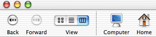 Figure 1
When you see references such as ~/Library/Fonts, you should read them as “the Fonts folder inside the Library folder in your Home folder.” The actual location of this folder depends on your short user name. In my case, my short user name is cweger, and my Home Fonts folder is located at /Users/cweger/Library/Fonts.