
Showing results for virgos today xvid promo code saudi arabia 111ft x 111ft
One handy feature in InDesign is the ability to generate QR (quick response) codes within an InDesign document. QR codes are a special kind of barcode in the form of a square mosaic pattern—you’ve probably seen them increasingly appearing on posters, advertising, and packaging. But what made the InDesign team decide to add them to their software?
Believe it or not, the development of this feature started with the Senior Product Manager, Chris Kitchener, working in his backyard, putting together a trampoline for his kids. Somewhere in the middle of the project, Chris realized he was totally lost. Fortunately, there was a QR code in the printed instructions. Chris used his smartphone to scan the code, which opened a video that demonstrated all the steps necessary to finish the job.
This personal experience showed Chris the importance of QR codes on printed material and how adding them to InDesign could benefit users.
Where QR Codes Came From and Why They’re So Ugly
QR codes didn’t start out as a means for watching trampoline videos on a smartphone. They were created in 1994 by Denso Wave, a subsidiary of Toyota. The information in the codes was used to help track the thousands of parts necessary to assemble cars.
QR codes were an improvement from the standard barcodes that are applied to packaging and books. Those codes are considered one-dimensional, as their information is read only across the code. But bar codes require quite a bit of space to be read correctly and are limited to providing only 20 digits of information. Denso Wave needed a way to put more information into a smaller area. Their solution was to create a two-dimensional mosaic pattern that is read both horizontally and vertically. This allows the QR code to represent up to 7,089 numbers or 4,296 alphanumeric characters—way more than a plain barcode—in less space (Figure 1).

Figure 1: A barcode is read in only one dimension. But QR codes can store more data encoded in two dimensions.
But coming from a manufacturing background, QR codes were never supposed to look pretty. In order to be scanned correctly, there needs to be a clear area between the mosaic pattern and any other text or lines. There also needs to be a high contrast between the code pattern and its background. However, that doesn’t mean that the codes have to be black on a white background. You can choose any combination of high-contrast colors—blue on pink, brown on yellow, red on gray. You can even put the QR code pattern on an image, as long as there’s enough difference between the pattern and the background.
Even with that degree of flexibility, it’s unlikely that many designers are initially thrilled with the thought of incorporating QR codes into their work. But once you understand the benefits of QR codes for your readers, you may feel better about making room for them in your layouts.
Types of QR Code Data
There are nine different types of data that QR codes can contain (Figure 2). However, currently InDesign can only create five of them.

Figure 2: Types of QR Code Data
How Much Are They Used?
According to an article by Marketing Charts, while not yet a mainstream activity, the use of QR codes is growing. They are especially popular in China (30% of smart phone users have used them) and South Korea (38%), with the US running a close third at 24%. They are also popular in Turkey, India, and Brazil (Figure 3). These numbers indicate that there is a use for QR code marketing in all sorts of media.

Figure 3: The Percentage of smartphone users scanning QR codes.
Unfortunately, the use of QR codes in marketing depends on educating the user base on their availability. Given the explosion of QR codes in advertising, magazines, and packaging, it’s hard to find anyone who hasn’t seen a QR code. People may not know what they’re called, but they definitely know what they look like. According to the 2013 BrandSpark/Better Homes and Gardens American Shopper Study, 83% of North American consumers are aware of QR codes, and 47% of those have used their mobile device to scan one at least once. Among those that have scanned a code, almost half did so from a magazine (49.8%), in-store sign (49.3%), or packaging while shopping (49.2%). The numbers are lower for newspapers (17.7%) and transit ads (8.7%).
The Possibilities of QR Codes
It doesn’t take much effort to see how QR codes can help any marketing plan. Many advertisers now include a code on their print ads and posters. Sadly, most of these codes only take the reader to the product’s website. But codes can do so much more!
In 2011, Macy’s unveiled their “Backstage Pass” campaign, which uses QR codes located in the stores. Customers scan the codes to open videos from Macy’s celebrity partners such as Tommy Hilfiger, Jennifer Lopez, P. Diddy, and Martha Stewart (Figure 4).

Figure 4: As shown on their website, Macy’s spells out the entire QR code process in ads and web pages.
In Austin, Texas, the bus stops for the MetroAirport bus have posted QR codes you can scan to receive up-to-date information about when the next bus will arrive as well as a route map. Tesco’s Home Plus supermarket chain in South Korea uses QR codes in a unique way. They do not have as many actual stores as their major competitor. So Tesco places photographs of store shelves in bus stops and subway stations to create virtual stores. Shoppers can then scan the QR codes for products on those virtual shelves to fill a shopping cart in their smartphone (Figure 5). The items are delivered when the commuter gets home that evening.

Figure 5: Commuters in South Korea can shop for groceries while they wait for a bus or train by scanning QR codes.
Restaurants are getting in on the act too. Several restaurants in Vancouver, BC are using QR codes to provide diners with information about the ingredients used in their meals. I visited a restaurant in Austin, Texas that has a QR code printed on their bar napkins. When I scanned it, my phone opened a web page with discounts at the various branches of the restaurant (Figure 6). I particularly liked the added message “My, you are tech savvy, aren’t you?”

Figure 6a: A QR code is printed on bar napkins at Max’s Wine Dive in Austin, Texas.

Figure 6b: When the QR code on Max’s napkins is scanned, the customer is taken to a website with discounts.
QR codes have also found a home in books. My own InDesign CC Visual Quickstart Guide uses QR codes to add multimedia to print. In previous editions of the book, I used arrows in illustrations to indicate motion in the document. However, this edition has QR codes in the margins of the book next to those illustrations. Readers can simply scan the QR code, and a YouTube video opens explaining the technique (Figure 7). This has been very helpful for showing how to use intricate features such as the Pen tool. It was particularly helpful that InDesign has a QR code creator within the application. With over 150 videos in the book, I could easily create the QR codes without leaving my InDesign layout. We also chose a cyan-colored code that matches the highlight colors in the book—much less clunky than black codes would have looked.
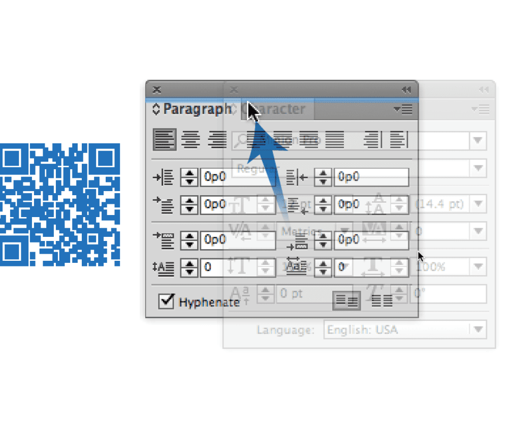
Figure 7: The static print images in a book can be augmented by QR codes that link to video demonstrations.
Tech-savvy companies have found many uses for QR codes. Google employees have QR codes with their contact information on the back of their business cards. The recipient gets to read the contact information and then scan it into their smartphone. Because all the data is encoded in the QR code itself, this works even without a web or WiFi connection.
AARP magazine ran a cover story on Hoda Kotb and Kathie Lee Gifford. Readers could use a QR code in the magazine to view a video of the two women in their photo shoot. This is the type of information that a print-only publication couldn’t ordinarily provide.
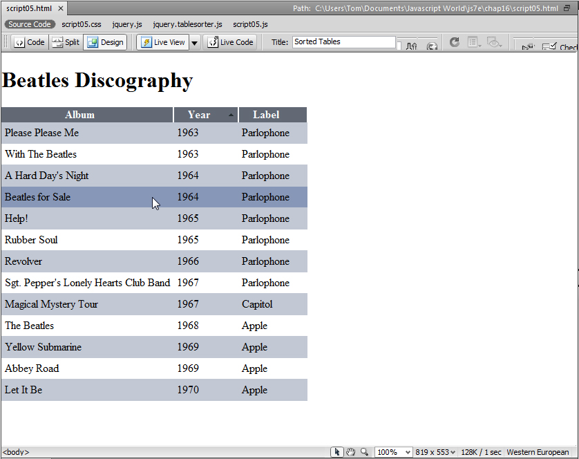
The Trada building in Boulder, Colorado has a large QR code on the outside. Scanning the code brings the viewer to the website of the company developing the building (Figure 8).


Figure 8: A QR code on a downtown building in Boulder, Colorado provides a link to the website for the developer of the building.
Taco Bell and ESPN have used QR codes in an ad campaign for the Bowl Championship Series college football games. Customers scanned QR codes on the food containers. The code took the viewers to exclusive videos of ESPN analyst Mark May previewing upcoming games.
Taco Bell has even created print ads with QR codes made from avocados and lemons. When scanned —and amazingly, they do scan correctly—they open web pages with the recipes that inspired new Taco Bell dishes (Figure 9).
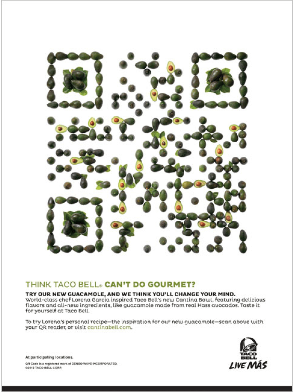

Figure 9: These two “fruity” Taco Bell ads contain actual QR codes that take readers to websites with special recipes.
QR codes don’t even have to be scanned from printed images. I recently went to an event where the presenter projected a QR code onto the screen in the room. Attendees could scan the code to then open an online survey that rated the content of the presentation.
Tell Your Viewers What To Expect
Not too long ago, it was necessary to put instructions next to QR codes explaining how to download the software that reads them and what to do with it on your smartphone. Then, you might not have needed instructions for how to use them, but you might have wanted to suggest where your customers could download the software. Today, most QR codes appear without any instructions at all. Still, you should probably tell your viewers what they can expect if they scan the QR code. For example, a QR code on a package of vegetables might have a label explaining that the code will provide recipes for using those vegetables. A QR code in an ad might explain that you can use it to send an email requesting more information about the product. Some companies also alert their viewers that there may be data charges for accessing the code information. Other uses are self-explanatory; you don’t need to explain the QR code on a business card.
Creating and Modifying QR Codes
It’s very simple to create a QR code in InDesign. Choose Object > Generate QR Code. The Generate QR Code dialog box appears. Use the Type menu to choose one of the five types of QR codes. Then fill in the appropriate fields for that type of code (Figure 10).
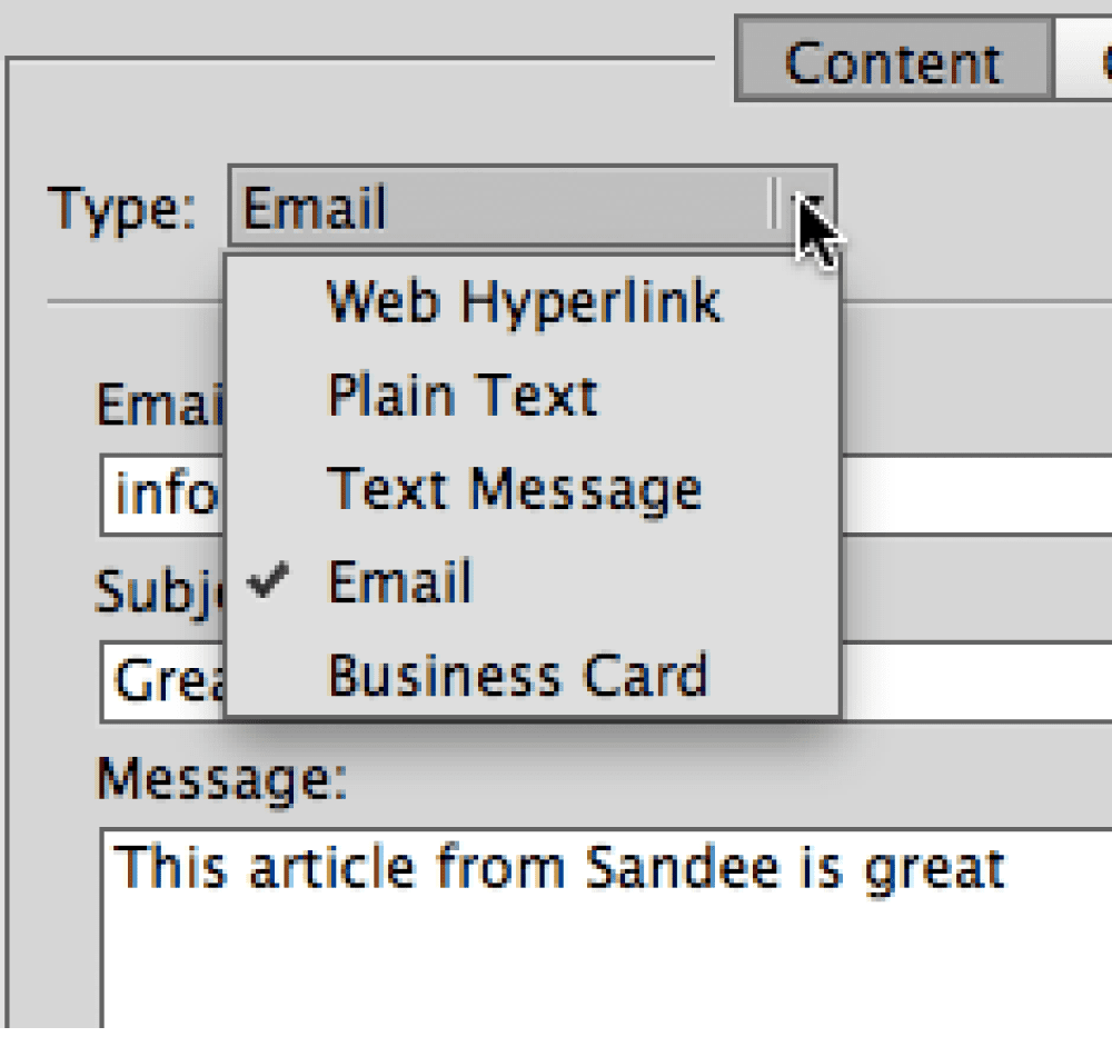
Figure 10a: Use the Type menu to choose which kind of QR code you want to create.
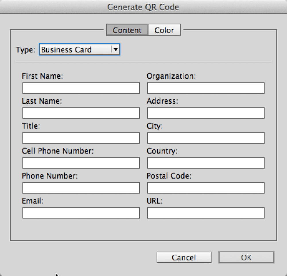
Figure 10b: The fields for a business card QR code
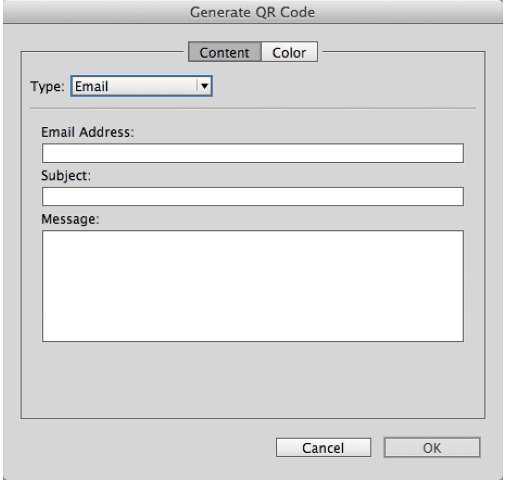
Figure 10c: The fields for an email QR code

Figure 10d: The fields for a text QR code
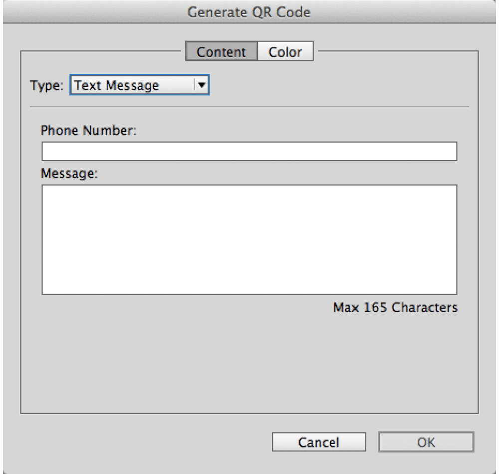
Figure 10e: The fields for an SMS text message
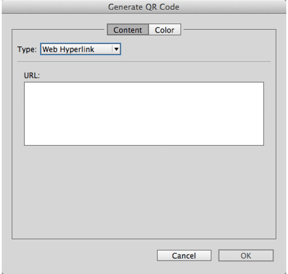
Figure 10f: The fields for a website URL QR code
Click the Color tab to select a solid color swatch (sorry, no gradients) for the QR code, and then click OK. A loaded cursor appears. You can then drag to create the QR code at whatever size you want. As they are simple vector objects, you can scale the codes to any size without worrying about resolution issues.
If you want to edit the information in the code, select it, and then choose Object > Edit QR code. The Edit QR Code dialog box appears where you can change the code.
QR codes are pretty robust, with redundancy built into each pattern. This means that a slight scratch on one part of the code doesn’t destroy the integrity of the information. It also means it is possible to add a logo to the center or side of a QR code without losing the information in the code (Figure 11). You can add a QR code to t-shirts, cups, or balloons, and it will work. Several companies are alreadycreating temporary tattoos of QR codes. These make for fun activities at corporate events. They work—even applied to the bumps and wrinkles on skin. (I suppose you could get a tattoo artist to ink a permanent one if you really wanted to, but I’ll pass.)

Figure 11: Despite the manipulations, all these codes are valid when scanned.
Editing in Illustrator
InDesign’s QR code objects are embedded PDF files, but they don’t appear in the Links panel. This means you can’t manipulate the objects directly in InDesign. But you can use Adobe Illustrator to modify the code in many ways. Double-click with the Selection tool, or use the Content Grabber to select the embedded PDF object within the frame. Copy and paste it into an Illustrator file. You now have native Illustrator objects that can be modified using Illustrator tools or pasted back into InDesign for manipulation. (See the sidebar for information about a product that does this for you within InDesign.)
But be sure to test codes that have been modified, and for best results, use them at a rather large size. Also note that you may get different results with different mobile devices. Devices with higher resolution
cameras can scan more QR codes accurately.
Software for Reading QR Codes
There are many QR code reader apps for Android phones available at the Google Play store. Even better, the Galaxy S IV and some Sony and Nokia models come out of the box with a QR scanner already installed. This trend may extend to future Android devices. Of course, the best feature for a smart phone would be pattern recognition that would automatically open a QR code reader if the code pattern appeared in the camera lens.
While Apple doesn’t include built-in QR scanners in its mobile devices, there are easily over 250 readers in the App store. Some code readers work better than others. I have had great luck with the NeoReader and Bakodo for the iOS.
Pushing the Envelope
There are countless ways to enhance print content with QR codes. Couple that with the fact that it’s almost trivially easy now to create these codes with InDesign CC, and you can’t help but get excited. If you’re like me, you’ll probably start spotting great places and uses for QR codes everywhere you go. In the meantime, here are just a few more ideas to get you thinking.
- A cookbook can include QR codes to show videos to demonstrate the tricky parts of recipes.
- Magazines can use QR codes to bring audio and video content to print versions.
- Restaurants can post QR codes at every table so diners can access a list of daily specials.
- With a QR code on a movie poster you could view a trailer, and even buy tickets.
- Household appliances can have QR codes linked to the owner’s manuals, or the manufacturer’s customer service number or email address.
And to think, all of this (and more) is possible to create with InDesign, partly because of one man’s struggle to assemble a kids’ trampoline. After reading this article, I bet you can tell how I feel about QR codes. But just in case it’s not totally clear, scan this illustration for the answer.

When quick response codes (now better known as QR codes) were invented in 1994, consumers weren’t meant to see them. Originally used to track vehicle parts, QR (quick response) codes could be scanned rapidly and accurately—but spread very slowly to other markets. To grow, these codes needed consumer acceptance, and consumers needed not only a scanning device, but also a dedicated app to read them.
All this changed in 2017 when Apple released iOS 11, which allowed iPhones to scan QR codes directly and in seconds. Suddenly, people realized they could access and deliver all kinds of information in these little squares, which could conveniently be captured from any angle. The more people became accustomed to using QR codes, the more they appeared and spread. The plain black-and-white code with its pixel-like appearance started to take on new, interesting styles. Designers began creating artwork with them and integrating them into designs.
Now, QR codes are everywhere: restaurants, museums, airports, hotels, event venues, bus terminals, libraries, and grocery stores. You scan them on business cards, packaging, receipts, clothing tags, and produce stickers. As large-scale public art pieces, they catch your eye. You can’t help but wonder: What content do they lead to?
This article will give you tips on how to create QR codes that are not just functional but also visually interesting, and share some QR code designs for inspiration.
What Makes a Functional QR Code?
Before generating a QR code, consider who will use the code and how the code will be accessed. A design that is too unusual may not be easily recognized as a QR code by less tech-savvy audiences (and may merit a text prompt such as “Scan me”—but of course this only works if the audience can read the language you use). A code that has low contrast in colors may be difficult to discern by people with low vision or in low-light conditions, such as a dim gallery or theater. Though less exciting, a black code on a plain white background is generally the safest choice for visibility.
Pro Tip: If the QR code will be placed in a context where there is content in braille near it (such as public signage or on a braille book), add a tactile indicator signaling the presence of scannable content. A specialty printer can create raised dots on the QR code itself, or you could apply a tactile sticker that says “scan the QR code below” in braille.
Size matters
For most printed matter to be viewed at an arm’s distance, QR codes are easily noticeable and scannable when an inch or wider. When creating QR codes that will be used at larger sizes, ensure the resolution is high enough for easy scannability (or better still, use a vector file). A code that will ultimately be seen at a distance or in motion (such as on a car or bus, or on a banner intended for escalator passengers to view) should be larger for the same reason.
Yet, avoid scaling a QR code so large that other things moving in the environment (like people) will constantly obscure part of it, making it difficult to scan. This is particularly relevant to QR codes intended to be applied to floors or walls.
Especially critical is ensuring the three eyeballs of the QR code remain clearly visible. The eyeballs are the larger objects in three corners of the QR code. These function like visual anchors for a scanner, allowing it to detect the presence of a QR code and locate the coded information within. The border around the eye is called the eyeframe.
Location, location, location
Also consider where the code will be placed. When designing QR codes for signage, posters, or other pieces that cannot be moved by the viewer, ensure the code appears in a position that is easy to capture in full. For instance, placing a code at the bottom of a floor-to-ceiling sign would require people to bend down to scan it, while placing it at the top would require people to arch their backs or step backwards. If the code in destined for a crowded environment (say, near a popular exhibit or a space where people will be gathered tightly), a larger size and slightly elevated position may help more people be able to access the code.
No portions or distortions
For best functionality, QR codes should appear in their original proportions and in full. This means if the code should not be distorted or cropped in the final viewing context. So printing QR codes on materials that will eventually stretch or wrinkle the appearance of the code (like shrink-wrapping or balloons) or that may be cut off randomly (like roll tape) may not be ideal.
Whenever possible, test the visibility and scannability of the code in the final use context… and, of course, make sure that it links properly to the content.
Pro Tip: When you enter a web address for the code to direct to, keep it short. Shorter addresses can be easier for the technology to process correctly and efficiently.
Generating a Basic QR Code
Many tools are available to help you generate your own QR code: Adobe Express, Bitly, Canva, QRCode Monkey, and even InDesign (Object > Generate QR Code). In Google Chrome you can right-click on the web page you’re viewing to generate a QR code for it. Each tool offers different benefits.
For instance, InDesign offers a few built-in QR code content types, such as a business card template that can help sync to a phone’s contact list, but it does not yet allow you to customize its appearance. QRCode Monkey, on the other hand, enables you to select various QR code content types, as well as to change the foreground and background colors, add a logo or image, or select different shapes for the dots, eyeframe, and eyeball.
Once generated, a QR code is ready to use. But why stop there, when you can design it even further?
Next-Level QR Codes
Rather than using a QR code straight out of your generator of choice, you can create an even more eye-catching design with it. Or you can design the code to be more integrated into the rest of your design, even to the extent it is hidden from initial view and would require a viewer to search for it.
There are essentially three categories of ways to design more creative QR codes, with endless possibilities within each. You can customize:
- The inside of the QR code
- How the QR code is framed
- The physical materials of the QR code
A word of caution: When creating artistic QR codes, ensure the code can still scan easily despite your changes. Remember, QR codes function best in their original proportions and with colors that have high contrast with the background. Also, if the code design is so artistic that it no longer looks like a QR code, you may need to include text or some other prompt to indicate the design is scannable—otherwise, it’s possible no one will use the code as you intended!
Reinterpret the interior
After generating the code, you can tweak the shapes of the code into colorful illustrations in virtually any illustration style you like (Figure 1).

Another idea is to integrate an illustration or photo with the dots of the QR code, such that the illustration appears somewhat separate from the entire code itself (Figure 2).

Rather than a solid fill, use a pattern to fill the QR code (Figure 3).

Try integrating words and letters into the code. This creates possibilities for branding, messaging, or hinting at the contents of the code (Figure 4).

You can even animate a QR code, with illustrations moving around inside the code as if in a maze (Figure 5).

Frame the QR code in a shape
Consider surrounding a QR code with an illustration or a photo, leaving most of the code as originally created. The imagery might relate to the QR code appearance or vice versa for a more integrated look (Figure 6).

This can even take the QR code out of its usual square shape, lending it a rounder look. Make sure, however, that the three eyeballs still frame the content at a right angle, allowing scanners to access the coded information (Figure 7).

The surroundings can be a continuation of the code’s interior but in the shape of something else. You can do this in ways that hide the QR code, which could be useful if you’re designing for a game or game-like context (Figure 8).

You could even integrate the code into a data visualization, inviting the viewer to scan for more information about the data (Figure 9).
The square itself can be the primary part of an illustration. This lends naturally to square-shaped objects like gift boxes and houses (Figure 10).


3D QR codes
After you create a code with a generator, you can use it as a blueprint for creating a physical, three-dimensional QR code. Whether you enjoy painting, weaving, sculpting, embroidery, gardening, cooking, or something else, you can likely find a way to create a QR code in that vein. Materials can be building bricks, fabric, thread, ribbons, beads, tiles, food, wood, foliage, tools, paper, and more. 3D codes might be used as public art, home decor, signage, marketing keychains, pet collars, or clothing accessories (Figure 11).
Tagging Out!
QR codes can be both functional and aesthetic, enticing viewers to discover what lies within their cryptic patterning. While QR code generators make it easy to have a simple, practical code, don’t stop there. Explore the myriad possibilities for making codes that are memorable, delightful, and engaging. With a little extra creativity, your next opportunity to link content can now go far beyond a typed URL—you can create something people can’t wait to scan and explore.
This article originally appeared on the Adobe Design Center.
Welcome to Part 2 of this three-part introduction to Adobe Flash. You survived Part 1 of this tutorial, where you created, set up, and imported content into an FLA file. Because you’re reading Part 2, you’re probably ready to learn more about Flash. That’s good, because more fun ensues in this part — you will create symbols, animation, and even write some simple ActionScript to make the banner function.
Note: This article uses Flash CS3 Professional. If you still use Flash 8, please read the previous version of this article. If you’re still using Flash MX 2004, you can read this even earlier version of the article.
You can also watch a video tutorial version of this tutorial series in the Creative Suite 3 Video Workshop.
Requirements
To follow along with this article, you will need the following software:
Flash CS3 Professional
Sample files:
gnome_part2.zip (973K)
Prerequisite knowledge:
Part 1 of this series
Adding Text
You need to add some text to your banner for decorative purposes. You can add several types of text to a Flash document: static text, dynamic text, or input text. Static text is useful when you need to add decorative text to the Stage, or any text that doesn’t need to change or load from an external source. Use dynamic text when you want to load text from a file or database, or change the text when the SWF file plays in Flash Player. Use input text when you want the user to type into a text field. You can take that text and send it to a database, have it manipulate something in the SWF file, and more.
You can add any of these types of text using the Text tool. For this exercise, you will add some static text to the Stage. To add static text, follow these steps:
1. Open the banner.fla document you created in Part 1 of this tutorial, and rename the file banner2.fla.
Note: If you didn’t finish Part 1 of this tutorial, didn’t feel like reading it, or lost your file, then open the source files ZIP archive that accompanies this tutorial. Inside the start folder, find banner.fla and use this file to begin the tutorial.
2. Choose Insert > Timeline > Layer (or click the Insert Layer button on the Timeline) to insert a new layer. Double-click the layer’s name and type text to rename the layer.
3. Select the Text tool (which looks like a large letter T) in the Tools panel.
4. Click near the top of the Stage and type Overworked? into the field that’s on the Stage.
5. Select the text field using the Selection tool. A bounding box appears around the text when you select it.
6. Open the Property inspector (Window > Properties > Properties) and make sure Static Text appears in the Text Type pop-up menu.
7. Change the font of the text to whatever font you prefer. You change the font using the Font pop-up menu (next to the A icon, seen in Figure 1).
8. Change the size of the font to 24 points using the Font Size pop-up menu, and see if it fits within the banner. You might need to change the font size until the text fits on the Stage.

Figure 1: Change text settings in the Property inspector until the text fits on the banner. This text has bold face and a drop shadow filter applied (using the Filters panel).
When you finish, the text should look similar in size and position to the text in Figure 2.

Figure 2: Add some static text to the banner.
9. Select the Text tool again and type Underpaid? below the text you added in Step 4.
10. Select the text field and open the Property inspector. Change the text to the same font you selected in Step 7. Then select a font size so the text is large but still fits on the Stage.
11. Repeat Steps 6 and 7 to add the phrase Gnome? below the previous two lines of text, and then use the Selection tool to select each text field and move them until their position resembles the text in Figure 3.
When you finish, your banner will resemble Figure 3.

Figure 3: You should have three lines of text that resemble this image when you finish this exercise.
12. (Optional) Open the Align panel (Window > Align) to align the text to the center of the Stage. Select a text block on the Stage, click the To Stage button in the Align panel, and then click the Align Horizontal center button. (Move the mouse over a button in the panel to see what its name is.)
13. Choose File > Save to save your progress before moving on.
Tip: For advanced text effects, you can create text in Adobe Illustrator®, save the file as an AI, PNG, or SWF file, and import it into Flash.
Using Symbols
A symbol is an object that you create in Flash. As you discovered in Part 1, a symbol can be a graphic, button, or movie clip that you reuse throughout the current FLA or other FLA files. Any symbol that you create is automatically added to the document’s library (Window > Library), so you can use it many times within a single FLA file.
When you add animation, you should always animate symbols in Flash instead of animating raw graphics (graphics that you draw) or raw assets that you import (such as a PNG file). For example, if you draw a circle using the Oval tool in Flash, you should convert that circle graphic into a movie clip before you animate it. This helps you reduce the SWF file size and makes it easier to create an animation in Flash.
In Part 1 of this tutorial, you created a graphic symbol when you imported the join_us.ai file into Flash. In this tutorial, you want to animate that symbol; therefore, you need to change it to a movie clip symbol, which has a timeline. In the following exercise, you convert a graphic symbol to a movie clip symbol in the following exercise. You will animate this movie clip in later exercises.
1. Delete the join_us graphic symbol from the Stage.
2. In the Library panel, select the join_us graphic symbol, and then right-click (or option-click) the instance.
3. Select Type and then Movie Clip from the context menu to change what type of symbol it is.
The icon that represents what type of symbol it is change from graphic symbol icon to a movie clip icon.

Figure 4: Use the Convert to Symbol dialog box to convert selected content into a symbol, give it a name, and add it to the document’s library.
4. Drag and position a new instance of the join_us movie clip symbol on the Stage.
Remember that the symbol’s name (in the library) is different than its instance name (on the Stage) because you can have numerous instances of a single symbol on the Stage. For example, you can set an instance name for the join_us symbol using the Property inspector after you drag it to the Stage from the Library panel. If you drag another instance of join us to the Stage, you assign it a different instance name. You use the instance name in your ActionScript to reference and manipulate the instance with code, and there are some naming guidelines you must follow when you assign an instance name. (I’ll discuss these later in this tutorial, in the section called Writing simple ActionScript).
Movie clip symbols have their own timelines. This means you can animate each movie clip instance on its own timeline, and on the main Timeline of the document. This is unique to movie clip instances. You will animate the movie clip in the following exercise.
Adding Animation to a Timeline
You have already used the Timeline in Part 1 of this tutorial to insert new layers and add content onto those layers. In Part 1, you added assets to the Stage and a frame on the Timeline. You might have noticed that after you add content on a frame, a filled circle appears on the frame to signify content on that frame. Whenever there’s new or changed content on a frame, it’s called a keyframe and has a filled black dot on the frame. A keyframe is a frame where you define changes in the animation, or a frame that has content on it. An empty keyframe has a hollow circle. For more information on different kinds of frames, do a search on “frames and keyframes” (with quotes) in the Help panel (F1).
You create an animation in a Flash document by adding content to a timeline. When the playhead moves across a timeline, those individual frames play; when they’re played in quick succession (like a flipbook or succession of frames on a reel of film), you can create an animation.
When you create a frame-by-frame animation, every frame is a keyframe. In a tweened animation, you define keyframes at significant points in the animation and let Flash create the contents of frames in between. Flash displays the interpolated frames of a tweened animation as light blue or light green with an arrow drawn between keyframes. Because Flash documents save the shapes in each keyframe, you should create keyframes only at the points in the animation where something changes.
Creating a Frame-by-Frame Animation
To create a frame-by-frame animation, follow these steps:
1. Choose Modify > Document.
The Document Properties dialog box opens. This is the dialog box you used to change the dimensions of the banner in Part 1. Now you want to change the frame rate for the banner.
2. Change the number in the frame rate text box to 18. Click OK to apply the new setting.
A higher frame rate means that your animation plays smoothly, more so than when you had it set to 12 frames per second (fps). Changing the fps setting means that the main timeline and movie clip timelines all play at the specified frame rate.
Note: An increased frame rate also means that there is a slightly increased demand on the user’s computer (or CPU) to render the extra frames each second.
3. Double-click the join_us symbol instance on the Stage.
This opens the symbol in symbol-editing mode (see Figure 5). In this mode, you see the movie clip symbol’s timeline, which runs independently of the timeline for the main FLA document (the one you saw prior to double-clicking the symbol). This means you can have animations that play and stop independently from animations on the main timeline. Remember that a movie clip still plays at the document’s frame rate (18 fps).

Figure 5: In Symbol-editing mode, the symbol you’re editing appears normal, while other items on the Stage are dimmed. Changes you make in this mode apply to every instance of the symbol in your FLA file.
When you enter this mode, it means you edit the symbol itself, not just the single instance on the Stage. Any changes you make on this Timeline (which is the movie clip’s Timeline) apply to every instance of the symbol you use in the FLA file.
You can tell that you’re editing a symbol by looking at the edit bar (see Figure 6).

Figure 6: Use the edit bar to navigate a document. The edit bar might be above or below the Timeline. The rightmost icon (in this case, join_us) indicates the current symbol being edited.
Scene 1 refers to the main timeline of the FLA document. You can click this button to return to the main Timeline. The names after it point to the symbol you’re editing. If the symbol is nested within other symbols, this path might contain several names. In Figure 6, you can see that you’re editing the join us symbol that’s on the main Timeline (Scene 1).
4. Select everything inside the movie clip and press F8 to convert the artwork into another new movie clip symbol. To select all of the artwork, you can click and drag the mouse diagonally over the stage, or hold Shift while you click the three keyframes in the Timeline.
5. In the Convert to Symbol dialog box, type the name nested_mc in the Name text box, select Movie clip, and then click OK.
A new movie clip is added to the library. Also notice that two layers on the timeline are now empty. You can tell that these layers are empty because the frames have unfilled circles, which represent no content, and the topmost layer has a filled circle (meaning it has content). In the following steps you delete the layers that no longer contain artwork.
6. Select the text bg layer on the Timeline and then click the Delete Layer button below the layer name (it looks like a trash can).
7. Repeat step 6 for the star layer. After you’re finished, you should only have one layer on the timeline called text fg. You can rename this layer to star if you wish.
8. Select Frame 15 and then choose Insert > Timeline > Keyframe.
Tip: Press F6 to quickly insert a new keyframe.
This command inserts a new keyframe, which means you can modify the content on that frame to create animation. Currently, the content on Frame 15 is duplicated from the content on Frame 1. When you modify Frame 15 in a future step, the modifications won’t change the content on Frame 1.
9. Select Frame 30 and press F6 to insert a new keyframe. The keyframe duplicates the content from Frame 15. That means the content on all three frames is the same.
10. Select the movie clip instance on Frame 15, and then open the Property inspector (Window > Properties > Properties).
Note: Make sure you select the instance on Frame 15, not just the frame. You can first select the frame on the Timeline (or move the playhead to Frame 15) and then select the movie clip instance on the Stage in order to see the correct context of the Property inspector, as shown in Figure 7.
11. Select Brightness from the Color pop-up menu.
12. Change the slider value to 75% (see Figure 7).
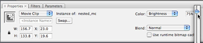
Figure 7: Change the brightness of the movie clip instance.
The brightness changes for the instance on Frame 15. The instances on Frames 1 and 30 do not change. This means that you can now add a motion tween that animates the brightness value between Frames 1 and 15, and then from Frames 15 to 30. After playing Frame 30, the playhead loops back to Frame 1 and the animation starts again.
Tip: You could also change the alpha or tint values using the same procedure. Alpha tweens are more processor-intensive than tweens that change the brightness or tint of your animation. Try to avoid processor-intensive procedures whenever possible.
13. Select the instance on the Stage at Frame 15 again, and then select the Free Transform tool in the Tools panel. Select the lower right handle and drag it towards the center of the image to make it smaller (see Figure 8).

Figure 8: Resize the instance using the Free Transform tool.
14. Click and drag the red toggle (playhead) from left to right across the Timeline.
The star should jump between large and dark, to small and “bright” (or light-colored). This is essentially a frame-by-frame animation, because the graphic changes between frames without any “tweening” applied: you have a succession of graphics that change when the playhead reaches the frame. However, in this case we do want to apply a tween to this “animation”, because it is too choppy and a smooth transition will look nicer. To learn how to apply a tween, read on!
Creating a Tweened Animation
You can create several kinds of animation in a FLA file. In this section of the marathon tutorial series, you will create a tweened animation or motion tween. A motion tween is an animation where you define properties such as position, size, and rotation for an instance at one point in time, and then you change those properties at another point in time. In this animation, you change the brightness and size of the instance (already defined in the previous exercise).
For information on different kinds of tweens, do a search on “about tweened animation” (with quotes) in the Flash Help panel (F1).
1. Select any frame between Frames 1 and 15, and then select Motion from the Tween pop-up menu in the Property inspector.
The span of frames changes color and an arrow appears between Frames 1 and 15 (see Figure 9). Notice how the options in the Property inspector are different when you select a frame compared to when you select a movie clip instance (see Figure 7 earlier).
Tip: You can also right-click (Windows) or option-click (Mac) the frame and select Create Motion Tween from the context menu instead.
2. Select any frame between Frames 15 and 30, and then select Motion from the Tween pop-up menu in the Property inspector to create a second animation.

Figure 9: Create a motion tween between Frames 1 and 15, and then 15 and 30, on the movie clip’s timeline.
3. Click the playhead and drag it across the movie clip’s Timeline to test (or scrub) the animation.
4. Select Control > Test Movie.
Tip: A quicker way to test your SWF file is to use keyboard shortcuts. Press Control+Enter (Windows) or Command+Return (Mac) to test the file.
The test environment opens where you can see the animation. Notice how it loops, appearing to fade in and out because of the change in brightness. By default, the playhead returns to Frame 1 and replays the animation after it reaches the final frame on the timeline in the movie clip. This means the animation loops repeatedly unless you tell it to stop. You will find out how to do this later in the section called Writing simple ActionScript.
Creating a Button
When you create a banner, you need to let your user click anywhere in the banner area and open a new browser window. You can create buttons very easily in Flash. Your button can either have a graphic with rollover graphics, sounds, and even animations of their own. Or you can create an invisible button. Invisible buttons are useful when you want to create “hot spots” on your website or make the entire banner clickable without obscuring your graphics. In the following exercise, you’ll add an invisible button over your banner graphics.
Tip: For more information on creating visible buttons with graphics and rollover effects, search “creating buttons” (with quotes) in the Flash Help panel (F1).
Before you start this exercise, make sure you are on the main Timeline, not in symbol-editing mode for the join_us movie clip. If you are, click Scene 1 on the edit bar (between the Timeline and the Stage by default).
1. Select the topmost layer on the main Timeline (this should be the text layer), and then choose Insert > Timeline > Layer to create a new layer. Rename the new layer button.
2. Select the Rectangle tool in the Tools panel (the button’s icon looks like a square).
3. Find the Colors section of the Tools panel and click the pencil icon to select the Stroke color control.
4. Select No Color, as shown in Figure 10. Doing so disables the rectangle’s outline.

Figure 10: Select No Color for the stroke color control.
Note: The color of the rectangle’s fill, the other color control, does not matter.
5. Click and drag the mouse diagonally across the Stage to create a rectangle.
The size (and color) of the rectangle does not matter — you will resize it later using the Property inspector.
6. Click the Selection tool in the Tools panel and then click the rectangle on the Stage to select it.
A crosshatch pattern appears over the rectangle when you select it.
7. Open the Property inspector (Window > Properties > Properties). Change the value in the W (width) text box to 160 and the H (height) text box to 600. Then change the X text box and the Y text box both to 0 (see Figure 11).

Figure 11: Change the width and height of the rectangle and then set the location of the rectangle to cover the Stage.
8. With the rectangle still selected on the Stage, press F8 to change the rectangle into a symbol.
9. In the Convert to Symbol dialog box, type invisible btn in the Name text box, select Button, and then click OK.
10. Double-click the new button on the Stage to enter the symbol-editing mode.
The rectangle is currently on the first Up frame of the button you created. This is the Up state of the button — what users see when the button sits on the Stage. Instead, you want the button not to have anything visible on the Stage. Therefore, you need to move the rectangle to the Hit frame, which is the hit area of the button (the active region that a user can click to activate the button’s actions).
11. Click the keyframe at the Up frame and hold down the mouse button while you drag the keyframe to the Hit frame (see Figure 12).

Figure 12: Click and drag the rectangle keyframe from the Up frame to the Hit frame on the Timeline.
Now even though the entire area of the banner is clickable, there is no visual appearance of the button on your banner.
12. Click Scene 1 to return to the main Timeline. Now there is a teal rectangle over the banner area. This refers to the invisible button’s Hit area. If it’s distracting to you, you can hide the button layer in the authoring environment. On the Timeline, click the dot that’s under the Eye icon on the button layer to hide the contents of that layer.
Writing Simple ActionScript
You need to add some simple ActionScript 3.0 code to your banner in order for the invisible button to open a website or send information about how many clicks the banner has received.
There are several different places you can add ActionScript in a Flash document. You can select an instance, and add ActionScript that attaches directly to that instance. To access the code, you would need to find and select that instance again. You can also add ActionScript to a frame (or multiple frames) on the Timeline. It’s a good idea to add all of your code to a single frame on the Timeline because it’s much easier to find, update, and organize when you’re working on a file. Do not attach your ActionScript to instances, which you cannot do using ActionScript 3.0 anyway.
Note: You can also keep your ActionScript in external class files that import into the FLA file you’re working on. This is sometimes the best way to organize your ActionScript, particularly when you work on larger projects and especially important in ActionScript 3.0. This topic goes beyond the scope of this tutorial, however.
Notice how your Join Us motion tween continually loops when you test it. By default, the playhead on the Timeline loops if you have content on more than one frame. Therefore, if you have content on several frames in a movie clip or on the main Timeline, it will play and loop forever. You can stop the playhead from looping by adding a single line of ActionScript. For example, if you add this ActionScript to a frame, the playhead stops when it reaches that frame:
stop();
You don’t need to add this ActionScript to your banner. However, you can add this ActionScript to other FLA files you create to stop a timeline. The stop action is an example of ActionScript that you should be aware of when you use Flash so that you can stop looping SWF files when necessary.
Before you add any code, you need to give the button a unique instance name. The instance name enables you to target the button with ActionScript code. If you don’t name the button, your code doesn’t have any way of targeting the button from a timeline. The first step is to assign the invisible button an instance name. Then you can add code that targets that button using its name.
1. Select the invisible button on the Stage.
2. Open the Property inspector (Window > Properties > Properties) and find the <Instance Name> text box in the Property inspector.
3. Type inv_btn into the <Instance Name> text box.
Note: An instance name is different from the symbols name (which is what you type in the Name text box in the Convert to Symbol dialog box). An instance name cannot have spaces or special characters but can contain underscores. Also, instance names are case-sensitive.
4. Choose Insert > Timeline > Layer to insert a new layer and then rename the new layer as actions.
5. Open the Actions panel (Window > Actions) and then select Frame 1 of the Actions layer.
6. Type the following ActionScript into the script pane (the editable text field) in the Actions panel:

In the first line of code, you see inv_btn, which is the instance name of the button you just added to the banner file. You’re adding a listener to inv_btn. In the first line of code, you register an event listener for the click event (MouseEvent.CLICK), because that’s what you event want to “listen” for with this banner. A click event can occur when a user clicks a button, and when this event is dispatched the button’s click event handler is called (buttonClickHandler, also in the first line).
The buttonClickHandler argument is what Flash Player calls once the event you’re listening for (the user’s click) actually happens. This argument is the name of a function found in the following line, and you call this function when a user clicks the button. So, now you need to define that function in your code.
So, the second line of code is the buttonClickHandler function. The function contains information about what happens when someone clicks the banner’s button. You added two lines of information inside the curly braces of the buttonClickHandler function. You have code to navigate the browser to a URL, and you request the URL for a particular web page: https://www.deseloper.com/gnome. Then there’s a second line of code with a trace statement. This statement is just for testing purposes — you know that the button code works if you see this text appear in the Output panel in Flash.
7. Select Control > Test Movie to test your code.
When you click the banner, You clicked me should appear in the Output panel. Also, a browser window should appear that opens the targeted website. If this doesn’t occur, open the finished FLA file for this tutorial (available in the finish folder of this article’s source files) and compare your code to the code in this document.
8. Return to the FLA file, and open the Actions panel. Highlight the trace statement, and click the Apply line comment button (demonstrated in Figure 13.)

Figure 13: Comment out a line of code using the Apply line comment button.
If you retest your code, now the commented out line will not execute, so the Output panel does not open after you click the banner. This line of code was used in the earlier step to check whether the button code executes when you click the button. Now that you know your button code works, you could comment out that line of test code (you can also delete it, if you don’t need to use or modify this code again).
The script in this example is a simple piece of ActionScript 3.0 code that reacts to a button click. There is much more information available about the ActionScript language in the Flash documentation (F1). Refer to the documentation’s Table of Contents for books and reference guides on ActionScript. A good place to start is Programming ActionScript 3.0 in Flash Help. There are also a few video tutorials that contain ActionScript 3.0 code in the Creative Suite 3 Video Workshop, and articles in the Flash Developer Center.
Testing Your Progress
Now you have a Flash banner with graphics and animation, which reacts to button clicks. You have completed your first interactive and animated Flash document!
Let’s take a look at the banner in action, within a browser window:
1. Return to your banner2 document and then choose File > Publish Settings.
2. Select the Flash tab in the Publish Settings dialog box.
3. Select Access Network Only from the Local Playback Security pop-up menu, to avoid possible security warnings. For more information about local playback security options, search “local file security” (with quotes) in the Flash Help panel (F1).
4. Choose File > Publish Preview (HTML).
The default browser on your computer opens and displays the banner. By default, the banner appears at the upper left corner of the HTML document.
5. Click the banner to open the web page. A new browser window should open and display a website.
6. Close both browser windows and return to the Flash authoring environment.
If you are happy with your document, save your changes and proceed to Part 3 of this tutorial, available on January 9. You might want to change the animation or text, or modify the code as necessary.
A finished version of the file is available in the source files) that accompany this tutorial. Look in the finished folder for a file called banner_pt2.fla.
Where to Go from Here
In this second part of the tutorial series, you added text, animation, buttons, and code to your document, and then tested a SWF file. Quite a bit of work in a short period of time! And, now you have an animated, clickable banner that you can export and add to a web page. In Part 3 of this tutorial, you will publish your work and take the file and add it to a Dreamweaver website.
About the Author
Jen deHaan was raised by wolves in the deep woods of the Canadian north. Canada’s chief exports include motor vehicles (or their parts), lumber, newsprint, nonmetal materials, and wheat. One overcast day in 2004, Jen left her life as a Flash deseloper (designer/developer) in Canada to write Flash documentation and samples at Macromedia in San Francisco. Aside from her ongoing work at Adobe as an instructional designer for web and video products, Jen runs several community sites for fun, and maintains a blog at www.webvideoblogger.com and weblogs.macromedia.com/dehaan. She believes that _root tends to be evil and misses Tim Horton’s coffee.
To the uninitiated, QR codes may look like nothing more than a more complicated version of a barcode. In a sense, that’s exactly what they are. But they can be used for much more than identifying products. Since pretty much everyone nowadays carries a camera in their pocket, they can quickly scan a QR code to visit a web page, start an email, and much more.

There are several online tools that allow you to create QR codes, but the file they give you is usually a raster-based image which can result in fuzzy, low-res QR codes that don’t always scan correctly in your output. Fortunately, Adobe InDesign has the built-in ability to create high-quality QR codes of varying different types. Let’s take a closer look.
Generating a QR Code
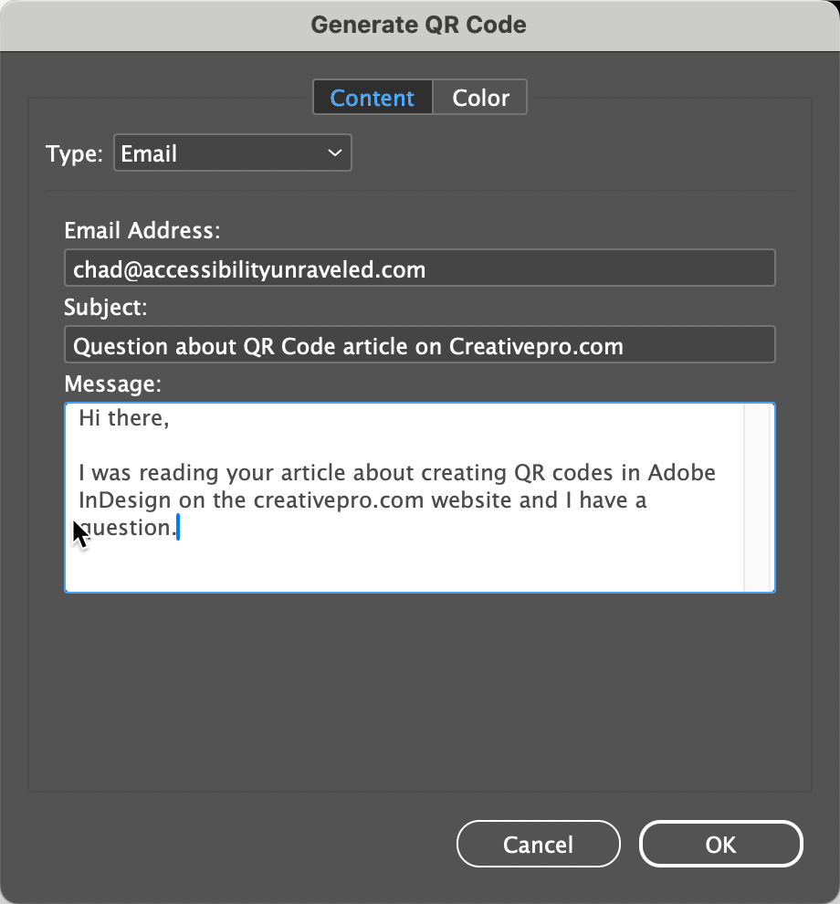
The ability to generate QR codes in InDesign has been around for quite a while. Still, I find that a lot of users don’t know about it. To create a QR code in InDesign, simply choose Object > Generate QR Code. InDesign displays the Generate QR Code dialog box where you can choose from several options for generating various types of QR Codes. They include:
- Web Hyperlink – This takes a user to a URL that you indicate.
- Plain Text – This uses the text as a query in the user’s default search engine.
- Text Message – This sends a text message to the phone number that you define and allows you to customize the message. For example, it provides a convenient way for folks to RSVP to a party invitation.
- Email – This composes an email on the device that is capturing the QR code. You can specify the recipient’s email address as well as a subject line and the message text.
- Business Card – This allows you to include contact information that when scanned will create a new user in the Contacts app on your device.
If don’t want your QR code colored with the default black, you can click Color choose a swatch.
Note: If you edit the swatch after creating the QR code, the color of the QR code will not update automatically. You have to reopen the QR Code dialog box (choose Object > Edit QR Code). Click OK to close the dialog box and then the color will update.
When you have the right type and color chosen, click OK to get a loaded place cursor. Simply click to place the QR code at the default size (a 3 cm square) or click and drag to resize the QR code as desired.

Why Make QR Codes in InDesign?
The benefit of using Adobe InDesign to generate your QR codes is that it offers you flexibility regarding what type of QR code you want to create and the QR codes generated in InDesign are vector-based so they can be scaled to any desired size without any loss of quality. You can also copy and paste them into Illustrator or Photoshop.
Adobe GoLive would likely seem a favorite with designers, given its ease of use and Adobe’s trademark user interface. Yet, even die-hard GoLive fans (and there are some) have probably considered jumping ship. Users have become all too familiar with GoLive’s tendency to corrupt site files and generate bloated JavaScript code that is next to impossible for humans to decipher and tweak. Add in its less-than-stellar performance and GoLive has been losing the little ground it had to the likes of Dreamweaver MX 2004.
Adobe appears to be trying to reverse this trend with GoLive CS by adding innovative features, improving on existing ones, and offering tighter integration with other Adobe products than ever before. Packaging GoLive CS along with the Premium version of Adobe Creative Suite makes the application available to a new set of Adobe customers who might have shied away from Web site design before but may consider it now (after all, it’s cheap when purchased with the other programs).
So let’s see what new and improved features Adobe has been working up with GoLive CS and whether it all adds up for you to opt for the new version.
Smarter Objects, Guides, and Rollovers
Introduced in GoLive 5, Smart Objects allows you to create a dynamic link between other Adobe application’s native formats with which GoLive generates a Web-friendly file. Whenever you perform a change such as sizing of the Smart Object or edits to the source file itself, GoLive goes back to the original source file and regenerates the Web optimized file. GoLive CS improves upon this already remarkable feature in variety of ways.
It’s now possible to resize a Smart Object image while maintaining its original proportions (see Figure 1). You can also crop a Smart Object, which works very much as it does in Photoshop, except only the optimized file is cropped, thereby leaving the source file intact. The new cropping feature also lends itself to the Tracing Image tool that allows you to use a ghosted background image as a design template. When cropping out a section of a Tracing Image, a new Smart Object is created. And to keep things manageable, all the Smart Objects used in your site now show up in their own folder in the Extras tab of the Site window and in the Library palette for easy access.
 Figure 1: Smart Objects now include better controls for proportional scaling and cropping.
Although you can’t drag guides out from the rulers as you can in every other Adobe application, GoLive CS includes Smart Guides that assist in lining up elements within a layout. Relevant guides appear when you drag an element near to another element and the element snaps into place when you release it (see Figure 2). This feature behaves similarly to Smart Guides found in Illustrator.
 Figure 2: Smart Guides appear whenever you drag an element close to another element’s shared axis.
Rollovers get a nice shot in the arm in GoLive CS. Not only do Photoshop CS, ImageReady CS, and GoLive CS generate the same reasonably lean, human-decipherable rollover code, it’s interchangeable as you jump back and forth between these applications. The newly combined Rollovers & Actions palette makes it possible to produce self- and remote-rollovers that aren’t limited to trigger events on images. GoLive can now even detect rollovers by looking for common suffixes to filenames such as “-out, -over, -down” as you add the main graphic (see Figure 3). It then automatically builds a tidy, working rollover for you, allowing you to concentrate on more pressing matters than fussing over rollover code and preloader scripts. All these features add up to a tremendous amount of flexibility and power to be creative as you design and build your Web sites.
 Figure 3: No more fussing with simple rollovers. GoLive can now detect a rollover setup and hook up all the code for you.
Code Complete
Although GoLive’s strong suit has always been its familiar (dare I say, WYSIWYG?) manner of laying out your Web pages, the coding features and tools found in this release make it just as easy to write code from scratch. To strengthen GoLive’s coding muscles, Adobe has added code completion, an updated JavaScript editor, and a new JavaScript debugger along with an organized interface to create, edit, manage, and preview your Cascading Style Sheets (CSS) all in one place (see Figure 4).
 Figure 4: The newly revamped CSS editor is now one window for creating, editing, managing, and previewing your styles.
Whether you feel right at home completely coding your pages or like to switch between layout and source code mode, code completion will certainly help you along the way. As you begin to type a tag, property, or any other valid bit of code, GoLive CS searches for appropriate choices to complete the statement and offers them in a popup menu beside the text you’re typing (see Figure 5). Dreamweaver has had this for a while now and it’s nice to see GoLive follow suit. However, GoLive’s code-completion feature does not offer up available CSS classes in your working document as Dreamweaver’s does. Nevertheless, code completion is an essential aide for anyone comfortable working with code.
 Figure 5: Code completion is a feature that finally finds it way into GoLive’s code views.
Over the past few years, CSS has earned acceptance as modern, capable browsers began to support the language’s powerful presentational capabilities. Almost gone are the days of using tables and spacer GIFs to impose your Web design out of HTML. CSS allows for exact positioning and formatting of HTML elements yet coding and applying it correctly is a daunting task that shouldn’t be taken lightly.
Fortunately, GoLive has had an excellent visually oriented CSS editor for some time, adding a code view in a recent release. In GoLive CS, Adobe has consolidated the CSS editor into one manageable window that provides both a graphical and code view along with preview pane that allows you to see what your style definition will look like before ever applying it (see Figure 6). You can even call up a mini-preview of the CSS class you are about to apply to a selected element in this context. All these improvements to the CSS editor go a long way toward making it easier to work with CSS — something we should all find ourselves doing more of, if we haven’t already.
 Figure 6: Before you apply a style you can hover over its name and preview it.
For GoLive CS, Adobe has licensed the rather capable Opera rendering engine just as Macromedia has done for their Web design applications. By using this engine, Mac users are offered a true-to-life rendition of what the final layout with look like on modern browsers, since the rendering engine is based on one. The Windows version still uses Internet Explorer’s built-in rendering engine.
If you became disenchanted with GoLive in the past because of the large amounts of nefarious code it has been known to generate, you’ll be happy to know that the Adobe developers have gone to great lengths to make the code generated by GoLive CS as compact as possible while keeping it easy enough to go in and tweak — something that was next to impossible to do in previous releases. If you’re just getting into coding yourself, the product comes packed with a bunch of ready-to-go snippets of code to get you off and running. XHTML support found its way in GoLive 6 and the validation feature still holds its ground with Macromedia Dreamweaver MX 2004’s browser-checking feature. All these code-related features and more, make GoLive CS a formidable coding tool hiding behind a versatile Web layout tool.
Pros: Better features for working with CSS; improved Photoshop integration; new Live View and Live Code more accurately render web pages within Dreamweaver.
Cons: For Mac users, new interface takes over your screen, and requires some retraining for all longtime users.
Rating: 85
In the tenth major version of any professional application, most of the basics are already taken care of. So it is with Dreamweaver CS4. This version successfully continues Dreamweaver’s movement toward building properly structured, standards-compliant Web sites. Whether you’re a designer or a Web programmer, Dreamweaver CS4 makes it easier to work with today’s sites, split up as they are between HTML, CSS, and script files. Add tighter integration with Photoshop for creating Web graphics, and this is an upgrade worth paying for.
Getting Started
To run Dreamweaver CS4, you’ll need Windows XP SP2 or Vista, or Mac OS X 10.4.11 or later. On the Mac, you’ll also require a PowerPC G5 or Intel-based Macintosh. I installed Dreamweaver CS4 as part of the CS4 Master Collection package on Macintosh and as a standalone program on Windows. Installation on the Mac took a long time (almost an hour), as is now familiar when installing an Adobe suite. Windows installation took much less time because there was so much less to install.
Hey, This Looks Different…
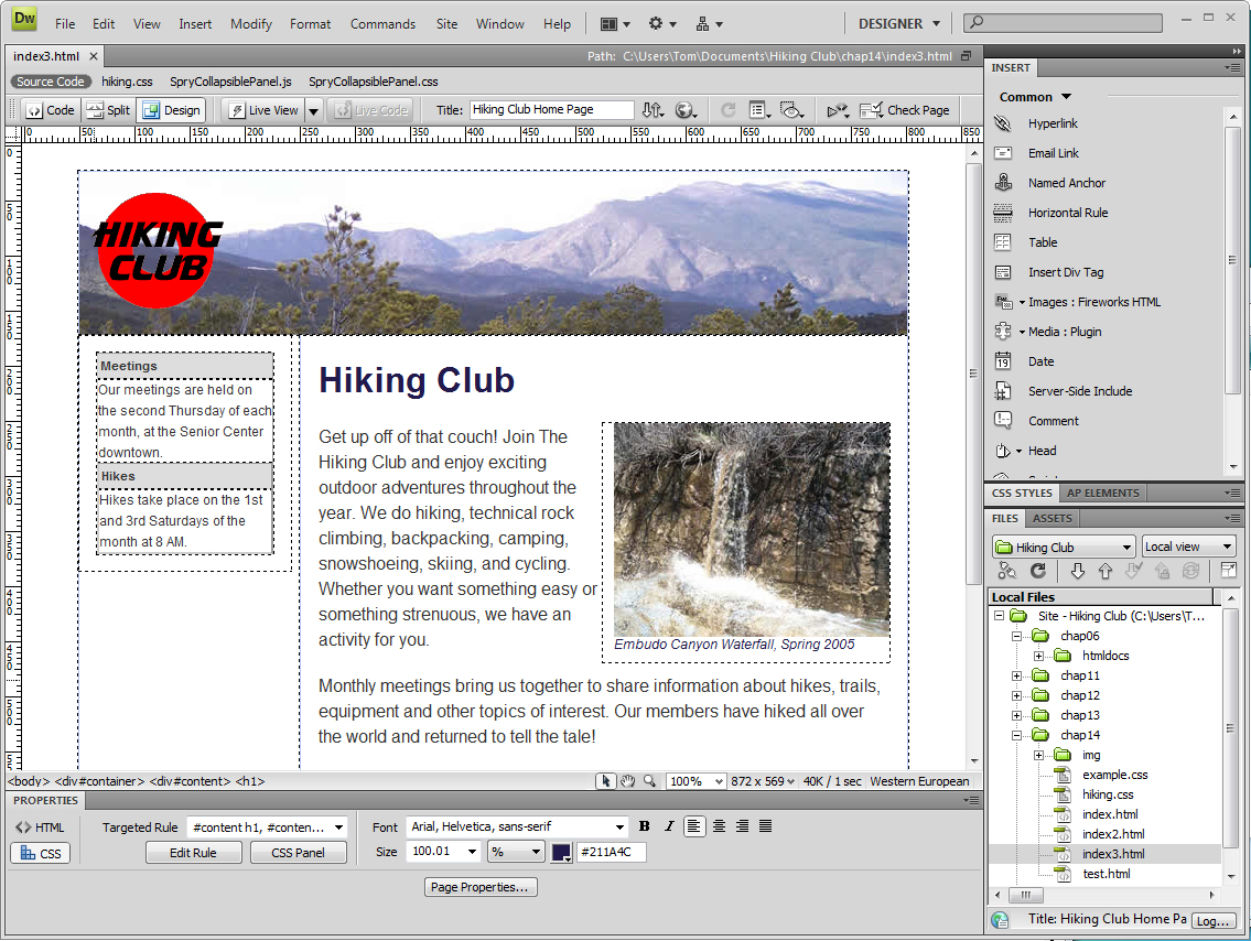
The first thing you’ll notice when you open the program is the tweaked user interface. Dreamweaver now uses OWL, the cross-platform OS Widget Library meant to unify the user experience across all the Adobe applications (Figure 1).
Figure 1. The Dreamweaver interface, like all of the programs in the CS4 suite, has become more panel-oriented, banishing the old Insert Bar to the panel dock on the right side of the screen, where it becomes the Insert panel. Click on the image to see a larger version.
You can pull panels out of the panel dock to become free-floating windows, or you can collapse the panels to icons for more document space. Clicking on the panel icon causes the panel to fly out so you can use it (Figure 2). You can arrange panels however you like, and you can save your workspace so it’s always available to you. Dreamweaver comes with several workspaces optimized for designers, coders, and application developers.
Figure 2. If you need more screen real estate, you can collapse the panels to icons. Clicking a panel icon causes the panel to fly out and appear. Click on the image to see a larger version.

One drawback to the OWL interface, especially for Mac users, is that it really wants to take up your entire screen. When I open a document on my 20-inch monitor, Dreamweaver’s document window, toolbars, and panels cover up all background programs. You can shrink the document window, but the toolbars and panels stick stubbornly to the top, bottom, and left sides of your screen. In this way, the interface acts more like a maximized Windows program, which isn’t expected behavior on the Mac and sometimes gets in your way.
Longtime Dreamweaver users may be a bit disoriented at first, because the Insert bar has become the Insert panel. In fact, the whole interface has become more panel-oriented. Tip: If you’re more comfortable with the Insert bar, just drag the Insert panel out of the panel dock on the left side of the screen, and to the top of your screen, where it will turn back into the Insert bar.
New to Dreamweaver CS4, the Property Inspector now has two tabs, HTML and CSS (Figure 3). Depending on which tab you’re on, Dreamweaver applies properties of that type. For example, if you’re on the HTML tab and click the Italic button, Dreamweaver applies the style using the HTML <em> tag. If you’re on the CSS tab of the Property Inspector and click the Italic button, Dreamweaver walks you through creating a new CSS style rule for the selection.
Figure 3. The Property Inspector is now split into two tabs, one for HTML properties and the other, shown here, that helps you apply CSS styles. Click on the image to see a larger version.
Adobe has removed some features of the program that are either obsolete or not in line with current best practices for building Web sites. The old Table Layout mode is gone, and good riddance, as CSS-based layout is the way to go for modern sites. Other now-departed features include Timelines; the Site Map tool; server behaviors for ASP .NET and JSP; and Flash Buttons and Flash Text.
What You See Is a Whole Lot Closer to What You’ll Get
Web designers have long had to contend with the HTML and CSS rendering differences between browsers. Pages that looked great in Firefox, for example, might look terrible in Internet Explorer. In the past, Dreamweaver’s Design view rendered pages — sort of — but you still had to preview Web pages in several browsers to see what they would really look like to users (Figure 4).
Figure 4. Dreamweaver’s Design View shows only a basic table and doesn’t render the effects of the attached CSS and JavaScript files. Click on the image to see a larger version.

Dreamweaver CS4 goes a long way towards true WYSIWG with the new Live View. Incorporating WebKit, the cross-platform rendering engine used by Apple’s Safari and Google’s Chrome browsers, Live View gives you a much more accurate view, right in Dreamweaver, of how your page will look in browsers that support Web standards (Figure 5). It even renders the CSS and runs the JavaScript. The prudent designer will still preview pages in all browsers that your site targets, but with Live View, you can get farther, faster when developing your sites.
Figure 5. When you switch to Live View, Dreamweaver shows you the CSS styles applied to the table, and you can see that the row under the cursor is highlighted, thanks to a combination of JavaScript and CSS. Click on the image to see a larger version.
The new Live Code complements Live View, because when you switch it on, it splits the window (Dreamweaver adds a vertical split to the previous horizontal-only Split View) so that your code is in one pane and the Live View in the other. With Live Code, you can interact with the page in the Live View pane as a user would in a browser, and see how your actions generate new code in a browser in the Live Code pane (Figure 6). You can even temporarily lock the code while performing a particular action to troubleshoot problems.
Figure 6. In Live Code, the screen splits and you can see how the JavaScript is rewriting the HTML code on the fly. If you look closely at the class in the Code pane for Sgt. Pepper’s, you’ll see that the class has been changed to “odd over” because the cursor in the Live View pane is over the entry for that album. Click on the image to see a larger version.
Finding Your Code
Code jockeys will also be pleased at two more new features that help you find and change code faster. Related Files shows the names of the support files that are often attached to HTML pages (such as CSS or script files) in a handy toolbar at the top of the document window (Figure 7). Clicking one of the names switches Dreamweaver to Split view and opens the document in the Code pane.
Figure 7. The Related Files bar makes it easy to jump to attached CSS or JavaScript files, and to display the source code for your HTML page. Click on the image to see a larger version.
If you’ve ever spent time tracking down which linked stylesheet is affecting a particular element on a Web page, then the new Code Navigator is for you. When you place the cursor over an element and Alt-click (Option-click on Mac), the Code Navigator window appears, showing the related stylesheet(s) and rules that apply to the element (Figure 8).
Figure 8. When you want to quickly find out the properties for a particular element on your page, the Code Navigator makes it easy.

Hovering over a rule pops up a tooltip with the rule’s properties. Clicking the rule’s name switches Dreamweaver to Split View, with the rule’s stylesheet in the Code pane, and the cursor placed in the rule, ready to edit. Code Navigator is a great tool when you’re building or maintaining a site, especially if you’re taking over a site from another designer and trying to figure out the style structure.
If you’re working on big sites that use the Subversion version control system, Dreamweaver can now act as a limited Subversion client to check files in and out of the repository. However, it’s not a substitute for a full Subversion client program.
Getting Chummier with Photoshop
It’s no surprise that Adobe has brought closer integration between Dreamweaver CS4 and its graphics powerhouse, Photoshop. In Dreamweaver CS3, you could copy images (and image layers) in Photoshop and paste them into your Web page layout in Dreamweaver, after a conversion step where you specified which graphics formats you wanted (PNG, JPEG, or GIF).
In Dreamweaver CS4, you can place Photoshop documents directly into the program, where it becomes a Smart Object; that is, it maintains a link to the original Photoshop .psd file (Figure 9).
Figure 9. The red curved arrow indicates that this placed Photoshop graphic is out of sync with the original Photoshop document.

When the .psd file is updated, Dreamweaver recognizes that it has changed and alerts you to update the copy in the Dreamweaver document (Figure 10). This means that you can use a single .psd file in many different pages of your site. When you update the Photoshop file, you’ll update all the copies throughout the site at once.
Figure 10. When the graphic on your Web page and the original Photoshop document are in sync, the curved arrows are both green.

Look Ma, No Database!
Dreamweaver has long had the ability to interface with a server-side database to create dynamic Web sites, but this requires serious database and programming knowledge.
Dreamweaver CS4’s new HTML data set feature allows you to store your data in a standard HTML table, a series of div tags, or an unordered list. Through a wizard, you integrate the data into a dynamic table that’s displayed using the Spry framework for Ajax. Spry is Adobe’s JavaScript and CSS library that lets you place user interface elements or effects on your Dreamweaver pages. The wizard gives you several options for displaying the data, and when users load your page, they can interact with the page to sort or display detailed information, drawn on the fly from the data document.
The cool thing about the HTML data set is that other people without layout skills can update the data document. Thanks to the dynamic page generated by Spry, the results will still look good.
One interesting development that appeared after Dreamweaver shipped was the availability of widgets from other JavaScript frameworks on the Adobe Exchange Web site, including widgets based on Yahoo Interface Library (YUI), jQuery, and MooTools. This indicates that Adobe wants to give Dreamweaver users access to the fruits of other developer’s labors. Previously, if you wanted to take advantage of any JavaScript framework other than Spry, you needed to integrate it in Dreamweaver’s Code View. Now, you can do it without needing to dig into the code; after you install third-party widgets with the included Extension Manager, they appear in Dreamweaver’s Insert panel.
To Upgrade or Not?
Pricing for Dreamweaver is unchanged: It’s $399 for new purchasers, and $199 for upgrades from Dreamweaver MX 2004 or later, or GoLive 5 or later. Upgrades from the standalone product to the CS4 suite are more complex, ranging from $599 to $1,399, depending on which version of the suite you want. See the Adobe Web site for complete details.
Dreamweaver CS4 still reigns as the premier Web design program, and owners of Dreamweaver 8 or earlier shouldn’t hesitate to upgrade. Dreamweaver CS3 owners have a bit more difficult decision, but if you do a lot of site building from scratch, the better handling of CSS, Live View, Related Files, and the Code Navigator will save you a lot of time and should quickly justify the upgrade cost.
Data Merge QR Codes were a feature added to InDesign CC 2014. The instructions provided by Adobe for creating variable QR codes in InDesign may provide a false sense of security for most end-users. Adobe’s help site shows the QR code feature as “Enhanced Data Merge” towards the end of the page, and spells out the specifics of how the code must be written.
This said, it means that QR codes are not applied the way most users would imagine. For example, if someone wanted an email address to appear as the QR code so that the result (once scanned) will send an email to a given address, it means they cannot use a field already in a database and apply the QR code field from the Data Merge panel. Instead, a new field must be created specifically for the records that are to appear as QR codes.
Here are the essentials:
- The record that contains the information to become a QR code must be a field of its own
- The field header must have a hashtag at the start of the field name (e.g. #code)
- The codes will always display as black, though the background color can be changed.
- The QR codes have to be written containing any necessary metadata specific for their purpose.
This is where most InDesign users may encounter problems, especially if they are unfamiliar with QR code metadata, and how to easily apply this metadata to existing information in a database. Before tackling this issue, it is important to understand what is going on. Put simply, at the start of the QR code, there is information that tells the QR code reader what kind of data is about to be parsed, for example:
- SMSTO: send an SMS;
- URL: load a web page in a browser;
- TEL: call a given telephone number
It is also possible to include more information so that the QR code reader can provide further information for the code being scanned, such as names and addresses for “virtual card” information.
The Adobe Help page lists five different ways that the metadata can be written, such as Plain Text, Web Hyperlink, Text Message, Email, or Business Card. However, any metadata available for QR codes can be used, provided the metadata is written correctly. This allows the QR codes to contain information such as Geo-location coordinates. A list of ways of writing the metadata can be found on this page.
It is also of note that there are several ways to write the code for contact information. While the Adobe Help page suggests using the VCARD method, the MECARD and BUSCARD methods also work.
As for the code to send an email, I initially had difficulty following the instructions on the Adobe Help site, so I used an alternative coding method – the W3C standard (rather than the MATMSG standard as suggested in Adobe’s Help). Eventually, I discovered that the code on Adobe’s Help page is incorrect:
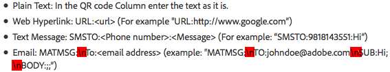
MATMSG:TO:johndoe@adobe.comSUB:Hi;BODY:;;”
It is missing a character and contains unnecessary data. It should read:
MATMSG:TO:johndoe@adobe.com;SUB:Hi;BODY:;;
The problem – the semi-colon was missing before the SUB, and the (new line instruction) is not necessary given that the semi-colons indicate the end of a line.
So, the question is how to use a database that has no dedicated QR code field so that InDesign can apply variable QR codes. Assuming the data is supplied as a Microsoft Excel spreadsheet, the answer lies in a formula type called Concatenation.
For example, take the following cards that need a QR code to email the consultant. The Excel file only contains the email address of the consultant, so a new field that will become the syntax for the QR code must be created. In this example it will be called #Qremail.
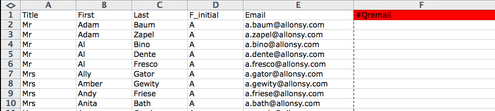
To accomplish this task, use the concatenate function of Excel. This function is used when entries in several cell must appear together in the same cell.
In the first empty row of the newly created field, use the formula builder to create the following formula that includes the concatenate function.
=CONCATENATE(“MATMSG:TO:”,E2,”;SUB:Hello “,B2,”;BODY:;;”)
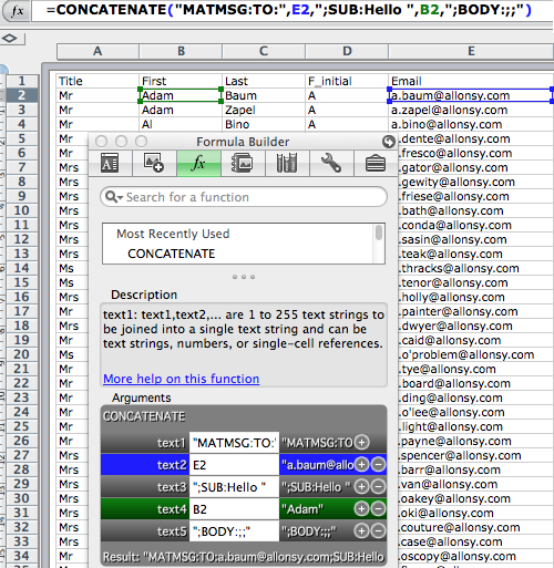
This will give the following result based on the email entry in the first row:
MATMSG:TO:a.baum@allonsy.com;SUB:Hello Adam;BODY:;;
Entering the syntax in this fashion will yield an email that is sent to the email address, and contains a subject line:
Hello First (where First = the first name of each person in the database above)
This example uses an email address, but it also demonstrates the power of the Concatenate function. If you’re creating QR codes for virtual cards, I would definitely recommend using a similar procedure utilizing the Concatenate function.
This formula can now be copied for the rest of the spreadsheet, and the spreadsheet saved as a tab delimited text file (CSV is possible, but the tab delimited text file format is my preference when dealing with complicated punctuation, as the database is less likely to create unexpected side effects thanks to a wayward comma or quotation mark). Close the newly saved .txt file before returning to InDesign.
Once back in InDesign, select the data source from the Data Merge panel and choose the newly saved .txt file. Once updated, the panel will indicate what fields will yield QR code information with a QR code icon. Once a QR code placeholder has been placed into an InDesign file, it displays with a blue dotted line.
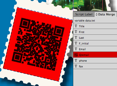
The file can then be merged to a new file or PDF for output with the QR codes displaying correctly. Try scanning the sample below!

Pros: Supports the popular WordPress, Joomla!, and Drupal content management systems; makes working with CSS easier; improved features for coding in PHP; more page preview options.
Cons: No HTML5 or CSS3 support out of the box.
Rating: 85 out of 100
The Web is all about change, and Web designers who fail to constantly adapt to change often need to find another line of work. The nature of Web sites has evolved drastically in the past few years. Sites with static pages, edited occasionally by hand, are fading fast. Today, many commercial and personal Web sites are built with content management systems (CMSs), which build pages dynamically by pulling from databases containing HTML, code, images, and other elements. Adobe has finally recognized that shift, and Dreamweaver CS5 is now relevant in the world of CMSs. At the same time, CS5 has goodies for long-time users who never create CMS-based sites, offering better and easier control over your site’s CSS than CS4. With an addition, it will satisfy people who want to use Dreamweaver to work with sites based on emerging Web standards, such as HTML5 and CSS3.
Support for Content Management Systems
Perhaps the biggest new feature in Dreamweaver CS5 is the ability to work with sites that are built on the foundation of a Web content management system (CMS), which are applications running on a Web server that create and manage Web content. The CMS manages and controls a dynamic collection of Web material and usually (but not always) assembles and creates Web pages that are served to the user “on the fly”; that is, the page is built and sent to the user when the user requests the page. Unlike static HTML, pages that come out of a CMS often don’t exist at all before the CMS software puts together the HTML, CSS, images, and scripts, and squirts them over the Internet to a user’s waiting Web browser.
Dreamweaver CS5 supports three of the most popular PHP-based Web CMSs: WordPress, Joomla!, and Drupal. (PHP is a programming language that typically is installed and runs on Web servers.) You can now use Dreamweaver to author, edit, and test content from any of these systems. You can view dynamically generated pages on a CMS-based site inside Dreamweaver; discover the related files used by the CMS and edit them in Dreamweaver; and filter down those files to find and work on the ones you need to make changes to your site.
Because Web pages served by a CMS are assembled from many different elements (often dozens or hundreds of PHP, HTML, JavaScript, CSS, and other types of files), you often don’t know exactly what the page will look like until you preview it in a Web browser. When you set up Dreamweaver’s connection to a CMS-based site, you specify the server on which the site is running. To view a page on the dynamic site inside Dreamweaver, you use Dreamweaver’s Live View, which was introduced in Dreamweaver CS4. Live View renders pages in the Dreamweaver document window using WebKit (the same page rendering engine found in Safari, Chrome and other standards-compliant browsers). In effect, it’s like having a Web browser built into Dreamweaver.
Figure 1. This WordPress page is being read from the server and displayed in Dreamweaver’s Live View. Click the image below for a larger version.

As part of loading the page in Live View, the program works with the supported CMSs to discover all the files that go into building the page. Dreamweaver then lists them all in the Related Files toolbar. You can then open any of the related files and edit it using Dreamweaver’s tools. Dreamweaver makes it relatively easy to do something that was previously quite difficult and required serious expertise in a particular CMS: find the particular related files you need. Because there can be so many files, Dreamweaver lets you scroll the Related Files toolbar and filter the file types it shows. You can even create custom filters to display files based on parts of their names.
Figure 2. You can use the Related Files toolbar’s Filter pop-up menu when you want to display and focus on certain file types. Click the image below for a larger version.

Pages generated by a CMS are based on templates that control the site’s look and feel. Because the content of the site is separate from its presentation, you can easily change the entire look of the site by modifying or switching the site’s templates. You can now use Dreamweaver to build and modify CMS templates, then test them with your sites.
Navigating Your Sites
In CS4, Live View couldn’t follow links, so you couldn’t easily explore your sites within Dreamweaver. That problem is fixed in CS5. Live View navigation allows you to interact with server-side applications and dynamic data. You can use the new Browser Navigation toolbar to enter a URL to inspect pages from a live Web server and edit pages you’ve browsed to, as long as they exist in one of your locally defined sites (Figure 3).
Figure 3. The new Browser Navigation toolbar has an address bar and allows you to easily browse your sites without needing to resort to a separate Web browser.

Better Control Over Your CSS
Two new features make it easier to write, modify, and work with cascading style sheets (CSS), an essential task with today’s sites. Dreamweaver was already no slouch in this department, so the new features are really icing on the cake.
The first feature answers the designer’s questions, “Just what does this CSS property do? Do I need it here?” CSS Disable/Enable lets you turn individual CSS properties off and on directly from the CSS Styles panel, allowing you to easily test and see the effect of the property. This works with and without Live View on; just click next to the property in the CSS Styles panel, which toggles an icon with the circle-and-slash No symbol.
The second new feature, CSS Inspect mode, works with Live View to let you visually display the CSS box model properties (Figure 4). You can see an element’s padding, border, and margin without needing third-party tools like Mozilla Firebug. Hover over an element on your page, and it displays with an aqua background, yellow margins, lavender padding, and gray borders. But that’s not all—as you hover over various parts of your document, the CSS Styles panel (in Current mode) dynamically updates to display the rules currently in effect. If the element is generated by JavaScript or a server-side script (as would be found in a CMS-created page), you can view and modify the CSS for an element that would not normally appear in either Code or Design views.
Figure 4. In CSS Inspect mode, hovering over an element on the page visually displays its CSS properties.

If you also turn on the Live Code feature (introduced in Dreamweaver CS4), the document window splits into two panes to show you the underlying code, with the content under your mouse highlighted in both panes. Live Code highlights changes as they happen, allowing you to quickly locate the dynamically loaded data or code changes triggered by JavaScript (Figure 5). The addition of CSS Inspect to Live Code is a nice enhancement to an existing feature.
Figure 5. When you have CSS Inspect and Live Code both active, hovering over a page element is reflected in both the code and rendered views. Click the image below for a larger version.
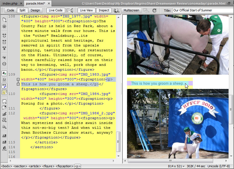
Making Codeheads Happy
If you’re a coder, there are several new features for you. Dreamweaver CS5 expands support of Subversion version-control servers so you can move, copy, and delete files locally, and then synchronize changes with the remote depository. If you don’t like the changes, you can now revert them from within Dreamweaver.
If you’re a PHP programmer, there are many new features aimed at you. The PHP code hinting has been greatly improved, so that as you type your PHP code and press Ctrl-Spacebar, Dreamweaver pops up function names and appropriate properties (Figure 6). If you need help with syntax, you can get documentation for the function you’re entering, provided from the PHP web site.
Figure 6. Improved PHP code hinting includes help with a function’s syntax and parameters. Click the image below for a larger version.

Dreamweaver has PHP code hinting presets for WordPress, Joomla! and Drupal.
Other Enhancements
One of the most vexing problems for designers is making sure their pages will display acceptably across different browsers and computer platforms. Most of us don’t have the resources to maintain a lab of computers with different operating systems and browsers so we can test sites in the myriad potential combinations. Adobe’s online service, BrowserLab, shows you how your page will be rendered by many different browsers and versions, under several different operating systems. Adobe BrowserLab uses Flash to display its emulated page renderings in a browser. You can choose which browser or browsers you’re emulating, and you can view rendered pages in a two-up mode, viewing them side-by-side to see the rendering differences.
Dreamweaver CS5 can now preview pages directly to BrowserLab, just as if it were any other browser. When you preview to BrowserLab, Dreamweaver sends the page to the service, which then renders the page as it would appear in whatever combination of browsers and operating systems you specify.
Dreamweaver has always had starter layouts that you can use as jumping-off points for your own designs, but they’ve been improved in CS5 to use the latest CSS best practices and boast new, easy-to-understand classes and structures. The text on the starter pages now explain more about the document’s structure and how the CSS works, and when you view the code, you’ll find that it’s heavily commented with explanations of each element.
Dreamweaver CS4 introduced Ajax widgets based on Adobe’s Spry framework, which uses JavaScript, HTML, and CSS to provide interactive page elements, such as sliding panels, animated menus, and the like (Figure 7). You can add these effects to your sites in Dreamweaver, even if you know nothing about JavaScript. Besides Spry, Dreamweaver CS5 now supports elements from other popular JavaScript frameworks such as jQuery. You download and install them into Dreamweaver with the free Adobe Widget Browser, an Adobe AIR application that allows you to browse widgets that have been packaged for Dreamweaver.
Figure 7. You can use the Widget Browser to find and add new interactive elements for your Web pages. Click the image below for a larger version.

Keeping Up with the Standards-Based Joneses
One of my initial disappointments with Dreamweaver CS5 was its conspicuous lack of support for two up-and-coming Web standards: HTML5 and CSS3. Each of these standards are far from complete, but they are workable for certain browsers, and many designers are interested in using, or at least learning, their capabilities. The desire to get up to speed with these standards has been spurred by the ongoing disagreement between Apple and Adobe about Flash support on the iPhone and iPad, with Apple asserting that HTML5 is robust enough to replace Flash, and Adobe’s vehement dissent. Regardless of either side’s claims, HTML5 is here to stay, and Dreamweaver needs to be able to create and work with it.
After Dreamweaver CS5 shipped, Adobe released the free HTML5 Pack, which the company describes as a “technology preview” for working with HTML5 and CSS3 in Dreamweaver. It’s implemented as an extension, installed with the Adobe Extension Manager. . Once installed, it adds code hinting for HTML5 elements; updates the code hinting in existing HTML tags to align them with the HTML5 specification; adds code hinting for many CSS3 specifications; provides a couple of HTML5 starter layouts; and improves Dreamweaver’s Live View so that it can better render pages made with the new standards.
The HTML5 Pack is oriented mainly toward coders. For the most part, Dreamweaver hasn’t been updated to integrate the new standards into the program’s graphic interface. For example, you can’t insert a movie file using the HTML5 <video> element in the same way that you might insert other media types from Dreamweaver’s Insert menu. Instead, you can insert the tag in the Code view, and Dreamweaver will help you write the code by showing you the tag’s attributes and auto-completing the code so that you don’t have to type all of it.
Despite the improvements in Dreamweaver’s Live View, the program won’t play media files in HTML5 documents; to properly preview these files, you must use an HTML5-compliant browser. Still, the HTML5 Pack allows Dreamweaver users to take advantage of these emerging standards (Figure 8).
Figure 8. This HTML5 document contains many new tags that are part of the new specification; here, you can see hgroup, nav, section, article, figure, and video. Click the image below for a larger version.

Your Upgrade Decision
Pricing for Dreamweaver hasn’t changed: It costs $399 for new purchasers and $199 for upgrades from Dreamweaver 8 or later, or GoLive CS or later. Upgrades from the standalone product to the CS5 suite are more complex, ranging from $599 to $1,499, depending on which version of the suite you want. See the Adobe Web site for complete details.
If you currently have Dreamweaver CS3 or earlier, the decision to upgrade should be an easy one. The improvements in CS4, plus the new capabilities of Dreamweaver CS5, should increase your productivity enough to pay for the upgrade cost. On the other hand, if you have Dreamweaver CS4, don’t work with PHP, have no need to design for sites backed by a CMS, and are already a whiz with CSS, then you may want to give this version a pass.
I have watched Web designers adopt Cascading Style Sheets (CSS) with interest. While some designers have gleefully adopted CSS as a must-have technology, plenty of developers resist adopting CSS. Yet, I think anyone who finally adjusts wonders why they waited so long.
Macromedia Dreamweaver MX 2004 makes adjusting to CSS even easier. The new Dreamweaver user interface allows developers to edit CSS styles more easily than in previous versions of the product. In fact, using and creating CSS styles is an inherent part of the development workflow. A developer has to work hard not to use CSS.
User Interface (UI) Changes
The most obvious change to the way Dreamweaver supports CSS is in its implementation of CSS within the interface. Don’t worry. For those of you familiar with previous versions of Dreamweaver, the CSS Styles panel is still around. But, you should see how things have changed.
Property Inspector. Dreamweaver MX introduced the concept of applying custom styles to a selected text object with the text Property inspector. This workflow may not have been apparent to everyone, however, since the developer had to toggle between HTML styles (which generated HTML font tags and assigned attributes to that tag) and CSS styles (which provided a pop-up menu of all custom styles defined within the available style sheet.)
In Dreamweaver MX 2004, the Property inspector only generates CSS styles, unless a user sets a preference to generate font tags. When I first saw this implementation, I thought this was rather… well… high-handed of the application. I’ve since gotten off my high horse. CSS is here to stay, and the font tag is not. Dreamweaver MX 2004 is driving that point home.
While this adjustment in the Property inspector may be transparent to users who have not been using CSS, CSS devotees will quickly become accustomed to applying custom styles at will from within the Property inspector. This is easy with the new CSS style preview available from the Style pop-up menu.
I think it is almost too easy to define new text styles within the Property inspector (and to end up with a number of poorly named custom styles in the process). Developers will need to find a workflow that makes sense. (Luckily, I have suggested a couple of workflows below.)
Before we leave the Property inspector, though, let me point out the Page Properties button (see Figure 1). In line with the other Macromedia MX products, developers can now define page properties by clicking this button. The Page Properties dialog box appears, just as it will if you choose that command from the Modify menu. As with other improvements, though, the more significant changes happen behind the scenes.
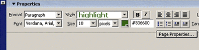
Figure 1: Defining page properties.
Page Properties Dialog Box. The Page Properties dialog box may look similar to the dialog box in previous versions, but it acts very differently (see Figure 2).
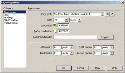
Figure 2: The Page Properties dialog box.
By specifying choices within the Page Properties dialog box, developers define style attributes for the body tag. Therefore, if a developer chooses to set the background color for the page to yellow and the text color to brown, those color attributes are assigned to the body selector in the head. And, to accommodate those of us who might forget, Dreamweaver will even assign the text color to TD and TH selectors so that they will be the same color!
As a special note, the Page Properties dialog box includes settings for link colors and underlining text (choose the Links category in the Page Properties dialog box). Any setting choices in this version will define the hyperlink pseudo-class selectors (a:link, a:active, and so forth). The Underline Style pop-up menu even provides an intuitive way to choose how you should use underlines within the hyperlink pseudo-class selectors (see Figure 3).
Figure 3: Settings for link colors and underlined text.
CSS Styles Panel. The CSS Styles panel should still be very familiar to developers (see Figure 4). The changes are slight. Instead of the Apply Styles and Edit Styles duality of the CSS Styles panel in Dreamweaver MX, users can only select and edit styles within the CSS Styles panel in Dreamweaver MX 2004. Users cannot apply the styles from the CSS Styles panel. The Property inspector’s Style pop-up menu does an admirable job of replacing that functionality.

Figure 4: The CSS styles panel.
Double-clicking a style listed in the CSS Styles panel will now open the external style sheet as a document in Dreamweaver, or will open the Code and Design view of the current document to the style definition in the head. This may be a little disconcerting at first, but it is nice to see the actual code for the styles. Clicking the Edit Style button in the bottom left corner of the panel will open the CSS style editor as in previous versions.
The CSS Style editor has seen little change, except for some wording changes in the New CSS Style dialog box.
Tag Inspector (with Relevant CSS Panel). The Tag Inspector has seen a significant overhaul, and this may be your new favorite place. The Tag Inspector is now a panel group, housing Attributes, Behaviors, and Relevant CSS panels.
As far as CSS goes, the Attributes panel doesn’t hold much of interest. You can quickly see the class name applied to the tag, but that is available in a few places. I think an interesting application of this panel is the display of class, ID, and style attributes. Ever find yourself creating an inline style to counteract something in a class style (I know… shudder)? Now you can see it and edit it. Or, more likely, have you ever inherited an over-styled page? Now you can quickly identify the pesky inline styles and remove them.
Far more interesting for our purposes is the Relevant CSS panel of the Tag inspector panel group. With a given tag selected, this panel will indicate any CSS styles affecting that tag. I was able to apply class and ID selectors to a tag, add some inline styles, modify the style of the tag selector, and create a contextual selector… and all of the styles defined by these various selectors were listed in the top of the Tag Inspector’s Relevant CSS panel. It even showed styles defined in a grouping of selectors. Choose a selector from the list at the top, and you can modify the style attributes below. The more I think about this feature, the more I like it (and the more I will expect to become dependent upon it).
By the way, the Relevant CSS panel even indicates styles that are not literally relevant to the selection (but that are applied to an element that is relevant). For example, if both the body tag and H1 tag have been defined with style attributes, clicking in text surrounded with H1 tags will include the body tag in the panel, but any attributes that are not inherited by the H1 tag are indicated with a red strikethrough.

Figure 5: The Tag inspector.
CSS Properties Panel. The CSS Properties panel appears if you double-click a selector or a style attribute in the Relevant CSS panel. I haven’t gotten used to this panel, and find it disconcerting if I mistakenly double-click something expecting the old CSS Style Editor dialog box to appear. This is nice, though, in that you can focus specifically on one selector, and set attributes accordingly. By the way, if the list of attributes looks long and confusing, set the display method to Show Category view. This will allow you to collapse the categories you won’t be using.

Figure 6: CSS properties panel.