
Showing results for com9394 con9 com com com1109764 con9 com com canon16 cooney com9394 con9 com com1109764 con9 com com1068773 139 139 com ( com ( com ( com ( com1068773 139 139 139
This tutorial is an installment of The Russell Brown Show
Text that swoops and swirls all over a page can be a good thing or a bad thing. The key to successful text on a path is to use it only when the subject matter calls for it, and to finesse the type with the right positioning, point size, and tracking.
In this video tutorial, Russell Brown, senior creative director at Adobe, shows you how to do just that in Photoshop CS2.
Click on the image below to begin streaming the video “Dancing with Type.”

The best typographic solution for a design project might not be type—it might be hand lettering. Custom lettering can be a cross between type and illustration; the words (still) communicate the message, but in a more distinctive, unique way. Each job is custom drawn, making every solution totally unique. Or as Jill Bell says, “The style and ambiance of good lettering reinforces the message or adds another dimension to it without having to say it.”
If you’ve never worked with a lettering artist—or even if you have, there are some suggested best practices to get the desired outcome with a minimum of stress and misunderstanding. I spoke with three experienced and talented lettering artists—Jessica Hische, Jill Bell, and Gerard Huerta—to get their take on how they work, and how to best work with them.
Jessica Hische
Jessica Hische is a lettering artist, illustrator, author, and self-described “avid internetter” working in San Francisco and Brooklyn. After graduating from Tyler School of Art, she worked for Headcase Design in Philadelphia before taking a position as Senior Designer at Louise Fili Ltd. In 2009, after two and a half years, Jessica left to further her freelance career and embark on several fun personal projects. Jessica began Daily Drop Cap, a project in which every day she created a new illustrative letter, working through the alphabet a total of twelve times. The popularity of Daily Drop Cap really kickstarted her career as a letterer.
What is the first step?
Research and brainstorming are enormously important parts of the creative process. What inspires my work the most is the content for which I’m designing. I read every book that I design a cover for, I read the articles I illustrate visual accompaniments for, and I research and get to know every client for whom I create a logotype.
Next I might do thumbnail sketches if I’m deciding between a few typographic lockups. My thumbnails are very rough and really just help me work through the lettering hierarchy, making sure I’m emphasizing the most important words when creating the final artwork. I lightly sketch out a few small illustrations of possible layouts, emphasizing different key words, and playing down less important words.
What’s next?
Once I’ve done the research, I’m ready to sit down and make sketches. Sketches are so important because you can explore different layouts and concepts quickly, getting the client on board before moving ahead with final art. My sketches tend to look quite tight, but that’s because instead of doing many iterations on different sheets of paper, I let my sketches ease in slowly, working lightly and loosely at first, and then cleaning up and defining the edges of the letterforms until the drawing is complete.
Refinement
Once my sketch is laid out loosely, I use a pencil to define it more clearly, making edits and changes if necessary, and cleaning up swashes and outlines. Sometimes I’ll fill in the letterforms if I want to get a better sense of the weight, or communicate clearly to the client that the letters will be nice and bold. When I send the sketches to the client, I hardly ever colorize them. I want the client to focus on the layout and letterforms, and not be distracted by color.
The next step is drawing vectors in Illustrator. My vector-drawing process is similar to the process I use for sketching—I build up the drawing in components, beginning with a skeletal stroke to define the letterforms.
When the design of the lettering is finalized and I’ve added just the right amount of decorative nonsense, I consider color. When choosing colors, I always make sure there is enough contrast between the lightest and darkest values in the design so that even if it’s printed poorly, the lettering is still legible.
Tips for a good job with me
Generally when you hire a letterer, you want to make sure the copy (words) you’re hiring them to draw are already decided upon (or very close to being decided upon). It’s very frustrating when a client hires you and then changes the wording mid-stream—which basically means you have to start over from scratch, especially if the word or phrase length has changed significantly. Other than that, I’m always happy as long as everyone has clear expectations of how the project is going to go (usually laid out in the contract), I know what the chain of command looks like on the client end (so I don’t get surprised by a major decision maker late in the process which can lead to do-overs and killed jobs), and everyone involved is a nice human and excited to work together. Getting on the phone with clients early on helps so much to establish trust and show a shared enthusiasm for projects.


A progression of both pencil and digital sketches illustrate the development of a concept, leading to the final design.


A tight sketch leading to the final artwork for a cover of Kiplinger’s magazine. Art direction: Stacie Harrison


A well-developed sketch includes all the primary elements in this poster for The Livestrong Foundation. Art direction: Meggan Webber
Jill Bell
Jill Bell of Jill Bell Brandlettering creates original, custom lettering solutions of any kind (logos, titles, fonts, taglines, handwriting) for all of the usual suspects: advertising, entertainment, packaging, editorial, corporate, publishing, government as well as other designers and most of the major type houses. Her work also includes original typeface designs as well as illustrations. Jill creates lettering that speaks directly to her clients’ needs and to their target audience: from warm, beautiful and personal messages, to dynamic, powerful corporate statements.
What is the first step?
The first step is collecting information about the lettering project from the client: anything from a brief and comps, references they may have showing styles and directions they like, to a slew of adjectives describing the project. Research, strategy, creative direction, an intellectual understanding and accumulation of information are all important before I put a tool to paper.
What’s next?
I provide sketches or comps of their project. Comps are fairly tight renderings created for presentation and decision purposes. At the literal desktop, I assimilate and then submerge all the acquired information, and let my lettering diva loose knocking out ideas with pen, brush, marker, crayon, and anything else that might be effective for the job at hand.
I select both my favorite solutions and the ones that most specifically fit the client’s criteria: as often as not they choose a direction I’ve explored, instead of the specific style that they may have pointed me towards. I scan my sketches, touch them up a minor amount in Photoshop, and email the black and white jpegs or psd files to the client, either meeting or more often exceeding the agreed upon number of comps.
Refinement
Based upon the client’s feedback and input, we work towards a final solution. Depending on the number of pairs of eyes needed for approval, refinement can be very swift, or it can entail additional rounds of comps and tweaking. More levels of approval (more eyes) usually mean more accommodations, changes, comps.
Tips for a good job with me
- Provide comps of your project whenever possible. I love reading and seeing briefs, scripts and books as well, although it’s fairly rare that I get to. Be sure to have all copy proofread, all names/titles cleared through the proper authorities before beginning a logo project.
- Provide me with a written description of the job (an email is good): what it is, how it will be used, your time line and budget/cost. Putting everything in writing helps to make sure we are both on the same track.
- Provide me with a PO and all paperwork that needs to be done up front before the job begins. No contractual surprises is a good thing.
- You will be one of my absolutely most favorite clients if you remember to send me a printed piece (a sample) that includes my lettering in use after the project is finished.

Sketches and final product for Cutter’s Skinsations.

Logos for entrepreneurial business.

Lettering for a Cape Cod Potato Chips ad.

Lettering for a corporate identity.

Logo for Norah Jones CD. She loved it so much she used it for an entire campaign.

Headline for a Starbucks ad.
Gerard Huerta
Gerard Huerta is one of the most highly-respected and accomplished lettering designers working today. He cut his teeth designing album covers and logos for the likes of ACDC, Ted Nugent, Blue Oyster Cult, Rick Derringer, Bob Dylan, The Isley Brothers, George Benson, Stephen Stills, The Charlie Daniels Band, and more. Since then, the scope of his hand lettering and typographic illustration has expanded beyond the recording industry to include mastheads, magazine covers, posters, movie titles, branding and graphic identities for advertising and other promotions.
What is the first step?
Research is always an important first step if it is necessary. As varied as clients and their instructions might be, I always begin work the same way: at my drawing board with a pencil or marker on tracing paper. Since I draw all of my letters, the process of sketching everything out allows for a unique solution.
What’s next?
I do many roughs and edit them down to the drawings that I feel can work. I tighten those up a bit, and if the client can read roughs, I will present them in this form. If it is a direct client (instead of an art director or designer), I may tighten the roughs to a comprehensive level for presentation. In the case of a logotype, I may execute these digitally from the sketches for presentation.
Refinement
Once a drawing is chosen, then it is scanned at an appropriate size for a template. A sketch is not scanned until I feel it is about 90% there in terms of its design (the drawing will contain most of the information I need to properly execute a final). It is then vectorized, paying close attention to point placement (this makes adjustment of curves much easier), and then colored or rendered if necessary. A sketch can be much looser today than pre-computer, when everything had to be carefully and tightly drawn in preparation for inking or painting.
Tips for a good job with me
- I think the choice of designer is as important as the appropriateness of the solution. I tend to do lettering with a high degree of finish so I would not be a good choice if one needed calligraphy, for example. Lettering people have different styles and strengths, and, like illustrators the choice of artist is important.
- If you have an idea you are sure about, relate that early in the process. It saves time.
- Being decisive is always important.
- Never hesitate to call a lettering designer to refine a sketch. Almost everything we do is a collaborative effort.


Initial concepts followed by the final artwork for Krista Santilli, a professional soprano. She wanted something custom for her promotional material. It is meant to feel musical with all of its curves, including a calligraphic-style bird. Art direction: Krista Adams Santilli


This preliminary sketch and final lettering is a header for a poster describing a Patients’ Bill of Rights. As the Bill is all text, it needed some visual interest and achieved it in the lettering. Therefore, it is a visual puzzle of many lettering styles. Art direction: AJ Cohen


St. Cecilia’s Consort is a professional group of musicians who sing high-quality music from chant to modern motets. The final logo solution selected from the five sketches above it, is inspired by the hand-drawn imagery and text from Gregorian Chant sheet music. This is a case where research is an important step. Art direction: Mac Cooney
Patterns (designs composed of regularly repeating graphic elements) have always intrigued me, especially those on wallpaper. I remember as a child spending hours figuring out how they were drawn.
Years later, as a college student, I opened the Adobe Illustrator file of the background used in the design of a major credit card. From the final product of this pattern, I learned to create these designs in Illustrator.
This knowledge opened up a world of possibilities in my career, and I’ve made good money on projects that have involved only patterns.
If you’re new to using patterns, my colleague Ari Weinstein has described in a CreativePro post how they work, how they are made, and how they are manipulated in Illustrator. Here, I’ll share a couple of techniques I use in my designs: how to generate organic hexagonal patterns, and how to create patterns to use in brushes.
Hexagonal Patterns
Figure 1 shows roughly how hexagonal patterns work. What is drawn on sides 1, 2, and 3 should be repeated on the opposite side at 180 degrees.
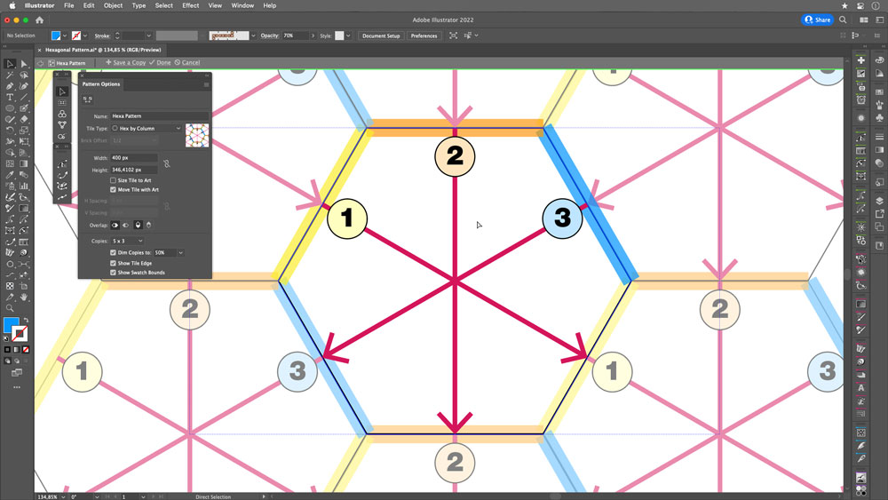
FIGURE 1. How hexagonal patterns work: Design elements repeat on opposite sides of a hexagon, meaning that three distinct design regions can repeat infinitely in any direction.
Here, I’ll show you how to make hexagonal patterns (from scratch) with a guide hexagon, using the Blob Brush to give the art a more organic vibe.
Start with a hexagon: Create a new file, then draw a regular hexagon using the Polygon tool. (In Figure 2, I used a 200 px radius.) Note the height of the resulting shape, which you’ll need when defining your pattern. In Figure 3, it’s 346.4102 px.

FIGURE 2. Start with your hexagon and save the measurement of its radius.
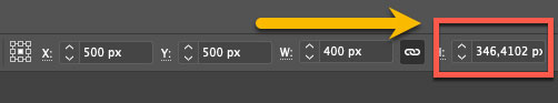
FIGURE 3. The height of your hexagon
Activate the pattern generator: Select the hexagon, then go to Object > Pattern > Make.
Modify the panel values: Start by naming your pattern something meaningful, and select Hex by Column as your Tile Type. For the height, use the width of the shape you started with in step 1 (346.4102 px), as shown in Figure 4.
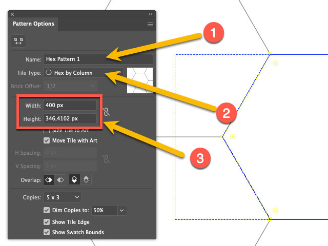
FIGURE 4. Pattern Options panel
Create settings for your pattern: Select the Blob Brush tool (Shift+B), then double click to bring up the Blob Brush tool Options dialog box, as shown in Figure 5.

FIGURE 5. Blob Brush Tool Options dialog box
Start drawing on side 1: Notice that Illustrator correctly duplicates your object throughout the pattern, doing the math for you along the way (Figure 6).
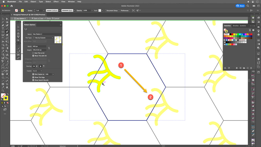
FIGURE 6. Drawing in the hexagon: side 1
Continue drawing on sides 2 and 3: Ensure that the paths do not intersect (Figures 7 and 8).
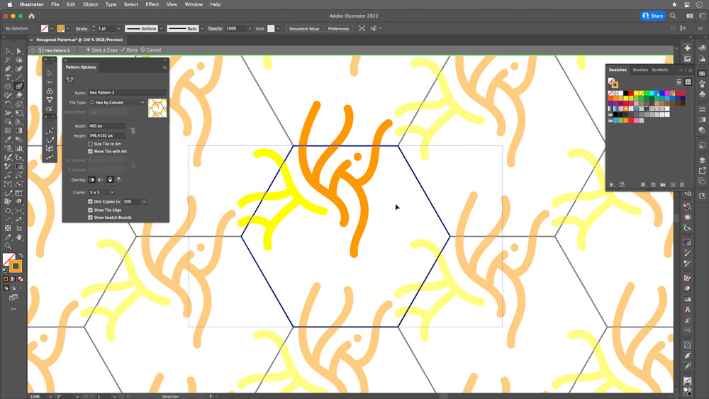
FIGURE 7. Drawing in the hexagon: side 2
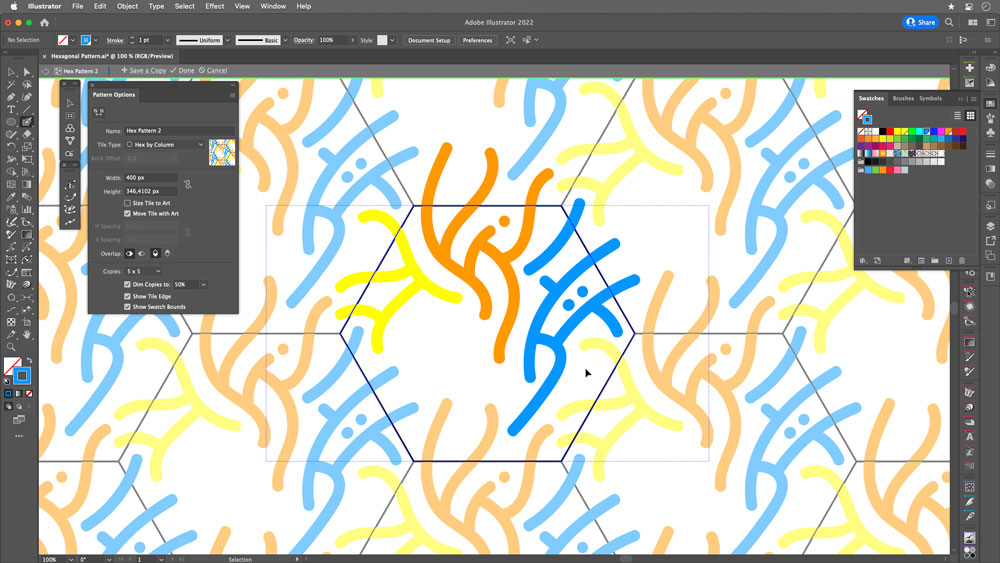
FIGURE 8. Drawing in the hexagon: side 3
Clean up: Delete the original hexagon. Save the pattern, and apply it to check its effectiveness (Figures 9 and 10).
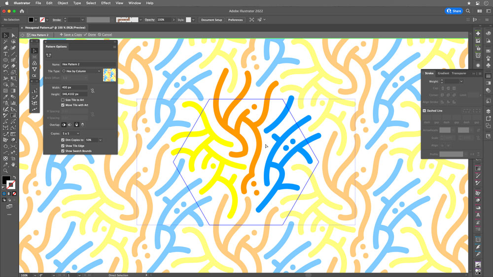
FIGURE 9. Once your pattern is defined, select and delete the original hexagon.
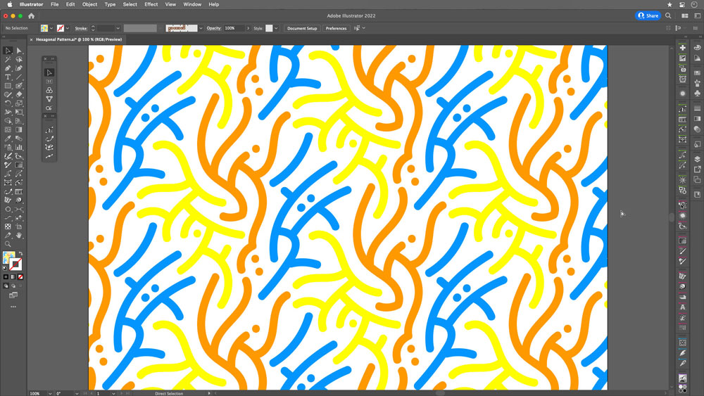
FIGURE 10. The pattern is applied to a rectangle.
Go beyond the pattern
You have a pattern! Now you can use it as the basis for a similar version.
Apply your pattern to a new object, then go to Object > Pattern > Save a Copy. Paint the paths black in this copy, complete some empty spaces, and save (Figure 11).
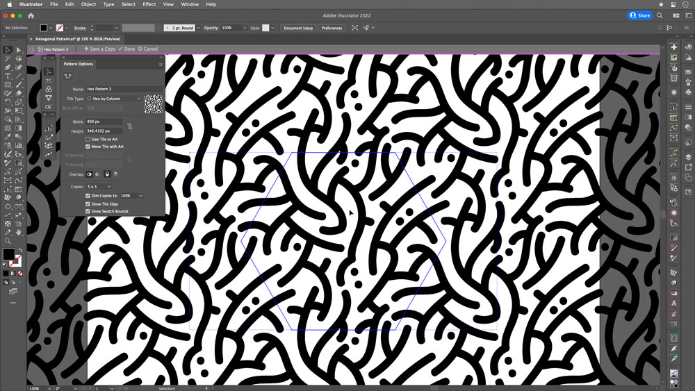
FIGURE 11. Duplicate and edit your pattern to create a new variant, one with more complex objects than the original.
In Figure 12, you can see how I applied this pattern to a hoodie, combining it with another background and playing with mixing and opacity modes.
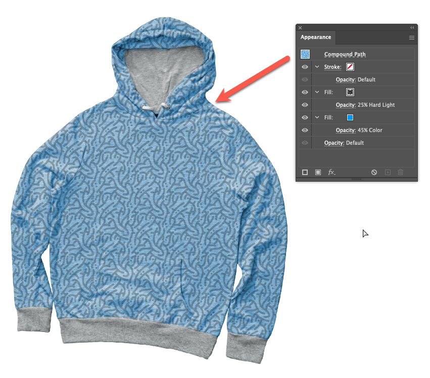
FIGURE 12. A hoodie using the example pattern
Sketch as sketch can
Although on some occasions I use my Wacom tablet and Adobe Fresco, I almost exclusively—like, 95% of the time!—start my pattern designs with pencil and paper.
For me, sketching by hand on paper is the crucial first step in the process of developing pattern artwork. Whether you’ll end up in Illustrator making small, simple strokes or a large, intricate design, sketching manually at the outset allows you to develop a concept faster and better.
Sketching can help you address design challenges and tackle solutions most immediately. It strengthens your creative capabilities in a different way. We all could use the opportunity to get away from technology—even for a moment.
I have some sheets with grids that I print as needed. I then easily pull these sketches into Illustrator by taking a photo with my phone and placing it. This practice allows me to combine the power and efficiency of Illustrator with the time-honored traditions of drawing by hand.
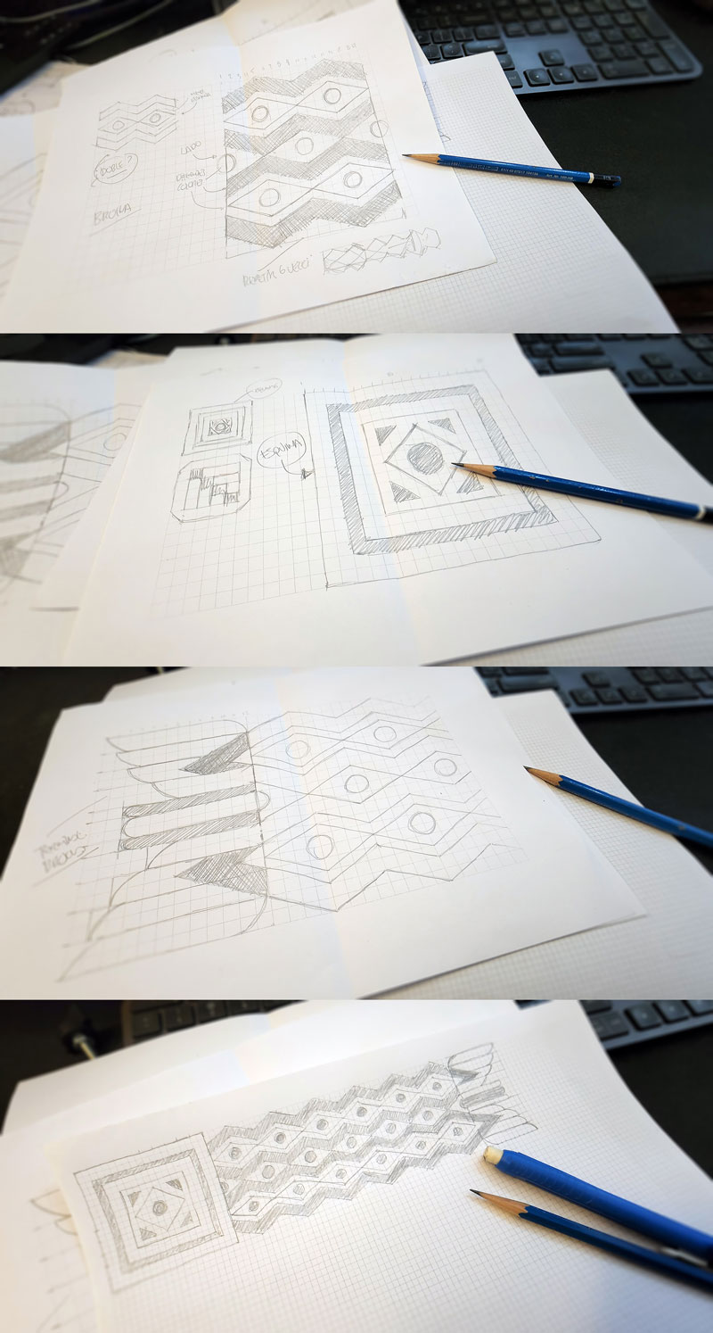
The author works out the basics of the design elements of a pattern brush the time-honored way: on paper, using sheets with grids that he can print as needed. He then digitizes them with snapshots on his phone and imports them into Illustrator documents, where he uses his sketches as a guide in drawing the vector art used to define the brushes.
Use Patterns in Brushes
Now, let’s look at an example of pattern brushes, a powerful graphic resource that allows you to create intricate and complex shapes in your designs. These require special attention because they are based on a specific set of the tiles (a complete set of the repeating elements) that form them.
To form a pattern brush, you need five tiles: the side tile, the outer corner tile, the start tile, the inner corner tile, and the end tile (Figure 13).

FIGURE 13. Pattern brush tiles interact to create intricate art applied to strokes, corners, and endpoints of various Illustrator objects and paths, open or closed.
In our example, we will draw only the first three of these tiles; the other two will be copies of their counterparts.
Start with a sketch: First things first—I wholeheartedly recommend sketching your art by hand before you do anything with Illustrator! (See “Sketch as Sketch Can” above.)
Create the side tile: Adjust the grid parameters in a new 1,000 px × 1,000 px document. Open the Guides & Grid area of the Preferences dialog box. Set Gridline Every to 100 px and Subdivisions to 20, as shown in Figure 14.
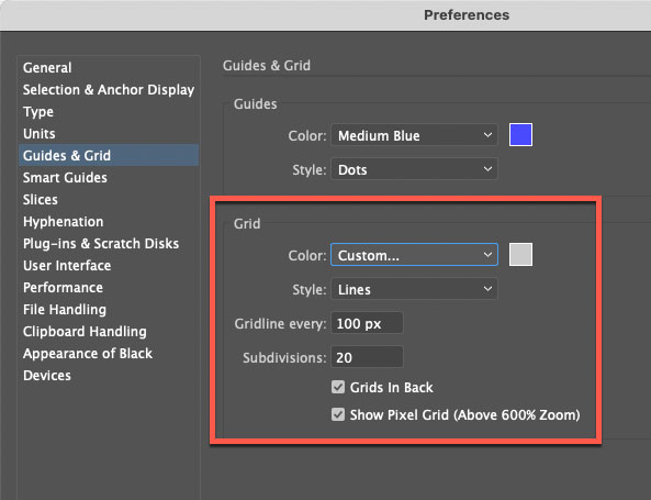
FIGURE 14. To adjust Grid area of the preferences, go to the Guides & Grid area of Illustrator’s Preferences dialog box.
Draw: Turn on the Snap to Grid option (View > Snap to Grid), and start drawing with the pen. The module measures 100 px high × 240 px wide (Figure 15).
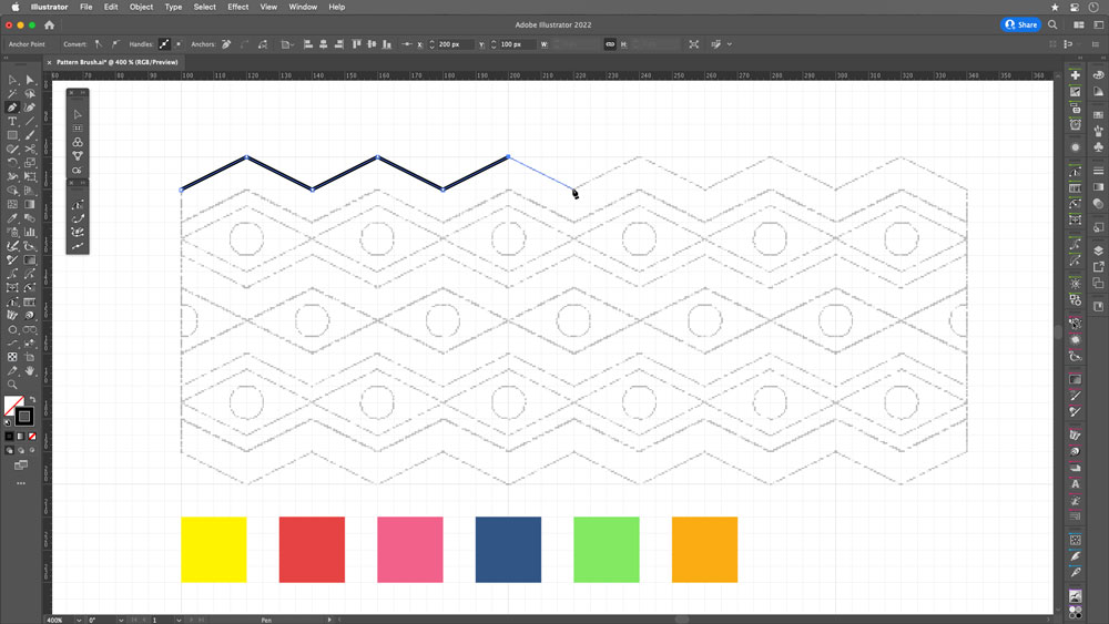
FIGURE 15. With your sketch as a guide and using the grid, draw with the pen.
Build with objects: Create essential elements, then copy and reflect them (Figure 16).
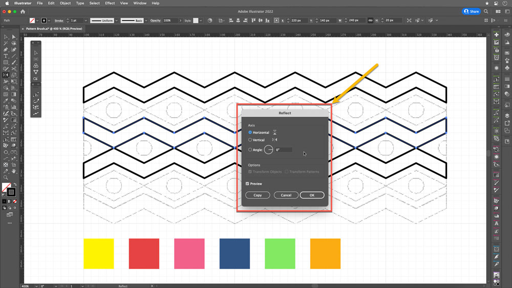
FIGURE 16. Use the Reflect tool to mirror your objects with precision.
Color: Apply colors to the fills to your taste (Figure 17).
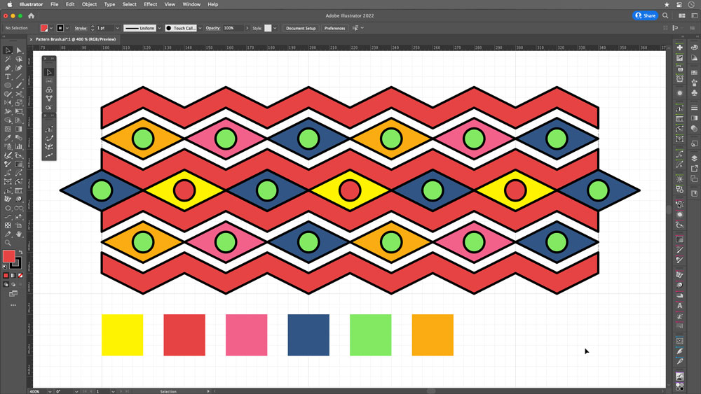
FIGURE 17. Apply color to the objects.
Clean up: Remove the black strokes and trim the rhombuses and circles of the ends by drawing a rectangle on top of the shapes, then selecting the three objects (rhombus, circle, and rectangle). With the Shape Builder tool, activate the option to subtract (press Option on macOS or Alt on Windows) and move the cursor over the part to delete (Figure 18). To avoid transparent parts, place a white object behind everything (Figure 19).
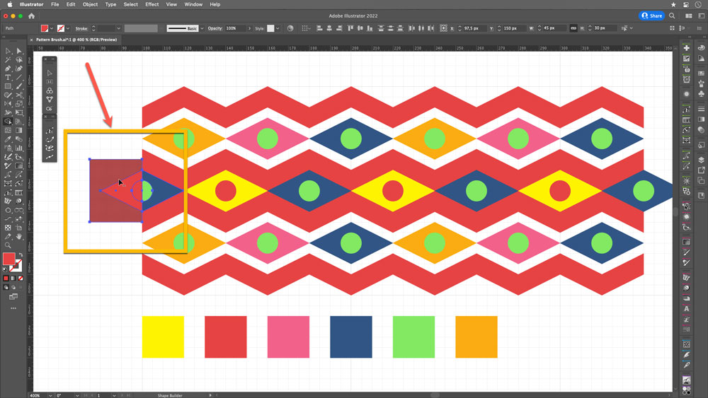
FIGURE 18. Use the Shape Builder tool to delete portions of objects that overlap the edge of the grid.
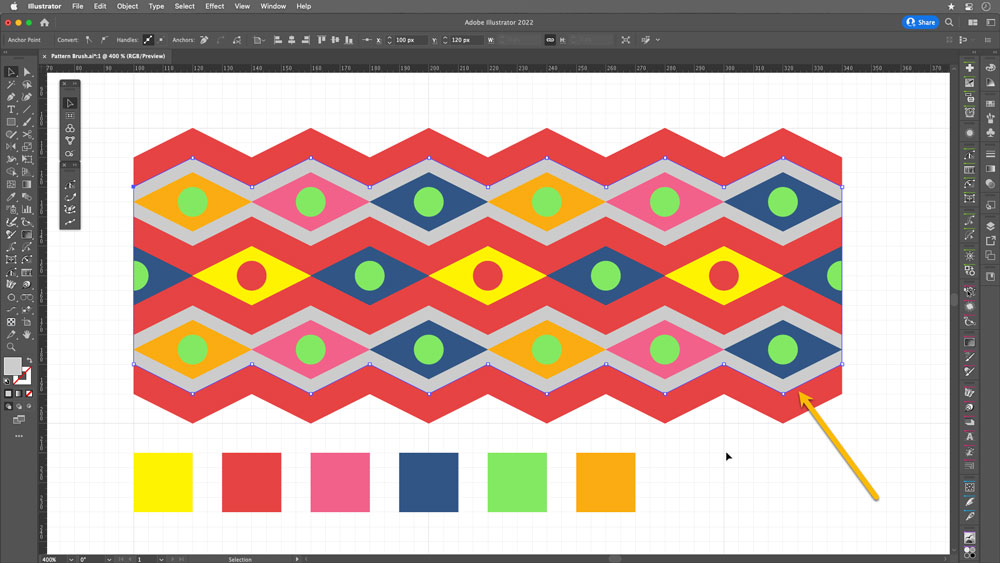
FIGURE 19. The area shown here in gray (for illustrative purposes) ended up as white.
Create your new pattern brush: With the selected objects, open the Brushes panel. Click on the New Brush button (1), choose the Pattern Brush option (2), and name the brush (3). By default, the Side Tile is the one created (4) (Figure 20). Notice that the outer corner tile also appears, but in this case, it is because Illustrator has automatically generated that corner (Figure 21).
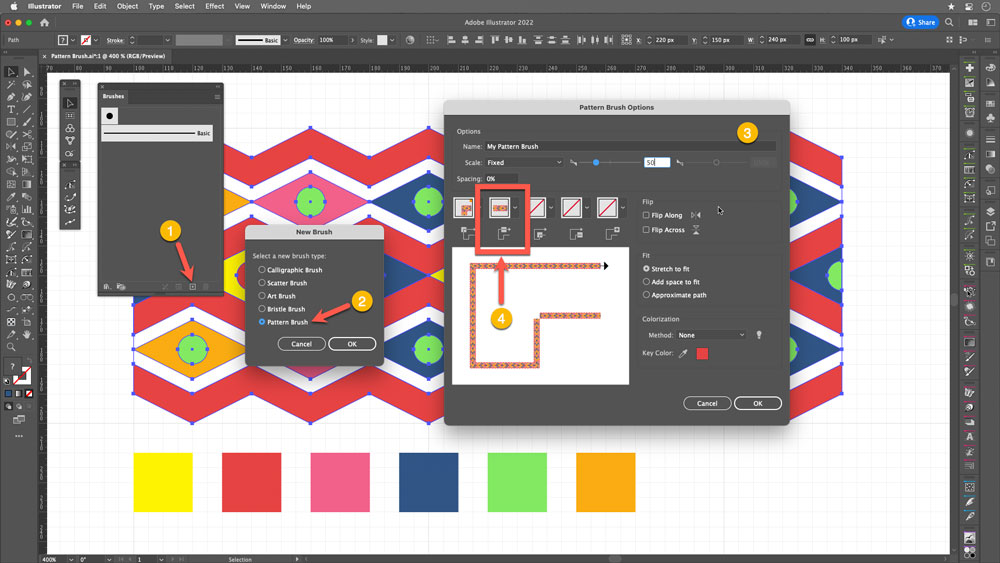
FIGURE 20. Pattern Brush Options window
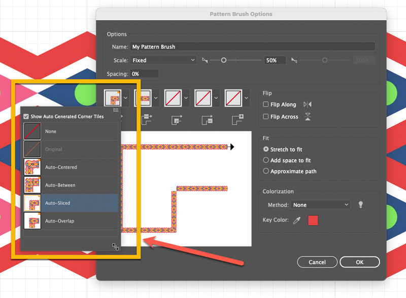
FIGURE 21. Illustrator will try to help by automatically creating corner options for pattern brushes, but in this example we will create our own.
Draw the outer corner tile: For this example, though, we will create the corners. To do so, use the grid as a base. Use the Rectangle tool, the Circle tool, and the Pen tool for the triangles (Figure 22).
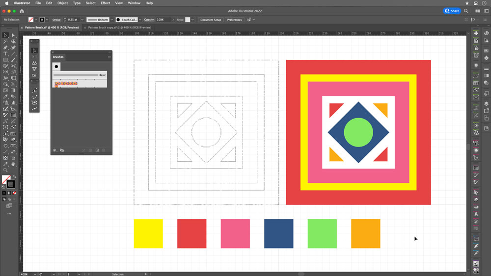
FIGURE 22. Draw the outer corner tile using standard rectangles.
Add to brush definition: Select the Corner Tile (Figure 23) and press Opt/Alt while dragging it to the position of outer corner tile in the Brushes panel (1); this replaces the auto-generated corner (2). Click OK to accept the change (3).

Create the inner corner tile: Repeat the procedure using the same object (Figure 24).
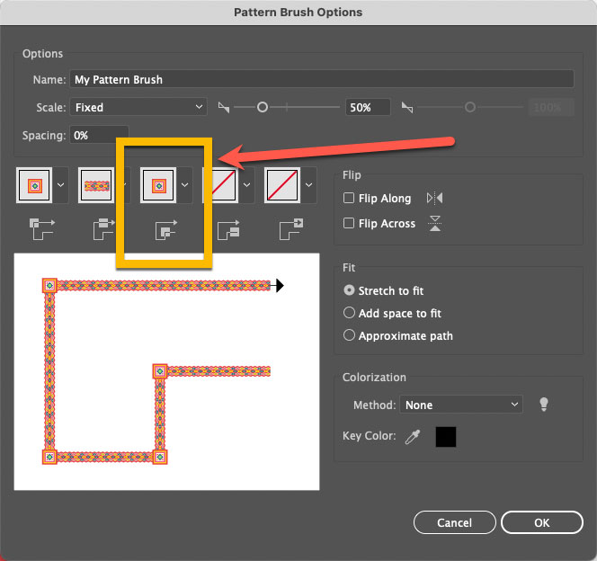
FIGURE 24. Inner corner tile replacement
Draw the start tile: Use rectangles to create the upper part. Then, with the Pen tool, draw the inner triangle (Figure 25).
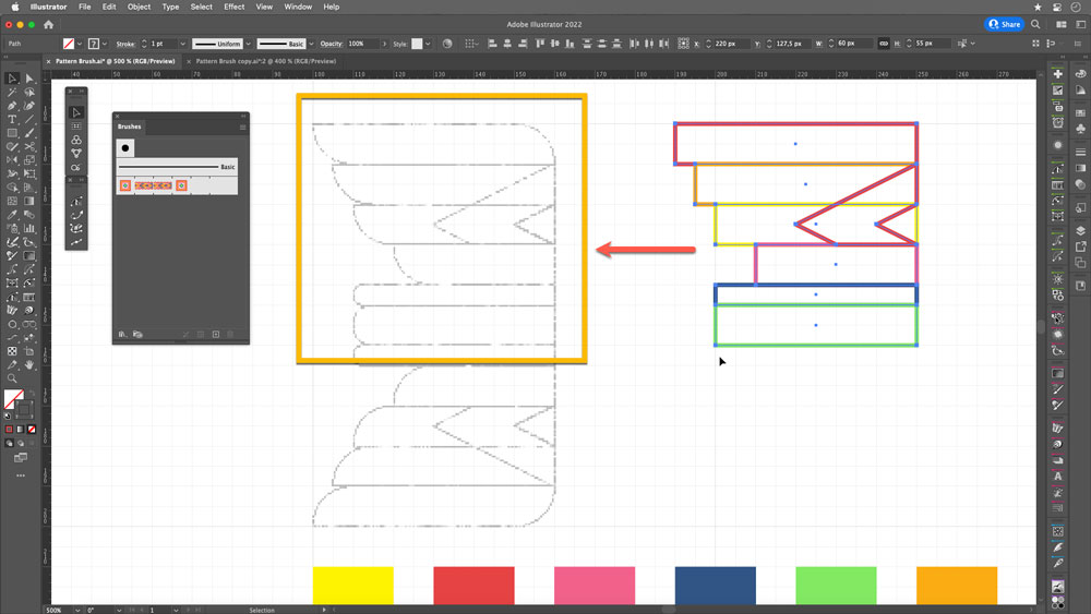
FIGURE 25. Draw the pattern parts with rectangles and the Pen tool.
Round the corners to match the sketch with the Direct Selection tool. (Figure 26).
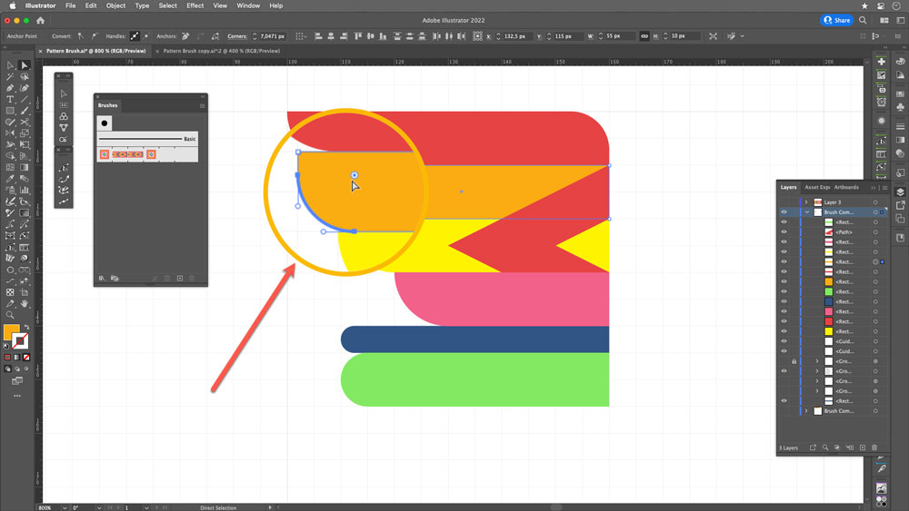
FIGURE 26. Round individual corners to match the sketch.
Select the top of the object, use the Reflect tool, and make a copy—this will be the start tile (Figure 27).
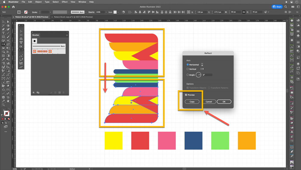
FIGURE 27. Reflect and copy the top objects.
Create the end tile: Copy the complete module and reflect it horizontally to obtain the end tile (Figure 28).
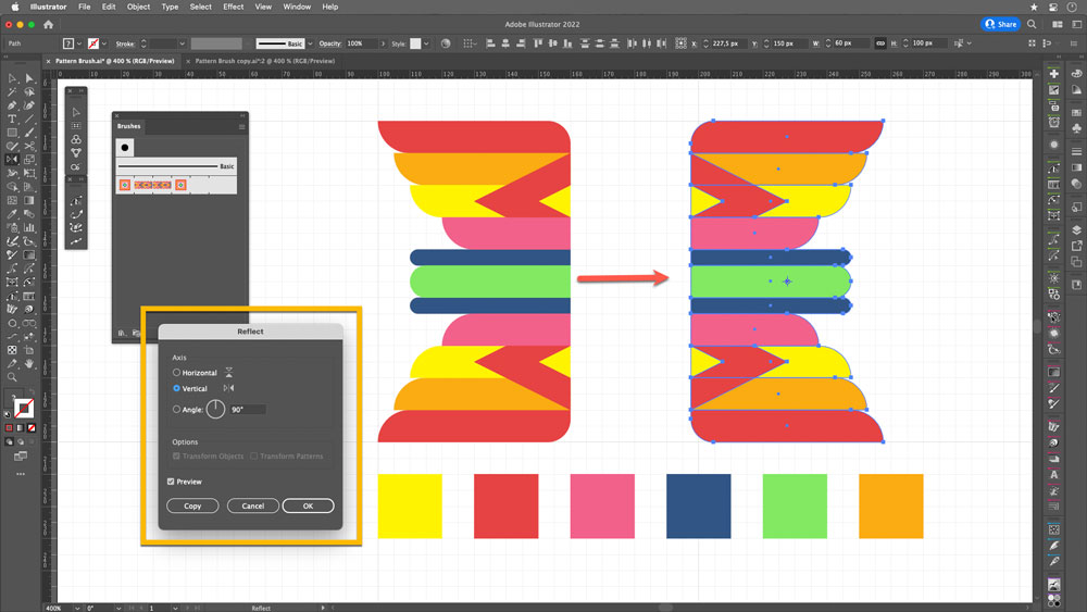
FIGURE 28. Duplicate and flip the object horizontally.
Add to brush definition: Again, while pressing Alt/Opt, drag your tiles to their respective positions: start tile (1), end tile (2) (Figure 29).
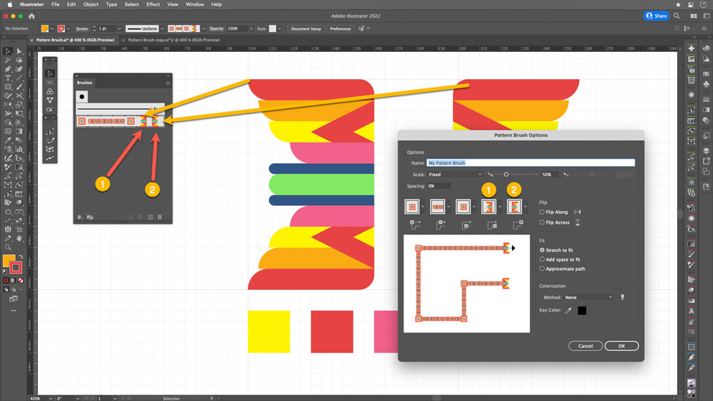
FIGURE 29. Put the start and end tiles into their respective positions in the Brushes panel.
And now, as you can see in Figure 30, you can use your new pattern brush on closed and open shapes, polygons, stars, variable width strokes—so many objects! The sky’s the limit.
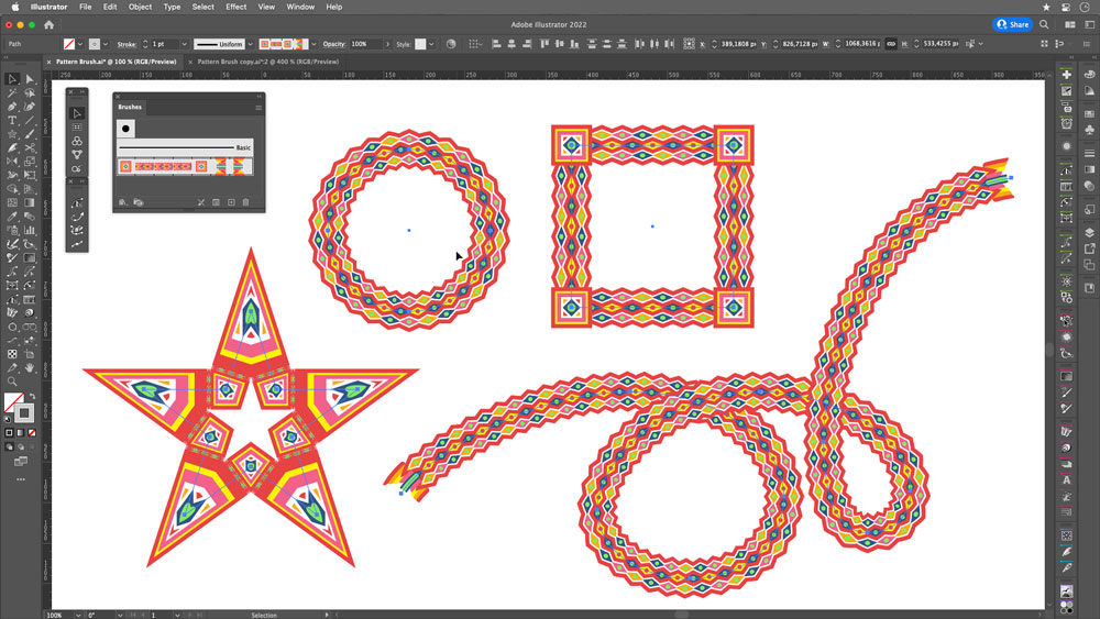
FIGURE 30. You can apply use a pattern brush to apply your pattern to different shapes and objects. Have fun!
This tutorial is courtesy of the Russell Brown Show.
There are times when low light or other factors make it impossible to capture a photo with a deep depth of field, yet a shallow depth of field may not yield the result you’re going for.
In those situations, take several shots of the same subject (with a tripod if possible), varying the area that’s in focus with each shot. Then let Photoshop merge the areas of sharpest focus from those stacked images into one seamless composite that looks as if it were captured with a deep depth of field.

The trick is to use Auto-Blend Layers feature, as shown in this brief video.

This tutorial is courtesy of the Russell Brown Show.
Photoshop CS5’s Content-Aware Fill feature intelligently fills in an area with texture that matches the surrounding pixels. While Content-Aware Fill is an amazing retouching tool that just about any Photoshop user can benefit from, its defaults are more successful on some photos than others. (Don’t have Photoshop CS5? Download the free trial.)
In this video tutorial, you’ll discover how to hide regions you don’t want to be part of the pattern so that Photoshop’s Content-Aware Fill patterns are as accurate as possible for every image.
For example, when I run Content-Aware Fill on the original photo in the usual way, the results aren’t realistic:

But when I use a special trick I’m about to teach you, the results are much better:

To learn the trick, click the image below. The video will launch in a separate window.

Are you reading this page on an iPhone or iPad? Click here for an iPhone/iPad-compatible version.
This content is courtesy of The Russell Brown Show.
In this tutorial, I begin with the Merge to HDR command in Adobe Photoshop CS4 Extended. I use it to combine seven photos shot one stop apart. The resulting high dynamic range (HDR) image looks OK, but I think it could be better:

And in fact, I make it a lot better, painting in exposure to recover information in the clouds, converting it to a Smart Object, and more.
Learn how you can do the same with your photos by watching the video below:
This tutorial is courtesy of the Russell Brown Show.
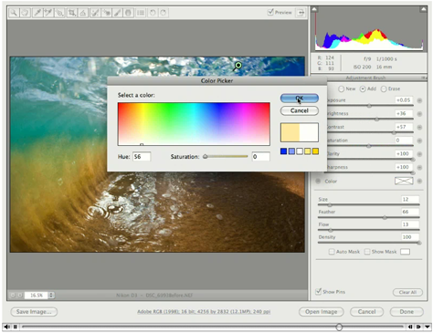
Camera Raw gives you fast and easy access to the data hidden in photos. Best of all, it comes with Photoshop! In this tutorial, I show you how to bring out the colors and the qualities of an image shot by photographer Clark Little.
The original is fine:

But with a little processing in Camera Raw, it becomes even stronger:

Click on the image below to follow me step by step.
Be sure to download the most recent version of Camera Raw by going to Help > Updates in Photoshop or Bridge.
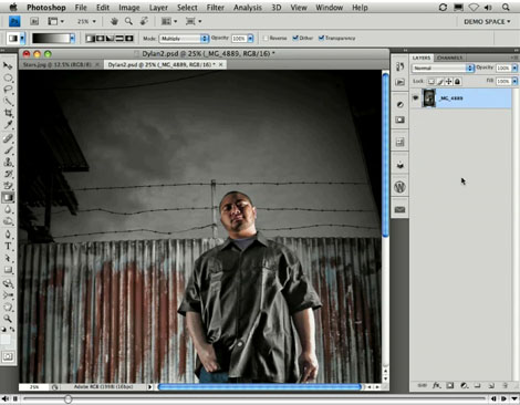
Photoshop is a valuable tool for editing one image, but you can double your creative options when you use the software to merge two images.
Photoshop’s Paste Into command gives you a quick and easy way to combine two images into a masked region. Although I’ll demonstrate the feature in CS4, the Paste Into command has been around for a while, so owners of older versions can play along, too.
Stream the 4.6MB QuickTime tutorial in a separate window by clicking the image below.
This tutorial is an installment of The Russell Brown Show.
Russell Brown, senior creative director at Adobe, demonstrates how to use Photoshop CS3 to convert a text layer to a Smart Object, then apply Smart Filters. You’ll create amazing special effects that are nondestructive, which means you can edit the text at any time!
Click on the image below to begin streaming the 10.9MB QuickTime tutorial:

If you don’t have QuickTime installed, you can get it here.