


This article originally appeared in the June/July 2009 issue of InDesign Magazine (#30). Subscribe to InDesign Magazine here.
You only get one chance to make a first impression. A cliche, but true — and while this applies to many things in life, it’s particularly true of business cards. Making a strong initial impact with your business card can make the difference between getting the job and your card being on a fast track to a bottom drawer — or the recycling bin.
It’s good to stand out from the crowd with a business card that is funny, unexpected, or clever, or all three, but first and foremost a business card should be functional. It’s all common sense really, but don’t lose sight of the fact that a successful card should give a positive first impression; provide clear and accurate information; and be kept by those you give it to. Anything else is gravy.
In this article, I’ll cover the following considerations as they apply to business cards:
1. What to include
2. Orientation
3. One- or two-sided?
4. Unusual shapes and sizes
5. Humor
6. Numbers: which to include and how to format them
7. Photos
8. What to print on
9. Extras
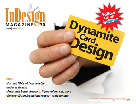
Click the image below to download the article as a PDF. You’ll have to view the file in the free Adobe Reader or Adobe Acrobat to take advantage of the interactivity built into the PDF.
This article was last modified on December 17, 2022
This article was first published on April 7, 2010
Commenting is easier and faster when you're logged in!

Recommended for you

Speed Up Your GREP Styles
Fact: Searches and replacements done from InDesign’s GREP tab in the...

InReview: V-Justify
Learn about a solution that makes bottom aligning pages in InDesign quick and ea...
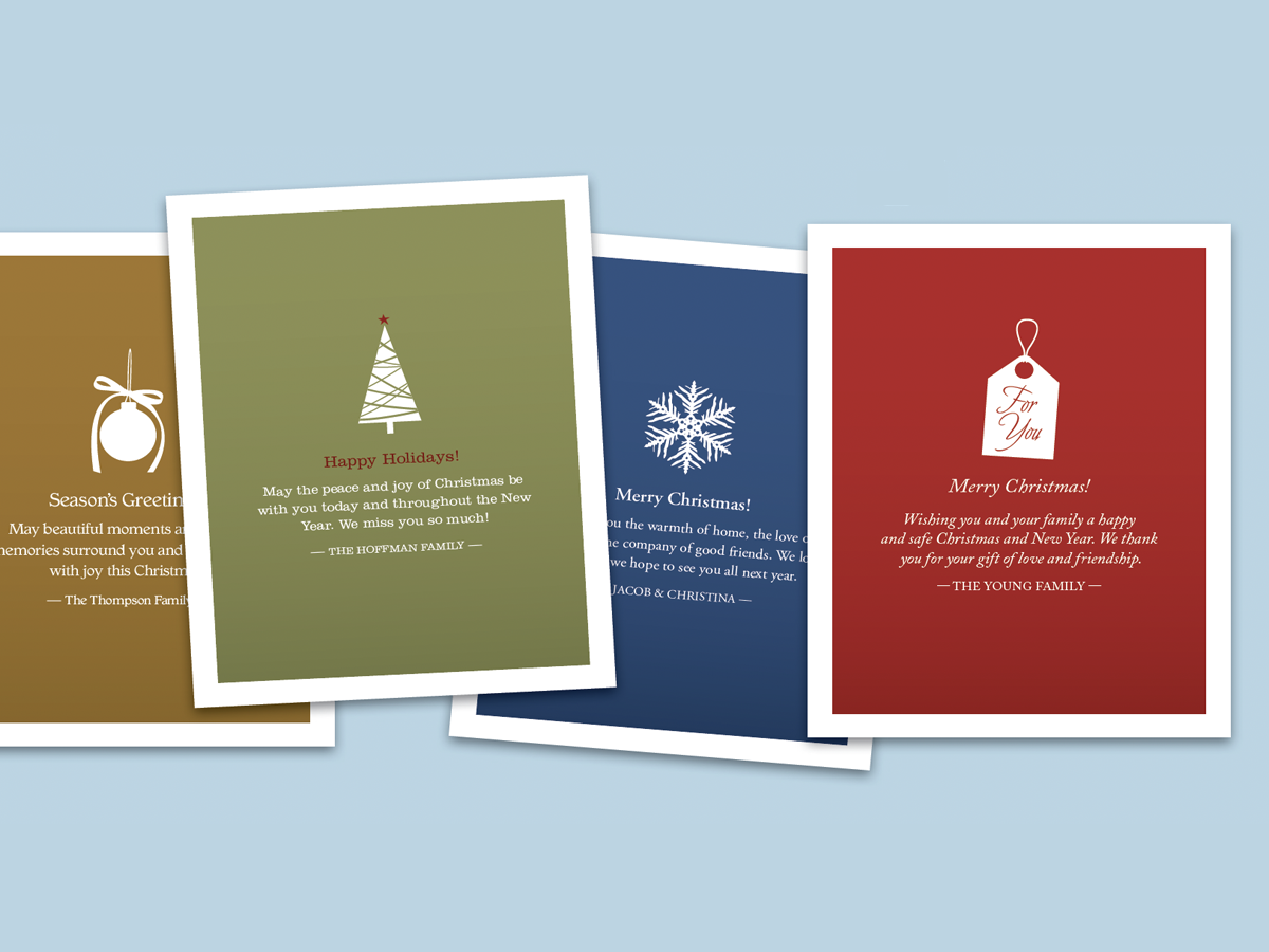
Before&After: Make Desktop Holiday Cards
If you need to make your own quick and easy holiday card, this one fits the bill...