

This InDesign tip on making neon type effects was sent to Tip of the Week email subscribers on March 9, 2017.

Sign up now and every week you’ll get a new tip, keyboard shortcut, and roundups of new articles, plus exclusive deals sent right to your Inbox!
Just scroll down to the bottom of this page, enter your email address, and click Go! We’ll take care of the rest. Now, on with the tip!
You can combine multiple letters into one continuous shape that looks like neon–without leaving InDesign! Start with a heavy, monoweight typeface, such as VAG Rounded Bold (A). Convert the text to outlines (Type > Create Outlines). For the T and W, overlapping the letter shapes is sufficient, but for the other letter combinations you’ll need connectors (derived from a rotated I, hyphen or other useful character). Overlap them as necessary to bridge the gaps (B). Tweak their shapes with the Direct Selection tool to ensure smooth joins, then combine the letters into one shape (Object > Pathfinder). The combined result shows several unnecessary anchor points, which you must remove with the Delete Anchor Point tool (C). Finally, apply fill and stroke colors (D).

This article was last modified on July 25, 2019
This article was first published on March 14, 2017
Commenting is easier and faster when you're logged in!

Recommended for you
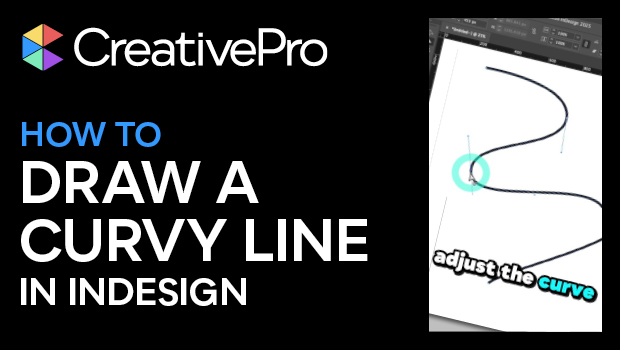
How to Draw a Curvy Line in InDesign
Learn how to create a curved line in InDesign, using the Pen tool then make adju...

InDesign 102
David Blatner is your guide for what to to tackle after you’ve mastered the basi...