
The Hoefler and Frere-Jones foundry has released a new type family called Tungsten. It’s a compact and sporty sans serif that’s disarming instead of pushy — not just loud, but persuasive.
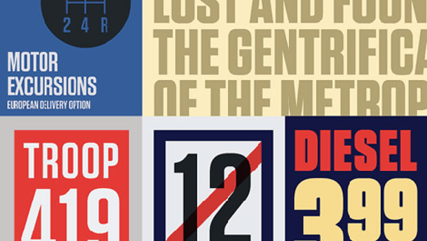
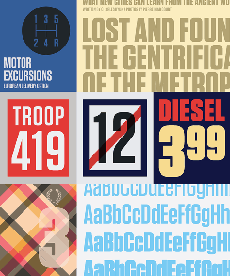
Flat-sided sans serifs have been a vital part of graphic design since its very beginning. Like many of typography’s loveliest styles, these letters are an import from sign painting, where the style — doubtless because its kit of lines and curves resembles plumbing — is colorfully known as “Modern Gaspipe.” These modular letters were an important part of the twentieth century poster, bright and optimistic in the propaganda of the Works Projects Administration (WPA), and peremptory in the Constructivism of the young USSR. In the service of any agenda, what these letters always signified was modernity, industry, and zeal.
Typographers have explored this compact modular style with mixed results. Typefaces that stay true to Depression-era forms run the risk of becoming nostalgic, forever evoking the sentimental Americana of tuxedo jackets and automats. Other designs, if they stick more doggedly to the underlying principles of rule and compass, often reveal how monotonous a typeface can become when restricted to too meager a kit of parts. Many such designs quit the fight when the going gets rough, abandoning their own internal rules when unruly letters like S or Y won’t conform to the grid — a frailty that’s especially unwelcome in this kind of typeface, whose square-jawed ruggedness would otherwise recommend it for action movies and airport paperbacks.
A few years ago, H&FJ started wondering if there was a way to make a typeface in this genre that was disarming instead of brutish, one that employed confidence and subtlety instead of just raw testosterone. It was an unusual design brief for themselves, completely without visual cues and trading in cultural associations instead: “more Steve McQueen than Steven Seagal,” reads one note; “whiskey highball, not a martini” suggests another. They decided to reduce the letterforms not to circles and squares, but to a manageable set of stated interrelationships — between inside and outside, uppercase and lowercase, and one letter and the next — that could be applied with equal consistency throughout the design. The result is Tungsten, a tight family of high-impact fonts that doesn’t sacrifice wit, versatility, or style.
You can now purchase Tungsten in Medium, Semibold, Bold, and Black weights for $99.
Latin-X® Language Support
Most fonts contain the accents necessary to accommodate the major Western European languages, at the expense of the rest of the world. Type foundries have traditionally addressed these absences on an ad hoc basis, creating one-off variants like “CE” (Central European) which might handle Polish, Czech, Hungarian, or Romanian — but not necessarily all of them. Often ignored were major languages like Turkish, with fifty million speakers, and “minor” ones like Catalan — a language commonly neglected, yet more widely spoken than Danish.
Unlike legacy formats such as PostScript and TrueType, OpenType fonts are virtually limitless in the number of characters they can contain. In preparation for moving its library into OpenType, H&FJ established the Language Research Program in 2005, in order to develop updated specifications for its Latin-based character sets. The initial product of this research is H&FJ’s Latin-X® character set, which expands the reach of a typeface to an additional 200,000,000 readers worldwide. This character set reflects not only a more accurate awareness of the political landscape of language, but the most up-to-date understanding of cultural norms.
This article was last modified on January 18, 2023
This article was first published on September 17, 2009
Commenting is easier and faster when you're logged in!

Recommended for you

The 7 Skills Every Design Professional Needs Today
Today more designers are finding themselves having to be well rounded with diver...
Introducing Peristyle by Hoefler&Co.
Jonathan Hoefler of Hoefler&Co. is at it again! He and his enthusiastic and...

Chalk One Up for Inspiration
Reading about the anonymous students—calling themselves Dangerdust—at Columbus C...