
The Magic of Design and Publishing
Master the tricks of the trade to enchant your audience
This article appears in Issue 91 of InDesign Magazine.
When I train clients in InDesign, I often find myself saying “it’s like magic.” On the surface, that statement might come as a surprise. However, upon closer examination, it becomes clear that there is a significant overlap in technique, approach, and workflow between these two disciplines. And I should know: I’m both an InDesign expert and a professional magician.
I’ve been fortunate to have careers in the worlds of both magic and design/production. The magic bug took hold much earlier in life (I was eight), but I have attacked both with the same passion and joy. The journey to explore what these two art forms have in common has been a fascinating one.
Magic and… InDesign? Really?
If you don’t see the intersection between magic and InDesign, suspend your disbelief for a moment and answer the following questions:
As a Designer
- How do you prepare to design and lay out your project?
- What fundamental techniques of graphic design and production do you employ?
- What is your process of creation and implementation?
- Do you begin with a pad of paper and a pen, or do you jump right into creating within your digital tools?
- How do you manipulate your audience through your design to instruct them on what and how to read and observe?
- Does form follow function, or does form lead you in your creative process?
As a Magician
- How do you prepare to create a new magic trick?
- What fundamental techniques of magic do you employ?
- What is your process for creating and executing a magic trick?
- Do you begin with a pad of paper and a pen, or do you jump right in with a deck of cards
or a coin? - How do you manipulate your audience through your presentation to instruct them on what to observe?
- Does the effect determine the technique used, or does the method lead you in the creation of a new effect?
There is no doubt in my mind that the job of the designer (or production artist) mimics that of the magician—or perhaps it’s vice versa. After all, isn’t it all about cheating, misdirecting, consistency, and efficiency? Let me explain…
We Cheat and Manipulate Our Audience
Our minds make connections for us. This process can work for us, or it can work against us. Both magicians and designers use the automatic processing of our minds to create illusion and design. We trick the brain by allowing it to work on its own. By understanding this, we can create superior design by crafting a pleasing story for the reader, or by drawing the attention and eye of the reader to where we want. The same is true for constructing a magic trick. We create the story for our audience, and we draw their eye to where we want to create a deceptive effect.
“Misdirection is possible because of the power of suggestion. It is a psychological fact that the first impulse of people is to believe. Doubting is usually secondary. And the power of suggestion wields a tremendous influence on our lives and opinions.”
— Vincent H. Gaddis, from The Art of Honest Deception
Let’s try a simple example of how the mind jumps to conclusions and makes connections on its own. Below, you will see three images (Figure 1). Read the directions for the first image, and then look at the image and do as the instructions have directed. Try not to look ahead to the subsequent images. Then, repeat for image 2, and finally for image 3.
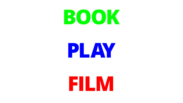
Out loud, say the words that you see in the image above.
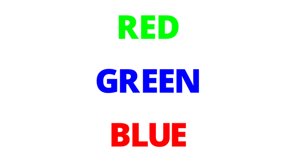
Out loud, say the colors that you see in the image above.
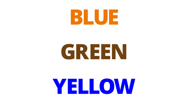
Out loud, say the colors that you see in the image above.
That wasn’t easy, was it? The reason is that our minds are being tricked by making assumptions based on what we believe we see. If a magician places a coin in his hand, there is no reason to believe the coin is not there. Knowing this can allow us (the magicians) to fool our audience and make the coin vanish.
Incidentally, this is why it’s often difficult to fool a young child in the same way. They have yet to learn the same assumptions as adults. So, when a magician places a coin into his hand and makes it vanish, the child thinks, “That’s right. The coin is gone. That makes sense.” (For the record, performing magic for young children is intensely frustrating and will make a magician want to quit the business.)
In the world of graphic design, we constantly cheat our audience, and they willingly submit to the illusion. That’s not a photograph in the newspaper… it’s just a grid of spots, some larger and some smaller! That drop shadow doesn’t really make the heading float above the page, but it seems like it! To some degree, the tricks of our trade rely on the audience letting themselves fall for it.
You Misdirected Me
We have heard the word misdirection many times in our lives. And it is understood that magicians use misdirection to fool their audience. This is absolutely true. There are many forms of misdirection in magic—a wave of the hand, a beautiful woman, the comic gag—but they all draw the attention of the audience away from one moment (the secret move) and put the attention on the action that has no bearing on the mechanics of executing the magic trick.
However, misdirection is actually just direction. We are directing your eye toward what we want you to see.
This is true for design as well. In fact, much of design is based on it. Designers direct the reader’s eye toward what we want them to focus on through the use of bold headlines, color, fonts, and graphical elements. What is a drop cap but a way to manipulate the reader, like a wave of the hand, saying “look here!”
It’s the job of both a designer and a magician to guide their audience to see, read, observe, and take away only what is intended.
After a performance, I listen to what my audience has to say—how they recollect what they have just seen. If I’ve done my job well, their recollections will vary from what actually happened. As an exercise, show one of your layouts to someone. Then watch their eyes as they peruse the page. After a minute, ask them what they glean from it, what content they find most important on the page. Then ask yourself, have you done your job in directing their attention to what you consider to be most important?
If your desired telling of the story through layout and design differs from what your audience is seeing, then you need to to alter your design through graphical elements and design techniques, such as large headlines or white space to draw their attention to where you desire. Remember, you have the ability to control your reader in this way.
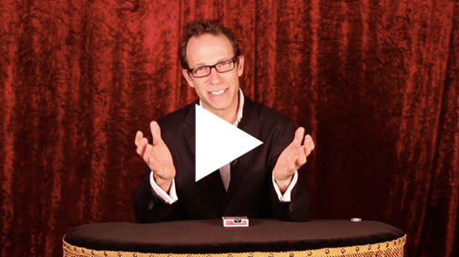
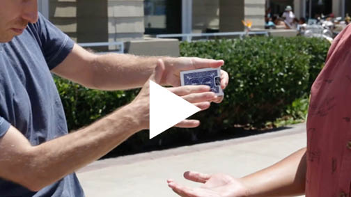
Check out the video example Misdirection at InDesignSecrets before reading on.
How did the thought-of card in the video make its way under the card case? In magic, as in design, the big move covers the small move. In the effect shown in the video, the bigger action of spreading the cards gave me enough misdirection to sneak the selected card under the card case. (How I removed the card from the deck is a secret, but it’s far less important than the effect as a whole—just like how you set the leading of type is less important than how readable the paragraph becomes.)
We use this same idea in design. Take big and bold headlines, for example. We can direct the reader’s eye using a larger headline. Newspapers use a hierarchical approach to headlines, using larger headlines first, then smaller headlines to inform the reader of the importance of the stories on the page (Figure 2).
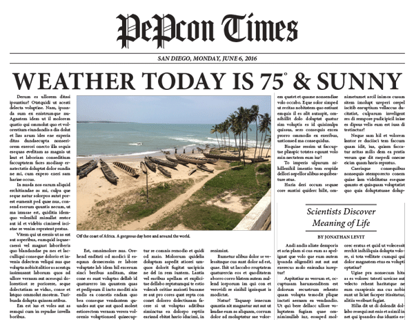
Figure 2: Newspaper headlines exemplify hierarchically structured information.
By using this concept of creating design elements to attract and direct the eye, you can elevate your designs from aesthetically appealing to something with more psychological impact.
Consistency and Efficiency
As layout artists, we should be striving to achieve a high level of consistency throughout our documents. In addition, we should be pushing for efficiency in our production workflow. While you might not expect it, these are two important concepts for magicians as well.
By achieving a high level of consistency in a magic trick or performance, we can be assured of the outcome every time. In addition, this consistency allows us to break away from the confines of our script and experiment, knowing that we can always come back to the established story and routine.
This is one reason designers often enjoy working with a layout grid, libraries of objects, and styles that are consistent. The underlying structure assures us that we can stretch and experiment, with the understanding that we can always come back to what is defined and safe.
Magicians are also striving for efficiency in the presentation of a magic routine. When I would become too verbose in my performance of a magic trick, or drawing out a patter, an old friend used to say to me, “Just do the trick.” Using proper techniques to eliminate unnecessary work/sleight of hand to accomplish an effect is crucial to a smooth execution of a trick. Plus, eliminating what is not necessary offers a more streamlined effect that is easier to understand.
When you produce templates and documents, eliminating the steps that are not necessary lets you focus on the presentation or design of your layout. For instance, by using styles (the single most important concept in layout production), a page can be built very quickly based on consistent design rules that have been established for the layout. This allows you to be creative with your design of the page rather than spending time on the humdrum work of making the page consistent.
Staying Ahead of the Game
Whether I am constructing a magic trick or routine or designing an InDesign template, I am always striving to stay ahead of the game. I take a step back and look at the bigger picture. I think of the project as a puzzle—how do all the pieces fit together to allow me to arrive at the outcome?
For a magic effect, I may execute a sleight of hand move early on that will pay off later in the routine. For a production project, perhaps I will take the time to make a template or set up a style early on that will increase my efficiency later in the process. I’m always laying the foundation to try to prepare for obstacles, twists, and turns.
I’m also constantly thinking “what if?” For example, what if I need to make a sweeping modification to the layout, such as a global typographic change or spacing between an image and its caption? How can I set up my document to allow me to make these alterations with the fewest steps?
Whether in design or in magic, one must be prepared for the unexpected—perhaps you expected to present indoors and now it’s outside; perhaps you expected to show differences with red and green but it turns out your audience is red-green color blind; perhaps your layout was destined for press but suddenly you’re publishing to a mobile app. The only way to avoid embarrassing ruin is to start with a good foundation, one on which you can improvise.
By applying this thinking early on in the creation process, you will save yourself time as you build on your templates. Therefore, the part of the production process that should take the most time should be the setup of the document or template itself. A newspaper may spend a year or two redesigning their publication—aesthetically and technically—so they have a layout that allows for stories and sections to be built extremely quickly. After all, a newspaper can’t put out a daily issue by being inefficient.
Five Techniques to become a great magician… or production artist
Becoming a great magician or production artist is a never-ending journey. To help you on your way, I’ve isolated five concepts and techniques for you to consider as you move forward.
1. Muscle memory
“To achieve nirvana, we must create without thinking.”
I’m pretty sure I just made up that quote. But there is something to it (if I do say so myself). To perform a successful magic trick, the mechanics of that trick must be in our bones, in our muscles. The moment we think about what we’re doing, we are exposed, and the entire routine falls apart. The performance, just as the design of a layout, loses its appeal and aesthetic.
Similarly, when producing a layout, knowing the interface and implementation of features such as styles should be executed without having to think about the process. When people talk about “InDesign power users,” this is what they mean: it’s just in their bones to the point that they don’t have to think which menu to go to, which panel to open. It just flows.
When we are practiced enough that the handling of a magic trick and the use of InDesign’s tools are second nature, then we can focus on what is truly important: the design and the performance.
Incidentally, I’m focusing on InDesign here, but the same thinking can be applied to whatever tool you are using, such as Photoshop or Illustrator.
Video example: Muscle Memory
2. Steal
“Good artists copy. Great artists steal.”
— Pablo Picasso
“Did he just say ‘steal’?” Yes, I did. But, you know, in a good way. Magicians steal all the time. Designers steal. Production artists steal. It’s important to remember that we are standing on the shoulders of great thinkers and creators. Steal from them. Learn from them. Build on the foundations they created.
After all, most people don’t realize that there are only about 19 core ideas in magic. In his book “The Trick Brain,” Dariel Fitzkee has classified all of these ideas, including a vanish, a transposition, a transformation, a restoration, and thought reading. Of course, those 19 fundamental categories lead to a multitude of illusions. The methods to get to these denouements will vary, but will often borrow from one another.
Take, as an example, a coin matrix. This refers to an effect in which four coins are arranged around a table and (after various “business”) the coins magically assemble in one corner. Thousands of magicians have learned this “standard” effect, but the goal isn’t simply to repeat what everyone else does with it. That’s like plagiarism. Rather, a great magician transforms the fundamental trick into their own routine, adding their own original perspective and style. That’s art.
As a designer, you must steal from design concepts created by others. The use of typography, opposing typefaces, grid, color—these become part of the design consciousness. They become trends. Then they go out of style, and then often return and are considered “retro.”
For some wonderful design ideas as well as historical trends, check out The Graphic Design Idea Book by Steven Heller and Gail Anderson. This book is filled with groundbreaking and wonderful design concepts such as monumentalism, illustrating with type, and layering. You’ll be hard pressed to come away uninspired, and by recreating some of these, you can’t help but become educated.
Video example: Steal. Don’t Plagiarize.
3. Transform
Stealing is easy. Transforming is hard.
Transforming an idea, technique, or effect is what separates a good magician or designer from a great magician or designer.
The truth is that once you have been exposed to so much magic, it isn’t easy to be fooled. When an idea has been transformed and executed in a way we haven’t seen before, we have a higher chance of being fooled, and that is a glorious thing. The greatest joy for a magician is to be fooled.
I created a magic trick that is now selling on the market for other magicians to use. It’s an idea that has been done and sold before (more than once). My method, however, is applying new thinking to an existing idea. The result is an effect that fools both magicians and non-magicians. Check out the trailer for this effect, below. (No, this article has not been a sales pitch to sell my magic trick. But I think you’ll find it cool!)
Video example: Transform
Great designers take existing design ideas and transform them into something we haven’t seen before. Even something that is “radically new” is, ultimately, just a response to an existing standard, and therefore built upon previous work.
I believe the process of creation should be to steal an idea and then to transform that idea to the point of creating something that is worthy of stealing by someone else, who then in turn transforms that idea once again.
Whether you are a magician, designer, or production artist, embrace your own proprietary sensibility. Find your own voice. Transform existing ideas, and then make them your own.
4. Learn the Fundamentals
At first glance, the tools we use, such as InDesign and Illustrator—with their huge range of features—can be overwhelming. However, once you learn your fundamentals within the application, the more advanced techniques all start making sense.
Take nested styles, for example. Nested styles ask you to think differently about styling text, using a more programmatic approach. But once you understand how hidden characters and styles are applied, nesting styles becomes quite easy to get your head around. The table of contents feature is another example of applying a fundamental technique—paragraph and character styles—to a more complex (and automated) process.
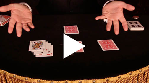
Magic is, once again, similar. The four-ace assembly you saw in the video earlier is from the mind of Larry Jennings. When I was much younger, I read about this routine in the book The Cardwright by Mike Maxwell. I tried to learn it, but I had trouble with the execution. It was overwhelming. I gave up. Recently, I decided to try again. This time, however, I was armed with the fundamental sleight of hand requirements found in the routine. I discovered this time around that this effect was quite easy. I was able to apply my fundamentals and breeze through learning the routine.
Learning your fundamentals, to some degree, is like learning a new language. Once you come to understand the jargon and how to execute the technique, and then marry that with muscle memory, it’s possible to elevate the conversation. Make these fundamentals part of your production language and you will elevate the conversation, enhance your design process, and increase the efficiency of your production workflow.
Where magicians have to learn the basics such as the Double Undercut and the Pinky Break, when it comes to InDesign, the fundamentals you need to master (sooner or later) include:
- Tool shortcuts
- Use of frames
- Text linking
- Zooming and navigating
- Paragraph styles
- Character styles
- Using the Control Panel
- Text wrap
- Understanding and using Margins and Columns
- The Pages panel
- Understanding the difference between container and content
- Understanding color models
- Aligning objects
- Using different units of measure
- The anatomy of typography
- Understanding color swatches
- Workspaces
- Master pages
- Find/Change
- Exporting to PDF
5. Make It Repeatable
Everything I’ve talked about so far—the proper use of styles, staying ahead of the game, thinking “what if”—all of this is the foundation for making the layout of a template repeatable. The same is true for magic: the proper use of sleight of hand fundamentals and always staying ahead of the game allows us to repeat an effect or routine effortlessly and efficiently.
By first creating styles and master pages carefully, and then taking the time to tag my text and objects with these styles as that content is placed or created, I am now ahead of the game (Figure 3). I can create new documents based on that template very quickly, and I am able to make sweeping changes to the layout by simply editing the styles.
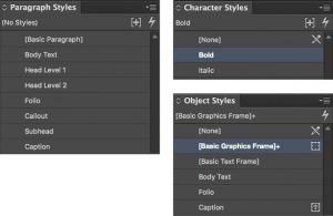
Figure 3: A common set of paragraph, character, and object styles can put any project on the fast track to success.
Freedom and Variety
“When deception is honest, it’s fun to be fooled. So sometimes, strange to say, we are fooled because we wish to be deceived. And that is the greatest, most important, principle of them all.”
—Vincent H. Gaddis, The Art of Honest Deception
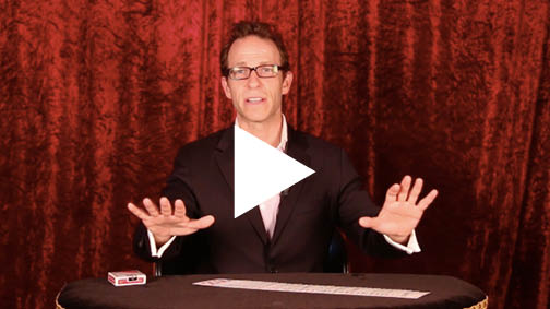
Video example: Pick a Card
Magicians and designers create by deceiving and manipulating. When we can approach our creation process with absolute efficiency and consistency, we can focus on what is truly important: guiding and directing (or misdirecting) our audience to see, read, and understand what’s important about the work we create and the works we publish.
Harness these concepts, and you will be well on your way to becoming a great magician and production artist!
Commenting is easier and faster when you're logged in!

Recommended for you

UX Design is Not Just a Web Design Thing
For the past few years, UX Design (user experience design) has been all anyone h...
Building Accessible EPUBs with InDesign
Learn how to build ebooks with a strong foundation to reach more readers.

Working With Spot Colors
Claudia McCue's guide to everything you need to know about designing and printin...