
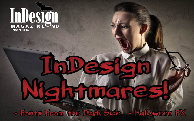
13 Fonts From the Dark Side
Don’t be afraid of the dark! Use these fonts for creating distinctive, impactful impressions with type.
This article appears in Issue 90 of InDesign Magazine.
There are countless design briefs that call for heavyweight, assertive fonts. These hefty designs, which are usually reserved for display usage, make a powerful statement while attracting the viewer’s attention with ease. While many of these substantial typeface designs are serious in tone, others can be friendly, ghoulish, and even humorous. I have selected thirteen of my favorite “fonts from the dark side” to share with you. They include black weights that are part of large families as well as single-weight styles. Some are current releases, while others are vintage, historic, or just timeless designs that never get old. But they all make a statement when used appropriately.
Fette Fraktur
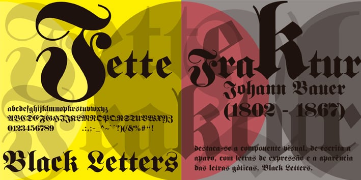
If you are looking for a gothic blackletter typeface, you can’t get any better than Fette Fraktur. Originally designed in 1850 by the German punchcutter Johann Christian Bauer and based on the Fraktur type of blackletter faces, the digital version of Fette Fraktur is derived from one first published by the D Stempel AG foundry in 1908.
This typeface, whose name translates to “broken bold,” was originally intended for advertisements, but is currently in favor for editorial use: music, fashion, and other style-based publications or articles. Fette Fraktur is also seen in use for menus, signage, logos, book titles, and posters with European or Germanic feel, but can also be used when a “goth” or dark feel is desired. The glyphs can be enlarged, rotated, and used to create decorative borders and other type-as-image applications. The caps are great for initial letters, while the entire alphabet is a popular choice for tattoos. Note that some of the caps are not very readable and may be confused with other characters.
Mostra Nuova
Mostra Nuova, designed by Mark Simonson, is based on a style of lettering often seen on Italian Art Deco posters and advertising of the 1930s. Although my favorite weight is the Black because of its stylish and ridiculously dense appearance, the family contains five other weights, beginning with an almost invisible, dramatic Thin, and stepping up in weight from there.
The Black weight is great for headlines and usages where a very dramatic, stylish vintage feel is called for. The lighter weights can be used for smaller-sized text, making the family practical for a range of uses—more so than others that are “just” display type. Although Mostra Nuova Black looks best when used in all caps, the addition of lowercase (as well as the five other weights), make for a much more practical family than a single-weight display font. This type family contains many alternate characters representing commonly found variations in Italian Art Deco lettering. Note: Mostra Nuova is an expanded and enhanced version of the previously released Mostra from 2001.
Poster Bodoni
Poster Bodoni (aka Bodoni Poster) was inspired by the work of Giambattista Bodoni (1740–1813) and supervised by Chauncey Griffith at Mergenthaler in 1929. This Bodoni font is distinguished by a very heavy yet graceful appearance. The family contains a companion italic as well as an upright condensed version.
Poster Bodoni displays characteristics of the advertisement fonts of the first half of the 20th century. The typeface was most often used for posters and signage, eventually including neon signs. Working with this typestyle requires care, as the strong emphasis of the vertical strokes and the marked contrast between the fine and thick lines lessens Bodoni’s legibility, making it perform best when used at larger sizes.
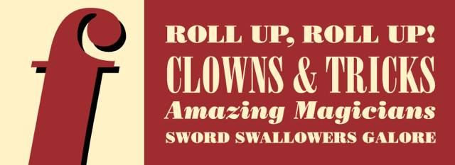
Studio Slant
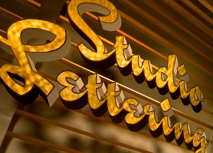
This chunky, connecting backslanted script is a product of House Industries. It is a member of the Studio Lettering family, which contains two other script faces, as well as a series of funky shapes. Based on the kind of hand lettering used for advertisements, editorials, and package designs in the pre-digital age, Studio Slant revives the spirit of a bygone trade by gracefully combining classic techniques with 21st-century technology. It comes with many alternate characters, including a set of super-sized uppercase letters for greater impact. I love this font for its bold, yet stylish, nostalgic appearance.
Fervent Black
Designed by James Montalbano of Terminal Design, Fervent Black, in both upright and italic versions, is brimming with personality and presence. The Black weight is part of a 10-weight family with companion italics, making it practical for both text and display.
Some non-conforming design features of Fervent include its epsilon-like lowercase e, as well as the shapes of the a, m, n, and k lowercase. The upright forms borrow heavily from the italic shapes, giving the roman a sense of motion. Alternate versions of the a, e, g, r, and s provide the designer with many options for customization.
Montalbano says, “I’ve always been fond of really black fonts and worked to keep the details (i.e., epsilon e) in the heaviest weights. These things tend to develop a life of their own, and the remaining details just emerged. I start, and somehow the type design finishes itself. I’m usually surprised how it turns out.”
ITC Machine Bold
This all-cap display typeface was designed by Tom Carnase and Ronne Bonder in 1970. ITC Machine Bold became popularized by noted designer and typographer Herb Lubalin, who frequently used it for posters, book covers, packaging, and signage. Although over 45 years old, this brawny, geometric typeface is timeless, and still a great choice when a strong, authoritative feel is appropriate. It does have a companion (Regular) weight, but the Bold has a much more dramatic appearance. For the most impact, Machine Bold should be used with very tight letter spacing and line spacing, much like Lubalin’s poster.
Neue Aachen Black
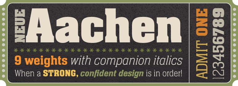
Neue Aachen Black is the heavyweight member of the revival family based on the original Aachen Bold, designed by Colin Brignall for Letraset dry-transfer lettering sheets in 1969. Its very narrow counters and short slab serifs suggests power and visual impact. Jim Wasco of Monotype expanded this two-weight family into one that includes nine weights, from ultra light to black, each with an italic complement, for a total of 18 styles.
The black weight conveys a sturdy, serious, yet powerful look. The range of lighter weights make this a very practical family when a range of sizes is called for, as the black is meant for display only. Wasco says, “It is not surprising that we’ve seen the heavier weights used for sports signage and banners, in addition to truck and power drink advertisements.”
Black Mark
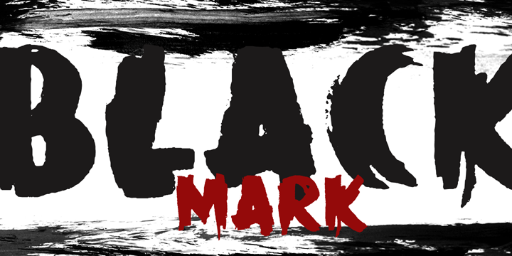
Black Mark is a fat, heavy, grunge-to-the-max marker font. It was designed by David Kerkhoff of Hanoded, a type foundry based in The Netherlands. David specializes in hand-printed typefaces and uses brushes, pens, ink, and paint to create his fonts, many of which have a graffiti-like appearance. This all-cap font has a companion italic, both containing alternate glyphs, allowing you to create a custom hand-lettered appearance.
Motter Corpus
Designed by the late Austrian designer Othmar Motter in 1994 and released by ITC in 2000, Motter Corpus is a stylized display design available in three weights: regular, semi condensed, and condensed. Its chunky appearance is softened by its rounded semi serifs, which make for an assertive-eye-catching look. This typeface can be used as all caps or upper- and lowercase, and looks great when used for anything from packaging and advertisements to headlines, logos, and signage.
Speeding Bullet Trails
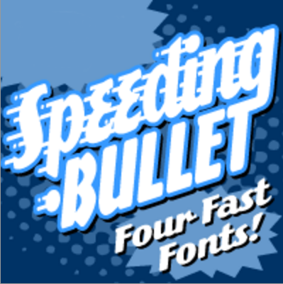
“Quick as The Flash, slicker than Quicksilver, the latest in our popular line of silver-age display fonts could probably outrun a locomotive and jump buildings in a single bound.” That’s how John Roshell of Comicraft describes his illustrative typographic creation. Comicraft is a foundry that has been designing comic-like fonts since 1992. Speeding Bullet consists of four versions, one with and one without trailing strokes, both with companion italics. I showcased the italic, as I feel it is the most effective in conveying speed and motion.
Dolmen
This eye-catching revival of the kind of typeface used by a 1920s jobbing printer (a person who prints mainly commercial and display work rather than books or newspapers) exudes all the fashion and culture of the jazz age. Dolmen, designed by Max Saltzmann for Linotype in 1987, offers an interesting alternative to other popular display fonts that try to capture the feel of this era. With its high/low waistline and its pointed, angular strokes, Dolmen can be used in all capital or upper- and lowercase settings, and gives any work an Art Deco look.
DIN Next Slab Black
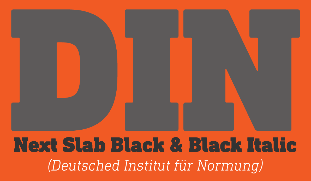
This typeface is just one weight of the DIN Next superfamily. Designed by Akira Kobayashi, Tom Grace, and Sandra Winter in 2014 for Linotype, it is based on the original DIN 1451, which was redrawn to accommodate slab serifs. DIN Next Slab is an industrial-strength design that brings a sturdy, square serif to the font family that has its roots in the German road sign system.
DIN Next Slab harmonizes perfectly with the styles of DIN Next; the basic letterforms and weights are identical. These two versions of the font can work together perfectly, not just in headlines and body text, but also within a text; they complement each other very well as design variations. The Black in particular is a brawny, muscular design that conveys a sense of vigor and assertiveness.
Impact
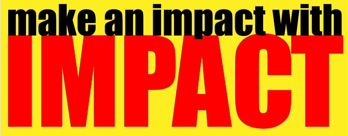
Designer Geoffrey Lee created Impact for the Stephenson Blake foundry in 1965. This sans serif display font is very heavy and condensed in the grotesque style. Its thick strokes, compressed letter spacing, and minimal interior counters are specifically aimed, as its name suggests, to create “impact,” making it best used in display situations requiring a strong statement. Inappropriate use (and overuse) has soured some designers on Impact. Still, it is still one of my favorite fonts for conveying a powerful message where space is a consideration. This compressed, geometric sans has both caps and lowercase, and looks authoritative either way—just avoid using it for text or other small size instances.
The Power of the Dark Side
It can be very tough for designers to find ways to break through the “sound and fury” of all the information bombarding us to get our attention. But these faces, whether recently conceived or evolved from time-tested, evocative classics, present a very persuasive argument for submitting to the power of the dark side. Indeed, together with a powerful font, you can rule the (design) universe.
Commenting is easier and faster when you're logged in!

Recommended for you

InDesign Magazine Issue 113: Calendars
Issue 113 of InDesign Magazine include articles on calendar design, high-contras...

Scanning Around with Gene: The Best Type Book with No Typesetting
I rarely feature any single work here at Scanning Around with Gene for fear it c...

TypeTalk: Get Typographically Correct Text from Word
TypeTalk is a regular blog on typography. Post your questions and comments by cl...