

On June 1, 2009, CreativePro.com and PANTONE unveiled the Designer’s Dream Giveaway contest. CreativePro.com provided the submission platform, and PANTONE provided the prizes. We asked you to submit projects you designed using PANTONE colors or other PANTONE products.
The results were impressively varied. The judges (me, PANTONE vice president Andy Hatkoff, and designer Scott Citron) saw everything from bus wraps to business cards. We considered ads, posters, brochures, annual reports, candy wrappers, conference guides, identity systems… But eventually, we agreed on one submission: a logo for a small local pharmacy.
Meet the Winner
Corey Meckes runs the design shop id graphics with his wife, Monica, in Everett, Pennsylvania. In an era of generic-looking towns with the same chain stores as every other generic-looking town, Corey and Monica are proud to serve the independent businesses in Everett.
Everett Pharmacy approached id graphics with the request for a logo that shows the long history and tradition of pharmacology, yet looks fresh. There were no initial restraints on the logo’s color or shape; instead, direction came from the multiple concepts Corey had to convey in one small mark. As the client put it, the ideal logo would convey a place that’s “traditional, friendly, relaxed, family-oriented, fun, and yet a very serious business. Good luck!”
Corey began the design process by searching online for vintage pharmacy signs, logos, and items. The labels on old medicine jars inspired him to create this logo:
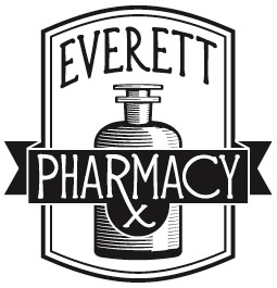
The typeface, Diehl Deco, was designed by Apostrophic Labs.
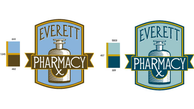
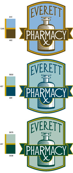
To choose the best color combination for the pharmacy logo, Corey turned again to old apothecary jars. He first tried the common vintage glass colors amber, brown, and cobalt blue (PANTONE solid 1245, 462, and 644, respectively). Then the client suggested trying green. “It took a lot of fine-tuning and color options to finally end up where we did,” Corey remembers. Here are just a few of the combos he considered:
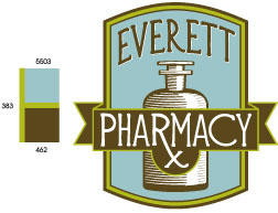
In the end, he and the client agreed on this:
Congratulations to Corey, and to Everett Pharmacy for a logo that’s appropriate and attractive!
This article was last modified on August 18, 2021
This article was first published on July 13, 2009
Commenting is easier and faster when you're logged in!

Recommended for you

Update of Linotype's Premiere Collection: Linotype Gold Edition 1.7.1
Linotype has just released an update of Gold Edition 1.7, its premiere collectio...

InDesign How-to Video: Using Based On Styles
Erica Gamet shows how the Based On feature makes it easy to create, update, and...
Design How-To: Making Complex Patterns with Simple Lines
This story is taken from “Before & After” Magazine). Creativepro...