
Originally posted Jun 26, 2009
When I was in the magazine business, I went to several magazine cover seminars where experts told us which colors and words generated the best newsstand sales; for example, “Ten Hot Tips” is much better than “Hot Tips.” Follow the rules and you would have predictable sales results. Nothing spectacular, mind you, but predictable. And if you publish an enthusiast magazine (cars, computers, trains, motorcycles, etc.), you should always picture that subject on the cover — never a person. I found out the hard way that these rules are generally true.
Yet there’s something in us that longs to break the rules. Breaking the rules on magazine cover theory is tricky. Do it poorly and you suffer fewer sales. Do it well and you may have a classic that breaks all sales records. Another complication: Once you or someone else has done something (like holographs or fluorescent colors), it’s far less effective for the next guy. Click on any cover for a larger version.

You also weren’t supposed to cross the wall between the magazine and the consumer. This meant never letting on that you were trying to trick the consumer into picking up the issue or better yet, buying it. But my favorite magazine covers are the ones that do just that.
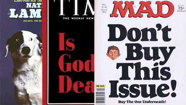
Perhaps the best known of this style is this great National Lampoon cover from 1973. It spoke directly to the consumer as purchaser and effectively showed them the consequences of their inaction. Brilliant.

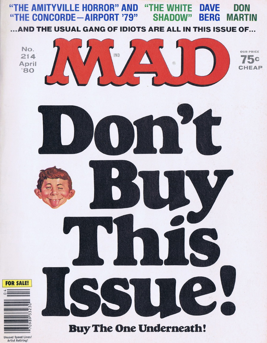
And Mad magazine has done this quite a few times, as if to shout, “Hey you! Come over here and buy this magazine!” I remember almost falling for one of these tricks myself.

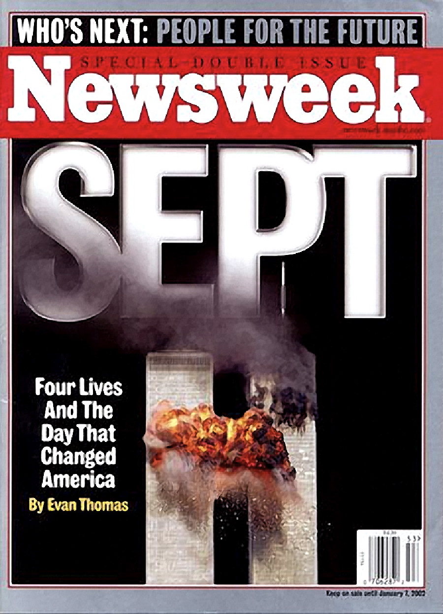
Another rule was to always highlight stories inside with text. No artsy-fartsy concept covers devoid of words. That’s why even the New Yorker has a cover wrap on newsstand copies so they can promote the stories within. So you can imagine what the cover experts would have to say about these three examples from the weeks after September 11. But I think they are compelling.


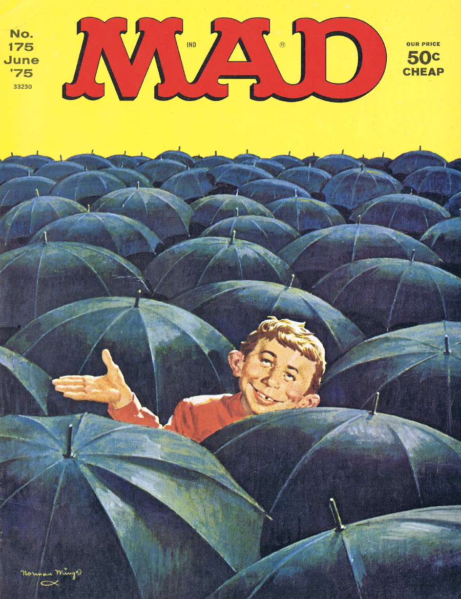
And if you have established a certain pattern with your cover designs, then you should always stick with that, or so the experts say. Perhaps that’s why I like these Mad magazine covers that break the typical Mad mold (which shows Alfred E. Neuman in some sort of parody role).


And no discussion of magazine covers should take place without paying respect to one of the greats, the Time Magazine “Is God Dead” cover (which was very controversial when released). It is eclipsed only by the follow-up tribute cover of a Grateful Dead fan magazine (called Relix) that asked in similarly large type, “Is Dead God?”

I could fill a year’s worth of columns with my favorite magazine cover designs. These are just a few I could put my hands on. If you have some of your own, please share them via the Comments button.
This article was last modified on June 11, 2020
This article was first published on August 10, 2015
Commenting is easier and faster when you're logged in!

Recommended for you

New Versions of FiFi, Fido, and Split & Folio Now Available
Managing Editor Inc. (MEI), an Adobe premier development partner and a leading p...

Get Many Images From One Original Photo
Did you realize that big photos have small photos hidden in the details—a collar...
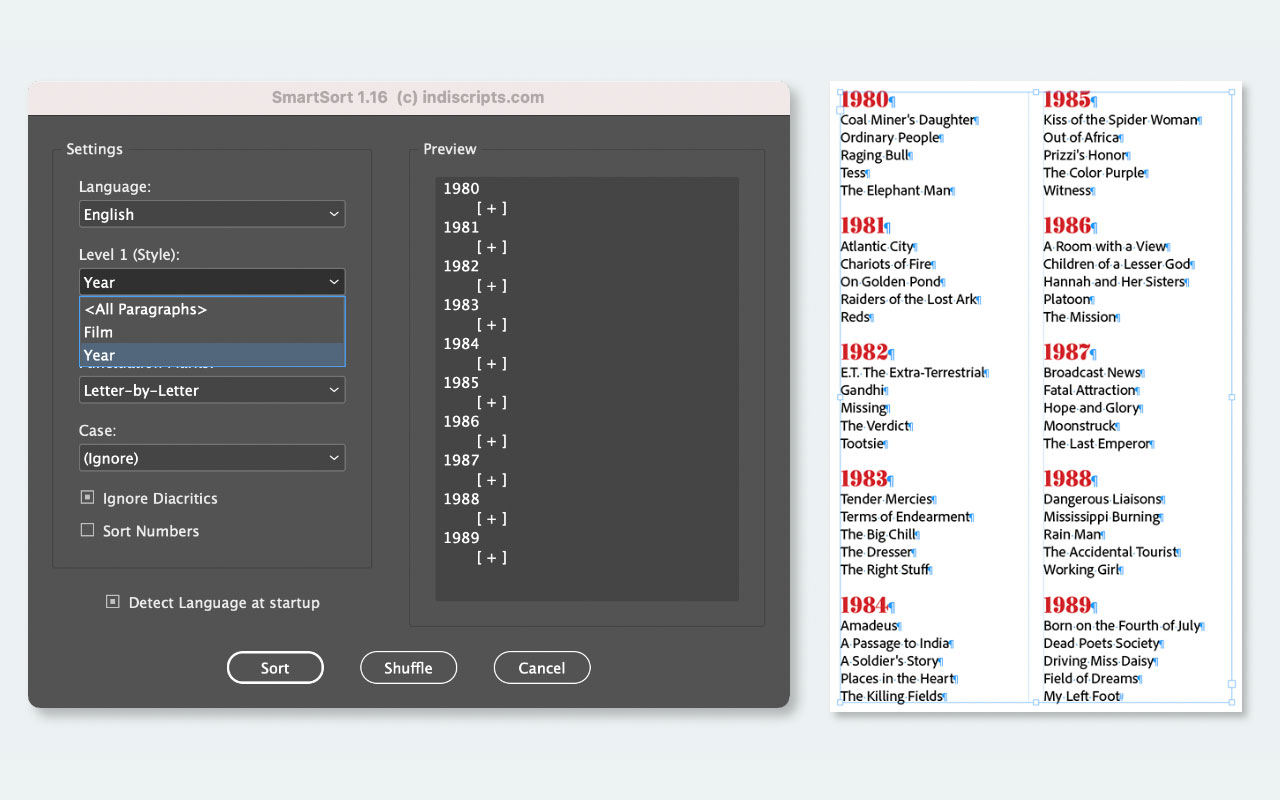
Script of the Month: Smart Sort
This month’s script offers a powerful solution for sorting text and table conten...