
Why Fonts Matter
In excerpts from Why Fonts Matter by Sarah Hyndman, this article explains the psychological effects of fonts on the reader, for the purpose of helping you use type more effectively.

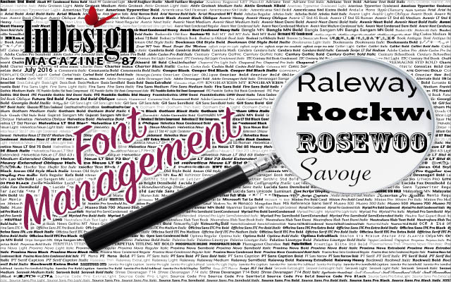
This article appears in Issue 87 of InDesign Magazine.
Editor’s Note: Fonts aren’t people, but they sure do have personalities. And voices. They speak to us in ways that can enhance or undermine the meaning of our text. Understanding what messages your font choices are sending is an essential step in achieving great typography. The following article is comprised of excerpts from Why Fonts Matter, by Sarah Hyndman. It explains the psychological effects of fonts on the reader, for the purpose of helping you use type more effectively.
Type is evocative
There is more to type than just being an invisible transmitter of words. The different shapes and styles of the typefaces themselves stimulate responses independently of the words they spell out, and before we even read them.
Type triggers our imaginations, evokes our emotions, prompts memories, and links to all of our senses (Figure 1).
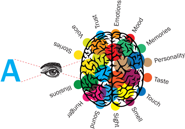
Figure 1
We automatically recognize attributes from the physical world, like how loud it looks, whether it is heavy or light, fast or slow, or what it would feel like to touch. We have also learned a great deal from our shopping experiences, which include knowing whether something is expensive, aimed at children, or how it might taste.
It is easy to measure how readable a font is, but it is less straightforward to measure how it makes people feel. As a result, there is less public-domain research in this area, and much of what we know as designers comes from personal observation and experience.
How do fonts influence you?
Spoiler alert!
Before reading this chapter, take the challenge in this short film: typetasting.com/movie.html.1
Is type
a conspiracy? Does it coerce you with secret messages hidden from view? No, far from it. Type appears right in front of your eyes and is clear for you to see. It is your choice not to pay attention to it consciously and to focus on reading what the words actually say. The type itself is still transmitting plenty of information, but it is communicating it directly to your subconscious (Figure 2).
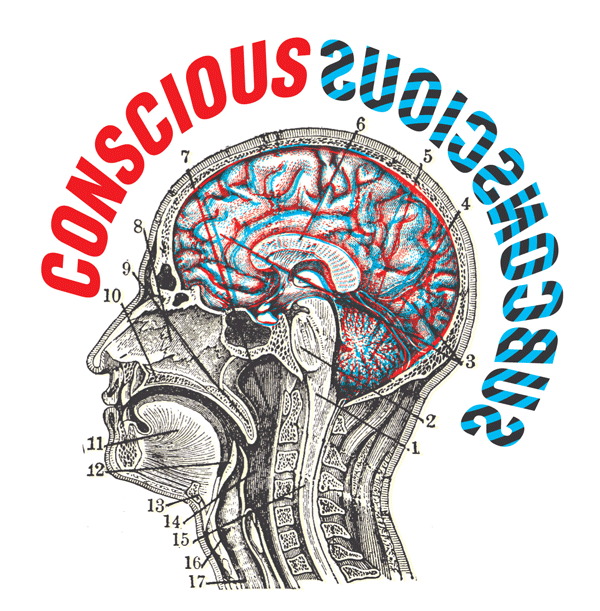
Figure 2
Through the looking-glass
Typefaces/fonts prime you with a great deal of information and set the scene for the words you are about to read. They give words a backstory, a personality, clue you in to whether or not you can trust them, whether they will be serious or light-hearted, academic or childish. Generally, well-set type is designed so that you “look past” the typeface and focus on the words themselves—unless, of course, the font does not match, like somebody with a bad haircut or a miscast actor in a film.
At any time, you can choose to become consciously aware of the messages the fonts themselves are communicating. In Figure 3, the red words simply give the name of each typeface, whilst the blue words in “mirror writing”2 suggest what they could be saying directly to your subconscious brain. Hold the book up to a mirror to reveal what the blue words are spelling out.
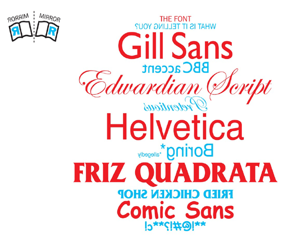
Figure 3
Type karaoke
Play the game of Type Karaoke by simply saying what you see. Try it out on friends, family or, for an energetic response, with a group of children (Figures 4 and 5).
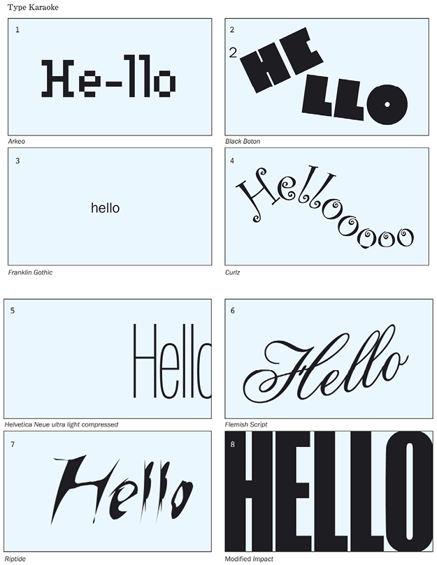
Figures 4 and 5
Type can function as a human-voice transmitter and convey the tones and qualities of your voice visually. We each have a unique voice that communicates a great deal about us, like our gender and age. It charts where we come from, whom we know, and where we have lived along the way. Could your voice look like the traditionally British and approachable Gill Sans, or the more intellectual Caslon?
Graphic designer Ellen Lupton describes typography as “what language looks like.”3 If you imagine that your voice is the typeface, then your vocal range is created by the sizes, styles, and weights of fonts within that typeface family and by how they are arranged on the page. Even a simple text message can be written expressively, from speaking very s l o w l y to SHOUTING. How do you feel when you receive a text or email written in all upper-case letters?
Clive Lewis and Peter Walker see the printed word as a visual code for speech that creates a permanent record of both (a) how the words sound when spoken, and (b) what they mean.4
In her famous 1930 essay5, Beatrice Warde compares typeface legibility to the human voice and suggests that if three pages were set in Fournier, Caslon, and Plantin typefaces it would be like “three different people delivering the same discourse—each with impeccable pronunciation and clarity, yet each through the medium of a different personality.”
Visual onomatopoeia
We all recognize instinctively that type mirrors qualities from the physical world, and understanding is consistently similar from one person to the next.
A bold font with more ink coverage on the paper looks loud, and if it is large enough to fill the field of vision, then it appears so close that it comes across as extremely loud. A small word looks a long way away and sounds distant and quiet. The arrangements of the letters on the page are easily read, like musical inflection, and you will match your tone of voice to this as you read.
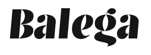
Type designer Jürgen Weltin says of his 2003 typeface Balega6 that with its contrasting curves and sharp edges it would ring with the “fat sound of a Jimi Hendrix guitar.”
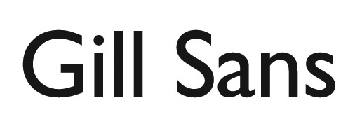
I always imagine that Gill Sans, designed in the 1920s, would speak with a “BBC English” accent. It would pronounce words and use grammar correctly, but have a friendly and relaxed tone, a few notches down from the formality of the Queen’s English. It is the typeface used for the BBC logo and is reminiscent of 1930s “keep calm” England.
Fonts reveal YOUR personality
Fonts are like typographic selfies. You are drawn to typefaces that reflect your values and aesthetics, and you dislike them when they do not. Your loyalty can be called into question if a brand you pay allegiance to changes its logo typeface to one you no longer identify with. This is illustrated by the outcry from Gap customers when the logo font was changed to Helvetica bold, which they thought looked “cheapy, tacky, ordinary” (Figure 6).
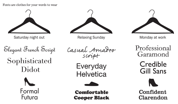
Figure 6
You interact with fonts through the brands you surround yourself with. You identify with the values of the newspaper you choose to read, the brands you put in your shopping basket, the clothes you wear and the car you drive. You are curating the fonts that surround you in your everyday life through the logos on the products you buy and collect.
Designers understand how important typefaces are when creating brand identities, and that a successful one can become highly recognizable from its lettering alone. You know from a single letter whether a cola is Coca-Cola or Pepsi, a TV channel is BBC or ITV, a browser is Yahoo or Google.
Non-verbal communication
When somebody is speaking, we take less than 10% of the meaning from the actual words they say. More than 90% of the meaning is communicated by their tone of voice and through visual clues like their facial expressions, body language, and the clothes they are wearing.7 Your clothes, like your possessions, transmit clues about your personality, financial status, social group, background, etc.
They tell the world who you are, or who you want to be today.8 You make judgments about others within the first seconds of meeting based purely on appearances.
“Didot is like a person who dresses up to look classy and knows just where to stop with the make-up.”
–Gwenäelle Barillon
Fonts convey non-verbal information in a similar way to clothes. Your choice of font tells the world how serious you are, and it clues the reader in to your emotions or your intentions before they have started to read. Just like noticing when somebody is dressed inappropriately or their words do not match their body language, if you use a mismatching font, you may find your credibility is called into question.
Graphology
Handwriting analysis has been considered a science for many years. We each have our own individual style which, according to the British Institute of Graphology, reveals the “pattern of our psychology expressed in symbols.”9 Graphology has been used as an evaluation tool in a range of situations, including screening potential employees, assessing the suitability of a marriage partner, and forensic graphology, which is the study of ransom notes and blackmail demands. Today a great deal of what you write is done by tapping on a keyboard, where the fonts you select, and how you use them, replace your personal handwriting style. Your choice of fonts may not be as individual to you as your handwriting but, as already shown, it still reveals a great deal about you—and this can be analyzed (Figure 7).
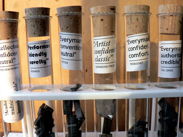
Figure 7
Use fonts and influence people
If you want to really connect with your audience, then it is important to consider who they are when you choose a font. This is like speaking in the right tone of voice; for example, you would not talk to your boss in the same way that you would talk to young children. In the business world, using type styles appropriate to the sector can help you to speak the same language, although this is not to suggest that you actually go as far as imitating the client’s corporate font. If you are not sure what these are, then look up some companies in the sector and see what type styles they use.
To continue the parallel with clothes, fonts can act like an interview suit if you are writing a CV or a letter to a potential client and need to be appropriate both for the industry and the occasion. This is not the time to parade your individuality with an outlandish outfit or a “personality” font. (Earlier in this book I mentioned that a student found his grades improved when he used a more suitable font.)
Influence yourself
Fonts influence what you read: you know whether what you are about to read will be intellectual, informative, silly, or important. Fonts set the tone and create a mood that can range from calm to energizing. They prime you to know whether what you are about to read will be entertaining or educational, and just how believable it might be.
Could you use this to your own advantage? Could you use fonts to influence yourself?
Copywriter Michael Everett changes his typeface depending on the tone of voice he wishes to write in, because he finds it helps him to use the right language style for a project.
For short and snappy car advert slogans, he writes in the modern, geometric Futura. He uses Times New Roman for long and informative editorial articles when he wants to write in a more intellectual style. He creates his invoices in the open and easy to read Century Gothic; I wondered whether he was instinctively choosing an “easy-to-do” font to make his invoicing feel like less of a chore.
Try this out for yourself. Open a document or an email, and see how different fonts change the tone of what you’re writing. A typeface like Century Gothic could help you to explain something difficult with clarity. Garamond or Book Antiqua could help you to feel like you’re tapping into your knowledge and wisdom, whilst a solid style like Bookman Old Style bold might help your words to flow more assertively as you write.
Endnotes
1. ‘Monkeying around with the gorillas in our midst: Familiarity with an inattentional-blindness task does not improve the detection of unexpected events’ by Professor Daniel J. Simons, 2010, i-Perception. www.youtube.com/watch?v=IGQmdoK_ZfY
2. ‘Through the Looking-Glass’ by Lewis Carroll, 1871. In the reflected version of her own house, Alice finds a book with the poem ‘Jabberwocky’ written in ‘mirror writing’, which she could only read by holding it up to a mirror.
3. Thinking with Type by Ellen Lupton, 2010, Princeton Architectural Press.
4. ‘Typographic influences on reading’ by Clive Lewis and Peter Walker, 1989, British Journal of Psychology
5. ‘The Crystal Goblet’ by Beatrice Warde, 1930, World Publishers.
6. ‘Balega’ by Jürgen Weltin, 2003, https://www.fonts.com/font/linotype/balega.
7. Silent Messages: A Wealth of Information About Nonverbal Communication (Body Language) by Albert Mehrabian, Professor Emeritus of Psychology at UCLA, 2009, kaaj.com.
8. You Are What You Wear: What Your Clothes Reveal About You by Dr. Jennifer Baumgartner, 2012, Da Capo Lifelong.
9. British Institute of Graphology, britishgraphology.org. Mehrabian poses the theory that when we talk 7% of what we communicate is through our words, 38% by our tone of voice and 55% by our body language.
***
Sarah Hyndman is a London-based graphic designer and founder of Type Tasting. She is involved in researching the connections between type and perception. Sarah creates her own experiments and surveys and also works on collaborative studies with the Crossmodal Research Laboratory at the University of Oxford. Her work has been featured by AIGA, CNN, FT, and Wired.
Commenting is easier and faster when you're logged in!

Recommended for you

Designing a Better Deck: Interview with Nolan Haims
Nolan Haims is on a mission to stop boring presentation designs. You know the ty...

InDesign How-to Video: Use Ignore Text Wrap
In this week’s InDesignSecrets video, Mike Rankin explains InDesign’s Ignore Tex...
Font Sizing Guidelines Part 2: Spacing Considerations
Q. How does font size affect its spacing? A. In the most recent TypeTalk, we dis...