


According to Typblography, a blog written by the Adobe type development team, Adobe finally has its own corporate typeface family. Created by type designer extraordinaire Robert Slimbach, the new family is called Adobe Clean.
You’ve actually already seen earlier versions of Adobe Clean in action in Creative Suite 3 and 4 splash screens and application icons. (Adobe calls them “mnemonic logos,” but just thinking about pronouncing that hurts my head.) You’ll see the design slowly make its way into other materials.
As David Lemon notes in the blog post “A new face for Adobe,” Adobe decided to replace their previous font choices, Myriad Pro and Minion Pro, because they’re used so widely.
Slimbach’s challenge was to create a type family with a “21st-century feel combined with an earnest readability,” says Lemon. “What he produced is as classic as all his other designs, but with an uncharacteristic blend of contemporary touches for on-screen rendering and a more ‘progressive’ feel.”
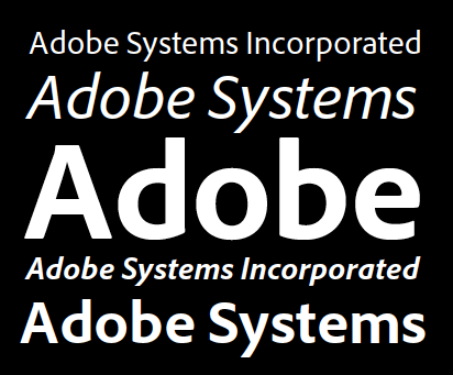
Samples are below:

To learn more about the font’s development, read the informative blog post.
This article was last modified on August 20, 2021
This article was first published on May 11, 2009
Commenting is easier and faster when you're logged in!

Recommended for you

TypeTalk: Standard and Discretionary Ligatures
Q. What exactly is a ligature, and what is the difference between a standard and...

A Celebration of Hand Lettering
The last time I wrote about signage in the developing world (Go on a Type Safari...

Setting Readable Reversed Type
Learn how to maximize the readability of light type on a dark or busy background...