

I like things that change slowly and aren’t as subject to fashion as most graphic and visual arts. Traffic and road signs are one such slow mover. They’re designed to be timeless; plus, cities, counties, and the federal government often don’t revise signs until they must replace them.
So it was a lot of fun to come across three catalogs that deal with the manufacture of metal highway and traffic signs (along with other related goods). Two from the Irwin-Hodson Company of Portland, Oregon, date from 1926 and 1938. The third, from the S.G. Adams Company of Saint Louis, dates from 1939.
I’ve done something a little unusual for me, which is produce scans with a lot more small type since I think the context is particularly interesting this time. So please click on any image to see a larger version.


The first thing that strikes me in this look back at early automotive travel is the lack of conformity. There was little regulation, so signage varied from town to town, depending on the local supplier. You can see a few very minor regional differences today, but it’s only individual street-name signs that still have some local character. Another bit of regional America down the tubes.


Technology played an important role in the development of traffic signage. By the late 1930s, each of these companies had introduced “reflectorized” material as part of sign construction, though the materials were crude by today’s high-reflection standards. I suspect the use of reflective material had more to do with sign changes than any alteration in type design or setting.
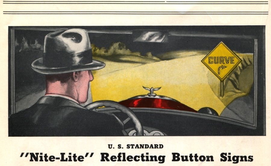


In fact, reflection was a really big deal, so all sorts of ways were tried to make something show up at night. Remember, not only was reflection poor in those days, but car headlamps glowed like bad 40-watt light bulbs.


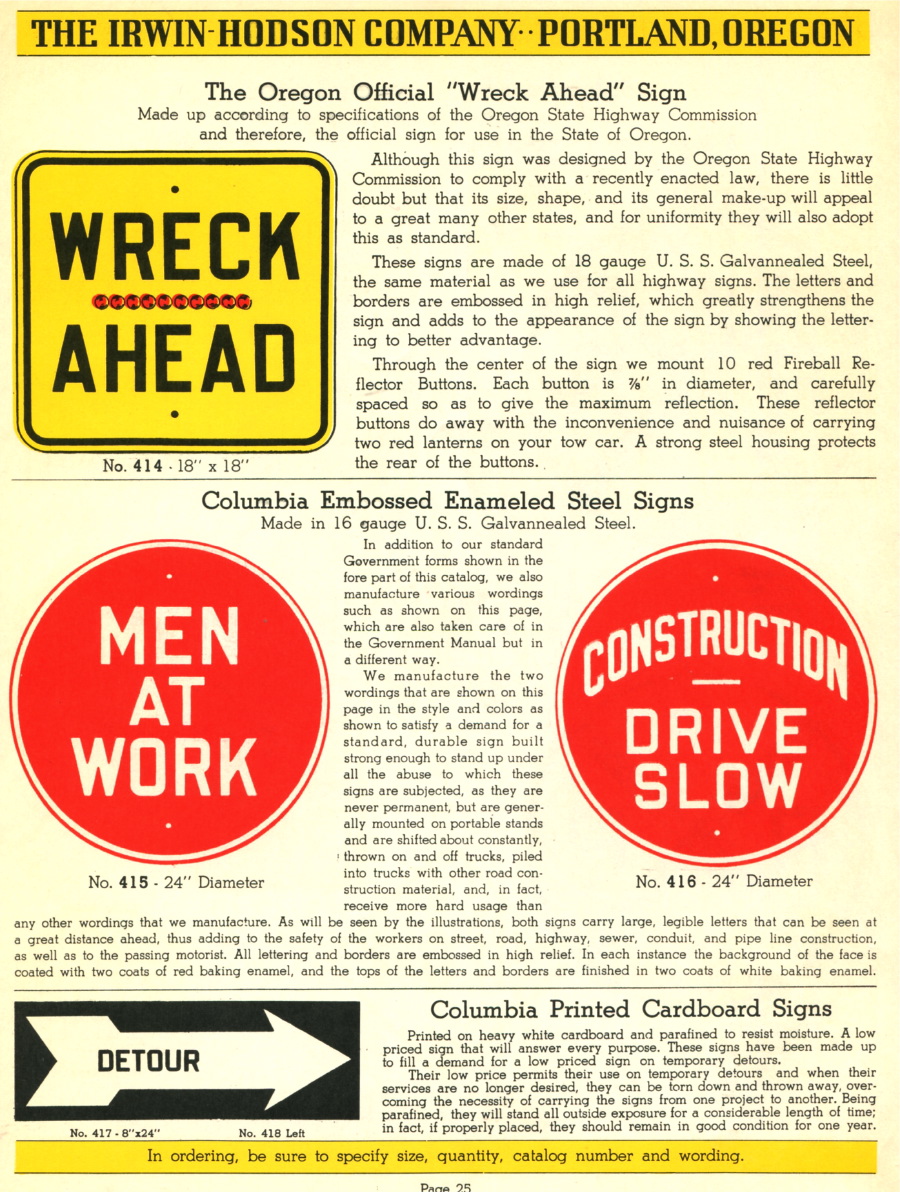
The other thing I noticed in these catalogs is that most of the signs were yellow, including the STOP signs. I imagined STOP signs had always been red, but yellow is actually much easier to see at night. However, by 1938 the STOP signs on the roads were red.


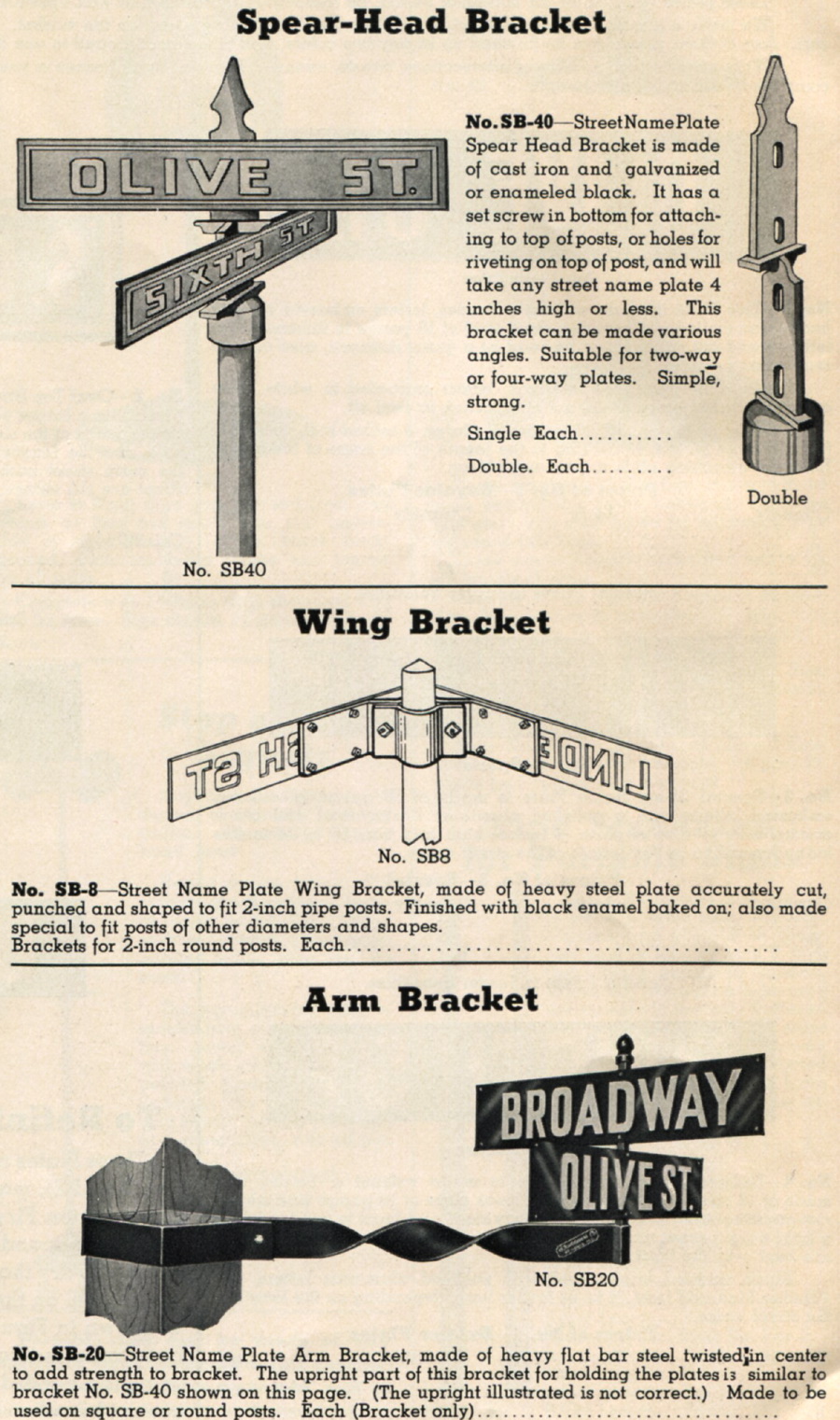
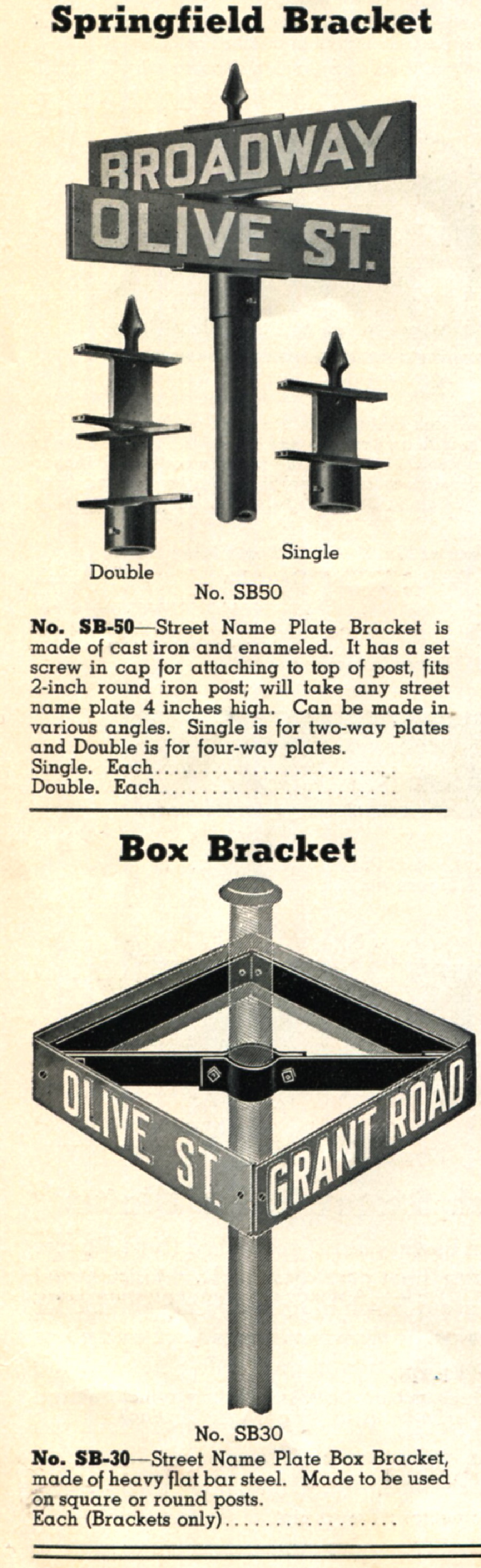
And I surely like the variety of street-sign ornamentation and the fact that some structures are known by the city that popularized them (though I don’t know which Springfield to credit with the example below).


It seems that sign-makers used “please” and “thank you” a bit more then, and used more words overall to convey messages than we do today. I guess as you train generations, you can start using shorthand. Apparently, too, the concept of an “auto-camp” was relatively short lived, as was the notion of “branding” tires!


The 1920s and ’30s were also a time of great highway construction, so there were many signs and devices related to building and road-diverting. It was, in fact, the later development of a rigid national highway system that led to a great deal of standardization.

Go to page 2 to see more car licenses from the early 20th Century, plus more road signs.
This article was last modified on May 17, 2023
This article was first published on April 17, 2009
Commenting is easier and faster when you're logged in!

Recommended for you

How InDesign Understands Fonts
A daring exposé of the numerical truths behind all those characters you type.

Working With Bulleted and Numbered Lists in InDesign
With a little care and effort up front, you can create great-looking numbered an...

TypeTalk: Small Caps in Illustrator
Q. When I’m using Adobe Illustrator, how can I access the true-drawn small...