
InDesign Color Management
In this introduction to color management, David Blatner shows how a few easy techniques can improve your colors immensely in InDesign.

This article appears in Issue 85 of InDesign Magazine.
Color is tricky. Of course, it’s easy to make a color in InDesign and apply it to an object on your page, but to ensure that the color looks the same way on your screen and other people’s screens, and when you print it out… that’s tricky. And that, in a nutshell, is what color management is all about. Color management has a bad reputation as being too complex and technical, something that would require years of study to understand. And the result is that too many designers (especially InDesign users!) just ignore the topic entirely and resign themselves to complaining about color infidelity, rather than actually doing something about it. But in reality, things aren’t quite so daunting. You can get much better color by learning just a little bit about color management. So in this article, I’m not going to be comprehensive about how to get perfect color, because that would take hundreds of pages. Instead, I’m going to focus on the basics, and the most important things you need to know about color management. I promise, this won’t hurt a bit.
Why We Need to Manage Colors
First, it’s important to understand why color management is necessary. As you know, just because I pick a red on my screen doesn’t mean you’re going to see that same red on your screen, and that red will probably look even more different when it comes out on a printer. There are many reasons for this, but the simplest explanation is that different devices just display color differently. Some screens will be brighter, others may have a slightly greener tint to them, some more blue. Same thing with printers: the toner or ink in your desktop printer is CMYK, but it’s almost certainly a different CMYK than the inks on
a big printing press, and those are different than the inks used for fabric printing or screen printing, and so on. And even if the inks are the same, they look really different depending on what you’re printing on. Printing colors on bright white coated paper looks very different than printing on dull, porous newsprint, right? So when you’re trying to communicate with color, you have two options. You can just give up and say, “there’s no way it’ll ever work, so why even bother trying.” Or you can try to adjust the color, based on where it’s being printed or shown. Like, if you know it’s going to be printed on darker paper, you might make the color a little lighter. If you’re displaying it on a really bright screen, maybe you’d make it a little darker to compensate. This process of changing the color with the intention of maintaining the look of the color is the essence of color management. That change might be as small as temporarily tweaking how an RGB color looks so that it matches both on your screen and someone else’s. Or it might be as big as converting an image’s RGB colors to CMYK. In fact, you may have done RGB to CMYK conversions in the past and didn’t realize that you were doing color management, but you were.
Gamuts and Profiles
No matter how much you spend on the most amazing printer or monitor, you’ll never get something that can display every color that we can see. So whenever we talk about a color device—whether that’s a camera, scanner, screen, desktop printer, or printing press—we need to think about the range of colors it can capture or output. That range of colors is called its gamut. It’s tempting to say that different devices have bigger or smaller gamuts. Like, a lot of people say that an RGB device (like a computer screen) has a “bigger” gamut than a CMYK device (like your desktop printer). But actually, there are colors you can print with CMYK that you probably can’t see on your screen—especially some yellows and darker colors like pure cyan. So it’s more accurate to say that different devices have different shaped gamuts (Figure 1).
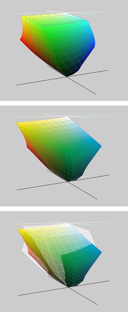
Figure 1: These images from the free Mac OS app ColorSync Utility show the 3D gamut of RGB (top), CMYK (middle), and the two combined (bottom). The gray grid is RGB superimposed on CMYK. Note how the cyans and some greens “stick out,” indicating they can be seen in CMYK and not RGB.
Getting great output profiles
Now that you know it’s important to have high-quality profiles, where should you get them? Fortunately, InDesign and Photoshop ship with a bunch of “generic” profiles you can use (Figure 2).

Figure 2: Some of the ICC color profiles that are installed on your computer along with InDesign.
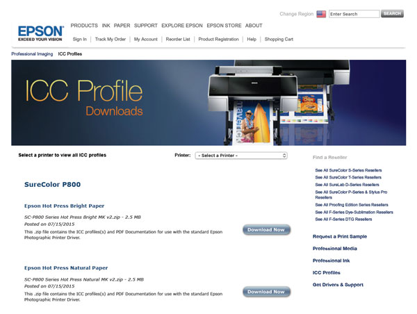
Figure 3: Epson offers a large number of color profiles to download and use with their inkjet printers and various papers.
Understanding document profiles
Document profiles are incredibly important because they describe what the colors in your documents—your placed Photoshop images and Illustrator graphics, and all the color swatches in InDesign—actually look like. That is, if I define a color swatch in InDesign as 100% cyan, then which cyan ink am I talking about? Remember that different physical cyan inks look different (and look nothing like pure RGB cyan), so the document profile explains what color I’m talking about in this InDesign document. Without a profile, it’s just a number; it has no definitive meaning. You should never use a monitor profile (or a camera profile) as a document profile, though you might use an output profile. For example, a CMYK image in Photoshop might include a document profile that says “the CMYK colors in this file are based on Uncoated FOGRA29.” Without that information, InDesign wouldn’t know what the cyan, magenta, yellow, and black colors are supposed to look like, so it wouldn’t be able to display them properly on screen. So part of your job is to track which document profiles you’re using in Photoshop, Illustrator, and InDesign. Fortunately, you rarely need to get document profiles outside the ones Adobe installed for you. For RGB images, you’ll usually want to use the sRGB or Adobe RGB profiles; for CMYK images, you’ll want to use a document profile that best matches your target printed output. (If you don’t know what your target printed output will be, then don’t convert it to CMYK yet; instead, leave it in RGB. See the article that Claudia McCue and I wrote here.)
Setting up InDesign
Every InDesign document has its own document profile—actually, technically it has two profiles: one for RGB and one for CMYK. (This is because InDesign, unlike Illustrator or Photoshop, can handle both CMYK and RGB images and color swatches at the same time.) Unfortunately, InDesign doesn’t make it obvious what those profiles are. The three main approaches for managing profiles all live at the bottom of the Edit menu: Color Settings. In InDesign, Color Settings are your preferences, or defaults, for new documents you create after you click OK. This is a key point: changing Color Settings won’t affect any documents you’ve already made, including the one you currently have open. Typically, the only thing you need to change here is the Settings pop-up menu. I recommend you use the Europe General Purpose 3 preset, because it uses the Coated FOGRA39 CMYK profile, which, as I mentioned earlier, is better than SWOP if you’re printing on a normal sheetfed or digital press (Figure 4). (To choose that setting, you may need to turn on the Advanced checkbox.) This setting also uses the sRGB profile for your RGB colors; I explain why this makes sense in InDesign in this article on InDesignSecrets.

Figure 4: Color Settings primarily changes the defaults for future documents.
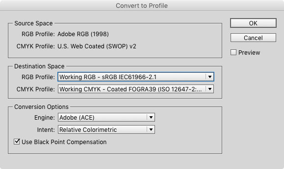
Figure 5: Convert to Profile is a great way to see what the current document’s RGB and CMYK profiles are set to, but just click Cancel when you’re done.
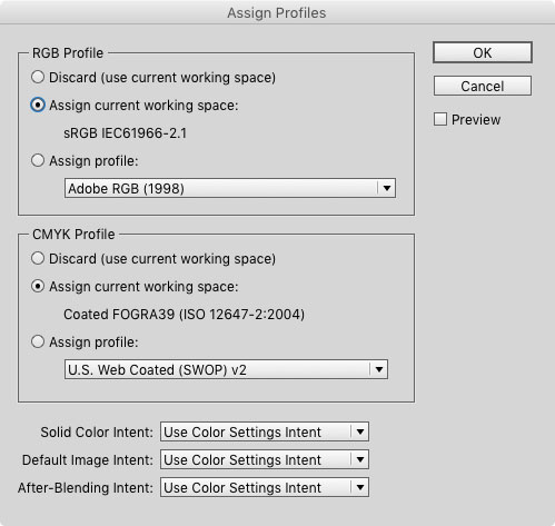
Figure 6: Assign Profiles lets you change the current document’s RGB and CMYK profiles—literally changing how InDesign understands what those colors look like.
The Transparency Blend Space
Did you ever add a drop shadow to an item and notice all the colors on the page shifted? If so, then you’ve seen the effects of transparency blend space. As soon as there is any transparency on the page, InDesign converts every color on the spread into what’s called the default transparency blend space. This is why sometimes colors and grays can suddenly change all over your page or your spread when you reduce the opacity of an item, or apply transparency effects like drop shadows or blend modes. It can also happen when you place a new image on your page. If that image is, say, a PSD file that has transparency, then InDesign changes the look of the whole page (and all the colors), based on the transparency blend space. In most documents, the blend space is set to CMYK, but you can control that by going to the Edit menu, choosing Transparency Blend Space, and then choosing either Document RGB or Document CMYK.  Grayscale images are also affected by this setting, because internally grayscale images are defined as either CMYK or RGB. If the blend mode is set to CMYK, then InDesign thinks of it as a CMYK image with data only on the black plate; if it’s set to RGB, and there’s transparency on the page, then internally InDesign displays it as though you converted it to RGB in Photoshop.
Why Colors Change Unexpectedly
When you start paying attention to color management, you’ll notice that sometimes the colors that Illustrator or Photoshop shows you don’t match what InDesign displays. Here’s how to track down the cause of that problem. First, if your image’s profiles don’t match your InDesign document profiles, colors may shift unexpectedly. For example, if you have a CMYK document in Illustrator set to the SWOP profile, and your InDesign document is using Coated FOGRA39, then the same color swatch in the two programs will look different. Again, that’s because each profile gives the color meaning. Second, let’s say you save your CMYK Illustrator or Photoshop document, and you save it with the profile embedded in the file. Then you place that CMYK file into InDesign. You might think that InDesign would read that embedded profile and adjust the colors so that it looks correct in InDesign. After all, that is the whole point of color management! But here’s the ugly truth: by default, InDesign ignores all CMYK document profiles in your placed images and graphics. That’s why you’ll usually get the same color in a CMYK image whether or not you clicked Embed ICC profile when you saved the file. While that sounds weird, for technical reasons it turns out that in most cases it actually is better for InDesign to ignore color management in CMYK files. The result is that if you place a CMYK image into your document, then InDesign displays that CMYK image based on the InDesign document’s CMYK profile (not the image’s). And when it comes time to print or export a PDF, it simply passes along the CMYK values. That way, the CMYK percentages in each color stay what they should be—a 100% black stays 100% black in the final output and doesn’t get converted into a 4-color rich black, and so on. RGB images are different: all RGB images—whether from Photoshop or Illustrator—are color managed. If the placed RGB image does not have an embedded profile, then InDesign uses your InDesign document’s RGB profile. If the image does contain an embedded profile, then InDesign honors it and adjusts its color appropriately. Tip: When you’re building a graphic in Illustrator, you need to decide which is more important to you: the actual color values or the way they look. If you’re creating graphics for a print job, and you care about the specific CMYK values—for example, if you’re using solid colors in icons—you’ll want to use the CMYK document mode in Illustrator. But if you’re making artwork mostly for onscreen viewing, or you use Illustrator for fine art, with a lot of fancy brushes and gradient meshes, and maintaining the look of the colors is more important than the actual values—then the RGB document mode may be the better choice. Because, again, while InDesign doesn’t color manage CMYK documents from Illustrator, it does manage them if they’re set to RGB.
Forcing InDesign to Notice a Profile
There is an important exception to the “InDesign doesn’t color manage CMYK images” rule: you can force it to honor an embedded document profile in a CMYK image from Photoshop. There are two ways to do this. On import: When placing a Photoshop (or any other bitmapped) image, you can enable the Show Import Options checkbox in the Place dialog box. Then, on the Color tab of the Import Options dialog box, you’ll see a pop-up menu called Profile (Figure 7).
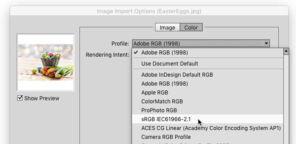
Figure 7: Choosing a color profile when placing an image.
Converting RGB to CMYK in Photoshop
As I said, you should not convert your images to CMYK in Photoshop unless you have a really good reason to do so. Instead, place them as RGB into InDesign. However, a lot of people do want to convert images in Photoshop, so I offer this one warning: if you’re going to convert to CMYK, don’t do it by choosing Image > Mode > CMYK. Technically, it’ll work, but there’s a critical problem here: which CMYK? There are lots of different RGBs and lots of different CMYKs. Should it be the CMYK for your desktop inkjet printer? Or the CMYK of your printing press? And if it’s your printing press, then which ink and paper are you using? Because, again, CMYK looks different with different output conditions. Using Photoshop’s Edit > Convert to Profile feature is the far better option, because it gives you the control you need (Figure 8).
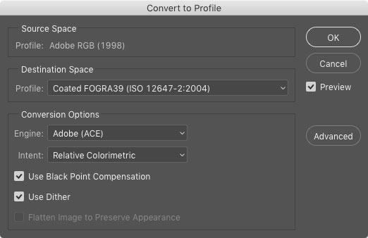
Figure 8: Using Convert to Profile in Photoshop to make an intelligent conversion from RGB to CMYK.
Soft (on screen) proofing
Soft-proofing is proofing your colors on screen, so that you’ll get a better sense for how colors will appear in print. InDesign offers several good soft-proofing features: Overprint Preview. When you choose View > Overprint Preview, InDesign turns on High Quality Display—so all your images and vector graphics look as good as they can—and shows where one color is going to print on top of another. Appearance of Black. Inside InDesign’s Preferences dialog box, the Appearance of Black pane lets you tell InDesign how you want black to look on screen and on desktop printers. By default, this is set to show Rich Black, which means make it as black as it can be. But in reality, black ink isn’t really that black; it’s more like dark charcoal gray. So I recommend changing these pop-up menus to Accurately instead. Setting this preference can be a bit of a downer, because your images probably won’t look as good onscreen. But you want to know the truth of what they’ll look like in print, right? Better to set expectations early on than to feel let down when the final product lands in your hands. Proof Colors. The most important soft proofing feature is View > Proof Setup > Custom, which opens the scary-sounding Customize Proof Condition dialog box (Figure 9).
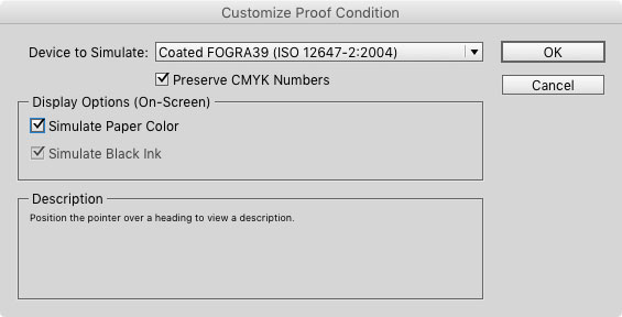
Figure 9: Maximize the accuracy of your onscreen proofing by customizing the proof condition.
Printing from InDesign
If you’re sending your document to a commercial printer, and they’re printing to a digital or offset press, then you’ll probably want to send them a PDF of your file and let them print from Acrobat. (I’ll talk about PDFs in the next section.) If you’re printing directly from InDesign, you’re probably making a flyer or poster for your school or work or something where you just want to get the best possible output from your desktop printer. The sad truth is that while technically you should be able to color manage your InDesign documents to a desktop printer, it actually turns out to be somewhere between difficult and impossible. The best option, in my experience, is usually to set the Color pop-up menu (in the Output pane of the Print dialog box) to Composite RGB, and then switch to the Color Management pane and set the Printer Profile pop-up menu to sRGB (Figure 10).

Figure 10: The best settings to use when printing to a desktop printer.
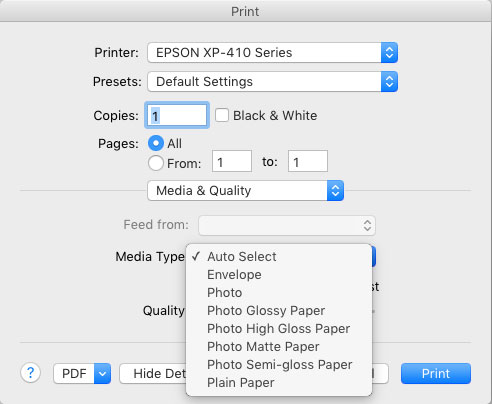
Figure 11: Choosing the right paper in the printer driver can make the color in your desktop printouts much more accurate.
Exporting Color Managed PDF Files
The whole point of color management is clear communication—like communicating colors accurately from your document to the screen, or from your screen to your desktop printer. But perhaps the most important communication is between you and your commercial printer—the company that is printing your document for you. And by far the best way to send your document to them is by making a PDF of it. Here, I’m going to focus on just one aspect of making a PDF: how to manage your colors. If you export an interactive PDF file, InDesign will automatically convert all your colors to sRGB—which makes sense, because the whole point of sRGB is that it more or less describes the color of a typical screen. But when creating a print PDF, you need to tell InDesign exactly what to do with your color. You do all of this in the Output pane of the PDF dialog box (Figure 12).
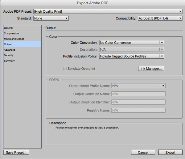
Figure 12: Choosing how color is handled in the Output pane of the Export Adobe PDF dialog box.
Check the Ink Manager
Before you export a PDF file, you should click the Ink Manager button (in the Output pane of the Print of PDF Export dialog box). If you have spot colors in your document, they’ll show up here in the list of inks. If you’re paying your printer extra to print special spot color plates, like varnishes or metallic inks, just leave those alone. But if you didn’t mean for them to be here, then turn on both the All Spots to Process and the Use Standard Lab Values for Spots checkboxes, so you’ll get the best possible conversion to CMYK. (Lab is a color space that describes what colors look like to the human eye. So by choosing Lab here, you’re telling InDesign to keep the look of the color as close as possible to the original, even though you’re converting it to CMYK.)
Small Steps with Big Results
I won’t lie to you: color management isn’t usually fun. The stakes are high, the jargon is weird, and often your reward for doing everything right is that colors appear less rich and vibrant than you had hoped for. But if you approach color management like a puzzle or a game, it can be very gratifying. And you can make yourself a very valuable team member by being “the one who understands color management.” Start with the basics: create a monitor profile and set up your apps and documents with the proper document profiles. Then take small steps into using better-quality output profiles. And whenever you see the words RGB or CMYK, think to yourself: which RGB? Which CMYK? After a while, you’ll see that you don’t have to do a lot to achieve much better and more consistent color in your documents.
Commenting is easier and faster when you're logged in!

Recommended for you

New Contest! The Mystery of the Missing Link
Solve this InDesign mystery for a chance at winning a great prize.

Quick Wins: Building Print Production Skills
Use these five resources to boost your prepress knowledge and skills.

This Week in InDesign Articles, Number 48
A few links, including some time-sensitive offers!