

When everything in a project proceeds according to plan, that’s great. It’s business-as-usual and all’s right with the world. But once in a while something doesn’t go according to plan, and that’s when knowing what’s happening under the hood can help you out.
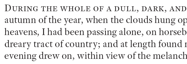
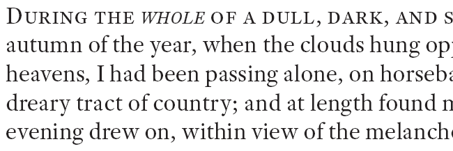
Here’s a little gotcha I came across on a current project. The typeface I chose for the body copy is Adobe Text Pro, a wonderfully readable typeface by Robert Slimbach with only one purpose: to be a wonderfully readable typeface. Like any robust OpenType text face, it includes true Small Caps, making it possible to use a Line Style that renders the first line of a chapter in small caps. Here’s an example using dummy text:
So far, so good. During the proofing, it turned out that a word in the first line of one chapter was supposed to be italicized, which had been omitted from the submitted copy. “No problem!” I thought, and applied my “Italic” character style. The result wasn’t quite as expected:
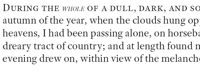
Shrunken italics? What’s up with that? There’s no “+” after the Character Style or Paragraph Style. The text is 13 point. The Character panel says the italic text is also 13 point, but it definitely isn’t. So what gives?
A quick trip to the Glyphs panel solved the mystery.
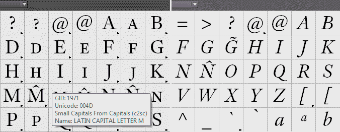
Adobe Text Pro’s roman weights include glyphs for small caps, but the italic doesn’t. This is not something you want to discover when you’re well into typesetting a 10-volume, 3,000 page project. (Yes, I know. Cold, shivery feeling, as if someone just walked over your grave, right?)
Faced with this dilemma, InDesign substitutes regular capitals from the italic font and scales them down according to what is set for Small Caps in Preferences > Advanced Type.
What’s a designer to do? The project is too far advanced to even consider changing the text face; the client has signed off on the design and too much work has already been completed. Can’t ditch the small caps line style, for the same reasons. Fortunately this is a single word in the opening line of one page among 3,000 or so. It’s possible and excusable to fudge things a bit.
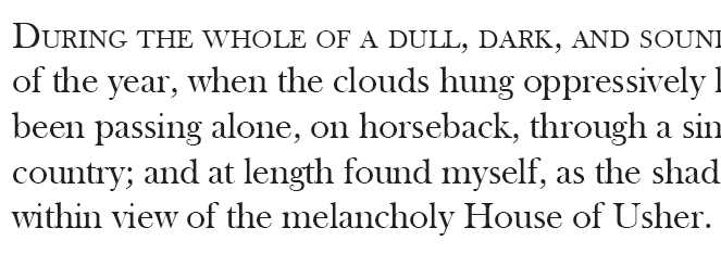
In most cases, lack of true small caps looks hideous when a line of type starts with a full capital. The initial cap looks as if it’s semibold, or the rest of the line looks wimpy, or both. Here’s Baskerville OldStyle:
The effect is made obvious (it’s worse in sans than serif) because the initial cap and the characters that follow are all upright (roman), and the eye expects an even “type color,” not a single anemic line in an otherwise-robust array of text.
But when there’s a change from roman to italic, the character of the glyphs changes. The reader understands that the italic word is intended to look different from the roman; a slight imperfection won’t catch the eye (unless you’re a typographer and you’re looking for it). In this case, changing the Small Caps scale in Preferences to 74% and adding a stroke of 0.05 points tweaks it to the right height and weight to pass muster. A little tracking (+10) compensates for the faux weight.
If you have to do something like this, print it out to make sure, on the highest-resolution printer you have available. It’s not possible to verify a match like this on screen, even zoomed in all the way, and a standard 600 dpi laser is no more than barely adequate.
The takeaways? One, be happy your typeface has true Small Caps, but verify all the weights and always check the italics! Two, in a desperate situation it is okay to fake it, if you do it carefully. (But don’t make a habit of it. Just because you can doesn’t mean you should.)
This article was last modified on July 25, 2019
This article was first published on May 20, 2015
Commenting is easier and faster when you're logged in!

Recommended for you

Why Are My Hyperlinks Still Working?
Jacob wrote to us with a problem he was having with a file: he was having troubl...
Saving Thumbnails of InDesign Pages
Keith does a "deep dive" into saving thumbnails for Bridge in InDesign.
Make Edit Original Use the Right Program
When you Option/Alt-double click an image, or do its menu equivalent – sel...