


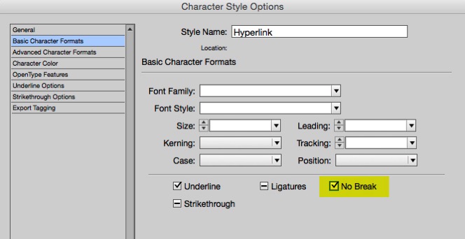
One of my favorite new-ish features of InDesign CC (version 9.2) is the overhaul of how hyperlinks are created and managed. One aspect of this is that now, when you create the first hyperlink in a document, a new Character style named “Hyperlinks” is created. By default, this character style only has two attributes: a character color named “Hyperlink” (a light blue), and a standard underline.
But, there are a few things you should do to improve this character style.
1. Add the “No Break” attribute. This will prevent long urls from breaking at the end of a line.
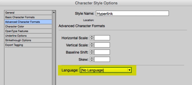
2. Change the language to “No Language”. This way, when you use Edit > Spelling > Dynamic Spelling, the URL will not display with the red underline that indicates a misspelling.
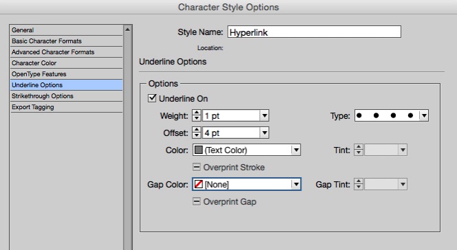
3. Change the appearance. The blue-type-with-an-underline harkens back to ye olde Netscape Navigator days. Nothing says that hyperlinks must be blue and underlined. I like to try to find a type and color combination that works well throughout the entire scope of a project, so that all hyperlinks can have exactly the same appearance. I often create a custom dotted, colored underline.
This article was last modified on July 25, 2019
This article was first published on March 25, 2015
Commenting is easier and faster when you're logged in!

Recommended for you

Batch Change Hyperlinks Across a Whole InDesign Document
What if you had to edit 900 hyperlinks in 5 minutes? Or make other huge changes...

InDesign Magazine Issue 145: Designing with Gradients
Issue 145 has articles on designing with gradients, page numbering, InDesign's h...
Making Hyperlinks the Easy Way
A free script takes all the trouble out of making hyperlinks from URLs.