


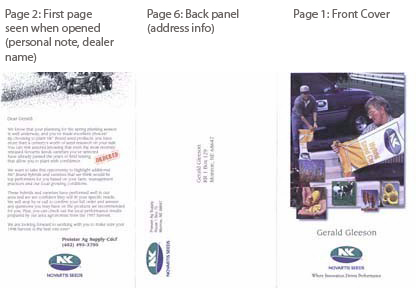
There are two levels of personalization in this classic direct-mail piece — a brochure mailed by Novartis Seeds to their customers.
Level One — Simple Personalization
On one level, recipients see their names on the cover, plus a personal note when they open the bi-fold mailer (page 2). The name of their dealer/agent is also there. The piece is addressed to them on the back panel (page 6), so an envelope is eliminated. Thus, one side of the sheet is the front page with name, address and personal note with the dealer listing.
Sounds pretty simple.
Level Two — Take it to the Next Level
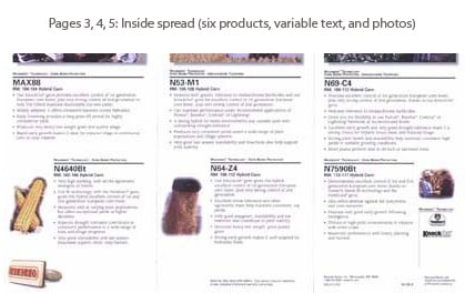
Then there is another level of personalization. The inside panels (pages 3-5) describe six products. The photo and text for each product are pulled from a database of information known about the recipient. There are over 90 products and 28 photos to select from — and each element is specially tailored to meet the customer’s farming operation needs. Even the color of the tractor is customized to the one the farmer prefers.
The Layout and Design Came First
Each text block and each image of the brochure has been prepared to fill a unit area on the page. This requires significant preparation. The design may actually come first, with the text developed to fit the area. Each has the same typographic format.
The piece has six panels in all and measures 4.75 x 8.5 inches when folded and 8.5 x 14 inches when flat. It is printed on 100 lb. uncoated cover stock.
The layout of the piece looks like this:
No Color…No Cracking in the Folds
Because no color goes across the folds, the brochure does not need to be scored to reduce the cracking of the toner. This is an area where designers need to work around the idiosyncrasies of the technology.
Usually, toner on a fold is not a serious problem if you fold with the grain. But, if you fold against the grain, you will have unsightly cracking. Most designers just avoid this situation in all cases if they can.
If you coat or laminate the piece, the problem is solved. This piece is designed to avoid cracking altogether by making the background white with no toner on any fold. Web-based printers sometimes run the paper and image in such a way that folds are against the grain. Sheet-based printers can get paper that is cut as needed for grain direction.
Simple, Yet Personal
Overall, it is a deceptively simple piece in that it has two folds and no other finishing. But the personalization is what makes it unique.
- First, the recipients see their name and address.
- Then they see a “Dear So-and-So” letter and the name of a local agent.
- But the secret to the success of this piece is the use of variable data based on the recipients’ past buying patterns.
The presentation is clean and efficient. Since the farming community is the audience, flashy graphics was not needed.
Results of the Program
This was one of the first personalized direct-mail pieces, and it demonstrated that variable-data printing could create greater response. The program was a huge success for Novartis Seeds:
- The company eliminated a 36-page product catalog with a customized 6-page catalog.
- Dealers who participated in the custom order affirmation program had a 21.7% increase in sales over the prior year.
- Dealers who did not participate in the program only had a 0.7% increase in sales over the prior year.
- There were 27% fewer returns and cancelled orders from the previous year.
- Novartis says that for every $1 they spent on the program, they had an increase of $50 to their bottom-line profit.
This article was last modified on January 10, 2022
This article was first published on May 2, 2007
Commenting is easier and faster when you're logged in!

Recommended for you

Scanning Around with Gene: Giving Until It Hurts (to Bring in the Mail)
I sincerely appreciate the many comments regarding last week’s post about...

InDesign How-To Video: Find All Numbers and Style Them
Use this GREP expression to find all the numbers in an InDesign document and the...

Straighten Me Out
Here are a few quick tips for spotting and fixing lines and frames that have gon...