

I pull the Periwinkle crayon out of the box and add a bit of it to the Wisteria already on my drawing, then finish it off with a touch of Asparagus and a dash of Mauvelous.* The simplicity of drawing with crayons makes me confident in the colors I choose.
Then I switch media to the world of Adobe Photoshop, choosing colors according to how red, green, and blue electromagnetic energy interact. Although I’m familiar with computer color selection, it’s a counterintuitive way to choose colors. To make matters worse, Photoshop’s Hue-Saturation-Brightness controls are based on emitted light, and we see colors on a printed page in reflected light. And were it not for the decades I’ve spent in the printing industry, even Cyan, Magenta, Yellow, and Black wouldn’t make much sense to me.
What I want is a really big box of crayons!
Enter Master Colors and its HVC Color Composer plug-in for Photoshop. HVC stands for Hue, Value, and Chroma. Based on a method for identifying colors based on their color (hue), intensity (value), and its saturation (chroma), the HVC Color Composer plug-in makes selecting colors much more intuitive. Whether you’re creating original art or designing for print or the Web, HVC Color Composer will give you an amazing array of choices that are both complementary and complimentary.
There are two versions of the HVC Color Composer plug-in for Photoshop. The standard version is $49.95; Color Composer Professional is $129.95. It gives you greater control over color contrast selection, and it adds the ability to sort the resulting palettes in the order of your choice, favoring the H, V, or C value.
Plugged-in to HVC Colors
Once added to Photoshop, HVC Color Composer lets you select colors based on the contrast of a color relative to another color, a method used by Albert H. Munsell. (For more about Munsell’s color notation system, see the sidebar “The Colorful Identification System.”) You set color contrast values in the modified Color Picker (Figure 1), and then HVC Color Composer builds a palette of colors. Its creation of palettes of complementary, adjacent, and contrasting colors is very logical, and the resulting palettes are handsome.

Figure 1. HVC Color Composer adds the HVC and Munsell notation controls to the Photoshop Color Picker. In this example, a pale green color is shown on the Chroma profile.
HVC Color Composer’s elegant animated palettes give life to the HVC color space, showing how the different hues are composed of different amounts of chroma. For example, yellow has the greatest range of chroma values (shown in Figure 1 above). Other colors, especially the blues and purples, have significantly less range.
Though it is possible to choose an out-of-gamut color using the HVC Color Composer, the plug-in’s out-of-gamut warning tells you that while the color you’ve chosen may exist in a theoretical world, it doesn’t exist in the world of pigmented colors (Figure 2).

Figure 2. In this example, I chose a color that’s slightly out-of-gamut on the chart. The result is that HVC Color Composer makes the color white, and marks it as out-of-gamut (see arrows). By clicking on the small green square, the color will jump into gamut at the closest valid point on the HVC scale.
It’s All About Contrast
When Munsell developed his system of color annotation, he worked with the contrast between colors and values, adjusting his system so that an equal movement in any direction from a chosen color would result in the apparent contrast difference in any other direction. A three-unit movement in Hue was equal in contrast to a three-unit movement in Value. Using this same method, the HVC Color Composer lets you enter values in Contrast numbers to compare colors and create palettes (Figure 3).
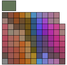
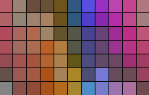
Figure 3. I created this palette of colors by selecting my asparagus color, upper-left, and building a palette with a contrast value of 10. With a strict Depth setting of 0, this limited the palette to only those colors closest to the 10-Contrast value set. Imagine a box of crayons in these colors!
It’s delightful how well this works. Selecting a contrast value of ten, as shown in Figure 3, will generate a palette of all hues, values, and chromas within ten contrast units in each direction. The results will surprise you, and will provide colors for your work that you would not normally choose.
You can generate broader palettes with a seemingly endless selection of colors, and an amazing range of values within those colors. Just note that when not constrained by its Accuracy and Depth controls, the palettes create too many possibilities. I find it’s easier to make a palette with only (only!) a few hundred colors, and then work with that palette. The Accuracy control sets the mathematical precision of the contrast value selection (thus limiting the number of colors selected), and the Depth setting controls the total number of colors that will be included in the palette created. The Depth scale is 0-100. When set to 100, you get every possible color. 50 will deliver half of the possible colors, and 0 will deliver the fewest colors in the resulting palette.
A Universal Swatches Palette
After your palette is made, you can export the colors in a format that anyone can then load into Photoshop’s Swatches palette. Once there, it can be exported again in a format that’s compatible with Illustrator or InDesign, making your palette a universal tool for the entire Creative Suite.
Master Colors has developed a version of HVC Color Composer for InDesign, as well. That plug-in adds a small HVC color picker to InDesign, and also features the same large palette, available by double-clicking on any color selection. When you’re satisfied with your selection, you can choose to add the color to the Swatches palette, and then use the color as you would any color in that application. For more on the InDesign version of the plug-in, read my review in the April/May 2007 issue of InDesign Magazine.
Printing with HVC Color
Casey George, digital department manager for Great Western Packaging in Van Nuys, California, puts a dollar value on the use of the Master Colors plug-ins. George’s company prints package labels for consumer products. His firm prints roughly 30,000 projects every year on three six-color Komori presses. He works with ad agencies, creative firms, and independent graphic designers who often send files with the unprintable RGB colors that are all too easy to choose in Photoshop. George steers those clients to the HVC Color Composer plug-in.
Says George, “When they use HVC Color Composer, they choose colors that I can match. Then I can deliver printing that is more acceptable more often. It saves time — and that saves money.”
Learning To Use HVC Color Composer
Perhaps the best feature of HVC Color Composer (beyond the software itself) is the extraordinary tutorial material available on the Master Colors’ Web site. The online color course takes you through the concepts of HVC color, the application of color contrast, and the use of the software. All of the online tutorials are available by clicking on the question mark in the color picker once you’ve installed the plug-in.
I recommend taking the six-part online course in HVC color. Before I went through it, I thought HVC Color Composer was just another color picker. Then I found myself musing over colors, their values and contrasts. Hours later, I really understood the concepts begun by Albert Munsell in the late 19th century. After a few weeks with HVC Color Composer, I actually think in HVC colors. It’s more intuitive than other color spaces, and the results are really beautiful. This one is a keeper!
* Actual Crayola brand color names (Tickle-me Pink is another of my favorites).
This article was last modified on January 4, 2023
This article was first published on March 23, 2007
Commenting is easier and faster when you're logged in!

Recommended for you

Layer Tennis Returns Today!
As far as I’m concerned, Coudal Partner’s Layer Tennis justifies the...
Scanning Around With Gene: 108 Years of Dust
How an industry dies says a lot about how it lived. Some, like coal mining or st...
Four Under-the-Radar Lightroom CC Features Worth Knowing About
Adobe’s new Lightroom CC application is a streamlined sibling to Lightroom Class...