


In part 1 of this tutorial, you learned how to create the basic interface shape and add depth to the shape for greater realism. (If you missed out on part 1 and want to drive right into part 2, you can download the interim file here.)
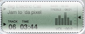
In this installment, you’ll layer a convincingly realistic LCD on top of the shape, and finally, add buttons to the display. The end result should look like this:

It’s your own MP4 player!
Create the Liquid Crystal Display
18. Open the interface where we left off last week.
You should have a layer that is the shape of the screen. In this case, it’s layer 2 (Figure 18). If you don’t have it, use the magic wand tool to make a selection in the open area of the iface layer, create a new layer, and fill it with gray.

Figure 18
19. Let’s give it that LCD background look.
Go to Filter > Noise > Add Noise (Figure 19).

Figure 19
20. Now we need to give it a slight green tint. Go to
Filter > Adjust > Hue/Saturation (Cmd/Ctrl+U). Check Colorize and use the settings shown in Figure 20.

Figure 20
21. We want to add some of the display elements now.
Choose the custom shape tool (Figure 21), which is under the rectangle tool when you hold down your mouse button.

Figure 21
Choose the direct pixel option on the top toolbar. Click the shape and choose a triangle. If no triangle is available, click the arrow by the shape and the Library will open. Choose the arrow at the top right and choose all.
22. Create a new layer and add three arrows as shown in Figure 22.

Figure 22
23. Now we’re going to turn the right side of the screen into the music player’s balance meter (Figure 23).
Here is the easy way to generate all the tick marks: Create a single short dash using the line tool set to 1 pixel (under Custom Shape Tool). Hold down the Alt/Option key and drag out a copy of the dash. Repeat this until you have all the marks as shown in Figure 23. Don’t worry if it’s not perfect looking; we’ll fix that.

Figure 23
24. You should see that each tick mark is on its own layer. Link these layers and only these layers. (In Photoshop CS2, the link icon has moved to the bottom on the palette; however, you don’t need it to link. Just hold down the Cmd/Ctrl key and click on all the layers to select them.) The resulting linked layers should look like Figure 24.

Figure 24
25. Now use the Align/Distribute buttons (Figure 25) to align them perfectly. Choose the Distribute Vertically button. If you click the wrong button, simply Undo (Cmd+Z).

Figure 25
When you’re happy with the tickmarks, you can merge its layers by choosing Merge Linked from the Layers palette fly-out menu.
26. Add the rest of the text, such as the playlist, using the text tool (Figure 26).
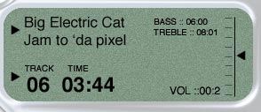
Figure 26
27. Now it gets really exciting. We’re going to make our VU /Level meter. There are lots of ways to do it, but this is my method:
Make a selection around the area where the meter should go (Figure 27).
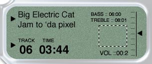
Figure 27
Create a new layer.
28. The next step comes from my book, 101 Different Things to Do with Scanlines. Kidding, there is no such book. But if you don’t know how to make scanlines, take this quick primer.
Fill the selection with some scan lines (Figure 28).

Figure 28
29. We want the scan lines to be only black. If your lines have black and white, select the Magic Wand, turn off its contiguous setting, select the white, and delete (Figure 29).

Figure 29
30. Make a selection with the marquee tool and delete vertical strips in the horizontal lines (Figure 30).

Figure 30
31. Make more selections with the rectangular marquee tool (Figure 31). Choose parts of the meter and hit delete. This isn’t very scientific, but it works!

Figure 31
32. Finally, you should have something that looks like Figure 32.

Figure 32
If you’re having trouble producing an image that looks like this, you can download the in-progress PSD.
Add Reflections and Buttons
33. Make a selection around the screen (Figure 33). The easiest way is to use the magic wand tool.

Figure 33
34. Create a new layer (Figure 34). This is where we’ll create the reflection.

Figure 34
35. Set the foreground color to white. Choose the gradient tool and choose the foreground to transparent linear option (Figure 35).

Figure 35
36. Drag the gradient from the top of the selection to about one-third of the way down (Figure 36).

Figure 36
37. Repeat for the bottom, except start from the bottom (Figure 37)

Figure 37
38. To give it more of a rounded look, press Ctrl/Cmd+T for the free transform tool (Figure 38).
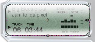
Figure 38
Hold down the Shift+Alt/option keys and shrink the gradients slightly.
Press Enter.
39. Go to Filter > Blur > Gaussian Blur and set it to >2 pixels. In the Layers palette, drop the opacity down to 60%.
40. You should now have realistic-looking reflections on the interface that give the screen a feeling of depth (Figure 40).

Figure 40
41. Add some product text (Figure 41). What company wouldn’t brand their product?

Figure 41
42. Now we’re going to add the buttons.
Create a new layer. Using the Custom Shape tools, create some shapes to use as the labels on the buttons (Figure 42).

Figure 42
43. Select the chrome interface shape layer (Figure 43).
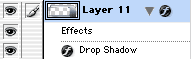
Figure 43
44. Make a selection in the shape of the button (Figure 44).

Figure 44
45. Press Ctrl/Cmd+J to duplicate the selection onto a new layer (Figure 45).

Figure 45
46. We have just copied a piece of the interface onto a new layer. By adding a bevel, we will make it look like a button.
Click the little “f” at the bottom of the Layers palette to open the Layer Styles dialog box (Figure 46).

Figure 46
Uncheck the Drop Shadow to turn it off. Choose Bevel and Emboss and change to Pillow Emboss. Click OK.
47. You should now have an indented looking button (Figure 47).

Figure 47
48. Repeat these steps for the forward and back buttons, only this time use a circular selection instead of a rectangular (Figure 48).

Figure 48
Don’t forget to choose the interface layer before pressing Ctrl/Cmd+J or nothing will happen.
49. The final MP4 player (have to be forward-thinking, you know) should look like Figure 49:

Figure 49
If you’re having trouble, download the completed PSD here.
This article was last modified on January 3, 2023
This article was first published on August 28, 2006
Commenting is easier and faster when you're logged in!

Recommended for you

Top 5 Lightroom 5 Resources
It has been a week since Adobe announced the availability of the Lightroom 5 bet...

Essential Tips for Working with Photoshop Masks
These quick tips will come in handy whenever you need to hide content on a layer...

A Review of the Adobe Post Mobile App
Recently Adobe released a new mobile application for iOS (iPhone), Adobe Post. L...