
I’ve always loved buttons. They provide a simple and intuitive way to navigate through a document. Now that I spend more time reading documents as PDF files or online, I use them more than ever. InDesign has been the premiere way of creating interactive PDFs, and, beginning in InDesign CS4, creating SWF files, and buttons can be used in both of these. Buttons can jump to another page, take you to a URL, play a movie or sound, and much more.
But before InDesign CS4, the interface for creating buttons was, to put it politely, sadly lacking. You had to figure out how to use the Button tool and the States panel, neither of which had a very intuitive interface. I always got confused when I was editing the appearance of additional states like a rollover. To create actions, I had to remember to select Button Options from the panel, then know that I had to click on the Behaviors tab, to access the hidden-away actions. And half the time, I’d forget to click the Add button before closing the modal dialog.
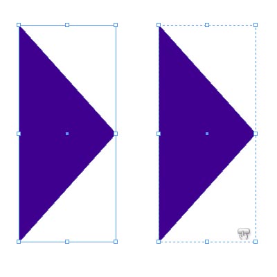
That’s all gotten much easier in InDesign CS4. The Button tool has been tossed in the software trash can. Now, to create a button select any art you create or import into InDesign, and choose Object > Interactive > Convert to Button, or choose this command from the contextual menu. The original object is on the left, the button is on the right. (If you change your mind, there’s a Convert to Object command.)
Even easier, you can pick pre-made buttons from a Sample Button library, and modify them to your taste. Anne-Marie wrote about this a few months ago. You’ll open this library if you choose the Interactivity workspace. It’s also found as a option in the new Buttons panel menu.
When you create a new button, the Buttons panel opens automatically, and the button is named Button x, where x is a number. Now, in one simple interface are all the controls you need to create and modify buttons.
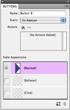
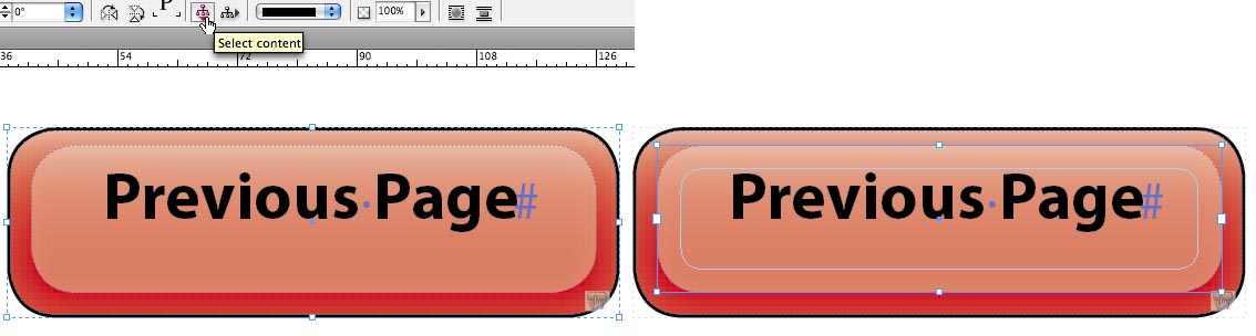
The [Normal] state (the appearance of a button without clicking on it or rolling over it) is selected by default. You can create an alternative state ([Rollover] or [Click] by simply clicking on one of the states below. By default the artwork from [Normal] is duplicated. It’s much easier to edit artwork (for example, adding an effect like an inner glow to a rollover) because buttons now behave more like groups than frames. Notice that the button illustrated above has a subtle dashed line like a group. I find that it’s now easy to edit the component artwork for a state by using the Select Content and Select Container commands on the Control panel or on the Object > Select submenu. The button “group” itself (left below) has no attributes, but artwork within the “group” can be edited (for example, the text frame, right). You could edit the text, move its frame, change its color or transparency, or whatever you like.
The On Release (Mouse Up) event is selected by default, or you can choose On Click (Mouse Down), On Rollover (Mouse Enter), On Roll Off (Mouse Exit), On Focus or On Blur events. You can probably figure out the first four of these events, but what is “focus” and “blur”? On Focus event is when the button is selected, either with a click or press of the Tab key. On Blur is when the focus moves away from the button.
You can add multiple actions (formerly called behaviors) by clicking the + popup menu. The popup menu reveals the same set of actions as in previous InDesign versions (for example, Next Page or Previous Page). But there is one addition?Go to Page, but it is for SWF export only. There is no Go to Page concept in PDF. I’ll cover how to create a text anchor for an interactive PDF, which creates a named destination, in my next posting. The – (delete) button lets you remove actions.
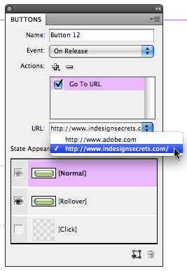
One more addition: If you’re like me, you may frequently make buttons to go to web URLs. You can enter a URL into the URL combo box for the Go to URL action in the Button panel. Now, the new URL is added to the drop down list of the combo box automatically. That makes it easy to select that URL again for another button without having to manually type it.
That’s all well and good, but what if you acquire dozens of these URLs. How do you clear out ones you no longer need? The answer is that they live in the same location as hyperlink destinations. To delete them, open the Hyperlinks panel (Window > Interactive > Hyperlinks), and choose Hyperlink Destination Options from the panel menu. There you’ll see the same list of URLs (now combined with other destinations like text anchors). Then select a URL destination from the list and click the Delete button, or mass delete all your destinations with the Delete All command.

In my next posting, I’ll give some tips and tricks for creating buttons for PDF files successfully, and I’ll show you how to create the PDF equivalent of a Go to Page command.
This article was last modified on January 18, 2023
This article was first published on July 12, 2009
Commenting is easier and faster when you're logged in!
Recommended for you

Indexing Case Sensitive Words
Indexing is a painful word, close to root canal in my opinion. I have been lucky...
This Week in InDesign Articles, Number 14
It's been a while since I posted my "weekly" articles, so this one is a long lis...
InDesign CS4 Users Can Now Manage Preferences Easily
Preferences can be shared and multiple preference files stored on one machine wi...