


Nowadays everywhere you look on the Web, you see shiny graphics. It’s like one day, someone just decided to polish the Internet. Apple has been quite smitten with shiny things, from the debut of OS X, to the high gloss screens of today’s iPhone and MacBooks. You can also find plenty of shiny stuff on Microsoft, Yahoo, Adobe, etc. The shiny look has found its way into lots of print and TV graphics as well. Shiny is the drop shadow of the ’00s. Has it already become a design cliché? I don’t know. To find out, we could consult the modern oracle, the 8-Ball.

The 8-Ball is fun, easy to make in any version of InDesign, and most important: it’s shiny.
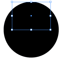
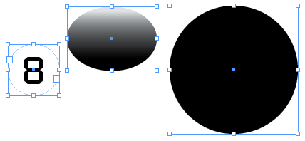
Start with a black circle.

Copy the circle and choose Edit > Paste in Place.
With the new circle still selected and the reference point at the top center, go to the Control panel and enter 70% for scale X percentage and 50% for scale Y percentage.
Create a gradient swatch that goes from about 10% – 100% black with the midpoint closer to the light end.
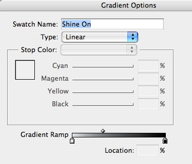
Fill the oval with the gradient.

Use the Gradient tool to make your highlight by dragging straight down (hold Shift as you drag).
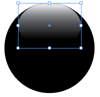
Experiment till you find a look that pleases you.

Mmm, shiny. If you like, you can scale or move the oval around, or tweak the gradient to change the highlight.
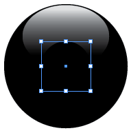
Now for the 8: select the black circle and again Copy and Paste in Place.
Move the reference point to the center, then scale the new copy about 40% as wide and tall as the original.
Fill it with [Paper].
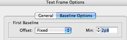
Use the Type tool to add the number 8 in a font of your choice. Center align it and use Text Frame Options to adjust the baseline.
Groovy.
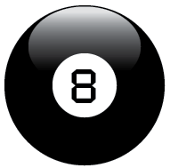
With just 3 pieces, your 8-Ball is complete and looks real enough that you might be tempted to grab and shake it.
Go ahead. Ask it the hardest InDesign question you can think of. And the answer is…

Again, there’s just simple stuff going on here. One triangle. Two black circles. Two gradient ovals. One gradient stroke.

The only part that uses transparency is the highlight over the triangle.
Now you can see how shiny icons are actually made of just a few simple pieces.


Try multiple light sources. Fill a circle with a radial gradient. Then add two gradient ovals for highlights, one at the top and a more subtle one at the bottom (to simulate a little light reflected off another shiny surface, of course).

Shine on, you crazy diamond!
This article was last modified on December 19, 2021
This article was first published on May 20, 2009
Commenting is easier and faster when you're logged in!

Recommended for you

Acrobat Tip: Make Last-Minute Corrections
An object you create in Acrobat, such as a link or a form field, can be selected...

dot-font: Can a Book Teach You to Set Type Perfectly?
dot-font was a collection of short articles written by editor and typographer Jo...

Design How-To: Make Type and Photos Play Nice
This story is taken from Before&After Magazine A strong, vibrant photo can b...