
This article appears in Issue 71 of InDesign Magazine.
The digital revolution may be in full swing, but a visit to any museum store provides ample evidence that for fine art catalogues, print is alive and well. How does working on fine art books differ from other print documents? What makes a great art book stand out?
One of a Kind
Unlike a digital file, a book has a physical presence. No matter how many millions are printed, the second it is touched by humans, each copy becomes unique (as the Seinfeld character, George, found out when he couldn’t return a book because, somehow, everyone could tell that “this book has been in the bathroom, hasn’t it?”). Book signings turn mass-produced objects into one-of-a-kind collectibles. For better or worse, a printed book will always be more than the content it conveys. It can become anything from a doorstop to an objet d’art.
It Takes a Team
Fine art catalogues are made to be kept. Forever. Like miniature museums, they seek to preserve and illuminate the highest forms of expression in a given medium, so it’s critical that everything about the book, from the design to the print quality to the paper stock and binding, be of sufficient quality to honor its content. Creating a work of such quality requires a partnership of experts. There may be a Leonardo or two out there who could master every aspect of the process, but for the rest of us, assembling a top-notch team is essential. This article covers only the design through printing phases of a book’s creation, but all of the other aspects of the process, including writing, editing, marketing, etc., need to be up to the same level. The books absolutely must arrive in the museum store—often from overseas—before the exhibit opens. It only takes one aspect of the
job done poorly—whether it’s bad photography, the wrong typeface, or poor scheduling—to ruin a fine art book.
Design
The book designer has to consider every aspect of the book and how it will work with the content. If the book is part of a series, the size and format may be predetermined; conversely, some projects may cry out for the invention of a wholly unique format. I asked book designer Susan Marsh, with whom I have worked on several books, how her approach to the fine art catalogue compares to designing other print work. As Susan puts it, “For most art books, the designer must create a design that is elegant without calling attention to itself; it has to provide a framework for the art and the scholarship of the text without upstaging them (Figures 1–4).  Figure 1: This book, Picasso Looks at Degas, appeared simultaneously in three editions: English, Spanish, and Catalan. The art is in the same place in each edition, but the bottom text margin is variable because the text runs different lengths in each language, and the text discussion must appear on the same page as the art. This way, all three editions could be printed with only a black plate change on press. ©2010 Sterling & Francine Clark Art Institute. Design: Susan Marsh.
 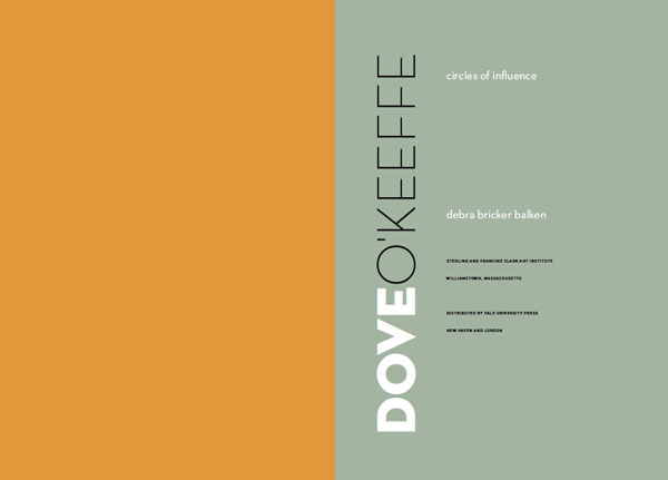 Figure 2: The justified serif type, with its centered swash headlines, evokes the typography of the 1700s. Adobe Cason Pro is based on the same Caslon types that were so popular with Benjamin Franklin when he was a printer in Philadelphia. The ornamental drop cap is Monotype Castellar. The spread is from Knowing Nature: Art and Science in Philadephia, 1740–1840. ©2011 Yale University Press. Design: Susan Marsh.
  Figure 3: Title page from Dove/O’Keeffe: Circles of Influence. The designer chose Neutraface Light and Bold for the title because the letterforms are both beautiful and eccentric, as are the artists, Arthur Dove and Georgia O’Keeffe. The extreme weight diffference implies the differences between the two artists, while the circular shape of the letter O echoes the subtitle. ©2009 Sterling and Francine Clark Art Institute. Design: Susan Marsh.
  Figure 4: Most of the photographs in this book show tall, thin fashion models, so it made sense to use a more vertical trim size than usual—8 × 11.5 inches—and a narrow text width and vertical display type. The display is Linotype Didot, the text is Fournier, and the captions are Meta. Pages from Fashion Show: Paris Style. ©2006 Museum of Fine Arts, Boston. Design: Susan Marsh. But in certain cases, the graphic design can be freer and more inventive, grabbing the reader’s attention and becoming part of the content (Figure 5).
 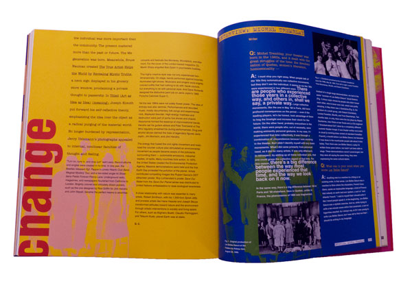 Figure 5: Some books call for a more attention-grabbing graphic design. Spread from Global Village: The 1960s, ©2003 Montreal Museum of Fine Arts. Design: Susan Marsh. “Unlike magazine writers, who write to fit a layout or are edited to fit,” says Susan, “curators write whatever length expresses their thoughts. They visualize the paintings they discuss as hanging on a museum wall, not cramped in a book. My job is to use typography and a flexible layout to bring their ideas to life in a varied flow of two-page book spreads. “A book is more like a film than like a website,” she continues. “It follows a linear progression. Not only does each spread need to be balanced, but there should be a rhythm to how the spreads flow through the book.” A well-designed spread looks inevitable—you think, “of course they did it that way; it’s the only way that makes sense.” What you don’t see are the five or six drafts of that spread the designer threw away.
Type Composition
Great type design can make an ordinary book look better than it is; bad type design can make a great book unreadable. A good designer will read the entire manuscript and select a typeface that reinforces the book’s identity. This can be tricky, because with so many typefaces available, there is a temptation to use new, cutting-edge typefaces. But if the book has 500 pages and lots of small type in the end matter, you have to make sure it will be legible. In addition, the typeface will need to have a robust OpenType character set. Ideally, this includes separate sets of numerals for superior figures, numerators, denominators, old style and lining figures, plus glyphs for any composite characters for the foreign words that will occur regularly in the manuscript. You may get by with a poorly kerned typeface in a shorter document, but for a long book, you don’t want to be manually adjusting thousands of character pairs. Once you’ve chosen the typefaces, it takes a great eye for proportion to establish design specs for every kind of text that will appear, from heads and body text to captions, lists, and the extensive end matter such as endnotes and chronologies of exhibits (Figure 6).  Figure 6: Typesetting and layout for the detailed “end matter” in fine art catalogues is often as much work as the main essays. Detail of page from French Art Deco, ©2014 The Metropolitan Museum of Art. Design: Susan Marsh. There are a lot of interrelated parts, including type size, justification settings, margins, figure styles, indents, leading, baseline grids… getting just one of these wrong can throw everything else off. This is why, although many designers do their own typesetting, the amount of text and the level of detail in fine art books justify bringing in an expert. Exhibit catalogs can be very lengthy. I have composed some that were multi-volume sets, and even single-volume books over 600 pages. As a professional typesetter, I use quite a few JavaScripts and plug-ins—some of which cost hundreds of dollars each—that allow me to set type with far greater speed and consistency than most designers. On a book that’s under 100 pages, a designer may not mind manually applying paragraph and character styles and cleaning up the manuscript, but on a large book, the sheer volume of text can be overwhelming. In general, typesetting a fine art book begins with the same process I use for any long document. Working from the designer’s sample file, I may re-create all of the style sheets, or at least check every dialog box in every style, to make sure all of the settings are optimized. For instance, a lot of designers are less experienced with things like GREP styles and nested styles (Figure 7), both of which can speed up the work and ensure greater consistency.
 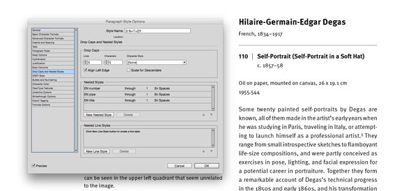 Figure 7: Using nested styles to automate formatting for the figure number, the vertical rule, and the title. One of my essential tools is the Multi-Find/ Change plug-in (Figure 8), which I use to set up a batch of find-change queries that I can run all at once.
  Figure 8: Using Automatication’s Multi-Find Change plug-in to set up a batch of find-change queries, and the result. Some publishers, such as the Metropolitan Museum of Art, have their own house style dictating which text strings cannot be broken at the end of a line, such as “pp. xx” or “fig. xx.” Once I set up a batch of queries to cover all of these rules, I can re-use that batch for each of their books. Other plug-ins and scripts that I use on a regular basis include Teacup’s Typefitter Pro for fine-tuning paragraph spacing, In-Tools’ Style Utilities and Power Headers, the entire DTP Tools suite, Peter Kahrel’s PlaceMultipleDocs.jsx, custom JavaScripts from Rorohiko, and several others. For me, the fact that every detail is critically important is one of the main things I love about typesetting fine art books. The book designers who hire me care deeply about how much space to use around the em dashes—they may each like a different amount, but they all care—and how to set the fractions, superscripts, etc. On art books, I’m asked to build custom composite characters, or change the size of the dashes, or adjust the kerning between particular letter pairs. Prior to the advent of OpenType, part of my job often included customizing typefaces, combining old-style figures with roman text. We may run several tests of the type with different justification settings until we find the one that looks best. We push InDesign to its limits in order to make the text as beautiful as possible. Every line ending is scrutinized; in fact, some of my designer clients join me in bemoaning the fact that we can’t customize the Adobe Paragraph Composer and H&Js even further to match each designer’s individual preferences.
Print Production
When it comes to fine art books, I compose the type, make all the editorial corrections, and hand the baton off to a specialist, like Sue Medlicott, who runs The Production Department (TPD). The range of tasks that Sue takes on varies from book to book, but basically, once the layout is done and the final type corrections are in, Sue takes over the files, and then she gets to wear all the production hats. And even more than with other kinds of books, with fine art books this is likely to mean coordinating information from a lot of vendors. It’s typical for book designers to work with low-resolution image files or with uncorrected versions of the high-res images. And since many fine art books are printed overseas, synchronizing the images for final output is an important step. TPD coordinates this process, handling all file transfers, checking proofs, and communicating with the printers. On many books, TPD will do the color correction and send final PDFs to the printers. On other jobs, their printer does the color work. “Typically,” says Sue, “we coordinate with the museum’s production manager at the start of the project. Some museums have a print production coordinator on staff, but many don’t. So we will select the printers, the binders, figure out the shipping schedules. We also consult with the editors and designers and source the paper based on their ideas of what is best suited to the project.” In addition to expertise in prepress work, this part of the job requires keeping up with a network of vendors around the world. A change in currency exhange rates can dictate where a book gets printed. It’s important to know each vendor’s strengths and weaknesses. “For example,” says Sue, “Chinese binderies employ many skilled handworkers that make some of the more unusual binding formats and techniques more affordable than working in the United States.” This part of the job also involves going on overseas press approvals, and requires a critical eye for color. The printer who is right for a large print run of books about painting may be completely wrong for a short-run book of etchings. The most important thing is to select the right printer for the kind of book you’re making, within your budget.
Prepress and Printing
One domestic printer that does a lot of fine art work is Meridian Printing in Rhode Island. I spoke with project director Danny Frank, and asked him what he sees as unique about working on fine art books, and what separates the best from the rest. Do they see a lot of books trying to be more “bookish” and use unorthodox trim sizes, special bindings, or tricks with paper such as die cuts, foldouts, and pop-ups? “Mostly on digital print runs,” he replied. “On an Indigo press, you can do a small print run of 10 to 100 books. Fancy bindings are very expensive, so you rarely see them on the offset print jobs. “The availability of digital color printing means that a lot more people are doing these very short-run books, which is great for independent publishers. Unfortunately, many of these books don’t have the level of writing, editing, design, and typography that went into a book that was more expensive to print. So the overall quality of the books out there in the public is being degraded.” In other words, the key characteristic that makes a book stand out from the crowd—quality—hasn’t changed. One thing that has changed, though, says Frank, “is that the size of our print runs has gotten dramatically smaller. The number of titles hasn’t really gone down, but 18 years ago, a typical print run was 3,000 to 15,000 books. Now, a typical run is 1,000 to 5,000.” How have improvements in press technology changed the way books are being done? “For one thing,” says Frank, “the presses are much greener. There is far less waste. New presses use far fewer sheets for makeready, so that makes a shorter print run affordable. In addition, Indigo presses are getting faster and the formats are getting bigger, so you’ll see a lot more digital printing and presses where plates are imaged right on the press, so they don’t have to be taken on and off.” I mentioned to Danny that on a lot of publications, designers or production artists like myself do all of our own prepress work and deliver final press PDFs to the printer. In fact, a lot of magazine printers use a Kodak InSite proofing system, in which the client uploads hi-res PDFs and the proofs are available online within a few minutes, with preflight errors flagged, awaiting approval. There is no human prepress operator involved. At Meridian, they use InSite proofing, but only as a preliminary tool. “It’s mostly for the designer to check things like the cropping,” says Frank. “We don’t use it for color, and it doesn’t replace the bluelines.” He adds, “We always ask for native application files. We have proprietary tables for color conversions, whether it’s using GCR (gray-component replacement) or hybrid conversions, and it’s all based on the type of image. You use a different process for a landscape photo than you do for a charcoal drawing.” According to Frank, a typical line screen will be around 200 to 250 for color work, and often 300 for black and white. But it really depends on the type of image, not just the color space. For instance, I asked whether they use stochastic screening (Figure 9) at Meridian.  Figure 9: Stochastic screening (left) more closely approximates continuous tone by using a smaller dot in a randomized pattern. Traditional screening (right) uses larger dots in a linear pattern, with each color at a different angle, which creates rosette patterns. Again, it depends on the image. “A lot of commercial printers do stochastic with a 20-micron dot, which isn’t very fine. We find that a 250- to 300-line screen looks better than a 20-micron stochastic. A smaller, 10-micron stochastic dot is more like a 400-line screen. But it’s much more touchy. Solid areas can cause banding, and other problems arise. The plates may not be compatible with it. We do use it, but sparingly, on those images where we feel it will help.” In terms of color space, they definitely prefer to start with RGB images, since they have a larger color space to work with when correcting the color. With the recent improvements in computer processing power and storage space, it’s misguided to downsample your files before sending them to the printer. The more information they have to start with, the better. “It’s even true for bit depth,” says Frank. “Technically, the plates are imaged using 8-bit color, but we would always rather have 16-bit images to start with. It just gives you more to work with.”
A Science, but Also an Art
I mentioned to Danny that many designers still believe that the Italian printers have the best eye for reproducing color paintings. With the technical sophistication of printing presses, is there still a need for such a thing as “an eye for color?” At some point, won’t it just be a matter of matching a specific set of measurements? “The eye is still critical,” says Frank, “You have to deal with so many variables, such as the metamerism of a particular paper under different lighting conditions. Newer proofing systems have helped a lot, but the main thing the measurements do is get you to the point where you can look at it sooner. “Thanks to more accurate measurements, the first sheet is 85% of the way there. The last 15% is up to the the pressman; and even if his numbers are right, the client still needs to see it. Once they see it on press, they may not even want it to look 100% like the proof.” So, no matter how much of a science it becomes, there will always be a role in printing for the human eye.
Standing the Test
Despite increased competition from digital presses and ebooks, you don’t have to reinvent the wheel in order to create an extraordinary book. The printed book has been evolving for a thousand years, and most of the sizes and shapes we use now are those that have worked best. They’ve stood the test of time; and if you apply top-quality craftsmanship at every step along the way, there’s a good chance that the book you create will do the same.
Commenting is easier and faster when you're logged in!

Recommended for you

Setting Defaults in InDesign
One of my favorite things about InDesign is that it often keeps me from doing so...
How to Turn Off InDesign’s Most Annoying Features
Adobe InDesign is rich with features, which is just one of the reasons I and man...

Using the Content Collector and Content Placer Tools in InDesign
Last time we took a trip to InDesign’s Island of Misfit Tools, we looked a...