


dot-font was a collection of short articles written by editor and typographer John D. Barry (the former editor and publisher of the typographic journal U&lc) for CreativePro. If you’d like to read more from this series, click here.
Eventually, John gathered a selection of these articles into two books, dot-font: Talking About Design and dot-font: Talking About Fonts, which are available free to download here. You can find more from John at his website, https://johndberry.com.
“Emigre” has shrunk again. The seminal type-culture magazine, which began in 1984 in a highly graphic, tabloid-size format and then a few years ago shrank itself to a standard 8.5-x-11 page size and added more philosophical written content, has adopted a new, almost pocket-size format (5.25 x 8.25 inches) and has already published two issues in that format. The small size accommodates a new focus (“new” but always present in Emigre’s eclectic mix) on music: Each issue comes in a cleverly constructed cardboard package that also contains a music CD.
Whatever else it has done, “Emigre” the magazine has always functioned as a way to show off the new typefaces released by Emigre the digital type foundry. The use of type in the new issues is fairly restrained—most of it is text type—juxtaposed with pages of the apparently artless but highly aware photography of ordinary places and bits of things that has been a feature of Emigre’s style for quite some time. (Several pages in each issue function as an oblique sort of liner notes, either photographic or typographic, for the music CDs.) But at the same time they’ve taken a new direction with the magazine, they have also begun issuing a series of type-specimen books for Emigre fonts, in the same small format.
Showing Off the Type
The type showings are not exactly your usual type-specimen book from a foundry. They certainly do the job—that is, they show each typeface in all its variations—but the way they do it is very much in the Emigre style.
The typefaces are not necessarily new releases: the three booklets I have before me showcase Not Caslon (Mark Andresen, released “circa 1995”), Platelet (Conor Mangat, designed 1993, released 1994), and Dalliance (Frank Heine, released 2001). Platelet, the clunky monospaced face inspired by the letters and numbers on California license plates, has been seen in graphic design quite extensively over the last eight years. Still, it’s very useful to have a handy booklet that shows not only the full character set but a bunch of inspiring examples of it in use, showing variations in weight, in size, and in the playful use of the font’s many peculiar forms (see figure 1).
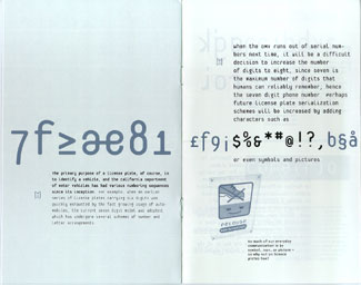
Figure 1: Derived from license-plate lettering, Platelet should look familiar—it’s been widely used in graphic design since 1994.
The Not Caslon booklet, which is called “Booklet No. 1” in the Emigre Type Specimen Series, shows a certain uncertainty about how to approach the series. The cover is generic, showing the Emigre logo but no example of the typeface in question; essentially, the outer sheet of this saddle-stitched booklet is the mailer, with postal information on the back and a lot of product and ordering information on the inner side.
The real specimen book for Not Caslon begins on page 3—and it’s a tour de force (see figure 2). The name “Not Caslon” doesn’t begin to suggest the wild, schizoid intensity of the actual letters, which look like they’ve been injected with the DNA of some Caslon italic swash caps and then run through a meat grinder. The voodoo tale ostensibly told in the text is presented on pages that look like the elaborately hand-scrawled ramblings of an obsessive outsider artist; it’s not an effect I would usually try to achieve, but it’s very effectively done, and I find it remarkable that it could be done so convincingly with a single typeface (no matter how eclectic). Of course, as the character set shows, there are several wildly different variants for almost every letter in the font.
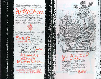
Figure 2: As this booklet shows, Emigre’s Not Caslon is definitely not Caslon.
Gawky with Flourishes
Dalliance is the one new release in this set of typefaces; maybe for that reason, it got a noticeably thicker type-specimen book (32 pages). Heine’s inspiration for Dalliance was a rough photocopy of some copperplate handwriting from an 18th-century German map. The typeface he created emphasizes its awkwardness, its almost drawn quality, and this comes out even more in the roman version that he made to accompany the script. Some of the characters in Dalliance Roman remind me more of advertising lettering from the 1920s than of the handwriting common in the Napoleonic wars. (A certain awkwardness of curve and line is a quality that obviously appeals to Emigre; many of the company’s typefaces exhibit it in one form or another, and it’s clearly a deliberate esthetic choice.)
The Dalliance type family—roman, script (not italic), and small caps—is flamboyant and extensive, with quite a few ligatures, flourishes, abbreviations, and alternate characters, as well as four different sets of numerals. The typeface looks like it would be fun to use; certainly somebody was having fun producing this specimen book (see figure 3). (The photo/typographic images by Caroline Abele are amazing.) My only quibble is that it’s hard to get a good sense of how Dalliance might set as text in narrow, justified columns, since the samples here have been typeset without turning off Quark’s letterspace-to-justify feature.
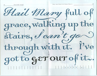
Figure 3: The promotional booklet for Dalliance underscores the font’s playful qualities.
The new “Emigre” and the new type-specimen booklets are both challenges and tools: challenges, as always, to our assumptions about type and its use, and tools for creating new graphic design.
This article was last modified on March 10, 2022
This article was first published on May 13, 2002
Commenting is easier and faster when you're logged in!

Recommended for you

dot-font: Designing Running Heads
Learn the best practices for designing these inconspicuous but essential book pa...

dot-font: Type Buzz in Vancouver
dot-font was a collection of short articles written by editor and typographer Jo...

dot-font: Zapfest
dot-font was a collection of short articles written by editor and typographer Jo...