Before&After: Picture It Twice
Use the same image twice—differently—to fill your space beautifully.

Next time a photo is your center of interest, try this: Use a small version full strength and a large ghosted version at light opacity. An image communicates differently at different sizes, so you double (or more) its effectiveness. And an image readily coordinates with itself, so design is easy. This 15-page article from issue 44 of Before&After Magazine shows you how to use the same image twice—differently—to fill your space beautifully.

Two views of the same person—one from audience distance and one up close—make different but complementary impressions, one in body language, the other in facial expression. You’ve seen this effect on those huge onstage video monitors.

© John McWade/Before&After Magazine, courtesy of Gaye Anne McWade.
Commenting is easier and faster when you're logged in!
Recommended for you

Before&After: How to Design a Logo of Letters
Logos with ligatures are handsome, simple, and compact.

Before&After: Design a Mini Portfolio Card
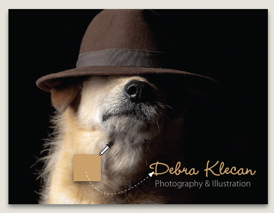
Here's how we helped a photographer improve her portfolio card.

Before&After: Our Color Wheel
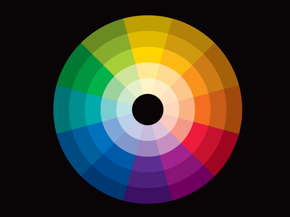
Learn how to use the color wheel—our tool for understanding which colors go with...


