This article appears in
Issue 41 of InDesign Magazine.
When it comes to type effects, InDesign may always be the poor cousin of Photoshop and Illustrator. But there’s a lot you can do to customize type using InDesign alone. In this issue’s column, you’ll learn how to create simple and effective type treatments within InDesign exclusively (almost) using vectors: converting text to outlines, creating and releasing compound paths, adjusting letter shapes with the Pen tool, and—most importantly using the Pathfinder functions. Let’s begin with that old chestnut of converting text to outlines and filling the resulting frame with a picture. Remember how excited you were the first time you realized this was possible? If you’re like me, you’ve tried it many times, but perhaps only with limited success. Here are some tips for a better result. Short words with equal numbers of letters are easiest to work with. I chose the word London (Figure 1). Stack the type vertically if your picture is tall. So that your text “windows“ are as big as possible, use a heavy sans serif (Gotham Black, in my case) set in all caps. Set the alignment to justify all lines so the text is a solid block, and apply tight tracking to increase the density of the type.
Figure 1: The beginnings are quite humble.
So far, so good, but the different widths of the letters may cause a gaping hole, like I have between the L and the O. To compensate, I’ve increased the size of these first two letters (Figure 2).
Figure 2: Some subtle resizing adds balance.
Next, select the frame with the Selection tool and convert the text to outlines (Type > Create Outlines or Cmd-Shift-O/Ctrl-Shift-O). This turns each letter
into a graphic frame (and means that it’s no longer editable as text). There are a couple of extra hoops to jump through before placing the picture. First, you need to ungroup the letters and then, so that the picture fills all the letters and not just one of them, you need to make them into a compound path (Figure 3).
Figure 3: Slowly, you’re turning the letters into a graphic frame that gives viewers a good look into the image you’ll place in the background.
The effectiveness of this technique depends in large part on the picture you’re using. The readers aren’t going to see a lot of the picture, so it’s important that they already have some idea of what it is. For that reason you want something iconic, so that the reader can easily “fill in the blanks.“ Ticking all these boxes is, however, no guarantee that the result won’t end up looking like a dog’s breakfast. Which, is indeed the case for Figure 4a and 4b, where the images are too busy. Figure 4c, a simple shape against an uncluttered sky, is a more successful attempt.
Figure 4: Just because an image is iconic doesn’t mean it’s the best candidate for this effect. If the image is too cluttered, as A and B are, it will compete with the letters.
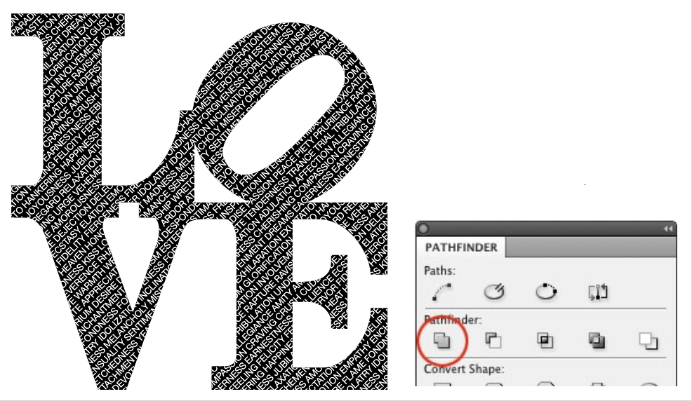
Of course, you don’t need to limit yourself to putting a picture inside your text. Why not put a text frame inside a text frame? In Figure 5, an homage to Richard Indiana’s iconic 1960s design, I set the type in Clarendon Bold. As well as being a good approximation of the original, this face has chunky slab serifs that give a bigger window onto the text that fills the letter shapes.
Figure 5: The Clarendon Bold typeface not only looks like the original in Richard Indiana’s iconic 1960s design, but it’s chunky enough that you can get a good look at the text inside each letter.
If your letter shapes overlap, after converting to outlines, use the Pathfinder options to add the shapes together. This avoids problems that may arise from creating compound paths from overlapping elements. However, in my example text, it also means that the counter on the O will be swallowed. Avoid this problem by selecting the counter with the Direct Selection tool (White Arrow) and copying it to the clipboard, before adding the shapes. Then, once you’ve combined your letters, choose Edit > Paste in Place to put the counter back in its original location. Select it and the outside shape and use the Pathfinder option that’s second from the left to subtract the counter shape. The next step is to cut or copy a text frame and paste it into the letter shapes (Edit > Paste Into). You can position the frame within the letter shapes the same way you’d crop an image inside a picture frame. Click on the Donut (Content Selector) and drag the frame around to your liking. A simple application of the Pathfinder Add function is to create a custom ligature or type mark. Like most of these techniques, it tends to work better with heavy, geometric sans serif typefaces. In the Figure 6 example, I’ve used Futura Bold and custom-kerned two straight-sided letters so that their vertical stems overlap. I then converted the text frame to outlines and used Pathfinder to add the shapes together. It’s now possible to put a stroke color around the resulting shape.
Figure 6: It’s easy to create a custom ligature or type mark.
Taking it a step further, you can combine multiple letters into one continuous shape and produce something like a continuous strip of neon. This gets tricky when combining straight-sided letters with curved letters. Start with a heavy, monoweight typeface with rounded edges that lend themselves to the neon tube effect, such as VAG rounded Bold (Figure 7A). Once again, all caps creates a more solid effect. Next, convert the text to outlines. For the T and W, just overlapping the letter shapes is sufficient, but for the other letter combinations you’ll need “connectors“ (derived from a rotated I) and overlap them as necessary to bridge the gaps (Figure 7B). Before combining the letters into one shape, tweak their shapes with the Direct Selection tool to ensure smooth joins. Even so, the combined result shows several unnecessary anchor points, which you must remove with the Delete Anchor Point tool (Figure 7C). Finally, you can apply fill and stroke colors (Figure 7D).
FIgure 7: Can you create the look of neon tubing without going into Photoshop? Yes!
The second Pathfinder function, Subtract, deletes a shape from the shape(s) beneath. In Figure 8A, I’ve used it to make a custom counter on the C and the P. My result is mediocre but this technique is skillfully applied in the London Zoo logo (Figure 8B), which unfortunately I can’t take any credit for. The principles are nevertheless the same. I drew vector shapes with Photoshop’s custom shape tool and copied and pasted them (via Illustrator) into InDesign. After converting the type in InDesign to outlines, I released the compound paths and deleted the counter shape for the P. Placing the shape over the letters, I selected both and chose Subtract.
Figure 8: Subtract a shape relevant to your word from the counter of one or more letters
Subtracting parts of letters offers all sorts of possibilities. The Victoria & Albert museum logo, designed by Alan Fletcher (Figure 9), is an excellent example. The left side of the A is subtracted to allow it to perfectly combine with the ampersand.
Figure 9: Although this logo was created before InDesign, it’s an excellent example of what’s possible.
In Figure 10, the ampersand interlocks with words to reinforce their connection. You can achieve this with the Pathfinder Intersect option. Set the text and convert it to outlines, then copy the text frame and Paste it in Place. It helps to put the copy on a separate layer and lock the layer beneath. With the type (now frames) selected, choose Intersect to leave just the overlapping pieces, which you can recolor to give the illusion that the letterforms are interlocking.
Figure 10: The Pathfinder tools let you create the illusion of interlocking letters, which gives your design greater depth.
To make Figure 11, I converted the text to outlines, then used the Pathfinder Extract function to punch through a frame to the picture beneath.
Figure 11: Coming full circle, this effect is a fresher variation on the first one in the article.
InDesign’s Pathfinder tools give you a range of options for conveniently and effectively combining text outlines with vector shapes. Just remember that these techniques work best when you keep things simple.
Learn how to create long text shadows in PowerPoint and keep the text editable.
Manage your privacy
This site uses cookies, but not the kind you eat. We use cookies to remember log in details, provide secure log in, improve site functionality, and deliver personalized content. By continuing to browse the site, you accept cookies.
Functional
Always active
The technical storage or access is strictly necessary for the legitimate purpose of enabling the use of a specific service explicitly requested by the subscriber or user, or for the sole purpose of carrying out the transmission of a communication over an electronic communications network.
Preferences
The technical storage or access is necessary for the legitimate purpose of storing preferences that are not requested by the subscriber or user.
Statistics
The technical storage or access that is used exclusively for statistical purposes.The technical storage or access that is used exclusively for anonymous statistical purposes. Without a subpoena, voluntary compliance on the part of your Internet Service Provider, or additional records from a third party, information stored or retrieved for this purpose alone cannot usually be used to identify you.
Marketing
The technical storage or access is required to create user profiles to send advertising, or to track the user on a website or across several websites for similar marketing purposes.
We use technologies like cookies to store and/or access device information. We do this to improve browsing experience and to show (non-) personalized ads. Consenting to these technologies will allow us to process data such as browsing behavior or unique IDs on this site. Not consenting or withdrawing consent, may adversely affect certain features and functions.
Functional
Always active
The technical storage or access is strictly necessary for the legitimate purpose of enabling the use of a specific service explicitly requested by the subscriber or user, or for the sole purpose of carrying out the transmission of a communication over an electronic communications network.
Preferences
The technical storage or access is necessary for the legitimate purpose of storing preferences that are not requested by the subscriber or user.
Statistics
The technical storage or access that is used exclusively for statistical purposes.The technical storage or access that is used exclusively for anonymous statistical purposes. Without a subpoena, voluntary compliance on the part of your Internet Service Provider, or additional records from a third party, information stored or retrieved for this purpose alone cannot usually be used to identify you.
Marketing
The technical storage or access is required to create user profiles to send advertising, or to track the user on a website or across several websites for similar marketing purposes.