

As a graphic designer, I find it difficult to imagine how non-designers see a world where they see no difference between Times Roman and Georgia in their default font menus and they think of Comic Sans as a perfectly reasonable choice for the text of their last will and testament.
That’s because those of us who work with type don’t just see shapes on a page or a screen—we hear them in our minds and feel them in our hearts as we read text. For us, type has a voice, a presence, a personality conveyed through type family, size, and style. It can talk to us softly and with grace and calm, it can scream menacingly and unhinged, or it can land somewhere in between.
The point is, we designers have very human relationships with our fonts. While it’s a stretch to say that we personify them, it’s fun to speculate what they’d be like as people. And we do interact with them in our menus. We welcome them into our workspaces and periodically escort them from our system. (“Go home, Clarendon. You’re drunk.”)
When we work with them, or discuss them with clients, employers, and colleagues, we refer to all these fonts by their names.
And much more often than we think, we’re butchering their intended pronunciation.
Learning on Paper

If we approach our profession with a love of craft and a respect for its history, why don’t we do a better job of learning this information?
At least in the United States, you can laser print a door sign and call yourself a graphic designer without any sort of training or education. Many of us worked at publications and were mentored by editors or other pros who use type but don’t necessarily know much about it.
And many of us are self-taught or got good at using design software through raw brute force of will.
I can think back to my high school days in the 1980s when I worked for a community newspaper and found the Compugraphic type catalog in a pile of documentation that came with the phototypesetting machine (which offered only knockoff versions of Times and Helvetica). I’d start recognizing recurring typefaces of the era and would pore over the glossy pages of specimens like someone looking over mug shots in a bad police procedural.

Figure 1. The c. 1982 Compugraphic type specimen book could let a young designer learn typeface names in print—silently.
The point is, I hardly ever heard any of those typeface names spoken out loud, even at work. Here I was, a kid from a country town of 500, getting to know this melting pot of historical type samples, foreign names, and geographic provenance only in print. I’m more surprised that I pronounced any of these font names correctly.
When for so many of us our introduction to these graphic personalities comes not from the spoken word but silently, through print, it’s no wonder we perpetuate these mispronunciations, sometimes for years at a time.
And these misunderstandings can be intergenerational, too. You can be a really good designer and start referring to SAY-bun in your design studio (Figure 2). Nobody’s going to pull you aside and tell you it’s Sah-BONE, because they probably don’t know any better, either. Meanwhile, your next cohort of wide-eyed interns are going to go out into the world and start the cycle anew.
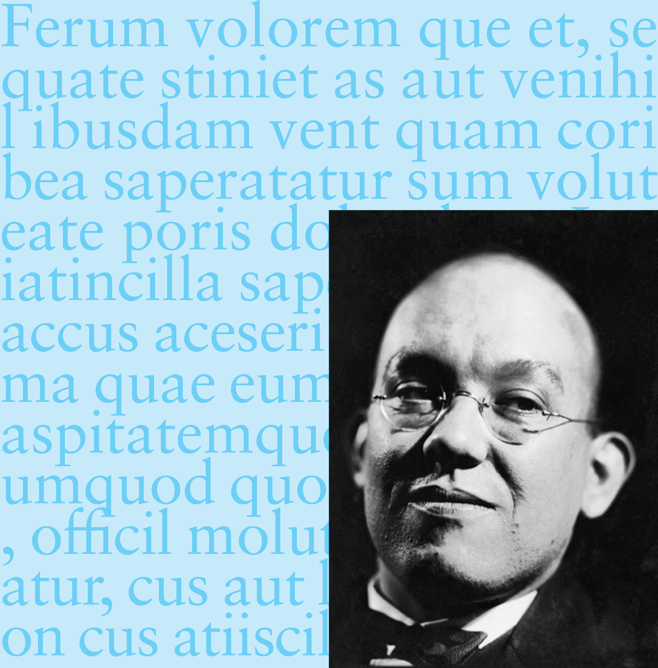
Figure 2. Sabon (Sah-bone), by Jan Tschichold (TCHEE-kold)
‘What They Were Calling It, I Have No Idea’
One of today’s most prolific type designers, David Jonathan Ross, agrees with this notion. “Most people who have been using these fonts have the pronunciation in their head,” Ross said. “They’ve read the name a million times. But out loud? They’re not sure.”
I reached out to Ross, who lives one town over from me, to get a perspective from today’s typographic artists and craftspeople who agonize over every Bézier curve (which I pronounced BEE-zee-ur for about 12 years).
These professionals kern every glyph lovingly and build every alphabet from the ground up. For every typeface that ends up as an OTF file, they make a whole that’s greater than the sum of its parts. Naturally, I wondered: Would mangling the name of a font be kind of like screwing up the name of their kid?
A prolific type designer who spent years working for the Font Bureau, Ross didn’t immediately see mispronunciation as an issue, but the names of the families in his own type library—among them Bungee, Condor, Fern, Fit, and Turnip—don’t exactly lend themselves to confusion, at least in U.S. English.
He suggested I contact James Hultquist-Todd of JTD Design, who, Ross said, has “the highest occurrence of tricky-to-pronounce font names in all of contemporary foundrydom.”
“I say that with admiration,” Ross quickly noted.
Hultquist-Todd got right back to me. “I’m bad at naming,” the Philadelphia-based type designer wrote ruefully.
“My first family, Garvis, started the trend,” he said. “It suffers the same fate as GIF (or JIF). I remember I was in The Netherlands once and I said it out loud (“Jarvis”), and someone said they never would have guessed it was pronounced that way; what they were calling it, I have no idea.”
JTD Design’s font family offerings (Figure 3) include Parabolica, Oculi, Gastromond, Garvis, Essonnes, Enfilade, and Elfreth.
Even Hultquist-Todd pronounced Essones incorrectly, and a French speaker corrected him.
“I was saying ‘Ess-on-nay’ when it should be ‘Ess-on,’ he said.
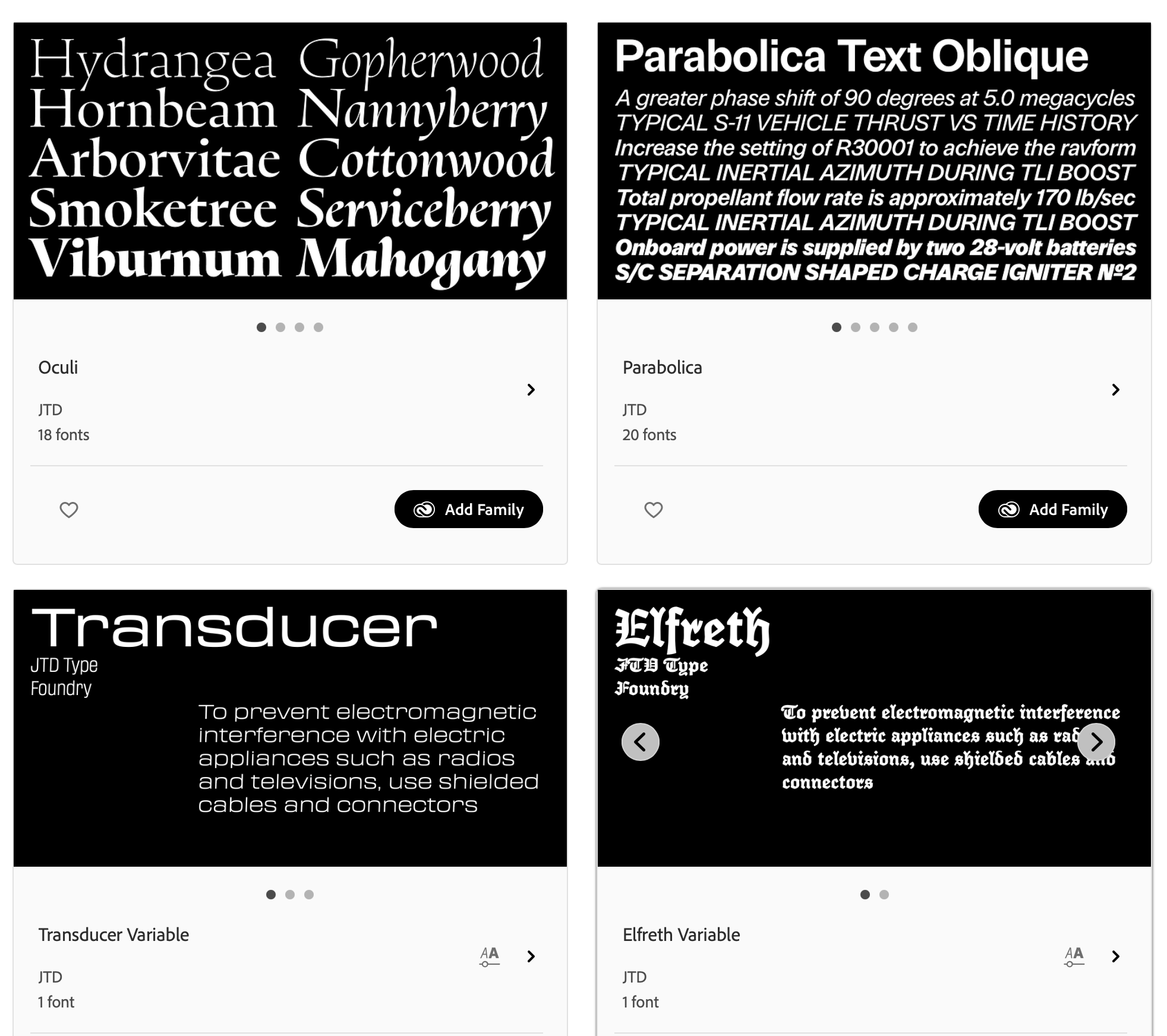
Figure 3. Some of the type families from James Hultquist-Todd and JTD Design available via Adobe Fonts
The View From the Comments
Buoyed by my success at talking to two rock stars of contemporary typography, I decided to take the discussion to the comments section.
When I asked the Type & Typography Facebook group whether font mispronunciation matters (Figure 4), one designer, Marie Varney, had strong feelings about not having strong feelings about it.
“I don’t care one bit, speaking as [a] designer who learned my craft in the ’60s at art college and worked in graphic design after,” she wrote. “I mispronounce all the time. It doesn’t mean I don’t know my Univers from Helvetica or Grotesque.”
(She also asked: “Why [for f—’s sake] do you really want to know?”)
Other group members shared some fun stories about mispronunciations. “Back in the ’90s, I worked with a designer who was probably in her 60s that pronounced Frutiger ‘Froo-tiger’ (like the animal) and Tiepolo ‘Tie-Polo,’” Dave Ellison wrote.
Lindsay Gresham Fulton observed that pronouncing Univers as oon-i-vair is like calling Paris Paree. “I think using Anglicized pronunciation is fine,” she said.
Some of the group members who responded to me also noted some good malapropisms. People tend to say “Veranda” instead of “Verdana,” for instance, noted Laurence Penney.
“I sometimes say Plankton instead of Plantin,” Robert Paul Richardson said. “I know perfectly well that it’s Plantin, but Plankton is more fun sometimes.”
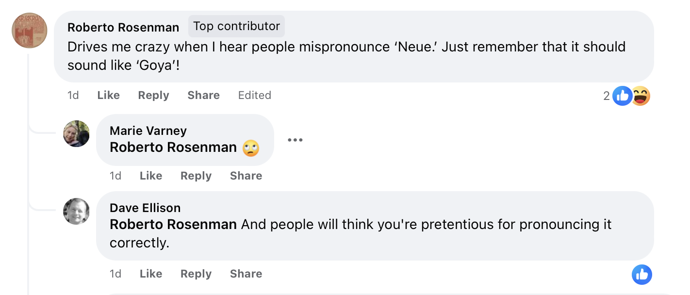
Figure 4. I invited members of the Type & Typography Facebook group to weigh in about type name mispronunciation.
‘I Would Never Be Annoyed’
Some designers will always urge us all to take the intellectual high road with articles (including type expert Ilene Strizver on this very website in 2009) that gently offer us a primer on how to accurately pronounce the names of the fonts we’re most likely to be using.
But the efforts to keep us pronouncing type names as originally intended is likely not going to gain a whole lot of momentum. It’s more of a curiosity and not a big deal.
Hultquist-Todd observed that legal complications have required him to rename entire type families at the eleventh hour.
“Naming is tough,” he said. “I’ve long thought about going to a number system like they used to do back 120 years ago,” potentially calling releases “JTD Gothic No. 1,” etc.
“We’ll see if I ever get that desperate,” he said.
In the meantime, mispronunciation of his hard-to-pronounce type families just doesn’t bother him.
“I would never be annoyed by anyone mispronouncing any of my names,” Hultquist-Todd said. “If people are talking about my fonts at all, I’m happy!”
Here are some samples from some type families with names that are hard to pronounce, taken from a few lists of perennial favorites and the trending fonts at myfonts.com. It also incorporates pronunciations compiled by typographic expert Ilene Strizver for CreativePro in 2009. For some of these, you’ll have to decide on how much you want to lean into the accent of the type designer. Dial it back if you’re hearing giggles and snorts from your colleagues.
Fonts
- Aachen AH-kin
- Antique Olive: ahn-TEEK oh-LEEV (feel free to throw in an “ooh-lala” while you’re at it)
- Arnold Böcklin: AH-nold BEH-kleen
- Avenir: av-eh-nir
- Bauhaus: BOW-house (rhymes with how, cow)
- Caflisch: cuh-FLEESH
- Cheltenham: CHEL-ten-um
- Didot: Dee-DOUGH
- DIN: din (an acronym for Deutsches Institut für Normung, German Institute for Standardization)
- Eurostile: ay-uro-STEEL-ay (Or, at least don’t say “your-o-style”)
- Fenice: feh-NEE-tchay
- Fette Fraktur: FET-teh FRAK-tour
- Helvetica Neue: hel-VEE-tee-ca NOY-uh (If the first part is too pretentious for you, just remember the “NOY-uh” bit)
- Kabel: KAH-bel
- Korolev: kah-rah-lehf
- Lucida: LU-sih-da
- Meta: meeta
- Microgramma: meek-ro-GRAM-ma
- Novarese: no-va-RAY-zuh
- Mistral: MEE-strul
- Peignot: PEN-yoh
- Plantin: Plahn-TEN
- Sabon: Sah-BON
- Univers: OON-i-vair
- VAG Rounded: An acronym for “Volkswagon Audi Group,” pronounced, according to a former auto dealer, as “bag with a V.” As this was discussed on Reddit, other alternative pronunciations were offered.
Designers
- Benguiat: BEN-gat
- Bodoni: buh-DOUGH-nee (not “Bo-DEE-nee”)
- Goudy: GOW-dy
- Koch: Kock (ending in a hard k as in lock) or Kocch (with a gutteral ch as in chutzpah)
- Tschichold: Tchee’ -kold
- Zapf: tsAHpf
This article was last modified on June 17, 2025
This article was first published on August 13, 2024
Commenting is easier and faster when you're logged in!

Recommended for you

Quark Unveils Quark Print Collection with Imposition Capabilities
Quark Inc. announced today the availability of the new Quark Print Collection, a...

Use New Window to Hide Your Selections
Lee wrote: Sometimes I like to use 'undo' to compare the difference between two...

Typefi Announces Typefi Publishing System Version 2.7
Typefi Systems Inc. has announced version 2.7 of its revolutionary flagship prod...