

You’d think that in 2023, InDesign might offer a way to override color profile settings for a particular page. You’d think wrong.
As the editor and designer of a broadsheet community newspaper printed on a circa-1970 web press, I’ve been trying to figure out how to make a better template for a publication that mixes color and grayscale pages—a template that shows unambiguously how the objects on each page will print.
The newspaper is printed in four-, six-, or eight-page sections, up to two at a time, with color available only on the front and back covers and in some cases the inside front and back covers (Figure 1). Personally, I can move color material onto a black-and-white page and not need to see a preview to know how it will print—but I’m cleaning up our template to make it easy for another designer to help me someday. With multiple sections and configurations, it can be disorienting for even experienced designers to get their bearings with the color configuration of our paper. And it all comes down to this: A good template should make color options as clear as possible.
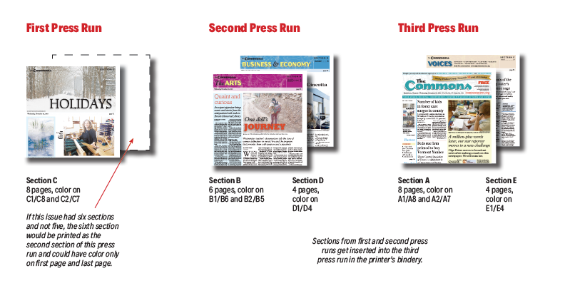
Figure 1. It took me a long time to figure out which pages can and can’t accommodate color in the newspaper I edit—sections are printed two at a time, and the first of these two sections can have more color than the second. It would be understandable for future designers to be baffled and make some mistakes.
If I were designing something only in gray tones, I could, of course, change the proof setup to one of Adobe’s black-ink-only profiles (like Dot Gain 30%). But that’s an all-or-nothing proposition that would render preview the entire document without color, and there is nothing more depressing than seeing your layout previewed on what InDesign thinks is newsprint (Figure 2).

Figure 2. Using color profiles to proof in InDesign is an all-or-nothing deal, and it doesn’t solve the challenge here.
But a workaround hit me a couple of weeks ago, and I have to say I’m pretty pleased. Here we go! (Or, because from here I’m writing from the perspective that you’re giving this a try, here you go. No pressure!)
Introducing the Gray Enforcement Frame
Because you’ll need to activate and deactivate the preview for each page depending on whether the page will have color, create a new layer for each page that you will want to preview.
Add one layer for any page that might be gray and call it “PREVIEW B/W PAGE 2,” “PREVIEW B/W PAGE 3,” etc. (Figure 3). Create this series of layers at the top of the Layers panel, above all the other layers.
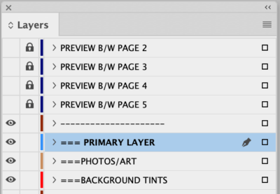
Figure 3. Make a series of layers, one for each page that might be displayed in grayscale, and position them above everything else in your template.
Create a graphic frame with [Paper] fill the size of the live image area of your page, and apply a 100% Hue transparency effect (Figure 4). This effect applied to this object—let’s call it the Gray Enforcement Frame—sucks all the color out of anything underneath and is the heart of how this template works.
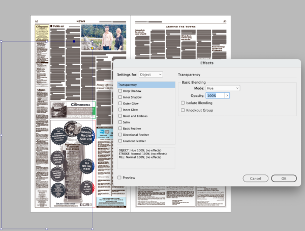
Figure 4. Behold, the Gray Enforcement Frame! Create a graphic frame, fill it with [Paper], and apply the Hue transparency effect, set to 100%.
Paste this frame onto each successive maybe-could-be-grayscale page, making sure that it is assigned to the layer that is associated with that page. Once the Gray Enforcement Frame is precisely in place, lock the object, then the layer (Figure 5). That makes the process of unlocking a very deliberate process, though one that is still almost effortless when you do so through the Layers panel.

Now, when you make the layer for that page visible, everything—everything!—on your page is in grayscale!
Because the layers are locked, you can place a color image into the document on any active layer below and drag it, full color, from the pasteboard onto the page, where it loses all of its color. You can place text styled with color subheads or dropcaps on a color cover, thread it to a text frame onto one of these black-and-white pages, and see the colors in your styles turn into a shade of gray (Figure 6). Thread the story back onto another color page and your text is displaying in color again!
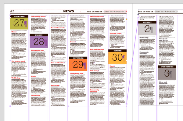
Figure 6. Paragraph and character styles that are defined in color will render normally on pages where your preview layer is turned off and in shades of gray on pages where you’ve turned it on.
Of course, if I toggle the layer visibility off any of the pages, any color objects on that page will display as their original color (Figure 7).
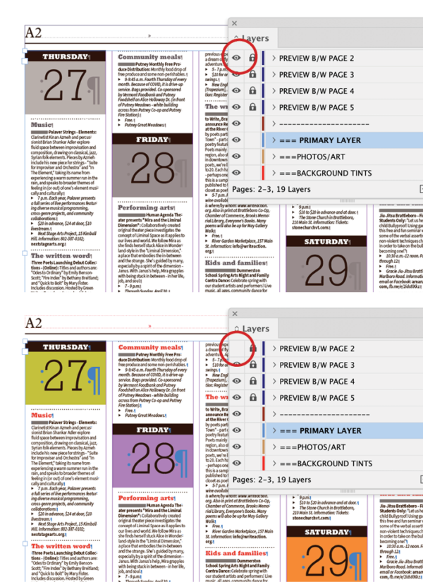
Figure 7. Just turn off the visibility of preview layer to see the page content’s original colors.
Adding and removing pages
You’ll find that the biggest complication will be the care it takes to add and remove pages while keeping the layers intact.
First, create a library (either original or a CC Library). Make sure the Paste Remembers Layers option is checked in your Layers panel menu. Go page by page and select the Gray Enforcement Frame. Click the Add Graphic button in the + menu of your CC Libraries panel, or if you’re using a traditional library, click Add Item from the panel menu (Figure 8). One by one, you’ll be saving the geometry of the Gray Enforcement Frame and the layer name for each page and naming that library item so you can clearly see the page number.
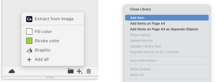
Figure 8. For each potential grayscale page, add your Gray Enforcement Frame to a CC Library, left, or a traditional library, right. Make sure Paste remembers layers is selected in your Layers panel menu and that the item is locked.
Now, if you want to add pages that will need the grayscale, add those pages to your document with the Pages panel (or the Layout > Pages menu).
Keep in mind that when you add or remove the pages, the layers will remain as originally planned, still named for the original page number but applied to the new page number (Figure 9). I’d rename those layers promptly, then check to make sure they’re turning the gray on and off as expected. The worst you can do is remove all of them, remove all the layers, and reintroduce the pages, one by one, from your library.
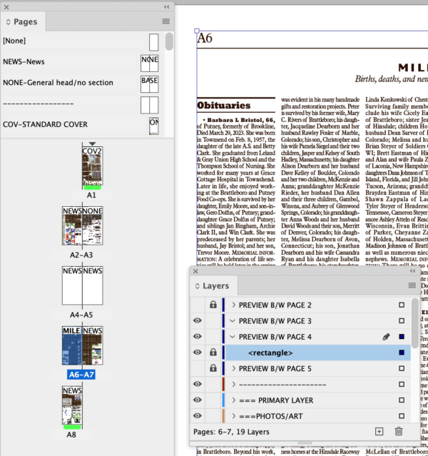
Figure 9. Adding a spread, now pages A4 and A5, to the document changes the pagination. The previews are intact but the layer names no longer correspond with the new page numbers.
With those layers up to date, add the remaining new pages one at a time. Select your library item for that particular page, right-click, and select Place Item(s) in your library or Place a Copy in CC Libraries (Figure 10). Your layer for that page will appear in the Layers panel, and your Gray Enforcement Frame will appear exactly where you will need it in your template, already placed, locked, layer named, and ready to go (Figure 11).
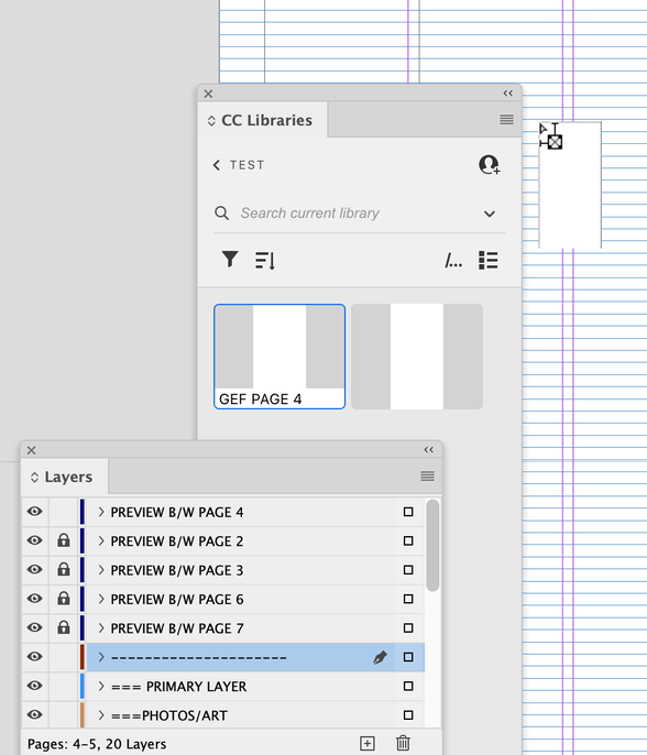
Figure 10. After adding pages A4 and A5, rename the layers for A5 and A6, now A7 and A8. Then place your Gray Enforcement Frame for page 4. If you’re placing the frame from a CC Library, InDesign will automatically add the layer for A4 from the library image as the topmost layer of your document.
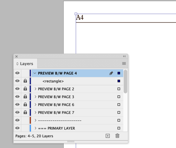
Figure 11. When you place your Gray Enforcement Frame from your library, it will position itself correctly on your page on that layer as a locked item. You’ll need to move the order of your preview layer.
A Complexity that Simplifies
I’ve used this template with the Gray Enforcement Frames seamlessly for a few weeks now, and it’s caused me to simplify other aspects of my template.
One example: For years, I have defined some colorful type elements in paragraph and character styles twice, once for color pages and once for grayscale. Now, all I need is the color version.
I’m now generating my photos for reproduction only in color, meaning it takes less time to scroll through and find the file I’m looking for.
Eventually, this workflow will let me easily create all of our news pages in color for the many readers who prefer a PDF download of the paper.
Granted, this is not a design need that is typical in the least, and I’m sure that it’ll be only a matter of time before newspapers will cease publishing on paper at all. But newspapers are not for tomorrow, they’re for the here and now, and this template here is now making my job a little bit easier. I hope others find this technique useful—or that it inspires you to concoct your own creative solutions for your own efficient publishing needs.
This article was last modified on June 17, 2025
This article was first published on May 15, 2023
Commenting is easier and faster when you're logged in!

Recommended for you

Raise Image Resolution Directly in InDesign
What do you do if you have dozens of images in InDesign and your printer says th...
Choosing a Different Transparency Alpha Channel for an Image
InDesign can use any extra channel of an image as a transparency mask, if you kn...

How to Copy Transparency Effects Between Groups
If you’re a regular reader of InDesignSecrets, you probably know I enjoy c...