

 This article appeared in Issue 84 of InDesign Magazine.
Q. I’ve created a brochure with some color overlay effects, and my client has approved my design, based on what I showed her on my monitor. But now that it’s time to go to the printer, I’m finding that the effect just doesn’t look the same in an exported PDF, and the proof from the printer shows the same problem. How can I fix this? A. Unfortunately, InDesign’s default viewing mode is a bit lazy—it doesn’t faithfully render some blending modes if you’re using spot color content. For example, in Figure 1, spot color shapes are using the Hue blending mode. In Normal view mode, the effect is subtle. But that isn’t the real story; choose View > Overprint Preview, and InDesign buckles down and displays the actual outcome. It’s a bit of a shocker, isn’t it?

Figure 1: By default, InDesign may not show accurate previews of blending modes applied to spot colors (left). But turning on Overprint Preview (right) solves the problem.
blending mode. Q. We combine pages from multiple documents in order to build project proposals. Now I’m encountering two problems, and I can’t figure out what’s causing them. First, when I drag a page from one document into another, the page numbers disappear! And if I just copy text from one document into the other, the appearance of the text changes. The text just uses the [Basic Paragraph] style in both documents. What’s going on? A. When you transplant a page, it takes on the corresponding master that’s in effect in the target document. In other words, if the A-Master in the donor document has automatic page numbers, but the A-Master in the target document doesn’t, you lose the page numbers. The same principle is at work when you copy and paste text between documents. Of course, your donor document and target document both have the default [Basic Paragraph] style, but someone has changed the specifications for that style in one of the documents. When you paste into the target file, the text takes on the specs in that file. This is one reason I’m not a big fan of changing the [Basic Paragraph] style. By the way, this happens regardless of the particular style; if you have a style named Heading in two documents, but the style is defined differently, pasted text will take on the definition of the target document as well. Q. My company is printing promotional brochures for an upcoming trade show. Because we only need a few hundred, they’re going on a digital press. I have an image with a dark blue background, but I need for the background to cover entire pages. I went into Photoshop and used the Eyedropper tool to sample the color, and built a swatch in InDesign with the same values, created a large rectangle, and filled it with that swatch. But in the printed piece you can still see the difference between the image and the InDesign object (Figure 2). I don’t want to have to create a ginormous image and composite the products together, because the client moves everything around so frequently. How can I make the colors match?

Figure 2: A color used to fill areas in Photoshop and InDesign content appears the same onscreen in InDesign (left). But it may look quite different when output to digital presses (right).

Figure 3: If you click and drag a corner of a frame without pausing, you may not see the Smart Guides that indicate matching angles.
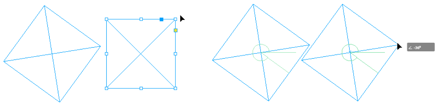
Figure 4: A pause after clicking the corner of a frame will invoke Patient User Mode, and make the Smart Guides appear when frames are rotated at the same angle.
Commenting is easier and faster when you're logged in!

Recommended for you

The Bookbuilder’s Almanac
For almost two decades, I made a living making books. Over the years, just about...
How to Avoid Print Problems with MathML in InDesign
How to use Adobe Acrobat to make sure math equations created in InDesign print i...

Making a Die Cut Shape in InDesign
Need to cut a hole in (or apply a spot varnish to or emboss) your InDesign docum...