

Making high-quality charts and graphs can be a difficult and time-consuming task when using InDesign alone. Most people will make a pie chart, bar graph, or other basic chart in Illustrator, and place it in InDesign. Over the years, there have been several scripts, workarounds, and tweaks devised to get around the difficulty of creating accurate charts in InDesign. Thankfully, Travis Kochel imagined a different type of solution for this problem. Instead of creating a massive graphics plug-in or a series of scripts, he developed a set of fonts called Chartwell, which utilize discretionary ligature options in Adobe applications to create charts that are customizable and easy to build.
The fonts, originally created at TK Type Foundry, are now sold through Monotype. In all, there are seven different Chartwell fonts that you can use to create different types of charts (Figure 1, next page). The desktop fonts can be purchased individually for $25, or as a set for $129 from fontfont.com. Web versions are also available as a separate purchase, with pricing (based on monthly page views) that ranges from $25–$5000 per font.
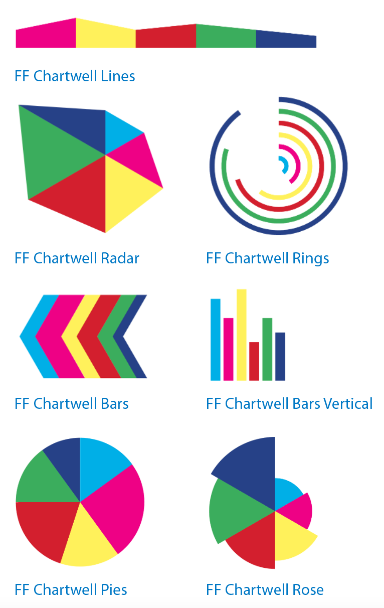
Figure 1: The seven Chartwell fonts and graph styles.
While it is a better deal to purchase the full set of fonts, it’s great to have the option to buy just the font(s) for the type of charts you need. You can recoup the small investment in a single-font license after creating just two or three charts (or even just a single chart, if you have to update it frequently). And since there aren’t any similar options that exist for InDesign (the fonts also work in any application that supports OpenType ligatures), Chartwell is the best solution I’ve seen for creating charts as an InDesign user. I would also say it is simpler than using Illustrator’s built-in chart tools (or the new Creative Cloud Charts features discussed in Brian Wood’s article). And if you’ve ever tried to create a pie chart in Photoshop before, I suspect you’ll find Chartwell to be a huge upgrade.
Getting Started
Installing the Chartwell fonts is just as easy as installing any other OpenType font you might use. If you want to use a font management solution, try FontBook (Apple’s built-in font management tool for Mac OS) or any cross-platform third-party font management software like Suitcase Fusion, Font Agent Pro, or Font Explorer X. Once the fonts are active and available to you in InDesign (Figure 2), you’re ready to create a text frame, type in a string of numbers separated by “+”, and choose OpenType > Stylistic Sets > Set 1. (Side note: I found that having Ligatures turned on was all that was necessary to make charts with Chartwell fonts. I saw others in online forums mention that Discretionary Ligatures was required.)

Figure 2: The InDesign fonts menus: The only user interface you need to use Chartwell.
I created the charts shown in Figure 1 using the same values and colors for each one. The values I used were: 15+25+15+20+15+10.
I changed the fonts, but kept the font size at 80 pt, with no letterspacing or scaling applied. However, Vertical Bars, Radar, Rose, and Rings didn’t work well with lower values. This shows that not every chart is valid for every data set. I increased the values (40+40+60+70+80+90); the larger values worked better.
While it is very easy to get started using the charts, and it takes very little information ahead of time to do so, it is a good idea to read the document that comes with the fonts. This four-page document shows examples of the charts on the first page. The second page provides the four basic steps required to get up and running (always set kerning and tracking to 0, use values of 0–100, apply colors to numbers, and turn on Stylistic Set 1), along with a little more history and information about how the charts are best used. The third and fourth pages provide a few more tips about each chart type. I think this information was added more recently, since I’d seen a few complaints that it was unclear how to create a pie chart with a hollow middle (Figure 3). Spoiler alert: The trick is to add a letter at the end of the string of chart data; the size and color of the “hole” is determined by the letter you use and the color you apply to it. I’d also seen complaints that for the Line chart, you couldn’t use 0 as an initial number, but this works now.

Figure 3: A Pie chart with a hollow middle, achieved by adding a letter to the end of the chart data.
The Rose, Rings, and Radar options are somewhat less intuitive to create and also require you to use letters in addition to numbers. Figure 4 shows examples of each of these type of charts, with a background grid in each. This grid is created by applying a letter (or in the case of the Radar, two letters) followed by a plus sign (+) before the string of number values.

Figure 4: Three varieties of charts with background grids.
If you prefer a visual jump-start, there is a 4.5-minute video created by one of the technicians who worked on this font that will take you through the basics. You can check it out at Vimeo.com. I also have to thank Travis Kochel and his team for creating documentation that isn’t a horribly designed list of steps. If you’re used to getting documentation in a traditional step-by-step format, you may be a little confused and dismayed. But if you like getting information that is grouped visually by topic and presented in quickly scannable and digestible nuggets, then you’ll be pleased. It makes sense that a designer working to make it easier to share infographics would take care in how the information for this font set is shared.
Adjusting Charts
I’m sure there are many hacks and tweaks that can be applied when creating a chart. One in particular that I discovered seems obvious and useful for the vertical bars chart. In this chart style, the spacing between the bars can be changed by adjusting the tracking. On the other charts, changing the tracking from something other than 0 causes the information to be displayed in invalid ways. But for the vertical bars chart, changing the tracking with a negative value moves the bars closer together, and applying positive tracking moves the bars farther apart. Knowing this will make it easier to adjust your chart to fit your space and the content.
To adjust the size of the other charts, you simply adjust the size of your font. If you have a chart with its final edits in place and you really need to adjust the size of the chart without adjusting font size, you can convert your text to outlines, group the item(s), and then adjust it the way you would any other vector graphic. As someone who has balked for decades about having fonts converted to outlines, I finally have to acquiesce that this is a great feature to have available.
Another key tip for adjusting charts is to use InDesign’s Story Editor to see the chart values and edit them without having to unmake the chart by turning ligatures off (Figure 5).
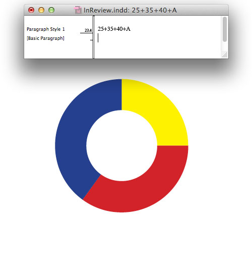
Figure 5: Use the Story Editor to access and edit data in existing charts.
Choosing a Chart Style
While the basic video and the PDF included with the Chartwell fonts are both great, they don’t actually explain when to use each type of chart. If you need help choosing a chart style, a site created by Bryan Connor may be just the ticket. Bryan runs The Why Axis, where he documents “the rise of data visualization in the digital age.” His basic descriptions provide a perfect overview of how and when to use each chart style, and you can also learn alternate names for the chart styles, which will assist you in doing further research. For example, it helps to know that a line chart is also called an “area chart.”
Limitations
One of the downsides of Chartwell is that the numbers you input to create the chart objects are not displayed visually as numbers. This may be fine for many situations, but if you need these objects to be labeled, you’ll have to make callout text frames and arrows yourself. Also, if you create a vertical bars chart, you’ll still need to create the underlying grid to show tick-marks for numbering and to share what the content is for the x- and the y axes. But this is hardly a deal-breaker, in my opinion. And if you create a lot of these charts, it would make sense to create a library of basic structures and callouts.
Unfortunately, there is one issue that may be a real deal-breaker for people who need to chart very precise data. Chartwell fonts currently work only for whole numbers. So if your data includes any decimal values that you need to chart, you’re sadly out of luck. We asked Travis Kochel if there were plans to add support for working with decimals, and this was his reply: “There is a new version in the works that will round decimals to the nearest whole number. I wish it were possible to accurately reflect the decimals, but I haven’t found a way to do it within the limitations of the glyph count in a font.” Until a way to represent decimals is added to Chartwell, you’ll have to take a manual approach and convert your item to outlines and then tweak the chart, which is not ideal, but is still faster than creating something from scratch within InDesign.
Outputting Charts
Since content that begins in InDesign rarely stays in InDesign, I had to see how easy it was to get the chart content out of InDesign. And I was relatively happy with what I found. Everything I printed, on a variety of printers, came out as expected. I feared that older printer-drivers wouldn’t be able to handle the font, but even the almost-dead inkjet printer that I’ve had for 10 years was able to process my page. I also exported my test as a PDF and was thrilled with the results I got using a variety of the built-in PDF settings that ship with InDesign, as well as my custom settings that I use regularly. I also had no problem exporting my CC2014 file and opening it in CS 5.5.
The one area where you might run into problems is if you have to output your file as a reflowable EPUB. In order to get your charts to appear in the EPUB, you need to use Object Export Options (choose Object > Object Export Options) to rasterize the container (in this case, the text frame containing the chart data)(Figure 6). Chartwell charts export just fine to fixed-layout EPUB.
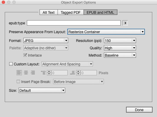
Figure 6: Use Object Export Options to get your charts to appear in reflowable EPUBs.
(Almost) Off the Charts
Despite a few hiccups, Chartwell fonts still offer you an elegant chart-making solution that more than pays for itself in a short amount of time. I’m amazed at the innovation that went into the process of using type and ligatures to create the chart objects. And I’m not the only one to think so. Since 2011, the Chartwell fonts have earned several awards from groups like Communication Arts and Fast Company, who gave them the Innovation by Design award.
Because of the inability to use decimals to create charts, and the need to purchase web versions of the fonts separately, I can’t quite give Chartwell a perfect rating. But I am still very excited about what these fonts can do. And I’m looking forward to using them to take the time and aggravation out of creating and editing charts and graphs right in my InDesign documents.
This article was last modified on November 5, 2024
This article was first published on October 1, 2015
Commenting is easier and faster when you're logged in!

Recommended for you

Importing Movies into InDesign
InDesign is a great tool for making rich-media PDFs, even letting you import mov...

Adobe is Ending Support for Type 1 Fonts
You still have plenty of time to upgrade your type library, but the end of the r...
Batch Change Hyperlinks Across a Whole InDesign Document
What if you had to edit 900 hyperlinks in 5 minutes? Or make other huge changes...