Stealing Great Design
See how to embrace your influences and borrow from them to make something totally new.

This article appears in Issue 144 of InDesign Magazine.
Steve Jobs liked to say that good artists borrow, great artists steal. He lived by his word, because he stole this quote from Pablo Picasso, who said, “Lesser artists borrow, great artists steal.” Turns out Picasso was probably paraphrasing Igor Stravinsky, who said, “A good composer does not imitate; he steals.” But before all of them, in 1920, T. S. Eliot wrote, “Immature poets imitate; mature poets steal; bad poets deface what they take, and good poets make it into something better, or at least something different.” We could go back further, but you get the idea (Figure 1).

Figure 1. Jobs, Picasso, Stravinsky, Eliot: Who stole it first?
The word steal is provocative, but not really accurate. Picasso didn’t steal, nor did any great artist. What they did was immerse themselves in far-ranging influences. They soaked them up like the proverbial sponge, and what they produced was a unique amalgam of those influences. Another homily that frequently gets trotted out a lot is There’s nothing new under the sun. As author Austin Kleon, in his wonderful little book Steal Like An Artist (Figure 2), points out, you have to go back to the Bible (Ecclesiastes 1:9) for the root of this one: “The eye never has enough of seeing, nor the ear its fill of hearing. What has been will be again, what has been done will be done again; there is nothing new under the sun.”

Figure 2. Austin Kleon’s Steal Like An Artist is an enchanting and provocative little book.
On the one hand, this might seem discouraging to a creative person: As a chef, there’s no dish you can cook that hasn’t already been cooked; as a songwriter, there’s no song you can write that hasn’t already been written; as a designer, there’s no design solution—no matter how inventive—that hasn’t already been created. But although all the ingredients have been used, although every chord has been played, and every layout or logo treatment has been thought of, they haven’t been executed with your particular style—with your blend of texture, color, tone, and touch.
Everything is a remix, but that doesn’t mean it has to be derivative. Even if the origins and influence are loudly proclaimed and the debt or nod to the predecessors is evident, the result can still be new and exciting. The elements are assembled differently, at a different time, and combined with other elements that were previously unseen or overlooked. When we take things apart and reassemble them, they don’t fit back together in the same way—even if we want them to—and when you add your own ingredients into the mix, the result is inevitably something new.
So I’m not really talking about stealing. That word is in the title of this article because editors like to have racy titles. Stealing is bad. Copying, or “being inspired by,” on the other hand is not necessarily bad. Copying another designer’s style can be a very informative exercise, especially if you’re copying a historical design style and using software to re-create work originally created with analog tools. Copying can be humbling. Scratch the surface, and you realize how deceptively simple the design is and appreciate how hard the designer worked to keep it that simple. (I got my own lesson in this while trying to reimagine an iconic magazine cover as a city’s promotional poster—with a little help from the London Transport Tube map and InDesign. You can follow along by downloading a PDF excerpt from The Type Project Book from this post.)
Copying gives you new ideas for how to use—and how to combine—the tools at your fingertips. It’s a time-honored way of building your own chops. Once you’ve learned the techniques, you take those that speak to you, combine them with others from different styles, and you’ve come up with your own, unique style.
Copying can also give an insight into why a certain tool is named the way it is and why it behaves in the way it does. These can be insightful moments, because even now, more than 30 years since the digitization of graphic design, most of our tools—their nomenclature, their options, and behaviors—are metaphors for non-digital equivalents, even though the majority of users, myself included, would be clueless if they had to create a layout without using a computer. Sparking off this idea and running with it, in 2008 Indonesian ad agency Bates141 Jakarta created a literal and life-size Photoshop interface (Figure 3).

Figure 3. Tools as metaphor made literal. In 2008, Indonesian ad agency Bates141 Jakarta designed this print ad for Photoshop CS4.
Copyright Considerations
When it comes to “stealing” great design we want to keep on the right side of the law. For works still under copyright, it’s a matter of interpretation how much the work must be changed to make it your own. There is a pervasive myth that if you change 30% of a copyrighted work, it’s no longer infringement—but the truth is more complicated. While specific designs are copyrighted, the building blocks that make up their style are not. The use of typeface combinations, colors, textures, the cropping of images, and so on are all stylistic elements and cannot be copyrighted.
Of course, many historic works may be out of copyright and in the public domain. In the USA, works published more than 95 years ago are generally considered public domain. You can reuse and recycle these works freely. There is a wealth of public domain resources. Although, as anyone who’s ever tried to use them will attest, trying to find just the right asset can have you falling down a deep rabbit hole. Be sure to set aside time for some fascinating detours.
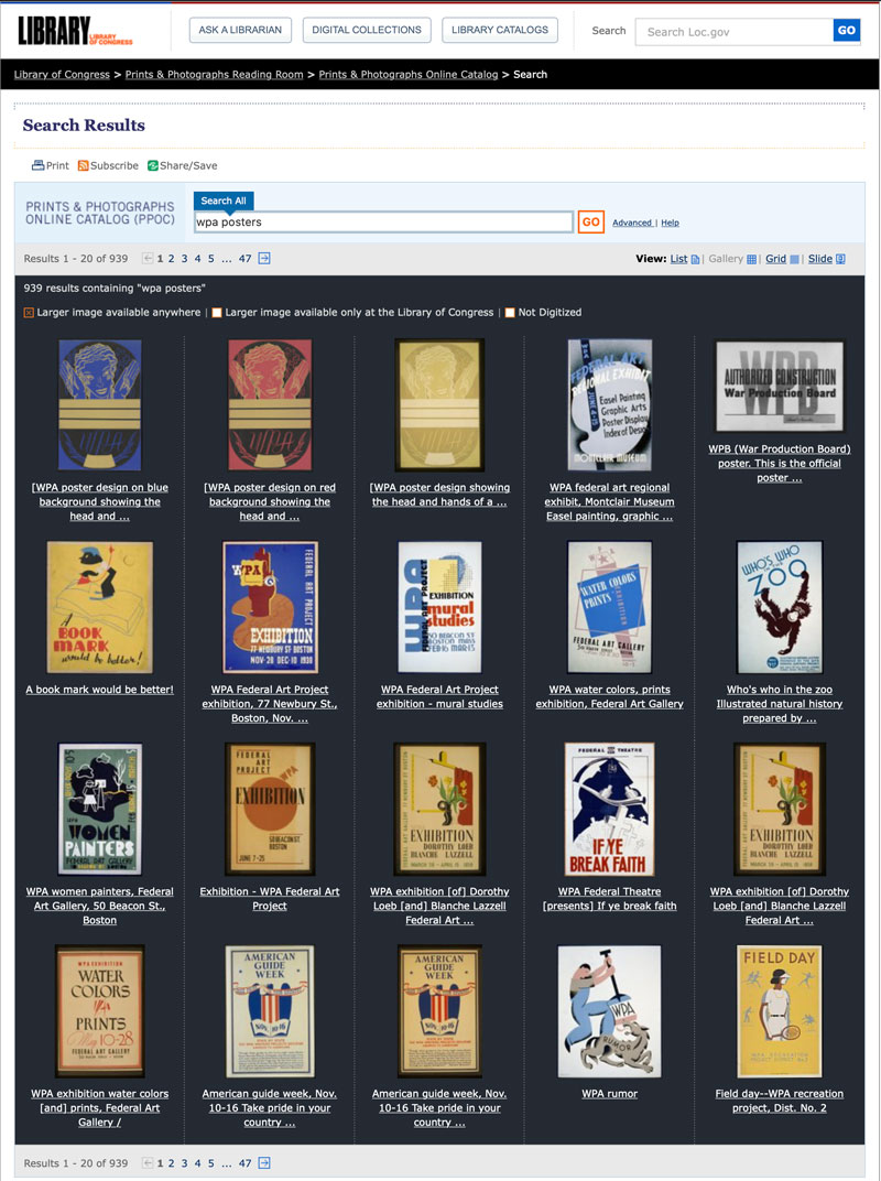
Searching the Library of Congress website for WPA posters—all in the public domain!
Persevere, and you will find many diamonds in the rough, including some amazing WPA (Works Progress Administration)-era and World War II morale-boosting posters, perhaps the best known of which is We Can Do It!, also known as Rosie the Riveter.
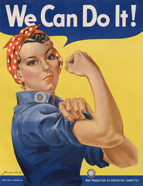
We Can Do It! (commonly known as Rosie the Riveter) by J. Howard Miller was made as an inspirational image to boost worker morale.
Know Your Design Style
As with any discipline, graphic designers don’t have to invent the wheel. Or to use another cliché, we can stand on the shoulders of the giants who came before us. Graphic design has been a recognized trade for over a hundred years. A lot of important stuff happened in that time. Even though our predecessors used different tools, the problem they were solving—how to communicate their client’s message in a clear and compelling way—was the same problem we grapple with today.
This is why we need to know our graphic design history. In a 2008 interview with Creative Review, graphic designer and art director Neville Brody opined that, “What happened between 1914 and 1935 has dictated everything that has happened since in any area of design.” Turns out that Bauhaus was more than just an ’80s goth band.
So, we need to be familiar with the broad strokes of the various design movements—especially those active in this fertile period—that have led us to where we are today (Figure 4). What did they stand for, how did they handle type, what color palettes did they prefer, what was their relationship to the technological changes of their day? We should know what these styles signify, what political and emotional baggage they bring with them, so that we can use them sensitively and appropriately.

Figure 4. A timeline of graphic design history by Kalimna Kane
This is a fascinating and lifelong study, but there are many books available to quickly get us up to speed (Figure 5). It turns out many of them are authored, or co-authored, by the incredibly prolific Steven Heller.
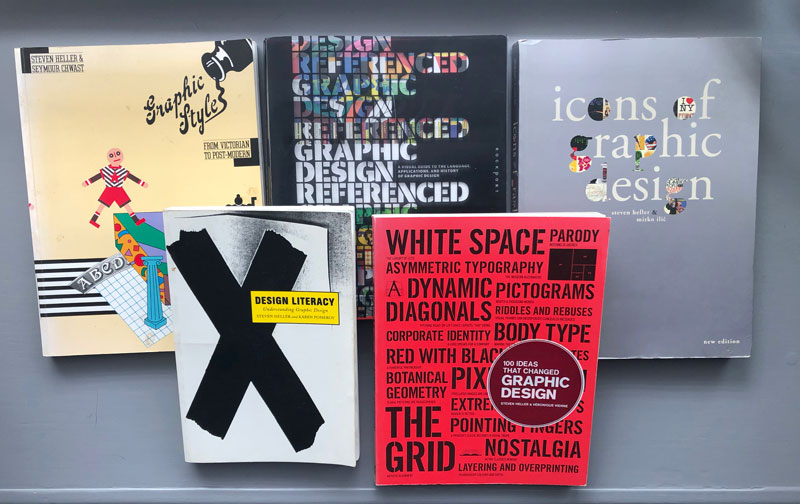
Figure 5. To steal great design effectively, get familiar with the timeline of graphic design history and surround yourself with good source material.
Armed with a knowledge of graphic design history, we can call upon design styles to evoke nostalgia and humor. As part of a continuum, we can make visual affiliations with our predecessors. Here are just a few examples…
Wes Wilson’s psychedelic rock posters of the late ’60s consciously reference the Art Nouveau stylings of the Vienna Secession, in particular the typography of Alfred Roller (Figure 6).

Figure 6. Fillmore poster by Wes Wilson (left), using typography inspired by Alfred Rollers designs for the Ver Sacrum calendar of 1903 (right)
The work of the Russian Constructivists (and the movements that it influenced like Bauhaus and De Stijl) has been particularly influential on graphic design and its impact can still be seen a hundred years later. This is because the design is so strong and bold—and because it looks easy (deceptively so) to copy. Some of this influence can be seen as direct reference or parody, which is fun, but in the hands of real practitioners, it can become a new style in its own right (Figure 7).

Figure 7. Alexander Rodchenko’s poster Books (Please)! In All Branches of Knowledge is one of the most referenced pieces in the history of graphic design (left): the cover of You Could Have It So Much Better, by Scottish indie band Franz Ferdinand (center); an ad on the back of a bus in San Francisco (right).
Neville Brody first came to prominence as art director of
the influential style magazine The Face in the 1980s (Figure 8), and his early career owes much to the style of his idol Alexander Rodchenko.
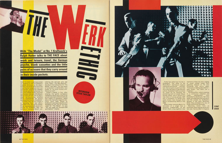
Figure 8. Spread for The Face designed by Neville Brody
Conceptual artist Barbara Kruger also tapped the rich vein of Rodchenko’s style, with her stark black-and-white images overlaid with aphorisms in Futura Bold Oblique. Her style was, in turn, remixed or—depending on your interpretation—appropriated by the streetwear brand Supreme (Figure 9).

Figure 9. Two of Barbara Kruger’s most recognizable works: “Untitled (We Don’t Need Another Hero)” (1987) and “Untitled (Your Body Is a Battleground),” (1989), and the Supreme logo
Continuing with our chronology, the brilliant Swissted website reimagines concert posters designed in the International Typographic Style (the preeminent force in graphic design post World War II until the early 1990s). It’s a wonderful example of two ideas—punk rock and Swiss modernism (which designer Mike Joyce, readily admits have little to do with one another) combining to make something new and fun (Figure 10).

Figure 10. The Swissted home page
Sometimes influences are passed down unconsciously. Did the punks of the ’70s know they were channeling the Dada art movement that began in Zurich during World War I? And could they ever have imagined that their record covers would in turn be repurposed as posters for semi-professional football teams (Figure 11)?
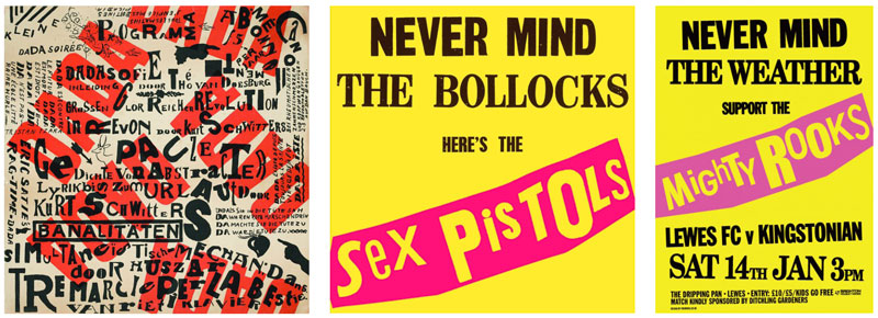
Figure 11. Theo van Doesburg Poster for Dada Matinée (1923), Jamie Reid Never Mind the Bollocks, Here’s the Sex Pistols (1977), Charlie Dobres for Lewes FC, Never Mind the Weather… (2014)
And why is this all relevant to InDesign users? Because if the Dadaists and the Constructivists, the Punks and the protagonists of any other ism were working today, they would be using InDesign, Photoshop, and Illustrator. They’d be choosing their fonts in the same way we do, getting frustrated with spinning beach balls, and cursing the latest operating system “upgrade.” They might even be reading this magazine.
Drawing on the riches of the past is nothing new. For decades, Penguin books have used historical artworks for their covers. When the Classics range was redesigned in 1965, art director Germano Facetti was keen to make the connection between great works of literature and great works of art (Figure 12).

Figure 12. Book covers from the Penguin Classics range
All subsequent redesigns have retained artwork appropriate to the topic and the period of the work. Not only do the carefully chosen images evoke an era, a particular place, or aesthetic, but collectively they help define a brand. Presumably they also kept the art budget low—a saving which we hope was passed on to the readers.
In a more irreverent way, there’s a long history of record album cover designers borrowing artworks from the past. You probably have your own favorites, but Figure 13 shows a few that came to my mind.

Figure 13. The Clash’s cover artwork for London Calling (1980) designed by Ray Lowry was an homage to the design of Elvis Presley’s self-titled debut album. The Pogues cover artwork for Rum, Sodomy & the Lash (1984) by Peter Mennim is based on The Raft of the Medusa (1818–19) by Theodore Géricault, with the band members’ faces replacing those of the men on the raft. Bow Wow Wow’s See Jungle! See Jungle! Go Join Your Gang Yeah, City All Over! Go (1981) is based on Le Déjeuner sur l’herbe (1863) by Édouard Manet.
Ironically, my first exposure to these historic artworks actually came through the repurposed versions, only later leading me on a journey into the past to discover the source.
There are also examples of recontextualizing content. Savvy designers are always looking to take something overlooked and give it new life. Such was the case with Joy Division’s Unknown Pleasures (1979). Designer Pete Saville took an image of radio waves from The Cambridge Encyclopaedia of Astronomy, reversed it from black on white to white on black, and transformed it into one of the most recognizable album covers of all time (Figure 14). Nearly 40 years later rapper Vince Staples based the cover of his debut Summertime ’06 (2015) on this iconic work.
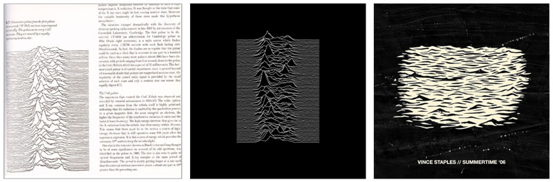
Figure 14. Left to right: Page from The Cambridge Encyclopaedia of Astronomy, Unknown Pleasures, Summertime ’06.
Everyday Design Needs
A policy of not reinventing the wheel applies to projects big and small. There are resources aplenty, and we should plunder them. On a more pedestrian level, be on close terms with the Glyphs panel so that you know what alternate characters are available in your fonts (Figure 15), and then take advantage of icon and picture fonts like FontAwesome (Figure 16). Use websites like the Noun Project to access SVG icons to find brilliant social media and design icons (Figure 17). Explore the custom shapes in Photoshop and the symbols in Illustrator (Figure 18). Sure, some of them are cheesy, but they’re there to be modified, adapted to your needs.
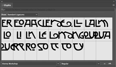
Figure 15. Get the most from a display typeface by knowing what stylistics extras are available.
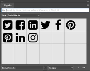
Figure 16. Make a glyph set for ready access to social media icons.

Figure 17. Need an icon? Check out the Noun Project.

Figure 18. Just some of the many vector shapes available in Photoshop
Take this approach everywhere: Design inspiration can come from where you least expect it—a shadow on a wall, a swirl in a cup of coffee, a beautiful piece of vintage signage. Look up to the clouds and look down at your feet—drain covers, for example can be quite beautiful and ripe for repurposing as vector ornaments (Figure 19).
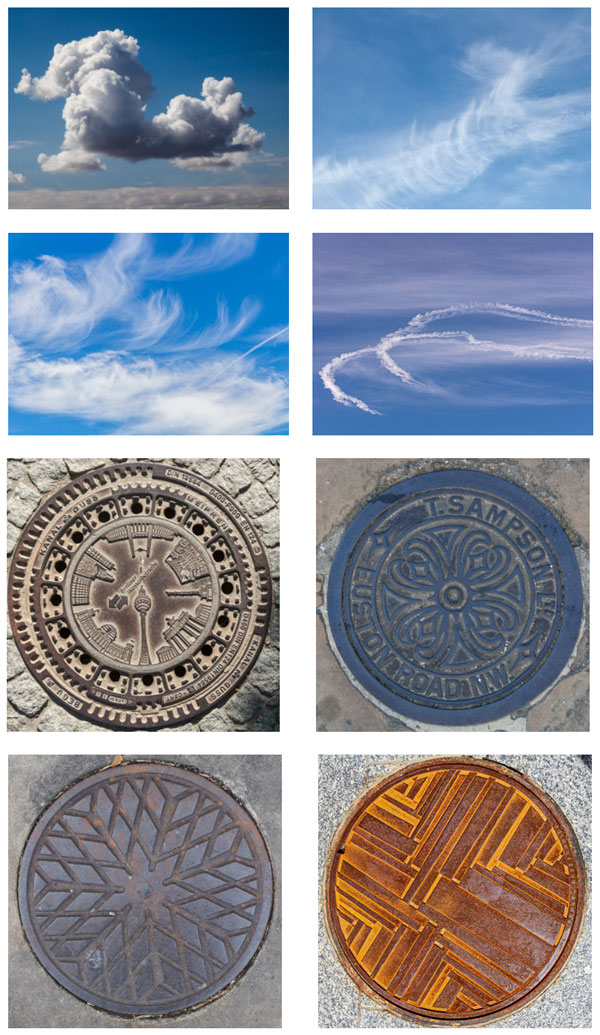
Figure 19. Above us only sky: Clouds can be a great source of pattern, shape, and texture. Below us… a selection of decorative drain covers.
We know that inspiration is everywhere, but sometimes it’s good to have a reminder. If ever you’re feeling stuck, browse the shelves of your local bookstore or library. Every one of those book covers involved a series of design decisions. Even those that are not successful can spark ideas as effectively as those that are.
Anything that poses or answers a question, that suggests what to do or what not to do warrants your attention. Invite these influences, nurture them, and curate them in your mind. This starts with remembering them: Carry a notebook, or use the camera on your phone as a visual diary. Collate your findings in whatever way works for you. For me, that means Pinterest, and my projects begin with gathering stuff on a Pinterest board. If you’re concerned about privacy, there’s the option to keep the board private. Gathering seemingly disparate elements together is quick way to make to make visual associations—some of which may surprise you.
The great works of graphic design are our building blocks, our vocabulary. Don’t worry that immersing yourself in its history will make you too suggestible to its influence. The likelihood of being derivative is greater if you cut yourself off from history. Just because you close your eyes to it, doesn’t mean it’s not there. When we know what came before we are better placed to position ourselves as part of a design continuum. Even if we try to reassemble those building blocks in the same way our antecedents did, we won’t be able to. But we can put them back together differently. We can take the tropes and visual shorthand of one style, combine them with those of another, add our own sensibilities and presto, we have something new. The words come out in a different order, arranged in new ways and garnished with layers of nuance and inflection that is uniquely ours.
Re-creational Learning
One of the best ways to learn both how to use an app (any app, including InDesign) and design is to try to re-create a layout you like. Be sure to have a ruler on hand as you attempt to build every element as closely as possible to the original. Or digitize the original, put it on its own layer, and construct your page over it. If you don’t have the correct fonts, try to find ones that are similar. For images, use approximations from the web or even shoot your own with your phone. Try to match the colors as closely as possible.
Try this with a magazine advertisement, a layout from a magazine, a book cover, an interior spread of a book, and a piece direct mail advertising. Accomplish all five and you’ll find yourself far wiser and more able than you were!
For more instruction on borrowing design elements, see Mike Rankin’s article in Issue #96.
Commenting is easier and faster when you're logged in!

Recommended for you

Communicating with Charts
Build your charts, graphs, and data visualizations with these helpful tips and p...

Creating Org Charts in InDesign
With the Gridify feature and two key paragraph style settings, you can create or...