

If a client wants an embossed letterhead, they’re going to have to take its final appearance on trust. Unless, of course, you can create a visual to give them an idea of how it will look. Here’s a step-by-step guide to simulating both blind embossed and foil debossed styles in Photoshop.
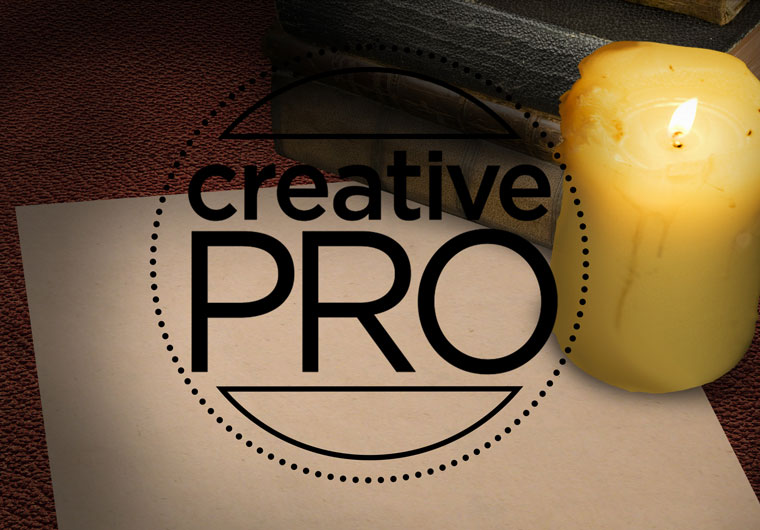
Step 1: Start with your design
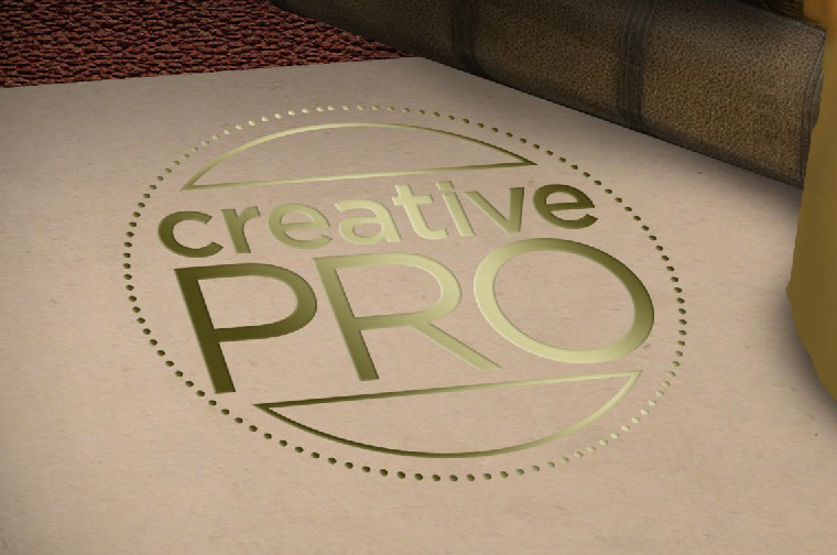
For this tutorial I’ve used the CreativePro logo, set in a ring of dots. I considered adding the tagline “What do you want to learn today?” in an italic serif font underneath, but fine details don’t appear well when embossed – either in Photoshop or in real life. Go for bold, strong text and thick strokes.

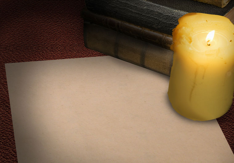
Step 2: Choose your background
A plain sheet of paper won’t show off the technique at its best. Choose a textured paper and, for added interest, place it in a lit scene.
Step 3: Place your artwork
Copy your artwork into the background document, with separate layers if that’s how you created it. The color of the artwork doesn’t matter.
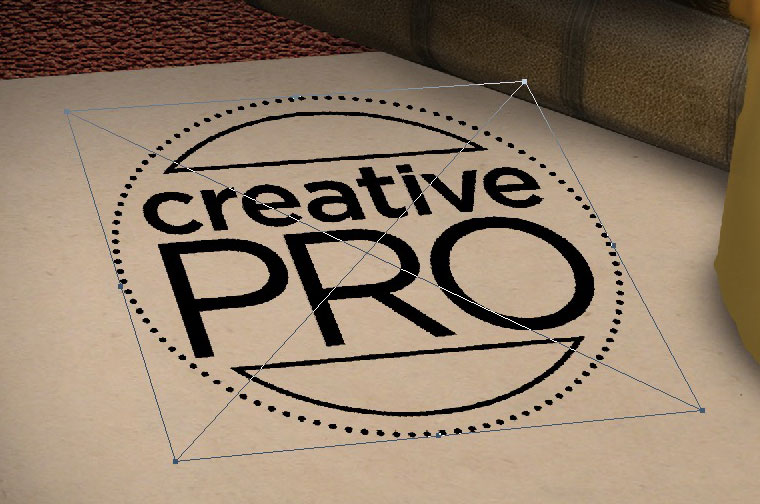
Step 4: Put it into perspective
Select all the layers in your logo artwork (if there are more than one), and choose Layer > Smart Objects > Convert to Smart Object. This will allow you to modify the contents later, and to adjust the perspective view if it isn’t quite as you intended. Then use Free Transform and hold Command (Mac) or Ctrl (Windows) as you drag each corner handle to place the artwork in perspective.
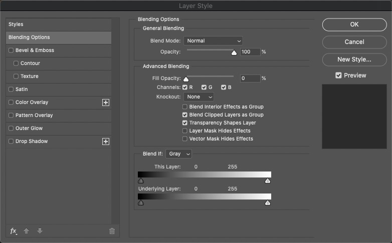
Step 5: Layer Style
Open the Layer Style dialog by clicking the fx button at the bottom of the Layers Panel. The first thing you want to do is to make the fill color of the original artwork invisible, so go to the Blending Options pane and set the Fill Opacity to zero. This will temporarily hide your artwork.
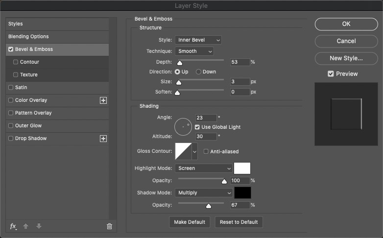
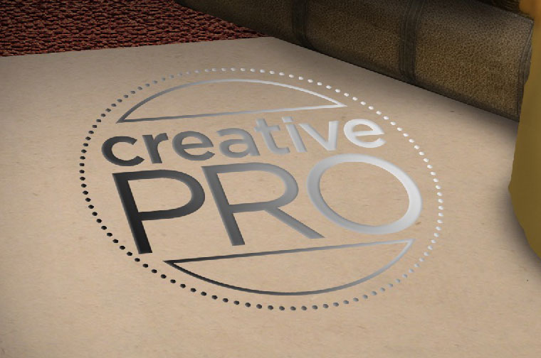
Step 6: Emboss the artwork
Check the Bevel & Emboss style, and choose Inner Bevel as the Style option. You’ll want a very small Size setting, just a few pixels; and set a depth of around 50%. It doesn’t need to be too strong. In the Shading section, drag the Angle control until it points towards your light source – in this case, it’s the candle.

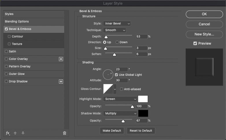
Step 7: Soften the effect
You don’t want the effect to look too crisp, since paper doesn’t behave in that way. So use the Soften slider to smooth out those crisp edges: a value of 5 or 6 pixels should work well, depending on the resolution of your artwork.

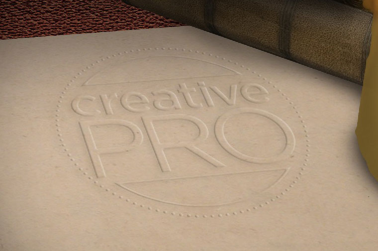
Step 8: Add a shadow
Since the logo is raised from the surface, you can expect it to cast a slight shadow away from the light source. Check the Drop Shadow button and create a shadow with a very, very low opacity – I’ve used just 6%. You don’t want it to overwhelm the artwork. Your blind embossed artwork is now complete.

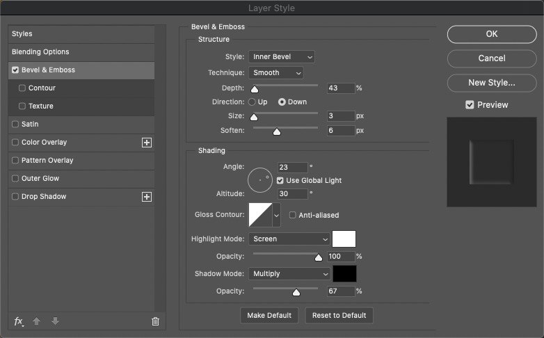
Step 9: Gold debossing
Blind embossed artwork is pressed up from below, making it stand up from the surface of the paper. But foil blocking, by its nature, has to be impressed from above. To achieve this effect, first go to the Bevel & Emboss section of the Layer Style dialog box, and change the Direction from Up to Down. This should be enough to create the deboss effect. And while you’re there, turn off the Drop Shadow.

Step 10: Adding the foil blocking
The first step in adding the blocking is to add a Gradient Overlay to the artwork, again using the Layer Style dialog box. Choose the basic black to white gradient, and set the Angle so it slants across the image.
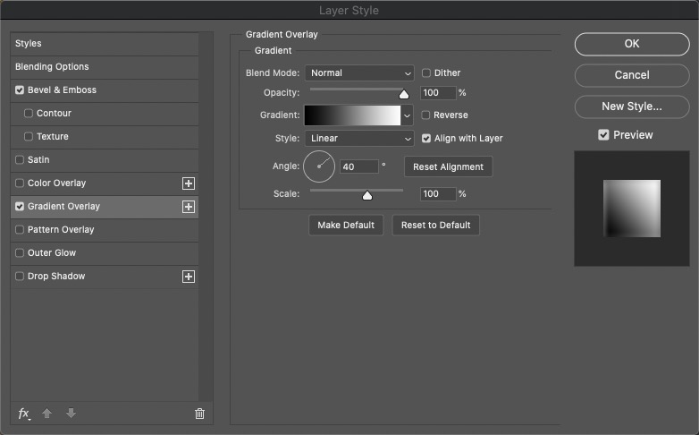
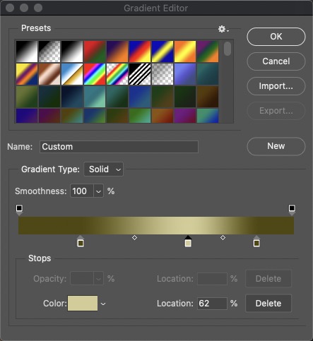
Step 11: Add the color
Click the Gradient swatch and the Gradient editor will open in a new window. Click on the white swatch on the right hand end and choose a bright gold color, but be careful not to make it too saturated: muted tones work best. Then hold Option/Alt as you drag it to the left to duplicate it, and once again click on the swatch. This time, drag downwards in the Color editor to make it darker. You can also delete the original black swatch on the far left.

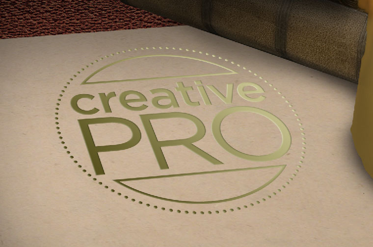
Step 12: Limit the highlight
The simple gradient gets the impression across, but it’s not very appealing. For better results, open the Gradient Editor again and move the bright swatch to the middle, and drag the dark swatch closer to it. Then hold Option/Alt to drag a copy of the dark swatch the other side of the bright one. By tightening up the gradient like this you’re producing a more concentrated highlight, which looks more convincing.
Step 13: Change the artwork
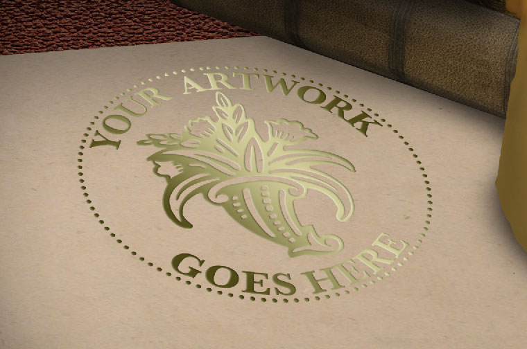
Because the original artwork was turned into a Smart Object before all the effects were applied, you can repurpose it with ease. Double-click the Smart Object in the Layers Panel, and it will open in a new window as a .psb document. You can replace what’s there with any content you like. When you Save this new document, your new artwork will appear in place.
This article was last modified on March 28, 2023
This article was first published on February 5, 2021
Commenting is easier and faster when you're logged in!

Recommended for you

How to Make Amazing Halftone Effects with Photoshop
Use a Photoshop method to explore and control creative halftone effects for prin...

How to Create a Burnt Paper Effect in Photoshop
Creating a burnt paper effect in Photoshop is much easier than you might think....

Photoshop, Illustrator, and InDesign New Features Guides Updated for 2023
These free reference guides are a unique resource for understanding the evolutio...