
Working with Handwriting Fonts
Handwriting fonts can help you connect with your audience—just be sure to avoid the clichés.

This article appears in Issue 141 of InDesign Magazine.
Playful, elegant, or quirky, type with a handwritten vibe can add authenticity or informality—or possibly both—to your print or screen projects. Handwriting fonts accentuate the personal and the organic. Used well, they can take a message and give it that extra something—be it warmth, friendliness, or humanity. Nostalgia is a powerful emotion and handwriting fonts can tap into fond memories. Like a typewriter font, handwriting reminds us of a pre-digital age—a mythical time when everything was cheaper, politicians were honest, and summers were longer. They can also convey a personal relationship between designer and audience. As consumers, we’re not stupid. We know it’s just a font, but we’re happy to suspend our disbelief—just as we do when watching a film or play. The conventions of drama differ from real life, and we accept them. Just as we seek out fiction to experience other lives and escape the humdrum of our own, we like to read handwritten type to escape the 9-to-5 of neutral body fonts. We’re aware of the artifice, but we’re happy to play along—up to a point.
But before we go any further, let’s start by defining what we mean by handwriting font. Distinctions between calligraphy, script, and handwriting are blurry—and I will wander back and forth over that blurred line, but here are some things to think about. Calligraphy involves the frequent lifting of the pen, whereas script is written with as continuous a line as possible. Both may be true of a handwritten font, but not necessarily. When someone mentions handwriting, we most likely think of cursive lettering. But it doesn’t have to be. The term handwriting font is really a catchall for a font that was done by hand, or perhaps more accurately, that was made to look like it was done by hand. As well as cursive options, this can include block lettering, chicken scratchings, the permanent marker look, and a wealth of other options that run the gamut from elegant and flowing to erratic and illegible (Figure 1).

Figure 1. Some of the different styles of handwriting font
Sourcing Handwriting Fonts
All the usual suspects: Dafont, Google Fonts, and FontSquirrel have an abundance of handwriting fonts available for download. In InDesign, Illustrator, and Photoshop, you can use the Fonts menu to filter by classification (Figure 2).

Figure 2. Filtering fonts by classification (left), finding and activating fonts using Find More, and finding fonts using the tags on Adobe Fonts (right)
Combine this with Find More option, and you can scroll through and preview all of the handwritten type available on Adobe Fonts and activate fonts on the fly. (If this seems too good to be true, well, it is—it’s often quicker to go directly to the website and preview and activate the fonts there.) On the Adobe Fonts site, you can also use the new tags feature to help refine your search. Unfortunately, there’s no easy way identify those fonts that offer stylistic alternates.
We don’t have to look far for inspiration. In fact, we can start with just pen and paper. Even if your handwriting has atrophied from lack of use in the digital age, it is still brimming with personality. (It really isn’t as bad as you think. And even if it is, that’s a look in its own right.) If all you need is a small passage of handwritten text for seasonings, then you can scan and vectorize your handwriting, or draw it directly onscreen using the Pencil or Brush tool in Illustrator. (See “How to Make Your Own Handwriting Font.”)
To see how others are using handwritten text, sites like Pinterest, Behance, and Fonts In Use, are treasure troves of inspirational examples (Figure 3).

Figure 3. FontsInUse.com is useful to find examples of how specific handwriting fonts have been used in projects.
Venturing outside (a big deal in these times), chalkboards, vintage signs, and graffiti can provide great ideas—take snapshots with your phone, and you’ll soon have a collection of source images to draw upon. Browse the shelves of any bookstore, and you’ll see many examples of the handwritten look (Figure 4).

Figure 4. Examples of book cover designs using handwriting fonts or hand lettering
You would expect to find this for children’s books, but it’s also true for fiction and cookery titles, where the use of hand lettering conveys the book’s uniqueness in a crowded market. Of course, it’s not always easy to tell if the designer has used a font or if the text is hand lettered, but that’s the point really.
Giving the Type Personality
Just like real handwriting, a handwriting font should have personality, which when you think about it is an oxymoron. Just because a font is called something like My Groovy Handwriting, doesn’t mean it’s organic. How can a product that is digitized, infinitely reproducible, and predictable, convey something that is as unique as a fingerprint? Repeating letters look the same in typesetting, but they aren’t identical when actually penned. To compensate for this and to add more personality, choose a typeface with stylistic alternates. You then can use the Glyphs panel or the Type Contextual Controls to swap as many of the repeating letters as possible with alternate versions of the glyph (Figure 5).

Figure 5. Use stylistic alternates to give your type more personality. Here I am using the Glyphs panel, with the Show menu set to Alternates for Selection. I prefer this to the Type Contextual Controls because the Glyphs panel lets you increase the view size of the glyphs. Only a minority of fonts come with alternates, so their availability might be a major factor in your choice of typeface.
Like drum solos, handwriting fonts should be deployed sparingly so that they don’t outstay their welcome. Everyone loves a dramatic display, but a little goes a long way. With large personalities and often eccentric flourishes, handwriting fonts are difficult for continuous reading—as challenging to the eyes as a drum solo is on the ears. Instead of setting whole passages or paragraphs in a handwriting font, limit their usage to just a phrase, a few words, or even a few characters (Figure 6). With fewer repeating letters, the type will look unique, and there’s the added bonus that the larger body of text will be readable.

Figure 6. The handwriting font (Mojito) is more impactful when used sparingly (right).
Handwriting fonts can be combined effectively with either serif or sans serif fonts (Figure 7). But they may not take well to extremes of sizing—too small and they become unreadable; too big and the idiosyncrasies that make them charming may become too obvious defects. You’ll want to consider the biggest and smallest size at which they need to function.

Figure 7. The cameo role played by the cursive the provides a welcome counterpoint to the assertiveness of the bold sans serif.
Some Things to Avoid
While using handwriting fonts can add a wonderful je ne sais quoi to your design, there are some things you’ll want to avoid. Most of these cautions are common sense; some are entirely subjective—so take them with a pinch of salt.
Graphic designers like to seek out undiscovered fonts, while avoiding those that are over exposed. There is good cause for this fickleness: The uniqueness of a product suffers if the typeface associated with it is used by other products that also claim to be unique. For this reason, widely used handwriting fonts can quickly become the victims of their own success—and because they are more recognizable than your average text face, they can’t just put on a baseball hat and sunglasses to disguise themselves in public. Anyone old enough to have been doing this in the ’90s will remember Tekton, the elegant handwriting font based on the hand lettering of architect Frank Ching. The first time you saw it, you were charmed. You wished that your own handwriting had one iota of its style and your doodles started to subconsciously emulate its simple flair. But then it was everywhere.
Intended as a typeface for use by architects, it quickly became the Casual Friday of the font world, a lazy shorthand for anyone wanting to convey informality and fun (Figure 8). Though objectively it lost none of its beauty, the curtain had been drawn back, and we saw that behind it was just bunch of PostScript code.

Figure 8. Tekton: Please don’t do this.
While handwriting can make a good logo, a handwriting font is unlikely to succeed. If you want a handwritten look, then hand write it. Sounds obvious, but sometimes with so many digital tools at our fingertips we can overlook the analog solutions staring us in the face. If you’re not confident about your hand lettering, then by all means use a font as template that you can manually trace over. The result will inevitably be different from the original, and that’s what will give it its personality.
Personally, I find the most enjoyable hand-lettering experience is using Procreate or Adobe Fresco on an iPad with an Apple Pencil. Turn up the smoothing option (Figure 9), and you start believing you’re a skilled scribe.

Figure 9. New Recipe, plus Smoothing
Fresco’s vector brushes mean you get crisp and scalable outlines, which can be exported to Illustrator. You probably won’t need a whole character set (at least not to start with), but if that changes, you could commission a proprietary font—or design your own.
Use Them Sparingly…? and Tastefully
With so much personality, handwriting fonts can be the perfect choice in the right context, but a design faux pas in the wrong one. If they were footwear, handwriting fonts would be flip-flops: great for very specific occasions, hopeless for others, and with a very limited range.
On a technical level, if we were talking exclusively about cursive lettering, then a good start would be to avoid obvious banana peels—like typing in all caps, using excessive lettering spacing, and enabling Optical kerning (which can really throw off fonts that require precise spacing)—but the field of handwriting fonts is so broad that we can’t even make these generalizations. Some marker-style fonts work best as block capitals (and may exist as uppercase only), and because many handwriting fonts are “home grown,” kerning metrics may be a bit off, so you’ll want to adjust letter spacing and kerning methods to taste (Figure 10). Leading values will also require case-by-case attention. Auto leading is unlikely to yield a good result. Basically, you’ll have to experiment.

Figure 10. On the right, I tightened the leading, made sure that Metrics rather than Optical kerning was used (to ensure that the letters connected), and took advantage of the stylistic alternates available. Because of their unique shapes and the diverse backgrounds every handwriting font should be treated individually. Some will work in uppercase, others won’t; some will look better with metrics kerning, others with optical kerning; in all cases auto leading is unlikely to yield the best result.
On an aesthetic level, if you’re using handwriting fonts, don’t be sneaky about it: Don’t try to pass off your typography as something that it’s not. Using a handwriting font won’t create a connection where there isn’t one already. If the intimacy is false, a handwriting font will look phony. How do you feel when we you receive mail addressed to you personally that—at first glance—looks handwritten? Maybe for a fraction of a second you think, “Wow! Someone has taken the time to sit down with a fountain pen and write me a letter. Just like in olden times. How exciting! How flattering!” Then you realize it’s a ruse, that it’s not handwriting, but a digital font, that the mail was unsolicited, and that thousands of other people got exactly the same piece of direct mail (Figure 11). If you’re like me, at this point you don’t care what’s on offer: The piece is immediately thrown in the recycling bin.
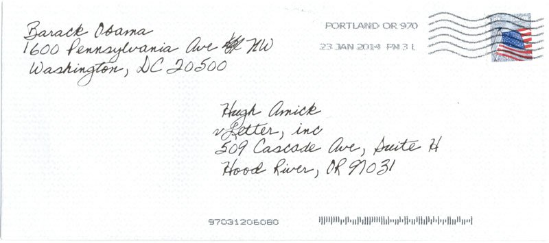
Figure 11. Do I really think that Barack Obama took the time to write this letter by hand?
Another time to avoid handwriting fonts is as a signature. If you’re using the signature of a real or imaginary person—maybe on the cover of historical biography or in the logo of a folksy brand—then only the real thing will do (Figure 12). Don’t try to convey something unique using something off the peg. It’s not going to look good when some other brand shows up using the same font for their messaging.

Figure 12. Logos that feature signatures are as old as the hills. Because their success depends on their uniqueness, the lettering is hand drawn.
How to Make Your Own Handwriting Font
Font creation is never going to be easy, but the Fontself Maker simplifies the process, and creating a handwriting font is a good way to get familiar with this inexpensive plug-in for Illustrator and Photoshop. Handwriting fonts are forgiving because they are so subjective. Things that judgmental people might call “mistakes” can be passed off as idiosyncrasies: There are no wrong answers. Your handwriting font doesn’t need to be the work of great penmanship; it just needs to be real.
A typical workflow starts with writing out each of the letters. To keep your lines inside the box, you can print out the convenient Fontself template (Figure 13). Draw multiple versions of glyphs to give yourself options and don’t forget all the punctuation marks you’re likely to need.
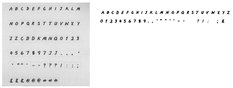
Figure 13. Write out your letters, optionally using a template to help keep them all the same scale.
Scan or photograph your page and in Photoshop, use a Levels adjustment and/or the Eraser tool to clean up the result.
After you place the file in Illustrator, use Image Trace to vectorize the shapes. Be sure to turn on the Ignore White option. You’ll probably want to make some scaling modifications to certain glyphs.
So that Fontself can better interpret your letter shapes, draw a baseline guide and a cap height guide. Use the Layers panel to name these, Baseline and capHeight respectively.
Now arrange your 26 letters in order. It’s essential that when dragging them as a batch into the Fontself window, that you have just 26 objects. For those letters that are comprised of multiple shapes, for example an O and its counter, combine them into a single compound path.
Finally, drag the selection of letters onto Fontself (Figure 14).
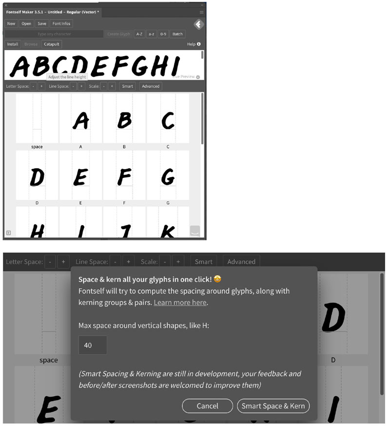
Figure 14. Drag the selected vector shapes into the Fontself window and auto kern.
Each of the letters should populate its respective slot or box. You can adjust the letters individually, but if you previously arranged them relative to the baseline guide, you shouldn’t need to make too many changes. You’ll need to repeat this process for the punctuation. Again, each glyph should be one object, so make sure you group together the two dots of a colon, for example.
You can test out the result by typing a few phrases. Click Space & Kern to automatically adjust the letter spacing.
Save the font to create an OpenType font (OTF), which you can open with Font Book, or whatever font management software you’re using. You should now be able to access your font from the font menu of applications and type away to your heart’s content (Figure 15).

Figure 15. Once you’ve saved the font and installed it with a font manager, you’re ready to take it for a test drive.
Handy Advice
Handwriting fonts, used sparingly and with attention to making them look unique, are a useful addition to your typographic palette. Avoid the pitfalls, exercise common sense, and consider creating them yourself.
Commenting is easier and faster when you're logged in!

Recommended for you
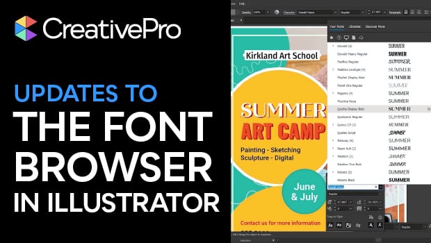
New Font Browser Features in Illustrator
Explore the new features added to the Font Browser in Illustrator 2026.


InDesign Magazine Issue 139: Adobe Bridge
Issue 139 of InDesign Magazine has articles on Adobe Bridge, InDesign 2021, IDML...