Designing with Column Rules
Creative techniques for designing with InDesign’s column rules feature.

This article appears in Issue 129 of InDesign Magazine.
Column rules—lines placed between each column of a story—too often are an invisibly visible design tool. Generally, they’re used on the straight and narrow, confined to newspapers and magazines. They’re kept simple and serious, humble and quiet—their typical purpose being to help establish modular content structure or help a reader navigate skinny columns of text.
But column rules can be anything but boring. They can be used in many other contexts and designed to serve various functions—to illustrate content, to signal content type, to distinguish translations, and to add a touch of branding.
Of course, you can always draw column rules manually, using lines or shapes on your InDesign page. But with InDesign 2020’s Column Rule feature, it’s now easier than ever to set column rules that scale, move, and automatically make way for any header text set to span multiple columns. In this article, I’ll cover how to set basic column rules with this new feature, and share a few examples of column rules to jumpstart your own creativity.
How to Use the Column Rule Feature
Set the number of columns for your text frame in the Text Frame Options dialog box, or in the paragraph formatting section of the Control panel (Figure 1). Note that the Column Rule feature only works in multi-column frames; it does not work on “columns” of text dragged out as separate, threaded frames.

Figure 1. Setting a text frame with three columns and one header line spanning all columns
Right-click on the text frame and click on “Text Frame Options…” or press Cmd+B on Mac, or Ctrl+B on the PC (Figure 2).

Figure 2. Right-click on the text frame to select “Text Frame Options…”
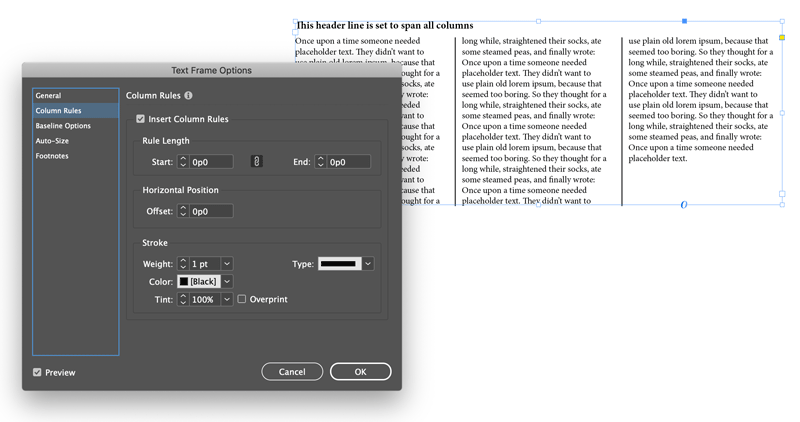
In the left panel of options, select Column Rules, and click the Insert Column Rules checkbox (Figure 3). If the Preview checkbox is selected, you’ll see column rules show up in your text frame. Column rules automatically skip paragraphs that span across multiple columns, such as headers.

Figure 3. Inserting the default style of column rules
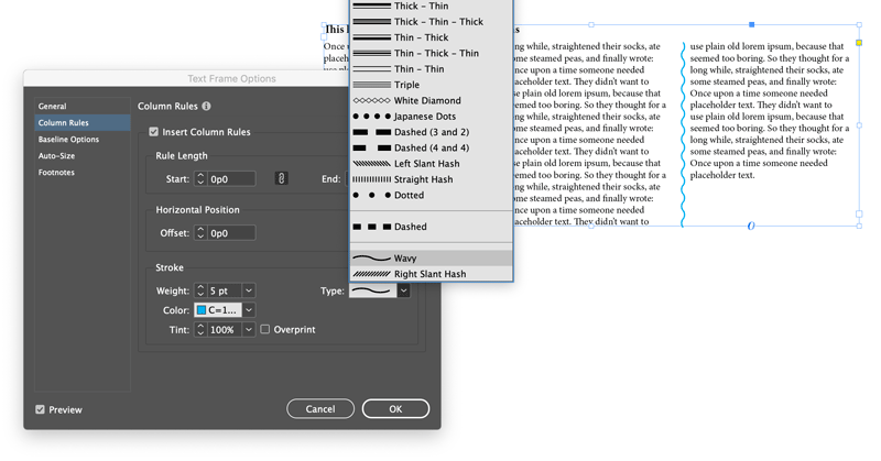
You can then customize the styling in the Stroke area of the panel, such as with color and stroke style (Figure 4).

Figure 4. Customizing color and stroke type
At the time of writing this tutorial, the Tint setting is actually changing the line’s opacity—that’s probably a bug; hopefully Adobe will either fix it or correct this label in future versions! Note that the rules span to the top and bottom edges of the frame, though you can adjust that with the Start and End fields—and those numbers can even be negative to extend the rules outside the frame.
Rule Your Own Creativity
Rather than thinking of column rules as tools restricted to long editorial pieces, think of them as dividers that separate chunks of copy. Suddenly, the opportunities expand…
Illustrate subject matter with column rules
You can use column rules to help illustrate items related to the subject. Consider wavy lines to represent string or noodles. Try dotted lines to suggest bubbles or buttons. Play with solid lines as buildings, doors, books…or piano keys, like in this product overview sheet for a piano shop (Figure 5).

Figure 5. A product overview sheet featuring column rules illustrating piano keys
In this example, the column rules are set inside widely spaced gutters and begin above the text frame to create the illusion of black keys on a keyboard. In this case, I’ve set two text frames side by side, one with three columns and one with four, in order to show the spacing of the black keys more accurately.
Keep in mind that you can also adjust horizontal offset of the column rules, change opacity, and rotate text frames to create angles, which further expand your illustration possibilities.
Combine column rules with paragraph rules
In this index for a children’s book on animals, dotted blue column rules meet with bold yellow paragraph rules to create a grid-like format (Figure 6). Mixing line styles creates a playful, artsy, and organic feel. Use only straight lines if you wish to accentuate the structure of cubbyhole compartments.

Figure 6. An index for a children’s book featuring column rules coordinating with paragraph rules
Use multiple column rules to integrate with a theme or subdivide content
By overlaying column rules, you can create unique designs that support a visual theme. In this event invitation (Figure 7), column rules of white diamonds overlap with column rules of solid black lines.

Figure 7. An event invitation card featuring overlapping column rules that illustrate the theme
Simply copy the main text frame, paste it in place, delete the text, and change the column rule styling. Here, the column rules suggest lacing detail (such as might be found on bodices and old-fashioned boots) or elegant latticework, mirroring the subject matter of a masquerade ball. The white diamond rules begin and end shorter than the solid bars on the layer beneath. Both frames can be grouped and then moved or rescaled easily.
Whether it’s with color or shape (or both), column rules can also be used to coordinate with a brand’s visual identity system, helping to reinforce the brand’s recognizability. In this bilingual poster (Figure 8), the brand’s illustration style with circular pops of color is reflected in the styling of the column rules, which separate English and Spanish translations.

Figure 8. A bilingual poster for health education featuring column rules that separate translations
The column rules were set to be shorter than the height of the text frame, and color-coordinated with the illustrations to reinforce the separate topics. The top section of text uses two overlapping text frames of column rules—one of straight lines, and one of a dotted line—to separate the columns of English and Spanish translations.
Integrating column rules with other design elements
Whether they’re dotted, dashed, wavy or straight, column rules are lines. And lines, along with proximity and alignment, are one of the basic tools designers use to establish relationships between items on the page. This spread from a product booklet for an interior design firm shows how column rules can help establish a stronger visual relationship between the text and the color-coded headings (Figure 9). The column rules were set to begin higher than the text frame, so that they connect with the header area (occasionally creating illustration opportunities, such as the hanging lighting fixture).

Figure 9. A spread from a product reference book featuring column rules that integrate with the design to distinguish different subjects at a glance
Make (and Break) Your Own Rules
Column rules offer great potential to liven up a layout, add a touch of branding, and support messaging through illustration. With InDesign’s column rule feature, it’s easier than ever to apply them to your designs. So, go forth and set your own rules! Be curious, be bold, and share something beautiful.
Commenting is easier and faster when you're logged in!
Recommended for you

Art and Design Inspired by Mexico
Happy Mexican Independence Day!! What’s that I hear you saying? “It...

InDesign Magazine Issue 108: Creating an Interactive Portfolio
Issue 108 of InDesign Magazine include articles on creating interactive portfoli...

Making Calendars the Andrews McMeel Way
See how one of the biggest calendar publishers around gets the job done.


