
InDesigner: AARP Magazine
The most popular magazine in America looks so good you’ll want to lie about your age to get it.


This article appears in Issue 125 of InDesign Magazine.
When your magazine has far and away the highest circulation in the country—more than 38 million subscribers—you need the right tools for the job. That’s why AARP uses InDesign, InCopy, and the vjoon K4 publishing system.
Wait, did I really just say AARP? That association for retired people? Yes, because it serves the entire 50+ population, and there are more than 108.7 million of us in the United States. And AARP is no longer an abbreviation for the “American Association of Retired Persons,” because its membership base and advocacy is now broader. It’s now simply known as the AARP, and its mission is to “empower people to choose how they live as they age.”
So with all that in mind about AARP, you can see how the AARP Magazine’s circulation would best even that of the Costco Connection. But just imagine trying to create a magazine that serves all people from ages 50 to 90. Most people in their 50s are still working. They need information about juggling college costs with funding retirement. People in their 60s are often closing in on retirement or starting to draw down funds. In your 70s, you might appreciate the latest news on senior scams and medical advancements. That’s why AARP creates three tailored versions of every bimonthly issue, covering those in different age groups. On top of that, the 10 designers on staff redesign each page for tablet viewing after each issue drops.
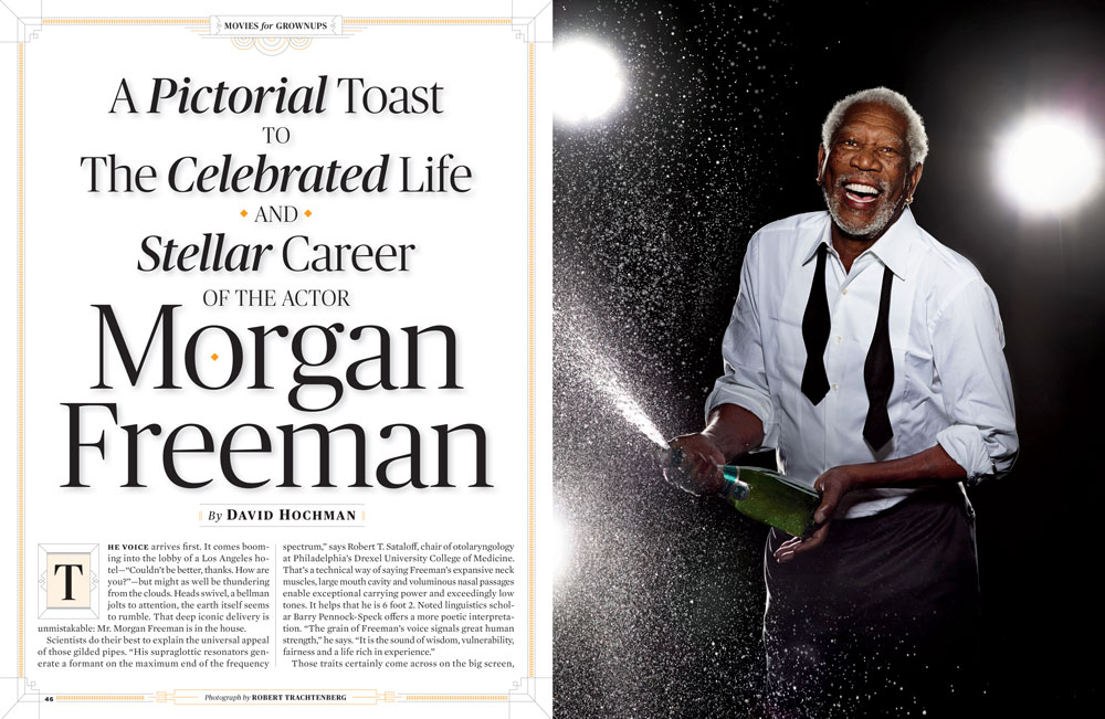
You can imagine how much work that is, and yet AARP Magazine continues to be truly stunning and chock-full of insights into everything from celebrities to cancer, from medication to #MeToo (Figure 1). Clint Eastwood on the cover, Jennifer Aniston
inside, Cyndi Lauper featured. Plus great stuff on work, retirement, insurance, driving, and more.

Figure 1. Tablet-designed pages showcase the variety of topics and an interesting mix of photography and illustration.
How do they do it? Let’s see.
An Eye for Design
The AARP template and overall design aesthetic have one thing in common: they’re easy on the (aging) eye. The pages are remarkably eye-catching and modern while retaining readable type. According to Design Director Todd Albertson, the designers achieve this by selecting fonts with a slightly higher x-height. While the body text is still small at 9.75 pt, the generous 11.75-pt leading and the design of the Mercury Text typeface provide at-a-glance readability (Figure 2).

Figure 2. For people with presbyopia (natural farsightedness due to aging), dense blocks of small type are no fun, even when the headline promises a fun read about the girl who just wants to have fun. The leading and font choice for body copy in the AARP template, however, make this article inviting. According to Thinking with Type, “Mercury is a typeface designed for modern newspapers, whose production demands fast, high-volume printing on cheap paper. The typeface’s bulletproof letterforms feature chunky serifs and sturdy upright strokes.”
Body paragraphs are justified, but the justification settings are fine-tuned for better spacing with the selected font (Figure 3). This impressive attention to detail is noticeable because you’re never aware of these changes—they just quietly make everything look better. Another typographic accommodation to the aging eye is limited use of reverse type, says Todd.

Figure 3. To achieve the most readable copy with justified paragraphs of Mercury Text, the Maximum Word Spacing is decreased from 133% to 100% and the Minimum Letter Spacing is decreased from 0 to -5%.
In a world where “print is dead,” AARP is printing and mailing millions of magazines every other month. To decrease shipping costs, they opt for a lightweight paper stock with a lot of show-through. For best results, AARP sticks to a limited color palette and brighter photos (Figure 4).

Figure 4. Brighter colors work best on the lighter-weight paper AARP favors to save on shipping.
The AARP Workflow
The K4 publishing system provides the hub for AARP Magazine’s production process, with the production director dispatching assignments to writers, editors, and designers who work independently. As with all publishing processes, the flow is more circular than linear, but it all manages to come together at the end inside InDesign. From a design standpoint, the process is:
- View an early story draft in Word to start generating ideas.
- Work with photo staff to comp ideas and pitch to senior design staff.
- Gain approval from the editor in chief.
- Assign photos and illustrations.
- Design the page in InDesign, importing stories from InCopy and images created in Photoshop or Illustrator (Figure 5).
- Route drafts through K4 for approval.
- Track changes and insert notes in InCopy.
- Finalize pages, produce tailored editions.
- Place final assets in a digital asset management system for tablet and web use.
- Begin production on other editions.
- Design tablet pages. In the past, Adobe DPS was used. Now that Adobe has sunsetted DPS, the plan going forward is to produce a responsive design through a web portal.
- Start over again on the next issue.
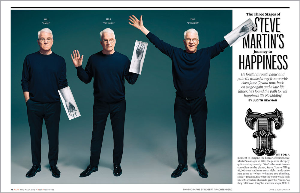
Figure 5. Photos and illustrations come together in this cleverly designed page. Note how the hand graphics complement the stroked headline and ornate initial cap.
Tailored to You
AARP knows the ages of its members, so they are able to tailor content to readers. The staff produces three different magazines for each issue for the 50–60 age group, 60–70 age group, and 70 and older. This might include simply tweaking an opening page (Figure 6) or swapping out an infographic (Figure 7).

Figure 6. The opening page for those in their 50s (left) offers a sugar plum recipe, while the opener for the 70+ audience suggests something nearly unheard of for GenXers: writing a letter.

Figure 7. The What to Expect infographics are customized to the various age groups, with familiar images and challenges highlighted.
InDesign makes these creative pages possible; the people make them engaging and relevant. We’re not saying you should lie about your age to become an AARP member, but if you have to…
Commenting is easier and faster when you're logged in!

Recommended for you

InReview: PDF2ID
This trusty plug-in for converting pdf files to editable InDesign documents can...
InDesign Magazine Issue 76: Publish Anywhere with InDesign to HTML5
We’re happy to announce that InDesign Magazine Issue 76 (August, 2015) is now av...

InDesign Magazine Issue 125: Hot Tips
We’re happy to announce that InDesign Magazine Issue #125 (September 2019) is no...