


dot-font was a collection of short articles written by editor and typographer John D. Barry (the former editor and publisher of the typographic journal U&lc) for CreativePro. If you’d like to read more from this series, click here.
Eventually, John gathered a selection of these articles into two books, dot-font: Talking About Design and dot-font: Talking About Fonts, which are available free to download here. You can find more from John at his website, https://johndberry.com.
Sumner Stone’s typeface Cycles has been around for some time, but it’s only now being released for commercial use. Cycles is a classical-looking serif typeface, which Stone has developed in several different versions, each one targeted for use at a particular point size: Cycles Nine, Cycles Eleven, and so on. Over the course of several years, he has refined the design and expanded the range of sizes, until today his Stone Type Foundry offers a superfamily of three text sizes and three display sizes, each with both roman and italic, and most with numerous variations such as small caps, fractions, and both old-style and lining figures.
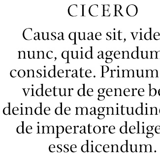
Sample of Cycles Eighteen, a display size meant for use at 18 point.
Making Text Readable
Cycles is primarily a text face, and a very attractive one. It has already been used in a number of handsome books, several designed by Jack Stauffacher, others by Chuck Byrne and Alvin Eisenman. It’s an elegant serif face, with Renaissance proportions and a calligraphic feel; there’s a good deal of contrast between the thick and thin strokes, which gives it sparkle, but not so much that it gets in the way of readability. Readability is what Cycles is all about. The display sizes have been developed to complement the text versions; at large sizes, the sparkle can be accentuated without becoming distracting.
Cycles grew out of Stone’s earlier typeface Print, which he developed in 1990 as a text face for “Print” magazine. Print is a “green” typeface, Stone says, “made for the reader, the environment, and whoever pays the bills.” It follows in the long tradition of text faces for publications that want to cram as much text as possible onto the page (thus saving paper and ink), yet still keep the text easy to read. Stone experimented to see how much he could condense a text type before it started to look cramped.
“My agenda in doing Print,” he says, describing his working method, “was to find an edge, a border. This seems to be a modus operandi which I employ often. If one can actually locate a border, it then becomes a fixed point from which one can proceed.” From that point, that limit—in this case, the narrowest practical width for the letters—he could experiment further to find the ideal. “The idea of a fixed point and successive approximations probably comes from the calculus,” he explains. “In this case the point was the narrowest possible easily-readable text. How to find it?” Demonstrably, Stone created a successful text typeface that was very narrow but comfortable to read in the columns of a magazine. “Print” magazine has been redesigned since then and now uses a different typeface for its text, but the Print typeface was its staple for years.
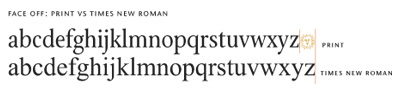
A demonstration that Sumner Stone’s Print typeface fits more characters per line than that old standard Times Roman.
Although Sumner Stone is not one of those type designers whose work can all be seen as variations on the same theme, he has explored the area staked out by Print and its large-display variation, Arepo, over the course of many years and several type families. As he points out: “Cycles is a widened Print. I did a number of experiments to find the other border. Wide. I was interested in line length vs. letter width. If one believes that there should be a certain number of words in a line, then why not achieve it for your line length with the proper-width character?” Although Cycles isn’t a broad or expanded typeface by any means, it is noticeably more generous in width than Print. The two could easily be used together, in narrow and wide measures in the same page layout.
Let the Typeface Fit the Size
But Cycles’ biggest draw is its separate designs for different sizes—something that was axiomatic in metal foundry type and is being gradually re-explored these days by some of the most adventurous digital type designers. Each of Cycles’ fonts is designed for use at a particular size. The details of the letters’ design are adjusted subtly to work best at that size, rather than just taking a single average design and scaling it up and down. Stone’s well-designed type specimen, which can be downloaded in PDF form from the Stone Type Foundry Web site, shows each variation of Cycles at its appropriate size, and also shows type set at intermediate sizes in both the next-larger and the next-smaller font, so you can see the difference for yourself. (It would be useless to try to show this here on the web, but it’s instructive to look at the page that shows, for instance, two identical paragraphs of 10pt text, one set in Cycles Eleven and one set in Cycles Nine. This is the sort of comparison a conscientious typographer will make before settling on a text face for any large project.) Having the complete capability of using Cycles in all its optical sizes would mean buying all the fonts, but Stone offers quite a number of different pricing options for useful combinations of individual fonts (and you can always ask him about custom combinations).

A comparison of the three text sizes of Cycles, each shown here at 100 point to exaggerate the fine details.
Sumner Stone tends to think in the long term, over millennia of tradition. “In typography,” as he says in his introduction to the Cycles family, “there is a fundamental relationship between the physical image of the text and the visual apparatus of the reader. For 2,600 years of making and re-making, the breeding of the Roman letter has been under way. Traditional type sizes are the product of a lengthy accumulation of human attention. Like a star crystallized out of the heavens, like a species of creature, each size of type is relatively absolute. It represents a reduction, a cooking down of the reading and writing experience of many generations.” Cycles’ optical sizes grow out of and honor this long tradition, “a tradition which has at its base an unwavering devotion to the legibility of the text.”
On Alphabet Farm
The Stone Type Foundry, which began in Palo Alto after Sumner Stone left Adobe Systems, where he had been type director, is now located on a walnut ranch in the rural Capay Valley of Northern California. Aptly, Stone calls his land (which is a working agricultural enterprise) Alphabet Farm. “On Alphabet Farm, letters are our daily bread.”
Carrying the metaphor forward (and speaking quite literally about the varying landscape where he lives and works), Stone says, “Alphabet Farm spans many diverse environments. Each Cycles size has its own preferred territory in the typographic firmament. Planted in the right spot, it will bear legible fruit.”
There’s more that could be said about Sumner Stone’s type designs and the traditions he carries forward through them, and perhaps I’ll come back to them in a future column. In the meantime, I’d suggest exploring his website, which presents, if not a complete picture, then at least a broad and undulating typescape.
This article was last modified on February 18, 2022
This article was first published on March 15, 2004
Commenting is easier and faster when you're logged in!

Recommended for you

dot-font: Front-Page Fonts
dot-font was a collection of short articles written by editor and typographer Jo...

dot-font: A New Typographic Glasnost
dot-font was a collection of short articles written by editor and typographer Jo...

dot-font: Language Culture Type
dot-font was a collection of short articles written by editor and typographer Jo...