

No matter how many times you’ve done it, sending a page-layout file to a co-worker or a service bureau can be a palm-sweating experience. Your hand hovers above the “OK” button as you run down the list in your head: Is that image really supposed to be behind the text? Was that bold font intentional? And which blue is the right blue? Then, once you’ve satisfied yourself that all is well, there’s something — or someone — else to consider: While you may feel comfortable with how you created the document, the stranger who opens your file may not understand what you have created.
Preflight programs such as Markzware’s FlightCheck don’t pick up these types of problems. You have to clean up your document yourself. That’s why establishing ironclad guidelines about what’s permissible is important. Build your document with these standards in mind, and you can save yourself a lot misunderstanding down the line.
Now before you ask “Haven’t we been down this road before?” keep this in mind: Recently I was consulting with designers and production artists in the communications and publications department of a large manufacturing company. In the course of discussing their publishing workflow with them, it became apparent that some folks weren’t aware of establishing these best practices. The bottom line? It doesn’t hurt to review them.
Here are some guidelines as to how to build your documents so they can be easily understood by anyone who opens the document.
- Don’t use text boxes or frames for color only.
I can’t tell you how many people use a text element to apply a stroke or background color to a page. The problem is that the text element (a box in QuarkXPress or a frame in InDesign) contains font information. Not only does this add to the file size, but the font information can confuse someone who doesn’t know where the font is located. If you need to apply strokes or colors to items, make sure they are applied with content set to None in QuarkXPress or Unassigned in InDesign (see Figure 1).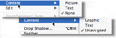
Figure 1: Choose Content > None in XPress (top) or Content > Unassigned in InDesign (bottom) to create non-text elements that can be used apply colors or strokes to layouts.
- Don’t hit the Return key to add space between paragraphs.
Your mother should have told you this one when you were a little kid. If you need space between paragraphs, use the Space Above or Space Below controls. So what’s so bad about hitting the Return key? Well, not only is it hard to control the exact space, but double returns can cause spaces if they fall at the tops of columns. The electronic Space Above avoids that problem. - Clean up the pasteboard.
Just as you wouldn’t leave your socks lying around the living room when company comes over, so you shouldn’t leave little bits and piece of text and images lying around the pasteboard of your document. Not only does it add to the file size, images will add unnecessary links and text may add fonts. Also, anyone opening the file may not understand if the elements on the pasteboard are supposed to print or not. - Name all colors.
This tip applies to InDesign, Illustrator, and FreeHand files., those programs allow you to apply colors to text or objects directly from the Color palette or Color Mixer (see Figure 2). Applying colors this way creates unnamed colors that don’t appear in the list of colors in the Swatches panel. What’s wrong with unnamed colors? Well, imagine you’re a service provider who sees only a few blue colors defined for the document in the Swatches palette. It would be a bit of a surprise if some pages suddenly contained some red text. Instead of creating unnamed colors, always define your colors first in the Swatches panel (see Figure 3). Then apply them to text and objects to avoid surprises.
Figure 2: The red color applied to this text is considered an unnamed color because it doesn’t exist in the Swatches panel.

Figure 3: This text has been defined with a color that is in the Swatches panel. This makes it easy for a service provider to what colors are in the document.
- Delete unused colors.
Why do good restaurants remove empty place settings at a dinner table? Because it’s a clue to the busboy that no one will be sitting there. The same logic applies to colors. If you aren’t using certain colors, it’s a good idea to delete them from the document — especially any spot colors you aren’t using. This way the service provider isn’t wondering where that color is lurking in the your file. - Use style sheets.
Style sheets are wonderful things. They allow you to apply complicated formatting with just a click or a keystroke. They make it easy to change formatting throughout a document with a single command. They let you know precisely the fonts and styles you have used in your document. So it is amazing how many people don’t use styles, instead formatting text manually for each instance. Perhaps if you are the only one who will ever open your document, you don’t need to use styles. But in most workflows, you really should use styles to format text. It makes it much easier for someone else to figure out how the text has been formatting. And standardized styles ensure that everyone on your department is using the same settings for size, spacing, and so on.Some service providers also ask that, like unused colors, you delete unused style sheets. This may make sense for the printer, but it can cause problems later if you need those styles in a document.
- Cleanup overset text.
The overset symbol in Quark is a small red x in a box. The symbol in InDesign is a red plus sign. Both symbols indicate that there is some amount of text that continues beyond the visible area of the text box or frame. As a general rule, you shouldn’t send documents to a service provider with overset text. Expand the text element so the overset symbol disappears (see Figure 4). This avoids any confusion from someone who can’t tell if the overset text was supposed to be visible or not.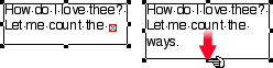
Figure 4: Expand a text box with an overset symbol (left) so that the overset symbol disappears (right). This ensures that there is no hidden text in the container.
- Name layers logically.
It’s real easy to add layers to documents; just click the New Layer icon. But the default names, Layer 1, Layer 2, Layer 3, do nothing to explain the logic behind the layers. Take an extra moment to name your layers according to their purpose (see Figure 5). If you want all the text to be on one layer, name it “Text.” If all the images are together, name that layer “Images.” This way the next person working on the project will know which layers contain what elements.And if you have designated some layers not to print, explain that in the name such as “Non-printing Notes.” There is nothing more confusing that wondering why certain items on the page aren’t printing.

Figure 5: Take some time to change the default names for layers (top) to more descriptive names (bottom).
- Give images unique names.
I recently read a request from a service provider where he asked designers to stop naming their logo files “logo.eps.” It wasn’t that there was anything wrong with that name, but that everyone labels logos that way. Try naming your logo with the name of the company. “Vectorbabe–logo.eps” is much more unique and helps the service provider tell whose logo it is.
Imagine that the next person who opens your document is a friend who is coming to stay at your house while you’re on vacation. You want to leave things neat and tidy. Try to anticipate the questions your friend might have. And if necessary, leave a phone number where you can be reached.
Read more by Sandee Cohen.
This article was last modified on January 11, 2022
This article was first published on February 10, 2004
Commenting is easier and faster when you're logged in!

Recommended for you
Tips for Creating Better Tables in PowerPoint
Making tabular data in PowerPoint look good can be challenging, but Stephy Hogan...

Tip of the Week: Editing Subpaths in a Compound Path
This tip was sent to Tip of the Week email subscribers on October 29, 2015. Sign...

Free Webinar on Optimizing InDesign Files for Translation
News about a free webinar on how to optimize InDesign files for translation, tak...